UI Bites
-
@levicki said in UI Bites:
@Tsaukpaetra I was imagining you wouldn't type that much but just put TWH in there.
I was editing the original for aesthetics.
My real edit-Mark would be:
😘
-
seriously considers adding custom CSS to change the colour of posts read by Tsaukpaetra
... Nah.
-
seriously considers adding custom CSS to change the colour of posts read by Tsaukpaetra
... Nah.
 Would need to be accompanied with a userscript, posts don't load with their upvoters by default....
-
I thought @levicki's lies about me would stop after he hasn't seen a single post of mine after a month. But apparently not.
And for the record, I'm still mad at @boomzilla for calling me a terrorist sympathizer for wanting police to wear body cams.
-
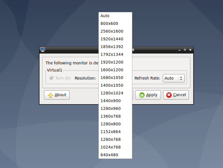
Debian/LXDE. 18 resolutions to choose from and not one of them is 1920x1080. Great job.
-
@anonymous234 auto?
-
@anonymous234 I love the lack of sorting.
-
@Gąska Auto just defaults to 800x600.
I managed to fix it though. You just have to
apt install open-vm-tools-desktopand it finally works as it should.On a related note: VMware Player still shows the "Hey, you have to install VMware tools in the virtual machine! Click here to insert the virtual CD, then manually run the installer in a terminal" message, even though using your distro's package manager has been the officially recommended method for many years, and even the installer itself tells you that.
-
@anonymous234 said in UI Bites:
I managed to fix it though. You just have to
apt install open-vm-tools-desktopand it finally works as it should.Ah yes, the super user friendly way. Yeah, I'm a little annoyed because it took me 30m (yesterday) to figure out how to install Chrome on Ubuntu 18.04. Fuck Snap. (I installed/removed/googled several times) Just go to chrome.com and click the fucking download link. I wouldn't have bothered, but Firefox can't do Slack calls. "Use Chrome or the desktop version". Um, yeah, your desktop version is in beta. I don't do beta.
-
-
@levicki said in UI Bites:
@Zerosquare said in UI Bites:
Not to mention the drop-down-as-well-as-up list.
No, you see, that's a drop-out list.

I'm waiting until they make a drop-in list.
Oh! Oh! The list could be a grid, left to right represents horizontal and top to bottom does vertical! Which of course doesn't work well for sorting either!
-
@levicki said in UI Bites:
Joking aside, I bet you can't use scroll wheel to select item on the list -- most of custom dropdown lists don't allow that.
I believe you are correct, from memory. Because no list will ever be so long it exceeds the vertical screen space!
-
@Tsaukpaetra He's not referring to the ability to scroll the popup that the dropdown list opens, which is also something a lot of custom controls forget about; he's referring to the ability to use the scroll wheel directly on the control itself to instantly change to the next/previous item.
Status: Seriously considering sending levicki a copy of everything I've done for my current employer precisely so he can point this sort of stuff out, so that when some creative person insists that I don't need up/down/disabled states for buttons or that clicking in a track should immediately move the thumb/elevator to that position or some other bullshittery, and that "no one cares" about it being the correct way, I have someone to point to and say "HE DOES!"
-
@TwelveBaud I’m not sure if you’re making a good case if it sounds like only levicki wants his shit done right.
I also get pretty annoyed by idiotic custom UI elements that lack basic functionality of the standard elements they’re imitating. Just because some idiot designer wanted form over function again and they didn’t even know all the things they missed to implement. And, as it sounds you’re tasked with badly implanting these, so do you.(But then this looks like GTK+ stuff, which is “standard” in its own world and couldn’t get much worse if you tried)
-
@TwelveBaud said in UI Bites:
insists that I don't need up/down/disabled states for buttons or that clicking in a track should immediately move the thumb/elevator to that position or some other bullshittery, and that "no one cares" about it being the correct way,
Yeah, the UI in Hypatia is hobbled in many similar ways. Like, if you click a button, there's no way to "un-click" it without it activating (for example, in most OS you can drag the mouse off the button to cancel activation).
It's... Fun.
-
@levicki can’t badly reinvent
the wheelstandard controls if you simply use standard controls.
-
couldn’t get much worse if you tried
I see you've not used all that many desktop systems…
-
@boomzilla said in UI Bites:
the golf is nice, too.
Only if you need a completely non-addictive aid to falling asleep for an afternoon nap.
-
@TwelveBaud said in UI Bites:
he's referring to the ability to use the scroll wheel directly on the control itself to instantly change to the next/previous item.
I'm not sure how I feel about that. The scroll wheel absolutely must scroll the list; that's not up for discussion.
But changing the selection? Hmm. I've been burned too many times by accidental changes to a focused-but-not-expanded dropdown when wanting to scroll a page.
-
couldn’t get much worse if you tried
I see you've not used all that many desktop systems…
He might have to get Enlightened.
-
couldn’t get much worse if you tried
I see you've not used all that many desktop systems…
The UNIXy ones with focus follows mouse and looking like Motif are thankfully in the past.
-
@HardwareGeek said in UI Bites:
@boomzilla said in UI Bites:
the golf is nice, too.
Only if you need a completely non-addictive aid to falling asleep for an afternoon nap.
Have you tried snooker? There's afternoon and evening sessions!
-
@HardwareGeek said in UI Bites:
@boomzilla said in UI Bites:
the golf is nice, too.
Only if you need a completely non-addictive aid to falling asleep for an afternoon nap.
Not with the amount of beer I drink that day.
-
From a discussion on the WTDWTF Discord I noticed how
 Chrome is on Linux.
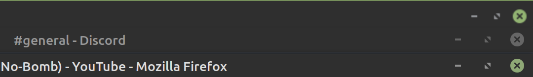
From top to bottom: Chrome, Discord, Firefox. Discord and Firefox uses native buttons. Chrome has them all compressed and fuzzy.
 have the Chrome devs done to make it so?
-
From a discussion on the WTDWTF Discord I noticed how
Chrome is on Linux.From top to bottom: Chrome, Discord, Firefox. Discord and Firefox uses native buttons. Chrome has them all compressed and fuzzy.
have the Chrome devs done to make it so?I believe they entirely disable the native title trim in the window manager and instead reserve a bit of their client area to build a fake title bar, which they then use to paint "tabs on top" in that title bar area.
There might be no other way, in Linux such things as painting title bars (or no such bars at all) have always been delegated to the window manager. Since they're not using the standard window trim they then had to add buttons in the spot where you would normally expect them, though they seem to have a bit of a one-off problem here...
-
I noticed how
Chrome is on Linux.Chrome is
everywhere. Customizing the title bar always means it has to draw it itself. Like it used the aero-style titlebar on my former colleague's Windows 7 that was set to Windows 95 look (I am not sure if Windows 10 can still switch to it, but if yes, he probably still uses it).On Linux it's much harder to make it match the common style, because there is so much variation. But it got yours almost right, so it's either very clever or you are sticking with the default.
There is an option somewhere to turn it off and let it have a normal title bar and separate tab bar, and both the snapped and the Debian-packaged Chromium seem to default to that.
-
Windows 7 that was set to Windows 95 look (I am not sure if Windows 10 can still switch to it, but if yes, he probably still uses it).

-
@HardwareGeek said in UI Bites:
Windows 7 that was set to Windows 95 look (I am not sure if Windows 10 can still switch to it, but if yes, he probably still uses it).
Windows 7 had the best look, though.
You’ll be all cool in 20 years when you set your Windows 10 X TEN X to the old school 7 look.
-
Windows 7 had the best look, though.
You’ll be all cool in 20 years when you set your Windows 10 X TEN X to the old school 7 look.Windows 10 dark mode is best.
-
-
Ending paragraph:
You're old and angry!
You bet! Now get off my lawn, punk.I like him.
-
@dcon That's not the best part.
It's in the footer:
privacy notice: datagubbe.se uses neither cookies nor javascript.
-
Great article, agree to most of it.
Oh, did I mention I hate applications putting custom garbage in the non-client area, and that Gnome needs to be taken out and shot?!
-
-
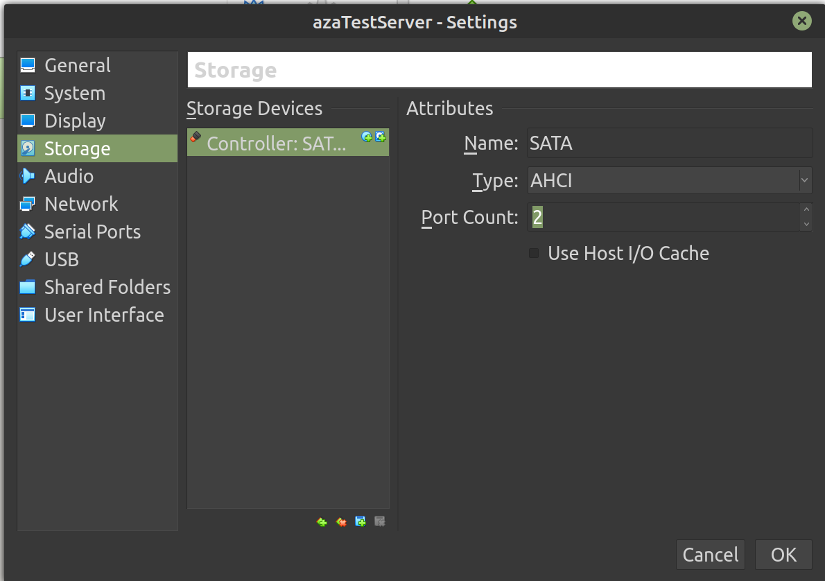
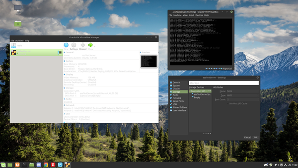
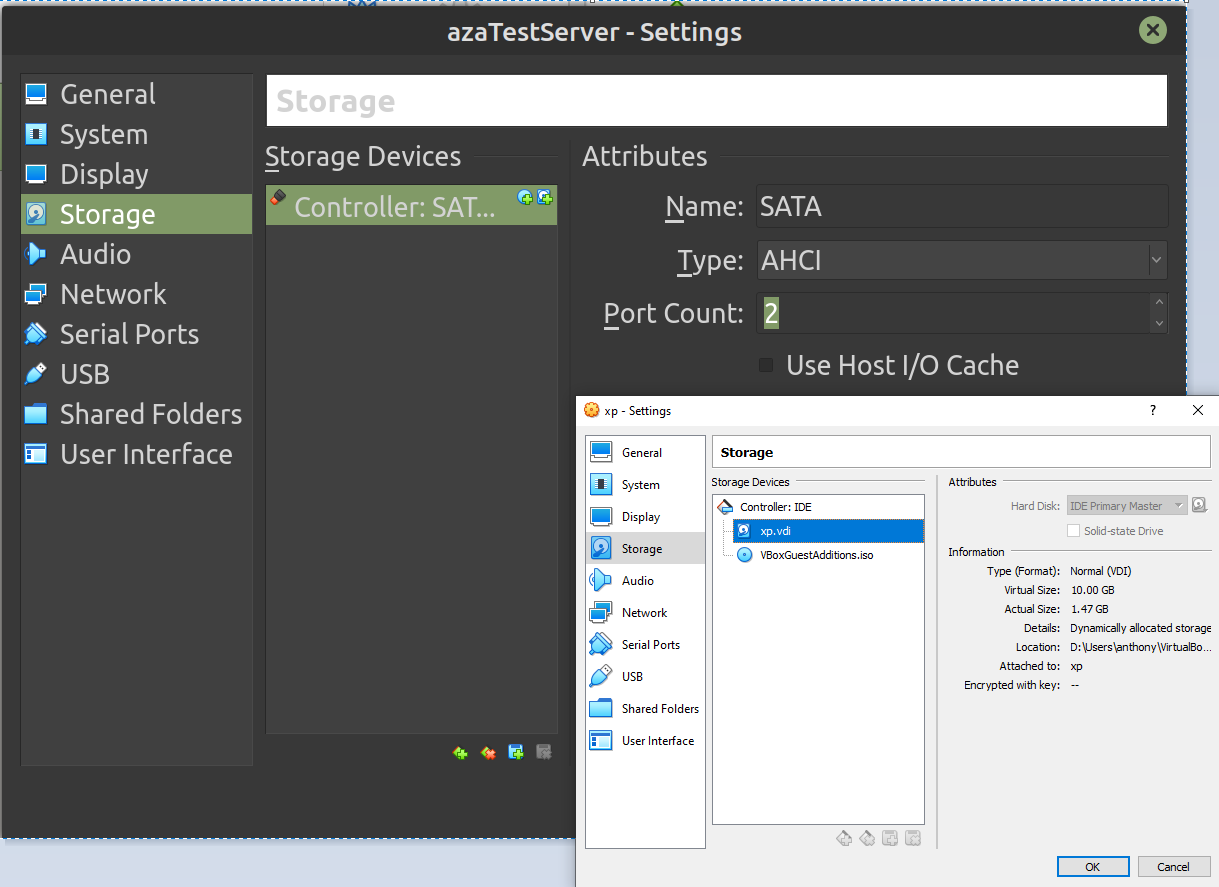
VirtualBox GUI does not like 4K monitors and HiDPI on Linux Mint.
-
@Atazhaia I don't get it...
-
@JBert It's a bit more evident on screen, but the icons and checkboxes are really tiny. Should be as big as the text.
-
@Atazhaia Ah, so that's why I couldn't find the WTF: it's a tiny one.
-
More VirtualBox WTF and better showing of the tiny icons.
Tiny icons everywhere! And also that light-grey-on-white in the manager? Yeah, that's how you get it. About zero contrast. I guess it does not like me using the dark window theme very much and gets the theme text color but uses its own background color in the window.
-
4K monitors
Tralala, my 4k monitor at 100% has smaller windows apparently...
But hey, the icons are apparently the same pixel size!

-
VirtualBox WTF
Also, you'll want to tick that "Use Host I/O Cache" box there, your disk performance should dramatically improve!
-
@JBert It's a bit more evident on screen, but the icons and checkboxes are really tiny. Should be as big as the text.
But some icons (namely the ones in the main list on the left) are… oh, that's because those ones are twice as big as the text at more typical text sizes.
-
@dcon That's not the best part.
It's in the footer:
privacy notice: datagubbe.se uses neither cookies nor javascript.
I almost added that to my post too...
-
@Tsaukpaetra said in UI Bites:
Tralala, my 4k monitor at 100% has smaller windows apparently...
Programs at 100% (almost) always work right since that's what they expect. Change that to 150% or 200% and that's when shit like @Atazhaia posted happens. (In Windows too [Fucking Adobe. Just try working with a 100% and 200% monitor])
No, I'm making fun of the people who can't use their monitors at 100 percent. I'll keep my teeny Windows.
-
Change that to 150% or 200% and that's when shit like @Atazhaia posted happens.
What's even the point of having a 4k monitor when you then set 200% scale, so the applications render at 2k anyway?
-
Change that to 150% or 200% and that's when shit like @Atazhaia posted happens.
What's even the point of having a 4k monitor when you then set 200% scale, so the applications render at 2k anyway?
Because it looks better. I have 2 23" monitors, one at 2K, one at 4K. Having them at 100% and 200% makes things consistent. But they look crisper on the 4K. (Now if the monitor were larger, I'd scale differently. 100% on a 27" is barely ok. I'd run that at 150%, but Ubuntu won't do 2 different monitor scalings)
-
https://youtube.com/upload

Two different "new stuff!" popups are interleaving. Clicking Learn More opens a video in a new tab, then when you go back to the previous tab it now looks normal:

-
@Bulb I'm pretty sure they render at 4k with the elements just being twice as big.
-
I've pressed Ctrl+Shift+T in my browser to reopen a tab with a CNET article I just read, and I got back a different article.
Thanks infinite scroll + auto-switching URL.