Project NEON
-
Exclusive: This is Project NEON, the upcoming incremental upgrade for Windows 10’s design
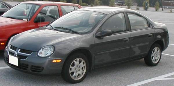
Late last year we reported on Project NEON – the upcoming UI upgrade for Windows 10. Recently we managed a closer look at Microsoft’s internal plans for Project NEON and the future of Windows 10’s UI (user-interface). Right of the bat I don’t want readers to be fooled by those who suggest this is a...
Project NEON will heavily focus on animations, simplicity, and consistency – essentially bringing back Windows 7’s Aero Glass and mixing it up with animations like the ones from the Windows Phone 8/7 era.
 Does that sound like a contradiction to anyone else?
Microsoft is introducing a new component called “Acrylic” to the Windows 10 design, which is essentially blur in the background, sidebar or the navigation of the app.
GODDAMNIT. Why do people want their computer to deliberately blur things?
-
Or they could, y'know, stop fiddling for a change.
-
@boomzilla said in Project NEON:
Why do people want their computer to deliberately blur things?
why do people want their computer to blur things wrong?
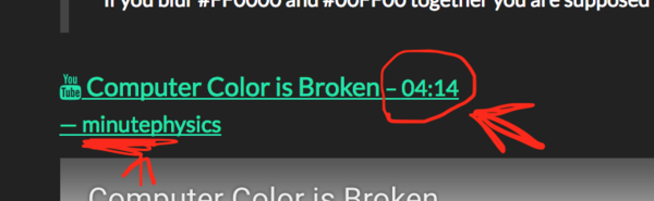
if you blur #FF0000 and #00FF00 together you are supposed to get yellow in the middle! not this yucky brown that everyone always gets.
those octets aren"t linear! you can't just average them to blur! you need to account for gamma!
GAH!

-
@boomzilla Project NEON ?
-
@TimeBandit Also:
Release - Eclipse IDE | The Eclipse Foundation

The Eclipse IDE Working Group is formed to ensure the continued sustainability, integrity, evolution and adoption of the Eclipse IDE suite of products and …
-
-
@boomzilla Neon's atomic number is 10 (like Windows)
It all makes sense now (or not)
-
@boomzilla said in Project NEON:
Project NEON will heavily focus on animations, simplicity, and consistency – essentially bringing back Windows 7
If only they really meant that
-
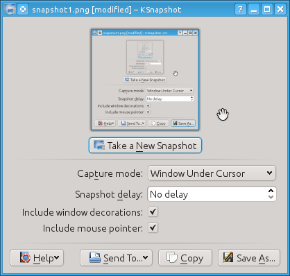
@boomzilla What the fuck is wrong with the alignment between date and time on that screenshot? I thought the tops and bottoms weren't aligned but I copied it into Paint and found out that wasn't the case. I swear there's something visually wrong with it and it's fucking bugging me.
-
@accalia said in Project NEON:
if you blur #FF0000 and #00FF00 together you are supposed to get yellow in the middle! not this yucky brown that everyone always gets.
-
@heterodox said in Project NEON:
@boomzilla What the fuck is wrong with the alignment between date and time on that screenshot? I thought the tops and bottoms weren't aligned but I copied it into Paint and found out that wasn't the case. I swear there's something visually wrong with it and it's fucking bugging me.
I think it's just compression artifacts. Cropped in krita and zoomed way the hell in and then a screenshot shows this:

My guess, as someone who really has no clue about how this shit works is that the text of the date has more pixels on the baseline than the time, whose glyphs are mostly vertical lines at that point, so it kind of got shifted in the compression.
EDIT: Looking at this for too long gives me a headache. Fuck you Bill Gates!
-
@boomzilla The font of the date is one pixel taller. The top of the texts is aligned.
-
-
@No_1 said in Project NEON:
@accalia said in Project NEON:
if you blur #FF0000 and #00FF00 together you are supposed to get yellow in the middle! not this yucky brown that everyone always gets.
EXACTLY!
-
-
@marczellm said in Project NEON:
@boomzilla The font of the date is one pixel taller. The top of the texts is aligned.
I think you're right. Ugh.
-
@boomzilla said in Project NEON:
Project NEON will heavily focus on animations, simplicity, and consistency
Consistently

-
@boomzilla said in Project NEON:
Does that sound like a contradiction to anyone else?
No, the only thing that matters to designs is that they change continuously. This way it always seems new. Once a look has existed for 5 years it starts to look old, at which point you can switch again to the old one.
-
@anonymous234 I still love my Plastik theme.
-
-
@boomzilla said in Project NEON:
mixing it up with animations like the ones from the Windows Phone 8/7 era.
Like anyone knows what that means. Like...10 people used those phones.
-
-
@No_1
 Screen Shot 2017-01-06 at 7.22.21 PM.png
LIAR
-
-
@Jarry said in Project NEON:
@No_1
Screen Shot 2017-01-06 at 7.22.21 PM.pngLIAR
I unsubscribed from that channel as soon as they posted their "If you don't vote for Hillary you are literal Hitler" video.
-
@Polygeekery fucking shitty software leaving tags open!!
I am leaving it, and cursing Node
 and @Jarry
-
Looks a lot like iOS...

-
@accalia said in Project NEON:
those octets aren"t linear! you can't just average them to blur! you need to account for gamma!
I didn't watch the video @No_1 posted, but I'd assume it says something to the effect of that sort of blending needs to be done in something like an HSV or HSL colorspace, not RGB. That (AFAIK) is the only way to get the desired result of, for example, the bright yellow you're looking for.
-
@HardwareGeek said in Project NEON:
I didn't watch the video @No_1 posted, but I'd assume it says something to the effect of
Slashdot is that way

-
@HardwareGeek The video says that to blur colors together correctly, the brightness values from the file (which are stored as the square root of the actual value) need to be squared, then averaged, and then can be re-square-rooted and saved; instead of how most software does it, by simply averaging the stored (square root) values.
-
@Polygeekery said in Project NEON:
@Jarry said in Project NEON:
@No_1
Screen Shot 2017-01-06 at 7.22.21 PM.pngLIAR
I unsubscribed from that channel as soon as they posted their "If you don't vote for Hillary you are literal Hitler" video.
Oh no, it's pretty true.
If you don't vote for Hillary you are Hitler.
But the problem is that if you don't vote for Trump you are Stalin.
-
@xaade said in Project NEON:
@Polygeekery said in Project NEON:
@Jarry said in Project NEON:
@No_1
Screen Shot 2017-01-06 at 7.22.21 PM.pngLIAR
I unsubscribed from that channel as soon as they posted their "If you don't vote for Hillary you are literal Hitler" video.
Oh no, it's pretty true.
If you don't vote for Hillary you are Hitler.
But the problem is that if you don't vote for Trump you are Stalin.Fucking @Jarry, that non-tag-closing asshat.
-
<tag>
-
So basically, Microsoft is adding to Windows what Apple added to OS X with the Yosemite release? The translucency effect has been in OS X for years...
-
@El_Heffe said in Project NEON:
@HardwareGeek said in Project NEON:
I didn't watch the video @No_1 posted, but I'd assume it says something to the effect of
Slashdot is that way
Those are the reply and vote buttons.
-
@AlexMedia said in Project NEON:
So basically, Microsoft is adding to Windows what Apple added to OS X with the Yosemite release? The translucency effect has been in OS X for years...
Is Yosemite before or after Windows 7? :P
-
@RaceProUK said in Project NEON:
@AlexMedia said in Project NEON:
So basically, Microsoft is adding to Windows what Apple added to OS X with the Yosemite release? The translucency effect has been in OS X for years...
Is Yosemite before or after Windows 7? :P
I think you meant Vista. ;)
There were transparent and translucent window borders and menus before then (Windows 9x shell replacements, AmigaOS, who knows what in the UNIXy world) but who did what when is more than I feel like researching at the moment.
-
@Parody said in Project NEON:
There were transparent and translucent window borders and menus before then
For reference, Windows itself has supported translucency since Windows 2000. It just works a hell of a lot better in Vista (and newer)'s window compositor.
-
@anonymous234 said in Project NEON:
No, the only thing that matters to designs is that they change continuously. This way it always seems new. Once a look has existed for 5 years it starts to look old, at which point you can switch again to the old one.
This is good news for all those people who still use Windows XP because they’re afraid they’ll get confused and forget how to use the computer by the different look of later versions.
-
@AlexMedia said in Project NEON:
So basically, Microsoft is adding to Windows what Apple added to OS X with the Yosemite release?
What, more and more annoying bugs? Microsoft (and Apple) have been doing that for years.
Filed under: A pox on all their houses
-
@Gurth said in Project NEON:
@anonymous234 said in Project NEON:
No, the only thing that matters to designs is that they change continuously. This way it always seems new. Once a look has existed for 5 years it starts to look old, at which point you can switch again to the old one.
This is good news for all those people who still use Windows XP because they’re afraid they’ll get confused and forget how to use the computer by the different look of later versions.
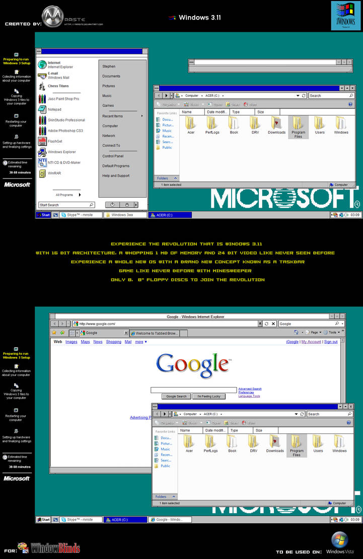
They should add a windows 3.1 retro theme.
-
@PleegWat said in Project NEON:
They should add a windows 3.1 retro theme.
If your install still has PROGMAN.EXE you're most of the way there. :)
-
@Parody I think they dropped that starting with vista.
-
@PleegWat said in Project NEON:
@Parody I think they dropped that starting with vista.
If you're running 32-bit Windows you could steal a copy from somewhere. Alternatively, 3.1(1) runs in DOSBox. Make that fullscreen and watch the fun! ;)
-
-
@PleegWat said in Project NEON:
@Gurth said in Project NEON:
@anonymous234 said in Project NEON:
No, the only thing that matters to designs is that they change continuously. This way it always seems new. Once a look has existed for 5 years it starts to look old, at which point you can switch again to the old one.
This is good news for all those people who still use Windows XP because they’re afraid they’ll get confused and forget how to use the computer by the different look of later versions.
They should add a windows 3.1 retro theme.
I can't seem to find the one I found that uses native (unsigned) .msstyles though...
-
@bb36e said in Project NEON:
@PleegWat said in Project NEON:
They should add a windows 3.1 retro theme.
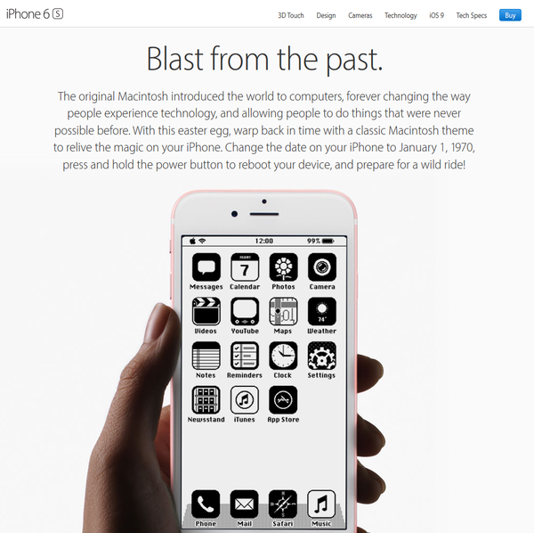
Yeah, permabricking your phone (at least until the clock is > 0 in your local timezone) is definitely a wild ride!
-
@Tsaukpaetra I appreciate your thinking differently
-
@Polygeekery said in Project NEON:
@xaade said in Project NEON:
@Polygeekery said in Project NEON:
@Jarry said in Project NEON:
@No_1
Screen Shot 2017-01-06 at 7.22.21 PM.pngLIAR
I unsubscribed from that channel as soon as they posted their "If you don't vote for Hillary you are literal Hitler" video.
Oh no, it's pretty true.
If you don't vote for Hillary you are Hitler.
But the problem is that if you don't vote for Trump you are Stalin.Fucking @Jarry, that non-tag-closing asshat.
I'm sure that there's some 'pataphysical reason behind it.
File Under: Oops, wrong Jarry
-
@boomzilla said in Project NEON:
@anonymous234 I still love my Plastik theme.
Funny, that's pretty much how MUI has looked like by default for the last quarter of a century, if you discount the fact that it had full font sensitivity in the 90s while that still seems to be a newish concept for many Windows programs

 KDE neon