After reading some UX stuff on Medium
-
@Onyx Not sure about the use of rounded rects. Could we try again with sharp corners, to stay in keeping with the theme of the doorway as a whole? And the grey you've used is a little jarring - perhaps move it a couple of shades toward the color of the door itself? Anyway I'll leave it up to you but if we could have it shipped to the client by 4:15pm this afternoon, that would be great.
-
@Onyx By the way I think the panel menu needs to be 5% further up the door, per memo from HR about designing-in accommodations for taller staff members.
-
@flabdablet Also, the drop down menu when you press on the hamburger is a bit confusing. Can it be shifted a bit to the left and some flat icons added to the options?
-
@Onyx that frame looks a bit skeuomorphic and dated. Could you flatten it out a bit?
-
Wait, no, too obvious. Let's try again.
Hm, no, still too contrasty.
There we go.
And y'all thought you were just joking.
-
@Onyx
The doorstep seems to be in a non-company approved color. This needs to be fixed with priority.Could you check that the back of the door also uses colors from the approved color list?
For reference you can use the colors on the SharePoint under Corporate Branding\Building\Building Elements\Internal Doors
But be sure to use specification version 5.
-
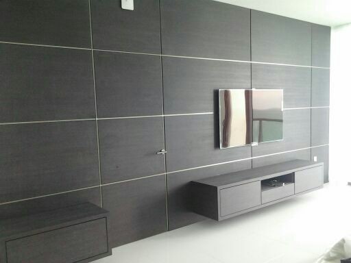
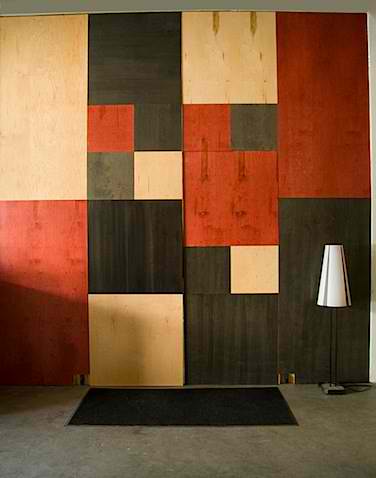
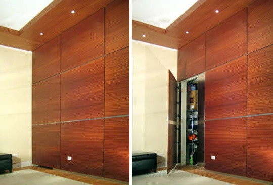
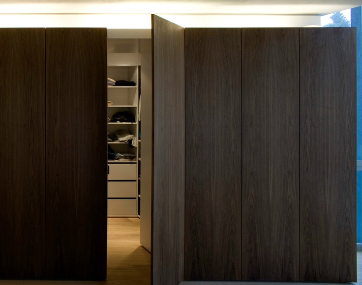
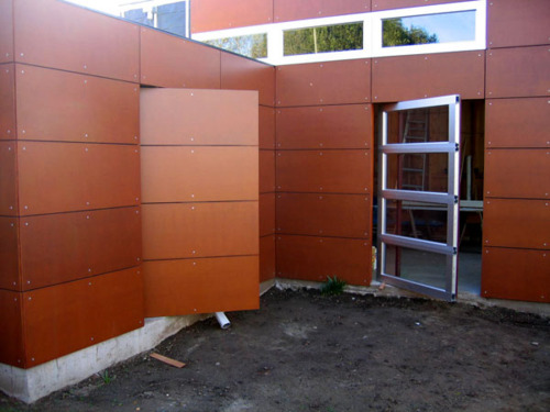
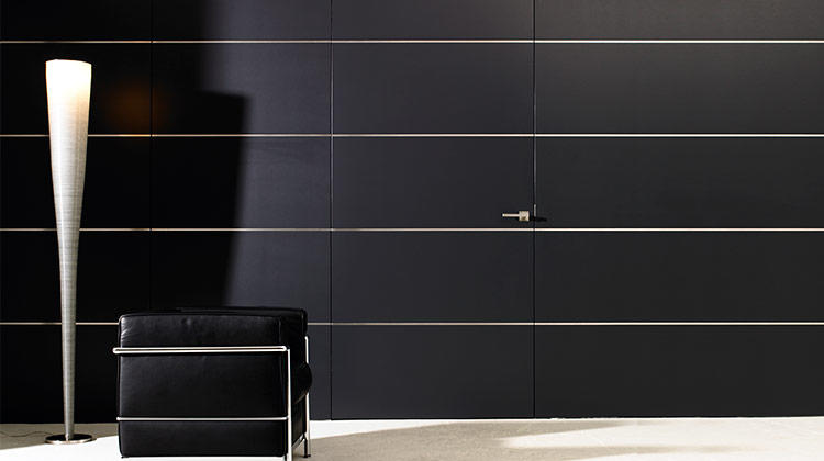
@Dreikin I want this wall

-
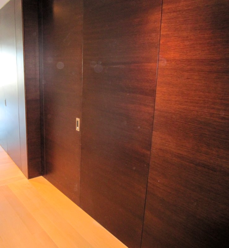
@aliceif said in After reading some UX stuff on Medium:
I want this
walldoor
-
@aliceif And not one person was surprised.
-
@Magus said in After reading some UX stuff on Medium:
@aliceif And not one person was surprised.
Of course not. It's very pleasing to the eye. One might even expect to find it in the Walldoor Astoria!
-
@blek said in After reading some UX stuff on Medium:
So... wat do?
@blek said in After reading some UX stuff on Medium:
people might want to it.

-
@abarker said in After reading some UX stuff on Medium:
@blek said in After reading some UX stuff on Medium:
So... wat do?
@blek said in After reading some UX stuff on Medium:
people might want to it.
Clearly missing "to" and "do".

-
@Tsaukpaetra said in After reading some UX stuff on Medium:
Clearly missing "to" and "do".
Yes, but I'm too lazy to insert words that other people CBA to type.
-
@abarker said in After reading some UX stuff on Medium:
Yes, but I'm
too lazy to insert words that other people CBA to typenot a mind-reader.FTFB?
Edit: Besides, isn't most communication interpretation? You have to fill in a lot of blanks in even the most simple of things...
-
@flabdablet said in After reading some UX stuff on Medium:
@Onyx By the way I think the panel menu needs to be 5% further up the door, per memo from HR about designing-in accommodations for taller staff members.
CLOSED_WORKS_ON_MY_HEIGHT_WONTFIX
-
@flabdablet said in After reading some UX stuff on Medium:
@Onyx By the way I think the panel menu needs to be 5% further up the door, per memo from HR about designing-in accommodations for taller staff members.
CLOSED_WORKS_ON_MY_HEIGHT_WONTFIX
-
@Luhmann said in After reading some UX stuff on Medium:
For reference you can use the colors on the SharePoint under Corporate Branding\Building\Building Elements\Internal Doors
But be sure to use specification version 5.dir \sharepoint\Corporate Branding\Building\Building Elements\Internal Doors
Acceptable Colors.xlsx
Acceptable Colors 2.xlsx
Acceptable Colors 2 (old).xlsx
Copy of Acceptable Colors 2 (old).xlsx
Acceptable Colors 4.xlsx
Acceptable Colors Phase 2.xlsx
thumbs.db
-
@abarker I guess I accidentally a word.
-
@Onyx That's not flat enough. Just take an example from modern kitchen design:

Doors without handles, you just need to push them at the right spot so that they spring open. Of course you cannot (visually) tell which spot is right, because an indicator would spoil the design!
-
@Grunnen If they're like my bathroom cupboard, any spot will do (on the side the door opens on; not the hinge side).
-
@Lorne-Kates
I would have sworn there was a visio diagram in there too ...
-
@Luhmann said in After reading some UX stuff on Medium:
@Lorne-Kates
I would have sworn there was a visio diagram in there too ...It's embedded in the Excel document.
-
@Luhmann said in After reading some UX stuff on Medium:
I would have sworn there was a visio diagram in there too ...
If it's anything like our Marketing, it probably requires an extra expenditure in the region of 20% of your entire budget just to get the exact descriptions of the fonts and colours and to get a process that will actually use them in the required way. Of course, I don't see much font usage on those doors, but that's probably a good thing overall; the unlabelled icons are so much more intuitive…
-
@Grunnen said in After reading some UX stuff on Medium:
Of course you cannot (visually) tell which spot is right
Use them for a while, then anybody can tell where to push just by looking at them.
-
@Gurth said in After reading some UX stuff on Medium:
Use them for a while, then anybody can tell where to push just by looking at them.
You can help with that by putting an extra rectangular panel (usually metallic) on the door.

-
@Gurth Sure, and anyone who has used a flat UI with hidden gestures for a while can probably tell how to use it. But is it good design?
-
-
@Gurth There's a reason that there aren't handles there. Those aren't drawers and cabinets, they're just blank cabinet faces so that they look the same as the real cabinets. Usually you see them in front of a bathroom or kitchen sink, which obviously can't have a drawer there.
-
@Dragnslcr So there's literally no cupboard space whatsoever in that unit? I somehow doubt that...
-
@Gurth True. And people sometimes forget that even the "classical" interface elements (like windows or buttons) are just as meaningless as the hamburger icon to people who have never used a computer.
The concept of intuitiveness is not as intuitive as it seems.
-
@dkf said in After reading some UX stuff on Medium:
@Gurth said in After reading some UX stuff on Medium:
Use them for a while, then anybody can tell where to push just by looking at them.
You can help with that by putting an extra rectangular panel (usually metallic) on the door.
What about shells, shells'll make it better. Right ‽‽‽‽‽‽‽‽‽‽‽‽‽‽‽‽
-
@Arantor said in After reading some UX stuff on Medium:
@Dragnslcr So there's literally no cupboard space whatsoever in that unit? I somehow doubt that...
Possibly. Or the cabinet and drawer doors are on the other side. That looks like a gas stove top, and there's an electrical outlet on the side, so there's at least gas lines and electrical wiring inside there. That might be why there aren't cabinets and drawers.
-
@Gurth
I spy, with my little eye, something beginning with H.
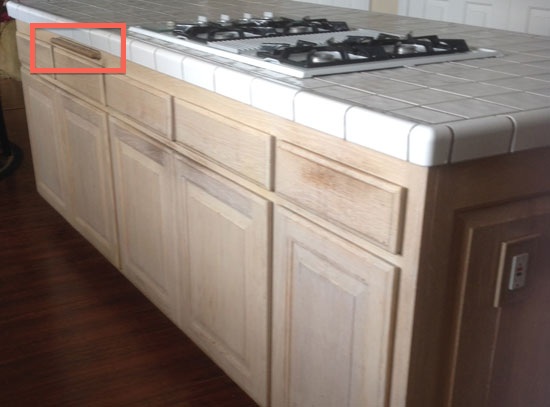
It's a handle!
-
@dkf I think that's probably a place to hang a cloth.
However, as that's a shitty old gas hob, and the worktop looks like a swimming pool changing room floor, who knows?
-
@coldandtired said in After reading some UX stuff on Medium:
I think that's probably a place to hang a cloth.
Yes, a handle.

-
@dkf But if nothing can be manipulated via it, it wouldn't be a handle

-
@coldandtired said in After reading some UX stuff on Medium:
But if nothing can be manipulated via it, it wouldn't be a handle
Sounds like you can't handle that thought!

-
@Dragnslcr said in After reading some UX stuff on Medium:
There's a reason that there aren't handles there. Those aren't drawers and cabinets, they're just blank cabinet faces so that they look the same as the real cabinets.
I don’t think so. This looks to me like cupboards and drawers that open by pushing against them, with a few that have been used a lot, one that’s used sometimes (the second door from the left), and others that don’t get used as much (plus, for completeness’ sake, two fake drawers below the cooker that obviously never get pressed at all). I’m not quite sure what the thing is that @dkf spotted.
A-ha, the site the photo is on also has what it claims is an “after” shot:
http://www.cabinetrefresh.com/images/old-kitchen-cabinetry-refinished.jpg
I guess handleless doors aren’t considered so great after all.
-
My parents have a kitchen where there isn't handles on the drawers (push to open). Works surprisingly well.
-
@lucas1 Whereas I struggle (a bit) with the lid over the sheet feeder on my printer any time I want to open that, because it works like that too and I usually don’t press it hard enough until the second or third try.
-
@Dreikin said in After reading some UX stuff on Medium
One might even expect to find it in the Walldoor Astoria!
I finally found out why forums need a downvote button.
-
Including knobs on the presumably non-openable panels in front of the stove.
-
@dkf said in After reading some UX stuff on Medium:
fonts and colours [on the web]
How often do you get a manager with a badly calibrated display that complains about those?
-
@kt_ said in After reading some UX stuff on Medium:
@flabdablet said in After reading some UX stuff on Medium:
@Lorne-Kates said in After reading some UX stuff on Medium:
you end up with a gigantic, ornate doornob. It is too high for most people to reach (though it's just fine for the manager's height). It was installed in the middle of the door, so that it would more prominently feature-- even though physics says a handle in the middle of a door is retarded. Because it's in the middle of the door, the engineers haven't been able to get a way to hook up a latch system yet-- no one can drill a hole that deep, or find a latch that long. So the door is just propped closed, making the handle useless. Also, because there's no latch, the door will randomly either jam or swing open.
Well, that's clearly fucked. So what we need to do now is flatten the doorknob into a clean, minimalist icon of itself. It will be much more intuitive that way.
I have lately been able to see how flat design works: my father installed iOS google drive app. Fuckin' 'ell, he didn't know where to click, cause buttons look like tips/headers. Cause there's no buttons, there's only differently styled labels, and not even consistently, for fuck's sake.
 Flat UI and Forms

Though some decry flat user interfaces as pure fashion, or as the obvious response to skeuomorphic trends, many designers have embraced the flat approach because the reduction in visual styling (su…
-
@Weng I have however see a blind person walking out of the bathroom run into a can put there by someone who moved it there from it's usual place.
-
@Onyx said in After reading some UX stuff on Medium:
@dkf said in After reading some UX stuff on Medium:
fonts and colours [on the web]
How often do you get a manager with a badly calibrated display that complains about those?
I once had a manager who didn't understand that IE10's widgets looked different than IE9, and insisted that we were doing css wrong.
...
that fucktoad may or may not have partially inspired the last April "Radio WTF"
-
@error said in After reading some UX stuff on Medium:
Flat UI and Forms
Though some decry flat user interfaces as pure fashion, or as the obvious response to skeuomorphic trends, many designers have embraced the flat approach because the reduction in visual styling (su…
Interesting to see that this article basically advises web designers to learn the same lessons application UI designers had figured out 20–30 years ago.
-
@Gurth said in After reading some UX stuff on Medium:
Interesting to see that this article basically advises web designers to learn the same lessons application UI designers had figured out 20–30 years ago.
And now UI designers are taking hints from the web...