UI Bites
-
Maybe there's something I could install, but

By the way, no warthog emoji seems to exist. Maybe the Unicode guys were too
to create it.
-
@Zerosquare said in UI Bites:
 : Our application is displaying wrong numbers. When can you fix it?
Charles Babbage said:
On two occasions I have been asked, 'Pray, Mr. Babbage, if you put into the machine wrong figures, will the right answers come out?' I am not able rightly to apprehend the kind of confusion of ideas that could provoke such a question.
-
: That's not an answer. I need a date!Filed under: so does @Tsaukpaetra, but not in the same way
-
-
@Zerosquare said in UI Bites:
: Our application is displaying wrong numbers. When can you fix it?Charles Babbage said:
On two occasions I have been asked, 'Pray, Mr. Babbage, if you put into the machine wrong figures, will the right answers come out?' I am not able rightly to apprehend the kind of confusion of ideas that could provoke such a question.
FWIW, there are algorithms where you can put in the wrong figures and get the right answer out because the underlying series converges strongly. An example is square root finding; the initial guess can be pretty much anything positive and you'll get the right answer.
-
@dkf You can't ask it for the square root of 100 and expect it to tell you the square root of 50 though, which is more like what Babbage was being asked.
-
@bobjanova said in UI Bites:
@dkf You can't ask it for the square root of 100 and expect it to tell you the square root of 50 though
Around here? Sure you can. AND YOU'LL BELIEVE IT TOO!
-
@Zerosquare said in UI Bites:
: That's not an answer. I need a date!
I'm not that into size difference...
-
@Tsaukpaetra said in UI Bites:
@Zerosquare said in UI Bites:
: That's not an answer. I need a date!I'm not that into size difference...
TIL there's something @Tsaukpaetra is not into.
-
@Tsaukpaetra said in UI Bites:
@Zerosquare said in UI Bites:
: That's not an answer. I need a date!I'm not that into size difference...
TIL there's something @Tsaukpaetra is not into.
I do try to avoid undue damage to my systems. They suffer enough abuse as it is without intentional harm!
-
TIL there's something @Tsaukpaetra is not into.
There is a lot of things he's not into.
Not because he doesn't want to, but because he can't
-
@TimeBandit said in UI Bites:
TIL there's something @Tsaukpaetra is not into.
There is a lot of things he's not into.
Not because he doesn't want to, but because he can't You're not wrong...
-
@bobjanova said in UI Bites:
@dkf You can't ask it for the square root of 100 and expect it to tell you the square root of 50 though, which is more like what Babbage was being asked.
You could ask some machines for the result of 4195835/3145727 and expect (and receive) the answer to 4195579/3145727 though
-

I kept pressing "Retry" a few times hoping they would start supporting .NET Core 2.2 again, but eventually I gave up and pressed "Continue".
-
Visual Studio is executing a suggsted action since a couple of minutes:
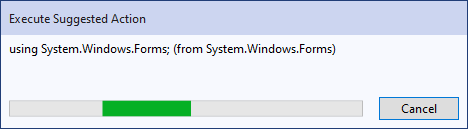
The designers of VS were wise enough not to use a classic progress bar.
-
Genius.com: I previously mentioned that they had switched to a crappy single-column mobile layout. However, today I discovered that the old desktop layout still exists:

Now I have to figure out what this particular browser (Firefox in a Linux vm) is doing right, that other desktop browsers aren't, to get the real experience rather than the dumbed down terrible version.
-
mobile layout
Did you try
Making the windowEnabling "desktop" mode? wider
wider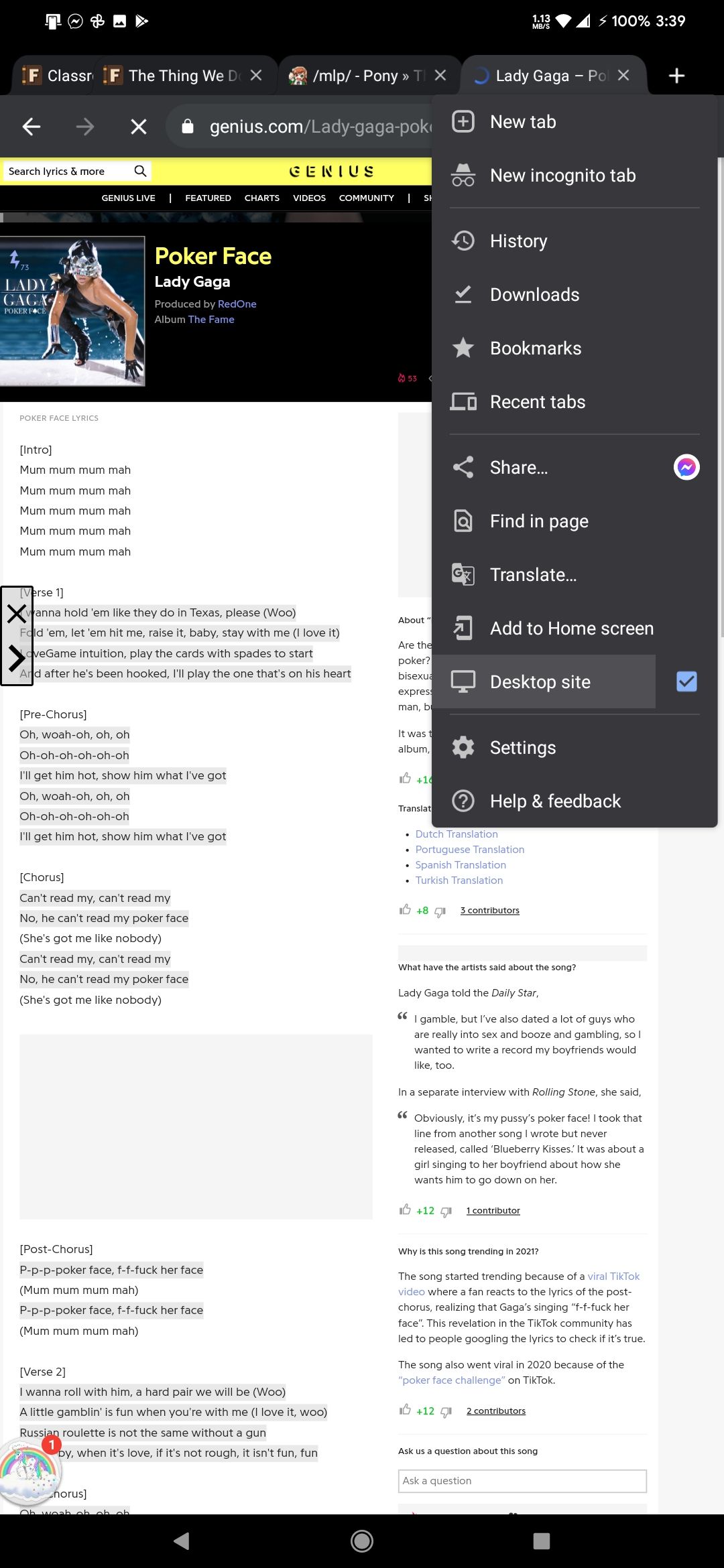
-
@Tsaukpaetra said in UI Bites:
mobile layout
Did you try
Making the windowEnabling "desktop" mode? widerHe's talking about the view you normally get on desktop.
There isn't a toggle for desktop mode on a desktop, and it doesn't change based on view port width.
-
Now I have to figure out what this particular browser (Firefox in a Linux vm) is doing right, that other desktop browsers aren't, to get the real experience rather than the dumbed down terrible version.
Oddly Firefox on my Macbook gets the 1-column version, but Firefox on my Windows desktop gets the 2-column version.
-
@loopback0 said in UI Bites:
@Tsaukpaetra said in UI Bites:
mobile layout
Did you try
Making the windowEnabling "desktop" mode? widerHe's talking about the view you normally get on desktop.
There isn't a toggle for desktop mode on a desktop, and it doesn't change based on view port width.Seems desktop-y enough to me....


-
@loopback0 said in UI Bites:
Now I have to figure out what this particular browser (Firefox in a Linux vm) is doing right, that other desktop browsers aren't, to get the real experience rather than the dumbed down terrible version.
Oddly Firefox on my Macbook gets the 1-column version, but Firefox on my Windows desktop gets the 2-column version.
My experience is similar but Different™: Firefox in my work Linux vm gets the good version, and Firefox on my Windows desktop gets the bad one.
-
@Tsaukpaetra Try clicking on one of the highlighted lyrics. If the annotation opens on the right, you got the good version, and if it opens in the middle of the lyrics, that's the bad one.
-
@Tsaukpaetra Try clicking on one of the highlighted lyrics. If the annotation opens on the right, you got the good version, and if it opens in the middle of the lyrics, that's the bad one.
Seems I got the good one? And double the ads! 🌋🎉

-
Firefox in my work Linux vm gets the good version, and Firefox on my Windows desktop gets the bad one.
Told you Linux is superior

-
Probably some 'A/B testing' shenanigans. Do you get a survey asking if you enjoyed your visit?
-
@bobjanova I looked a bit further into it. There's a forum thread about the 2020 redesign, and the one thing that's universally hated is the stupid single column layout. They had that feedback in testing before releasing it to the public, and carefully considered it before releasing that version to the public. And in the forum thread, after it went public, once again the response has been nearly unanimously negative for almost a year, and they're still not backing down.
Bonus WTFs:
- Logged in users get the old layout. I guess there's an option but I haven't felt the need to change it
- Before anyone asks, no, I wasn't logged in when I randomly got it. I only created the account afterward, and still haven't logged in on the vm that gets the good version
- The mobile version doesn't even use the stupid single-column. When you click on an annotation there, it slides in from the side.
- Logged in users get the old layout. I guess there's an option but I haven't felt the need to change it
-
once again the response has been nearly unanimously negative for almost a year, and they're still not backing down.
The users are holding it wrong. All of them.
-
Let's play spot what's wrong here:

-
-
And another round:
Why are people so obsessed with "I only use my computer at night in my basement" mode that even explicitly setting the light theme gives me white text on dark background?
-
-
explicitly setting the light theme gives me white text on dark background?
At least, it's properly named


-
It's in German?
I expected a Mac joke but I guess this works too.
What is wrong in the first one?
-
@loopback0 in both lists, left and right, there’s 5 items where the text is abbreviated with an ellipsis although there’s tons of space left.
-
@loopback0 in both lists, left and right, there’s 5 items where the text is abbreviated with an ellipsis although there’s tons of space left.
Guess I've seen so many programs that are absolute shit on hiDPI systems that I no longer even notice stuff like that. Sometimes Stockholm Syndrome is useful.
-
@loopback0 in both lists, left and right, there’s 5 items where the text is abbreviated with an ellipsis although there’s tons of space left.
It's fine on mine although there's less empty space. I'm guessing you have the scaling set differently.
Also you can drag the line between the two lists, I bet moving it slightly will fix at least one of them.
-
-
@loopback0 said in UI Bites:
@loopback0 in both lists, left and right, there’s 5 items where the text is abbreviated with an ellipsis although there’s tons of space left.
It's fine on mine although there's less empty space. I'm guessing you have the scaling set differently.
Factory setting.

Also you can drag the line between the two lists, I bet moving it slightly will fix at least one of them.
Moving that did fix the left side, even after moving back to its original position. Right side firmly remains in “I won’t show you” mode.
-
Cookies consent dialog on a website (yes, yes, in French):

Can you guess where you need to click to change those settings (like the first one that I changed for the snapshot)?
If you said "anywhere on the button-that-looks-like-a-slider", WRONG! You need to click on the white part of that widget. Clicking on the green or red part does nothing. Because obviously making the click target smaller is better. And obviously users would be confused if clicking on the coloured dot was actually moving the dot.


I didn't investigate how accurate the click area is. Can you click on the white pixels surrounding the coloured dot? Is the click region actually limited to inside the black ellipse or does the event handler use a whole rectangle? So many mysteries still to discover...
-
Bonus point for the explicitly misleading text ("You can control (...) each tracker independently by clicking on its switch").
-
@Zerosquare I hadn't actually read that text... well spotted.
I'm impressed at the effort they made to explain a fairly intuitive UI (
 ), albeit in a convoluted way... "[T]he red position expresses refusal to consent (trackers are deactivated), the green position expresses consent (trackers are active)."
Though double-bonus points for getting it even wronger. "Without action from your part all trackers are deactivated", except that the initial state of that window had all sliders to green (I think? I've forgotten but it they had been on red I would not have needed to click on them so I wouldn't have discovered this wonderful UI).
-
I'm impressed at the effort they made to explain a fairly intuitive UI (), albeit in a convoluted way... "[T]he red position expresses refusal to consent (trackers are deactivated), the green position expresses consent (trackers are active)."
I'm sure that the considerable group of green-red colorblind people appreciate that description.
-
I'm impressed at the effort they made to explain a fairly intuitive UI (
), albeit in a convoluted way... "[T]he red position expresses refusal to consent (trackers are deactivated), the green position expresses consent (trackers are active)."The only thing that makes it actually intuitive is the checkmark inside the slider. There are people with red-green blindness (not enough for me to consider in my niche software
but enough to consider when harassing the entire population) and no matter what the "copy what Apple does" crowd thinks, "left=off, right=on" is not by itself intuitive.E:
 @JBert wins by typing
 fasterless.
-
As if it made a real difference anyways. Even if you disable everything you can, they still run "essential" trackers -- "essential" being defined as "anything we can find a vaguely plausible excuse for".
-
@Zerosquare said in UI Bites:
As if it made a real difference anyways. Even if you disable everything you can, they still run "essential" trackers -- "essential" being defined as "anything we can find a vaguely plausible excuse for".
If they were essential, I wouldn’t have my browser automatically delete them.
-
The only thing that makes it actually intuitive is the checkmark inside the slider.
I almost mentioned colourblindness to preempt the
 , but . But yes, when I said that the UI was intuitive I was thinking about the checkmark, and the dialog as a whole.
Let's face it, ignoring the stupidity of the whole cookies thing, and the text, apart from the UI
 that I mentioned initially, it's reasonably well done.
There are only a few sliders (not 10 or 20 like some sites do), the labels are somewhat descriptive (not catch-all "essential services" or other bullshit), the sliders have a clear indication of whether the selected position is on the right or left (not like square sliders where you can't say which part is the "button" and which part is the background), for non-colourblind people the colours are very obvious, and there is a checkmark to replace it for colourblind. Yes, they got the click areas wrong, but that's not a huge issue either. For a dialog that happens on every website nowadays (so users should be used to see this kind of things), and that actually only happens if you asked "more information" on the first dialog (the one that says "we use cookies, accept / more information?"), that's not bad.
I didn't check text accessibility (tab order etc.) or other things, but on the whole, if all dialogs were made this way, I'd be reasonably happy.
-
@remi is this GDPR consent dialog? They're specifically built to be as dysfunctional and confusing as possible, to maximize the number of people who accidentally agree to everything.
-
@Gąska it's the standard "we use cookies" dialog. Not sure whether it's caused by the cookies-law that (IIRC) predated the GDPR by a couple of years, or the GDPR itself. Not that it matters either way. It's indeed intended that you'll just click "agree" on the first dialog (the one that you'll get before the one I was showing, which itself only happens if you click "more information" on the first one). Oh btw, the dialog I'm showing is also one better than the same in websites that just tell you "we use cookies, go fuck your browser settings if you don't want them."
Anyway, I was just mocking a stupid click-target area.
-
@remi is this GDPR consent dialog? They're specifically built to be as dysfunctional and confusing as possible, to maximize the number of people who accidentally agree to everything.
Add "annoying" to that.
The wrong choice is of course highlighted in bright colors and the select none button usually hidden. Not sure if I happen to have bad luck or if it's intentional (I assume it is), but it just so happens that most of the time the accept button is visible at the bottom while the reject button is scrolled off the bottom of the screen. And then often enough scrolling doesn't work or doesn't work correctly, because there's like an inner and an outer scroll area and phones don't actually show scroll bars while you're not scrolling.
There are probably provisions preventing them from making the button light-grey on white text in 2pt font, otherwise they'd do that too.
-

