UI Bites
-
Not sure why they ask for one store page vs. the other unless there's different laws involved; I would have expected to give a fake birthday for both.
- The legal limit for the two might vary differently by country. Once they need to split, it's easier to split for everybody.
- Even if legal, some people may not want to see lewd and/or gory content, so they have the chance.
Count me as part of group #2. I'm not interested in seeing either blood-and-guts games or lewd ones, despite being at least twice the legal age.
-
You have to enable Adults Only content to see those Succubus games in the lists, where Shadow of the Tomb Raider needs the Gore/Violence content setting.
I have them all enabled, that's not the point.
Extra silly is that for the games that need my birthday to view the store page, this remains the case even if I own the game.
-
Even if legal, some people may not want to see lewd and/or gory content, so they have the chance.
Steam has settings to hide that all anyway - you can see nudity while hiding violence/gore, hide it all, etc.
-
@loopback0 said in UI Bites:
Extra silly is that for the games that need my birthday to view the store page, this remains the case even if I own the game.
Adding to the silliness: Steam has my birthday saved as part of my profile. They know how old I am, they don't need to ask every time!
-
Incidentally, does anyone know how to add a free-to-play game to my account without downloading?
Clicking install and canceling didn't do the trick. But I don't want to download to this machine, and I'm pretty sure if I add to my wishlist it's just going to be forgotten there amid a hundred or so other games. Which isn't necessarily a problem in itself, I guess.
-
-
Incidentally, does anyone know how to add a free-to-play game to my account without downloading?
Pop the installer window but cancel before actually finishing? I think you need to get through to the final dialogue.
-
-
Clicking install and canceling didn't do the trick
Did you get to the end? The wizard has five pages...
Besides, you can cancel once the download has started...
-
@Tsaukpaetra said in UI Bites:
Clicking install and canceling didn't do the trick
Did you get to the end? The wizard has five pages...
Besides, you can cancel once the download has started...
No, I only got to the popup saying insufficient disk space.
-
@Zecc Ah, I had one of those in my download queue for months, and it was free to play only for a weekend. I never had enough space to install it (on the disk my Steam library is on, and I didn't want to install it on another disk that did have room because
 ), so it stayed in my library but not installed. (Apparently, my son bought it, and it's in his shared library, so that why it's in mine now, still uninstalled on my machine, although Steam would probably still be asking me to purchase and/or install it from my attempt that one weekend it was free.) In fact, I own several games I've never installed, either due to disk space or just not being interested enough in a free/bundled game to bother. So it is definitely possible to activate a key without actually installing, and it should still show up in your library (as uninstalled — gray text, rather than white).
-
@HardwareGeek Paid games and redeemed keys will add the game to your library immediately. But F2P ones are a bit different in that they don't have any purchase option. IME, install/cancel has worked to put the game into your library, but based on @Zecc's posts it might not do that if the install can't start due to disk space
-
F2P ones are a bit different in that they don't have any purchase option.
Ah, sounds logical, I guess. I'm not sure if I've ever tried to acquire one that is permanently free that I didn't immediately install.
-
I still can't get over how bad flat design is.
I'm
 enough to remember window borders.
This is particularly confusing:
And that was spontaneous. I wasn't looking for it.
-
@Zecc There are a few settings which improve things IMHO:
The other one is "shadows", as seen in this How-To Geek article. No idea why those aren't showing, I thought that was a default thing...
-
"shadows" [...] No idea why those aren't showing, I thought that was a default thing...
I don't know if it's because it's through remote desktop, but those aren't showing even though they are supposedly turned on.
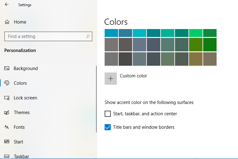
Thanks for reminding me to turn on accent colors on the window borders. That did help a bit.
-
No wait, what I meant was I dIDN't AsK FOR HeLP! :@flakybat:
-
I don't know if it's because it's through remote desktop
The desktop effects use some acceleration features that the remote desktop protocol does not support, so almost certainly.
Regarding that I have a
 -ish anecdote. Trying to present some application (implemented in unholy mix of swing and javafx) over (IIRC) WebEx meeting was massively slow. But then one colleague presented it running on another computer in which he was connected remotely and that was fine, so it became standard workaround. The window effects using acceleration is the main suspect.
-
@Zecc This is why dark mode is superior.
-
-
@boomzilla said in UI Bites:
@loopback0 said in UI Bites:
@Zecc This is why dark mode is superior.
Can't tell if sarcasm or

 .
.
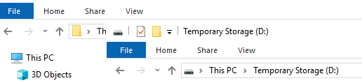
Dark mode at least uses more than 1 colour/shade, so it doesn't have the same issue as in Zecc's last screenshot.
-
@loopback0 said in UI Bites:
@boomzilla said in UI Bites:
@loopback0 said in UI Bites:
@Zecc This is why dark mode is superior.
Can't tell if sarcasm or
.Dark mode at least uses more than 1 colour/shade, so it doesn't have the same issue as in Zecc's last screenshot.
Uh...it seems to be using it on one of the windows but not the other. The one in front looks like it's part of the same window just like in @Zecc's. But yeah, I guess at least it's doing that somewhere. Not enough to make up for getting dark mode on you though.
-
@loopback0 said in UI Bites:
@Zecc This is why dark mode is superior.
Are you kidding?
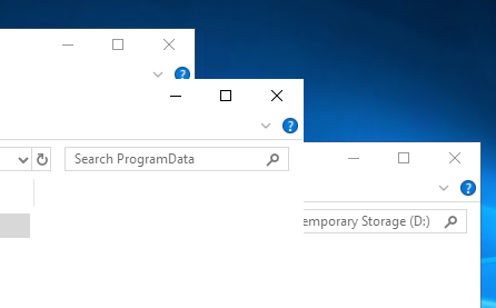
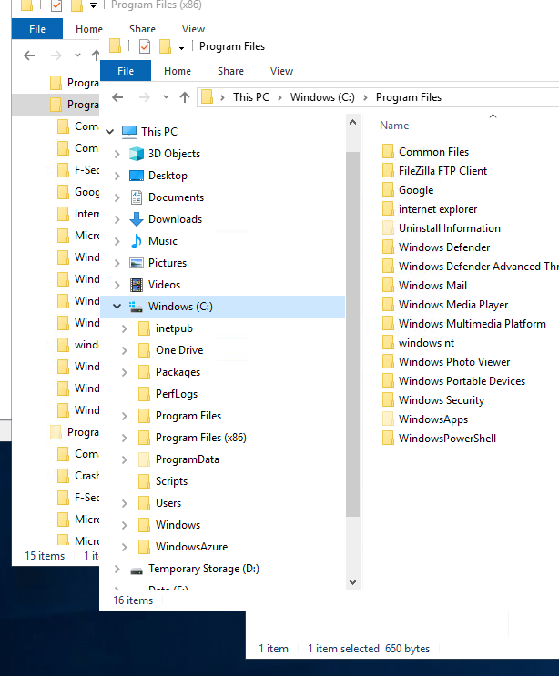
What is up with the window in the middle, is that shrunk to just the title bar? Didn't know you can do that on Windows. If it's not, I have no idea where it ends.Fake edit: I just realized there are only two windows and top windows's title bar just looks like bottom window's address bar. Fuck flat design.
-
@JBert the article is from 2018, but I love how years after they started spreading options over 5 different versions of system settings, they still have this old school one1:
https://www.howtogeek.com/wp-content/uploads/2018/05/img_5b033c80f1468.png
Imagine how that'd look like in their "every computer is a phone" style settings app. It would be at least 5 miles long.
1 Looks like we're running "Windows Server 2016" and I have no idea what that corresponds to, so I can't check if Windows Halloween H20 edition is still using the same dialog.
-
@topspin IIRC Server 2016 is equivalent to 1607.
-
Fake edit: I just realized there are only two windows and top windows's title bar just looks like bottom window's address bar. Fuck flat design.
Thanks for proving my point exactly.
-
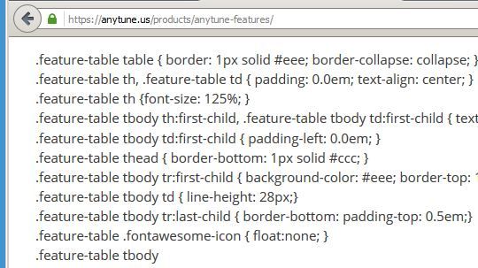
As we can see, AnyTune (TM) really does provide us with some features:
-
Unicode was a great idea, but it is still too complicated:

(a German "ü" was rendered as some odd "A" with diacritcs plus a quarter)
-
@BernieTheBernie said in UI Bites:
(a German "ü" was rendered as some odd "A" with diacritcs plus a quarter)
Someone interpreted UTF-8 as one of the ISO-8859-* group encodings (probably -1 or -15, but can't tell as they're identical in the sample area). Given how these things work, it could have been anywhere along the chain of programs between author and you…
-
@BernieTheBernie That reminds me of something...
-
@BernieTheBernie said in UI Bites:
(a German "ü" was rendered as some odd "A" with diacritcs plus a quarter)
Someone interpreted UTF-8 as one of the ISO-8859-* group encodings (probably -1 or -15, but can't tell as they're identical in the sample area). Given how these things work, it could have been anywhere along the chain of programs between author and you…
-
Dear Amazon,
could you please explain...

how you can deliver that book to me on Nov 23, while it is scheduled to be release on 2 Jan. 2021?
And how come it some used books are already available?
Is your time travel option patented?
-
@JBert the article is from 2018, but I love how years after they started spreading options over 5 different versions of system settings, they still have this old school one1:
https://www.howtogeek.com/wp-content/uploads/2018/05/img_5b033c80f1468.png
Imagine how that'd look like in their "every computer is a phone" style settings app. It would be at least 5 miles long.
1 Looks like we're running "Windows Server 2016" and I have no idea what that corresponds to, so I can't check if Windows Halloween H20 edition is still using the same dialog.
Settings, System, About, Advanced system settings (in the right-hand sidebar), Settings... in the Performance box.
-
The App Store of a trillion dollar company:
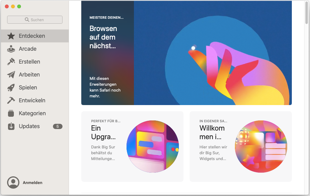
I'm not sure if they're
- too lazy to run their products even a single time for what may be the largest European market
- too incompetent to fix it
- have their heads so far up their designer-asses that they think this is perfectly acceptable. It's large and looks nice, who needs to use all that space to make the text actually readable?!
-
-
If your eyes aren't good enough to read the small text that's beautifully rendered on the Retina™ screen, then you're not the target demographic for their products, you old guy. Maybe they'll let you buy an app that zooms the screen if they're feeling unusually nice today.
yeah, I know accessibility features are built-in, but


-
too lazy to run their products even a single time for what may be the largest European market
It does the same even in English if you shrink the window as far as it'll go

-
@topspin Bah, you're just nitpicking. What kind of ridiculous language would have words longer than 7 letters?
-
@topspin
Option 4: German is just too fucking long.
Really, I used to work at a company with an app that had an interface in all major European languages ranging from French over Polish to Russian. We just made sure we tested in Dutch, French and English. Then asked ze Germans to test. They came back with a dozen fields where the text didn't fit the allotted space but after that we where golden.
-
@loopback0 said in UI Bites:
too lazy to run their products even a single time for what may be the largest European market
It does the same even in English if you shrink the window as far as it'll go
@loopback0 said in UI Bites:
Yeah, that actually works.

Didn't even realize it's "too small" and you can resize it. I mean, it started with that size and is pretty big already. Maybe they should start their windows in a size the content fits in or, you know, have some better scaling that doesn't suck ass so you can't read two words.
-
@loopback0 said in UI Bites:
too lazy to run their products even a single time for what may be the largest European market
It does the same even in English if you shrink the window as far as it'll go
@loopback0 said in UI Bites:
Yeah, that actually works.
Didn't even realize it's "too small" and you can resize it. I mean, it started with that size and is pretty big already. Maybe they should start their windows in a size the content fits in or, you know, have some better scaling that doesn't suck ass so you can't read two words.I thought the first thing every computer user did with every application was maximize the main window? That's certainly what the current crop of UI designers believe. Get with the program!
-
@Parody I thought Windows 8 removed the concepts of (non-maximized) windows altogether.

-
@Parody I thought Windows 8 removed the concepts of (non-maximized) windows altogether.
They tried, but graciously let you toggle it via the Tablet Mode setting.
I was very surprised the first time I detached my convertible tablet from its keyboard and all of my running applications disappeared :(
-
@topspin
Option 4: German is just too fucking long.
Really, I used to work at a company with an app that had an interface in all major European languages ranging from French over Polish to Russian. We just made sure we tested in Dutch, French and English. Then asked ze Germans to test. They came back with a dozen fields where the text didn't fit the allotted space but after that we where golden.Obviously, you missed Finnish...
-
@BernieTheBernie
Even the sales guys were not that crazy
-
- too lazy to run their products even a single time for what may be the largest European market
- too incompetent to fix it
- have their heads so far up their designer-asses that they think this is perfectly acceptable. It's large and looks nice, who needs to use all that space to make the text actually readable?!
When I worked on a medical app, the integration test suite contained a set of tests that switched to all languages in turn, went through all the screens (debug build had extra menu that, among other things, allowed showing any screen with mock data), screenshot all widgets in their reported bounding boxes, OCRd the text back and compared the results with the messages in the catalog.
But those apps are subject to regulatory oversight that might actually take issue with garbled or obscured labels—or rather with the lack of tests for them; the regulators usually don't test the app, they ask for the test logs and check that everything they can think of that might need testing has a test case defined and someone signed off that it passed.
It also had a bit easier situation in that the app always ran full-screen on one of a fairly small set of supported tablets, so resizing wasn't really a concern.
-
I thought the first thing every computer user did with every application was maximize the main window? That's certainly what the current crop of UI designers believe. Get with the program!
At least I generally do, because I don't have any better use for the rest of the screen (except when I need two apps side-by-side, but I have two monitors for that purpose these days).
Still, the app should start large enough that the content first without squeezing like this.
-
I thought the first thing every computer user did with every application was maximize the main window? That's certainly what the current crop of UI designers believe. Get with the program!
At least I generally do, because I don't have any better use for the rest of the screen (except when I need two apps side-by-side, but I have two monitors for that purpose these days).
I'm sure there's some inertia here, but I still use multiple overlapping windows on both of my monitors when I get going on a project. I rarely maximize a window, but I sometimes do the
AeroSnap thing with a pair of windows on one screen. I even play most games in a window nowadays.Still, the app should start large enough that the content first without squeezing like this.
That would be nice. I don't know what the Mac guidelines are for "window size and location on first launch" or what gyrations they'd have to go through to see what's overflowing without visibly resizing the window a bunch of times or get the scaling factor of the monitor(s) the window is on to do a best guesstimate resize or whatever, but the text should be reasonably readable.
-
Dear Google,
just a couple of weeks ago I presented here a screenshot showing Great Google Navigation on a German motorway.
Today I want to add a screen shot showing navigation in the province:The actual map was quite blank, and the route was not shown at all; still, Google could tell me where to turn.
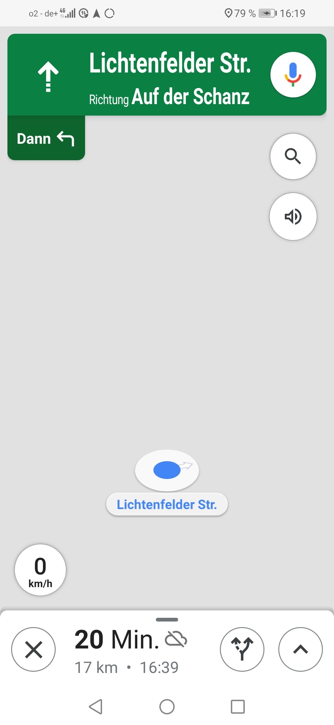
Some minutes later, some blurred roads became visible:
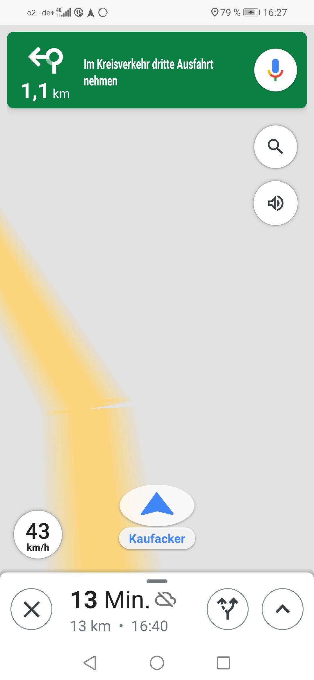
By the way, I was not drunk when I took that screen shot...
 Mojibake - Wikipedia

