Mozilla Rebranding Or: How to Waste Several Hundred Thousand Dollars on Awful Graphic Designs
-
@Sumireko What about the part where Yuyuko plays with Youmu's ghost half?
-
They haven't learned the lesson yet.
Don't wait until you have limited the choices to an imaginary choice, before asking for people's opinions.
It's patronizing, and no one likes it.
I totally fridge-logicked that this is true for the general election. It was unintentional....
but damn...
I'm depressed now.
-
@anotherusername said in Mozilla Rebranding Or: How to Waste Several Hundred Thousand Dollars on Awful Graphic Designs:
www.domain.com does not exist.
It does, and domain.com redirects to it.
-
@pydsigner said in Mozilla Rebranding Or: How to Waste Several Hundred Thousand Dollars on Awful Graphic Designs:
One of these things is not like the other:
If I saw the one on the right out of context I'd probably mistake it for some really weird Mission Impossible marketing.
-
@boomzilla said in Mozilla Rebranding Or: How to Waste Several Hundred Thousand Dollars on Awful Graphic Designs:
If I saw the one on the right out of context I'd probably mistake it for some really weird Mission Impossible marketing.
My guess would be "my first Photoshop project", TBQH.
-
@Sumireko lol
-
@Maciejasjmj said in Mozilla Rebranding Or: How to Waste Several Hundred Thousand Dollars on Awful Graphic Designs:
Also:
 Netto - sieć sklepów | Netto
Witamy w Netto - sieci sklepów, która oferuje produkty spożywcze, chemiczne i przemysłowe po bardzo korzystnych cenach. Netto - więcej za mniej. Zapraszamy!
These were my mental associations:

-
@Onyx The second lesson would be adding a shadow and some wrinkles.
-
@Lorne-Kates said in Mozilla Rebranding Or: How to Waste Several Hundred Thousand Dollars on Awful Graphic Designs:
If I had more time, I'd draw a logo of the Mozilla dinosaur wearing a #22 sports jersey, giving the middle finger.
With the slogan, "give us money"?
-
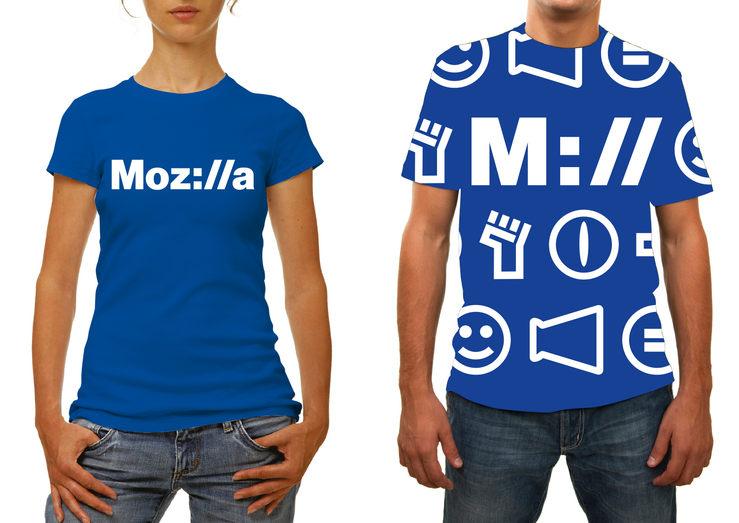
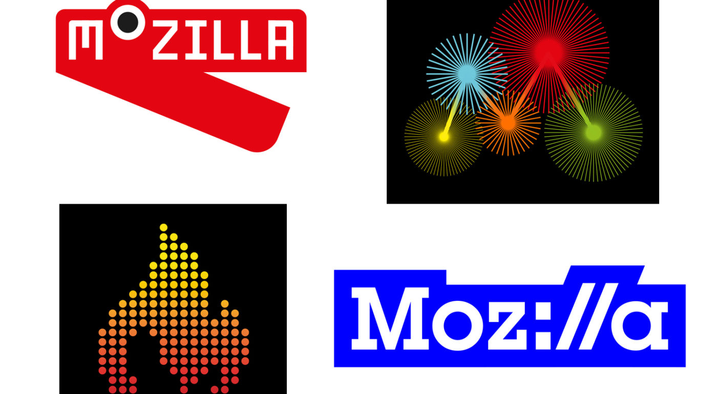
There is a saying in my country… a one-eyed amongst the blind. That's what the "Moz://a" is IMO. But it's not very original:
![0_1473021522332_logo[1].gif](/uploads/files/1473021520431-logo-1.gif)
-
@Lukfi said in Mozilla Rebranding Or: How to Waste Several Hundred Thousand Dollars on Awful Graphic Designs:
There is a saying in my country… a one-eyed amongst the blind. That's what the "Moz://a" is IMO. But it's not very original:
Shill?
-
@pydsigner said in Mozilla Rebranding Or: How to Waste Several Hundred Thousand Dollars on Awful Graphic Designs:
@Lorne-Kates said in Mozilla Rebranding Or: How to Waste Several Hundred Thousand Dollars on Awful Graphic Designs:
If I had more time, I'd draw a logo of the Mozilla dinosaur wearing a #22 sports jersey, giving the middle finger.
With the slogan, "give us money"?
Yuck. This is open source. You don't give money. The only money is what's been sucked out of a VC's cock and snowballed into the mouth of a sociopathic CEO to power their "vision for the browser".
-
@Lorne-Kates said in Mozilla Rebranding Or: How to Waste Several Hundred Thousand Dollars on Awful Graphic Designs:
This is open source. You don't give money. The only money is what's been sucked out of a VC's cock and snowballed into the mouth of a sociopathic CEO to power their "vision for the browser".
Sounds to me like “fuck them, don't give them money”…
-
I'm playing catchup apparently...
@JBert said in Mozilla Rebranding Or: How to Waste Several Hundred Thousand Dollars on Awful Graphic Designs:
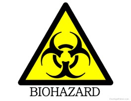
That dino-eye design for "Maker party"? Good luck selling that to people who claim to have Trypophobia:
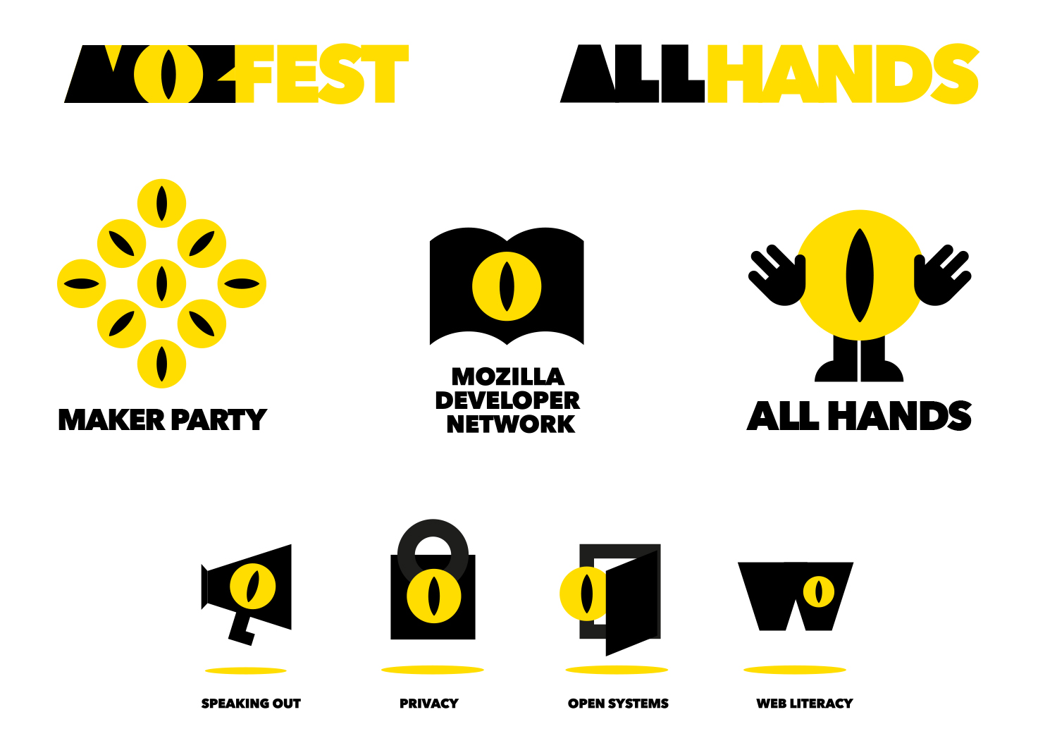
Middle row, right hand side. It's like no-one there's aware of Goatse.cx.
Or Sausage Party.
(The first one got
 'd I think)
@quijibo said in Mozilla Rebranding Or: How to Waste Several Hundred Thousand Dollars on Awful Graphic Designs:
This whole debacle reminds me of what happened when, out of the blue, one government tried to ask citizens to vote for a new license plate design.
Also: Boaty McBoatface.
-
@aliceif said in Mozilla Rebranding Or: How to Waste Several Hundred Thousand Dollars on Awful Graphic Designs:
@sloosecannon said in Mozilla Rebranding Or: How to Waste Several Hundred Thousand Dollars on Awful Graphic Designs:
@anotherusername Mozirra!
Mojira.
TIL that Mozilla Corp was bought out by Atlassian

-
https://www.mozilla.org/media/img/firefox/firefox-256.e2c1fc556816.jpg
This is their best logo, also most commonly known. A rare example of a logo that has some personality.
They could make a variation around that, or find another animal to locate around a sphere.Also, search for images using term "mozilla", the FFox logo is clearly dominant in the results anyway.
-
@Adynathos said in Mozilla Rebranding Or: How to Waste Several Hundred Thousand Dollars on Awful Graphic Designs:
https://www.mozilla.org/media/img/firefox/firefox-256.e2c1fc556816.jpg
2016'd that for you:

-
@bb36e that's... actually a decent proposal. It keeps all the FF themes while being clearly distinguishable from the actual Firefox product.
-
@Maciejasjmj I tried to make it as generic as possible :/
-
@bb36e *shrug* it's a logo, not a painting. Sometimes bland is better than shoving the designer's fascination with whichever artistic movement they were talking about in the last lecture.
-
@bb36e
But you kept the color scheme - making the association intuitive and logical.
The originally posted proposals, some of which may be competent on their own, have nothing in common with Mozilla's projects.
-
Design school, here I come! 😄
-
Not truly 2016. It has a gradient, even if only a small one. It's 2016 man, don't you know that flat design is all the rage?
Smh.
-
@Sumireko you mean material, right? "Metro", "flat"... those are all dead fads.. material is the way to go!
-
@bb36e But what about next week? Gotta stay relevant!
-
@dkf said in Mozilla Rebranding Or: How to Waste Several Hundred Thousand Dollars on Awful Graphic Designs:
@bb36e But what about next week? Gotta stay relevant!
Yeah, this week it's substratum!
-
@bb36e Google, the only one who can beat Microsoft at constant unnecessary redesigns.
I have the theory that they simply have a lot of graphic designers on payroll, and literally nothing for them to do most of the time. So they just end up redesigning stuff just to justify their job.
-
@anonymous234 said in Mozilla Rebranding Or: How to Waste Several Hundred Thousand Dollars on Awful Graphic Designs:
Google, the only one who can beat Microsoft at constant unnecessary redesigns.
At least google logo seems to be unchanged since 1998. Small font changes are unworthy of attention.
The small icon is a completely different though.
I remember seeing this thing in some places, never paid any attention to it though:

Only later (long after it was phased out) I learned this is associated with google :P
-
@Adynathos said in Mozilla Rebranding Or: How to Waste Several Hundred Thousand Dollars on Awful Graphic Designs:
https://www.mozilla.org/media/img/firefox/firefox-256.e2c1fc556816.jpg
This is their best logo, also most commonly known. A rare example of a logo that has some personality.
They could make a variation around that, or find another animal to locate around a sphere.Also, search for images using term "mozilla", the FFox logo is clearly dominant in the results anyway.
That's not the Mozilla logo. It's the Firefox logo.
-
@anotherusername said in Mozilla Rebranding Or: How to Waste Several Hundred Thousand Dollars on Awful Graphic Designs:
That's not the Mozilla logo
I am aware, I meant "best logo made by Mozilla".
Also the one that people know. If they want to make a new but recognizable logo for the company, they could make something similar.
Like Thunderbird logo - both follow the same pattern and it is easy to see a connection.
https://www.mozilla.org/media/img/thunderbird/thunderbird-256.e5af8f2b33f3.png
-
@anonymous234 said in Mozilla Rebranding Or: How to Waste Several Hundred Thousand Dollars on Awful Graphic Designs:
@bb36e Google, the only one who can beat Microsoft at constant unnecessary redesigns.
I have the theory that they simply have a lot of graphic designers on payroll, and literally nothing for them to do most of the time. So they just end up redesigning stuff just to justify their job.
Hence Google doodles?
-
lol
 Progress in the making – Mozilla Open Design
Since posting the seven initial design directions for the Mozilla brand identity three weeks ago, we've continued to shape the work. Guided by where Mozilla is headed strategically, principles of ...
-
@bb36e The fuck? Those are all horrible.
-
-
-
I wish Mozilla would concentrate on the tech rather than the "Freedom" and activist nonsense.
-
The idea with that
://is quite common:

I do not like the idea. Presence of
://in URLs is an boring and unimportant implementation detail. Also if in a few years this changes, the logo will look even more stupid.
-
@Adynathos said in Mozilla Rebranding Or: How to Waste Several Hundred Thousand Dollars on Awful Graphic Designs:
Also if in a few years this changes, the logo will look even more stupid.
In a few years, they'll change it again.
-
@Adynathos also, 99% of the people that they're targeting have no idea what
http://is. WHERE IS GRUMPY CATE: to be fair, those people also have no idea what the Mozilla foundation is so maybe it doesn't matter.
-
@bb36e said in Mozilla Rebranding Or: How to Waste Several Hundred Thousand Dollars on Awful Graphic Designs:
WHERE IS GRUMPY CAT

-
@Adynathos said in Mozilla Rebranding Or: How to Waste Several Hundred Thousand Dollars on Awful Graphic Designs:
I do not like the idea. Presence of :// in URLs is an boring and unimportant implementation detail.
 Sir Tim Berners-Lee admits forward slashes on World Wide Web ‘were a mistake’

Sir Tim Berners-Lee, the British scientist who created the World Wide Web, has admitted his decision to include two forward slashes in internet addresses was a mistake.
-
@PJH said in Mozilla Rebranding Or: How to Waste Several Hundred Thousand Dollars on Awful Graphic Designs:
Goa
-
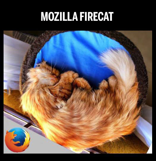
@dkf The next Mozilla logo needs more cats!
-
@bb36e said in Mozilla Rebranding Or: How to Waste Several Hundred Thousand Dollars on Awful Graphic Designs:
those people also have no idea what the Mozilla foundation is so maybe it doesn't matter.
And with this new brands, Mozilla is trying its best to keep it that way.
Or maybe I hold them to a too high standard, because they made FireFox which is my favourite brand amongst all tech products.@aliceif said in Mozilla Rebranding Or: How to Waste Several Hundred Thousand Dollars on Awful Graphic Designs:
The next Mozilla logo needs more cats!
-
\http://www.oshiete-kun.net/archives/images/sexy_firefox_cat.jpg (not exactly sfw)
-
@blek said in Mozilla Rebranding Or: How to Waste Several Hundred Thousand Dollars on Awful Graphic Designs:
not exactly sfw
Surprisingly enogh, that site gets a pass on our work filters, apparently.
-
-
Originally the forward slashes at the front of the URLs, the official name given to web addresses, have to be written in otherwise a page won’t load.
Now most web browsers usually fill them inTIL you can actually just type
http:www.google.cominto chrome . I assumed it would break and was going to be pedantic. Well played.
-
Nearly there – Mozilla Open Design

We’ve spent the past two weeks asking people around the world to think about our four refined design directions for the Mozilla brand identity. The results are in and the ...
Hacker News commenters are loving it:
That flame logo is really weird, but the others are so bad that they make it look pretty good.
Why don't they test it against the old dinosaur or the star? [...]
Apparently I'm in the minority preferring the flame logo. I mean, it's not great, but it's considerably more polished and attractive than any of the other options IMO. (Not that a re-brand is necessary at all...)

I saw one of the core developers tweeting that he hates dinosaurs because they're ancient meat eating predators that are extinct.
[...]
I disagree. Dinosaurs are cool. Dinosaurs are what we like when we still have dreams.Mozilla's dinosaur was a powerful, happy fellow who is clearly not extinct at all. I always liked that as an image of how Mozilla is about defying expectations.
Every single one of these fucking horrible and Mozilla should be ashamed. What is this shit?
This is the ultimate design by committee. The Burst logo is mediocre and is objectively the worst for the reasons stated above.

Is it just me, or are these designs terrible and the entire thing reeks of marketers inventing ways to justify their pay checks? The merchandise photos alone are cringe-worthy.
But why does Mozilla really need a new identity? To me their identity feels really solid and strong. It's been exposed to developers and technically minded people for years and years, but also to regular users through Firefox.
Wow, these are all amazingly ugly. Why didn’t they find a graphic designer to at least prepare one submission that looks good?
-
I'm a designer, and from my perspective these are all either incredibly generic or very poorly executed. It's an open exploration though, and they do admit the need for refinement.
Direction 2 is the strongest in terms of execution, but it's like they googled "stock developer logo." It's literally something any developer-facing tech company anywhere could use. Nothing about it is unique to Mozilla.
Direction 1: The crocodile-looking thing seems to be an effort at modernizing the dinosaur mark, but it's just so bad (the mark without the mouth feels decent and unique, but once you add the mouth it's like a bad joke). Stylistically it feels like something HotBot would have done in 1998 down to the random caPitaL lEttEr treatment.
Design direction 4 is trying to capitalize on a really popular (but now dwindling) faceted/stained-glass "data" trend... it's already starting to look dated due to overuse, and on top of that is really poorly executed (blobby rabbit, anyone?).
Design Direction 3 is mind-numbingly literal, it's like the first idea from a Sophomore design student. Some of the supporting patterns where the mark is simplified and abstracted beyond the "M" start to look interesting — but the main "M" mark is muddled mess. Just look at the all-white example on a poster, it's almost objectively hideous.
I think their existing lower-case 'mozilla' type treatment is generally friendly and recognizable and there's nothing wrong with it — this exercise would be more interesting if they stuck with that and looked into more options to modernize the T-Rex... I could easily imagine mozilla as a "mascot" heavy brand in the same vein as Mailchimp (but maybe dialed back a tad in the cuteness factor).
Addendum: Look at the homepage for their design partner Johnson Banks (http://johnsonbanks.co.uk/), and look at the shirt in Option 2 — give me a break. You don't even have to go beyond a single degree of separation to see how generic that concept is.
Addendum 2: Holy shit, look at these other options their agency partner has explored — these have their own issues and would need a lot of refinement, but are infinitely more interesting than these posted options:
route B (very '90s and the 'mozilla' treatment is a bit too abstract, but I think it could be pushed to a really nice place): https://blog.mozilla.org/opendesign/design-route-b-the-connector/
route F (combining a few existing trends, but it's eye-catching, fun, and I'd like to see more of it): https://blog.mozilla.org/opendesign/design-route-f-the-impossible-m/
I'm not sure if these options mean that Mozilla doesn't know who they are, or their agency partner doesn't know who they are — but it really seems like a brand lost in the woods.
 Google logo - Wikipedia

 GNUzilla and IceCat - GNU Project - Free Software Foundation