Mozilla Rebranding Or: How to Waste Several Hundred Thousand Dollars on Awful Graphic Designs
-
@xaade said in Mozilla Rebranding Or: How to Waste Several Hundred Thousand Dollars on Awful Graphic Designs:
I really need to see a submission from @r10pez10.
-
@sloosecannon said in Mozilla Rebranding Or: How to Waste Several Hundred Thousand Dollars on Awful Graphic Designs:
@anotherusername Mozirra!
Mojira.
-
@aliceif said in Mozilla Rebranding Or: How to Waste Several Hundred Thousand Dollars on Awful Graphic Designs:
@sloosecannon said in Mozilla Rebranding Or: How to Waste Several Hundred Thousand Dollars on Awful Graphic Designs:
@anotherusername Mozirra!
Mojira.
The creator of MineCraft is making an Atlassian clone??
-
@pydsigner said in Mozilla Rebranding Or: How to Waste Several Hundred Thousand Dollars on Awful Graphic Designs:
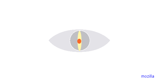
@JBert Also note the massive irony of having a Lock with a freaking Sauron Eye on it labelled "privacy". Security maybe, but eye for one don't associate malevolent supernatural eyes with privacy. Don't look now, it's the new NSA logo!
https://i.imgur.com/Chc8DiU.png
Originally based off of this
-
Here's a new logo, made in MS Paint that fulfills your requirements.
Thanks,
Arthorror
PS: Gibe me tree fiddy 4 dis
-
-
@XanderTheGamer said in Mozilla Rebranding Or: How to Waste Several Hundred Thousand Dollars on Awful Graphic Designs:
Here's a new logo, made in MS Paint that fulfills your requirements.
Thanks,
Arthorror
PS: Gibe me tree fiddy 4 disClaim rejected. Insuffient dithering, wrong shade of blue, and the font isn't a clone of Comic Sans. I mean, what is your problem?
-
@pydsigner Fixed: Now using Bubblegum Sans, using the proper shade of blue (or one very close to it, and has more dithering.

-
https://i.imgur.com/Ijavfgw.png
- The theme is pretty much taken from the periodic table of elements
- The "Moz"/"Forever Open." is on every element
- The "MDN" would obviously be for the Mozilla Development Network
- Other elements would use their TLA
- The "'16" is to tell everybody that Mozilla is hip and trendy (and it helps fill the whitespace)
Thoughts?
-
@Sumireko Is it using a Times New Roman clone? Otherwise, it should be rejected.
-
@Sumireko said in Mozilla Rebranding Or: How to Waste Several Hundred Thousand Dollars on Awful Graphic Designs:
fill the whitespace
REJECTED. Whitespace is PRIME. It's the key to EVERYTHING. It has to be CLEAN!
-
@XanderTheGamer said in Mozilla Rebranding Or: How to Waste Several Hundred Thousand Dollars on Awful Graphic Designs:
Now using Bubblegum Sans
-
@Lorne-Kates said in Mozilla Rebranding Or: How to Waste Several Hundred Thousand Dollars on Awful Graphic Designs:
@Sumireko said in Mozilla Rebranding Or: How to Waste Several Hundred Thousand Dollars on Awful Graphic Designs:
fill the whitespace
REJECTED. Whitespace is PRIME. It's the key to EVERYTHING. It has to be CLEAN!
But if we remove the '16, how will people it's
CURRENT YEAR?
@XanderTheGamer said in Mozilla Rebranding Or: How to Waste Several Hundred Thousand Dollars on Awful Graphic Designs:
@Sumireko Is it using a Times New Roman clone? Otherwise, it should be rejected.
It has Open Sans for the "Moz", so I think giving the hardcore FOSS fanboys a boner will offset the lack of TNR.
-
@Sumireko Open Sans is a good font, just not for headings/logos.
-
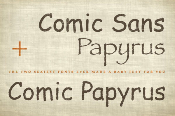
@error But Comic Papyrus isn't FOSS. How do we get the FOSS people to vote for the logo?
-
@Lorne-Kates said in Mozilla Rebranding Or: How to Waste Several Hundred Thousand Dollars on Awful Graphic Designs:
REJECTED. Whitespace is PRIME. It's the key to EVERYTHING. It has to be CLEAN!
-
What the fuck?
-
I suppose I'm in the minority, I don't hate them. Some are actually kind of neat. As a logo for a company like Mozilla? I don't know, I'm not a graphic designer, maybe they're terrible.
-
@Sumireko No generic touhou webcomic aesthetic? meh.
-
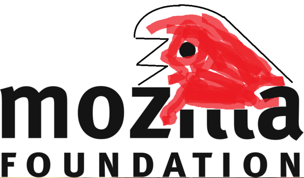
@pydsigner Should just have redrawn it, but kept it a red dinosaur. New look, but can still be associated with the old one.
-
@dkf said in Mozilla Rebranding Or: How to Waste Several Hundred Thousand Dollars on Awful Graphic Designs:
@Maciejasjmj That's a better logo than any of the proposed Mozilla ones…
I looked around on some "readymade logos for sale" sites for ideas
This one is available for $300 (I edited it a bit, please don't sue me)
-
@anonymous234 said in Mozilla Rebranding Or: How to Waste Several Hundred Thousand Dollars on Awful Graphic Designs:
@pydsigner Should just have redrawn it, but kept it a red dinosaur. New look, but can still be associated with the old one.
Well, as long as they don't change the color to purple...

-
@aliceif
Hmmm....
-
Alternatively:

-
-
@r10pez10 You never disappoint.
-
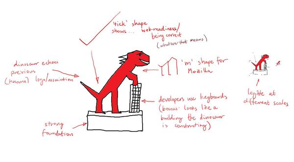
@r10pez10 said in Mozilla Rebranding Or: How to Waste Several Hundred Thousand Dollars on Awful Graphic Designs:
Plus it also looks like the dinosaur is standing at a lectern, great for the teaching aspects, as well as maybe being on a soapbox for advocacy.
The dinosaur's mouth is in a non-threatening smile, but the eyes are open to show it guarding your data.This is a winner.
-
@bb36e said in Mozilla Rebranding Or: How to Waste Several Hundred Thousand Dollars on Awful Graphic Designs:
@JBert looks vaguely vulvic
You just made my day so much better!
-
@anonymous234 said in Mozilla Rebranding Or: How to Waste Several Hundred Thousand Dollars on Awful Graphic Designs:
@aliceif
Hmmm....
WTF I can see my desk's wall behind the M! What did you do?!?!
-
I love the simplicity.
It makes a nice letterhead.
But I feel that there's still a good balance between this and what is being mocked on that site.
Of course, that's totally my opinion.
-
@dkf said in Mozilla Rebranding Or: How to Waste Several Hundred Thousand Dollars on Awful Graphic Designs:
The Eye branding is creepy, and should be both rejected and the designer reported to his psychiatrist for being weird.
The cobra movie was on tv when I saw this, and the cobras use the same designer:
-
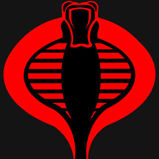
@groo said in Mozilla Rebranding Or: How to Waste Several Hundred Thousand Dollars on Awful Graphic Designs:
The cobra movie was on tv when I saw this, and the cobras use the same designer:
Never watched that at all, but I'm guessing they're antagonists. Antagonists have different logo requirements; creepy is good for them!
-
If I had more time, I'd draw a logo of the Mozilla dinosaur wearing a #22 sports jersey, giving the middle finger.


-
@error said in Mozilla Rebranding Or: How to Waste Several Hundred Thousand Dollars on Awful Graphic Designs:
@r10pez10 You never disappoint.
Whichever one of you bastards sockpuppets as @r10pez10, you are forbidden from ever coming out.
-
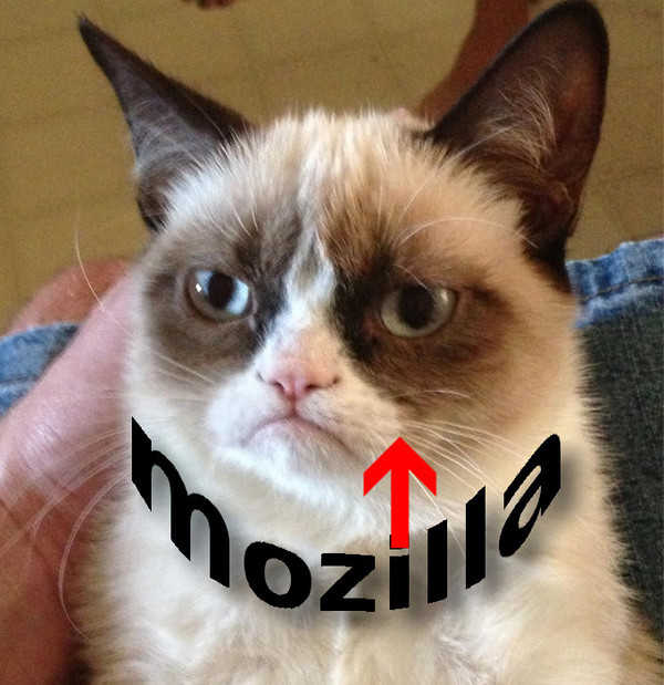
quick mockup, i think this is a bit too busy so the contrast could be reduced a bit:

alternatively, in this logo the arrow represents that mozilla will help the user find grumpy cat. additionally the upwards opening text contrasts with the cats frown:
-
This whole debacle reminds me of what happened when, out of the blue, one government tried to ask citizens to vote for a new license plate design. They thought that they were being all trendy by having an online poll so that everyone could get involved in choosing their favorite design.
And then that plan blew up in their face... first by those asking why we needed a new design (and all options removing a cherished local symbol), and then by asking why the only designs were those created by 3M, when instead the project could have been put out to tender for local design companies.
In the end they promptly dropped the whole idea and just added a digit to the current plates, the sensible choice.
 Alberta's new licence plate: same as the old licence plate | CBC News

The planned redesign of Alberta's licence plates has been stopped, premier Jim Prentice announced Thursday afternoon. The province plans to stick with the current "Wild Rose Country" plate.
-
Myyyyyyyyeaaaaah, "so, we did our best to hide that stupid http://www everywhere in our multistrip to the point of breaking copy-paste interaction with it, so yeah, let's have
://in our logo."But yeah, it is the least ugly of the bunch. Though the top right one has its own colon slash aspect, I guess.
-
@aliceif said in Mozilla Rebranding Or: How to Waste Several Hundred Thousand Dollars on Awful Graphic Designs:
*Emilia
FTFY
-
@uschwarz
Fuck the www part. And fuck browsers for trying to autoadd it.
-
@lolwhat said in Mozilla Rebranding Or: How to Waste Several Hundred Thousand Dollars on Awful Graphic Designs:
@JBert Re: "All Hands," let's turn those hands inward so they look like they're opening the eye.
I'm glad to see I'm not the only one who had the same first association on that one.
Some of them don't seem to be unified enough to give a coherent brand association. (Connector: basically everything just looks like a random abstract design. Wireframe. Impossible M: once you get away from the M shape it just says "this person likes optical illusions".) Half the ones that do have a coherent brand are horrible (The Eye, Flik Flak). Protocol and Open Button both give a recognisable brand and aren't unbearable, but associating your brand with :// makes it seem like you're trying to look outdated (given that browsers are hiding the protocol part these days), and this:

No. Just no. What the heck were you thinking? Once you associate M:// with Mozilla, this looks like "Mozilla got drunk and spewed up."
Open Button still makes me want to hide my eyes, but it's possibly the best of the bunch for me. It'd be better with different colours, I think.
-
@bb36e said in Mozilla Rebranding Or: How to Waste Several Hundred Thousand Dollars on Awful Graphic Designs:
quick mockup, i think this is a bit too busy so the contrast could be reduced a bit:
Wow those blues.... and soooo much negative space. Love it. Welcome to Web 3.0, mozil.la!
Edit: according to Wikipedia, Mozilla already uses mzl.la as a url shortener domain, so it's not much of a leap.
-
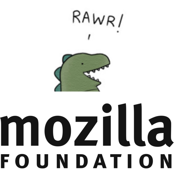
@pydsigner said in Mozilla Rebranding Or: How to Waste Several Hundred Thousand Dollars on Awful Graphic Designs:
Just for comparison, this is what Mozilla is trying to move away from:
https://wiki.mozilla.org/images/a/a9/Mozilla-foundation-logo.png
Actually, it seems they've already killed the dino and replaced it by "the Mozilla wordmark" (https://www.mozilla.org/en-US/styleguide/identity/mozilla/branding/):
The classic Mozilla dino head logo served as a symbol of the organization since our earliest days, but is now reserved for select uses and executions only. While you may still see it pop up on certain sites and campaigns, please use the Mozilla wordmark on all properties and materials instead.
Which is that (to be fair, you can change the colour. Woot!):
https://www.mozilla.org/media/img/styleguide/identity/mozilla/wordmark.b9f1818e8d92.pngSo yeah, a redesign is not totally a bad idea.
-
@remi said in Mozilla Rebranding Or: How to Waste Several Hundred Thousand Dollars on Awful Graphic Designs:
The classic Mozilla dino head logo served as a symbol
I read that as "severed" initially...
-
@remi At least the font is somewhat unique, in a good way. All suggested new logos are "unique", in a bad way.
-
@remi said in Mozilla Rebranding Or: How to Waste Several Hundred Thousand Dollars on Awful Graphic Designs:
now reserved for select uses and executions only
Execution by dinosaur? I think I saw a movie about that once...
-
@Onyx said in Mozilla Rebranding Or: How to Waste Several Hundred Thousand Dollars on Awful Graphic Designs:
The classic Mozilla dino head logo served as a symbol
I read that as "severed" initially...
I was more amused by the "execution" bit. But you could combine both, a severed head is rarely a good thing.
-
@remi said in Mozilla Rebranding Or: How to Waste Several Hundred Thousand Dollars on Awful Graphic Designs:
a severed head is rarely a good thing.
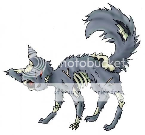
Except during the zombie apocalypse!
-
@dkf said in Mozilla Rebranding Or: How to Waste Several Hundred Thousand Dollars on Awful Graphic Designs:
@remi said in Mozilla Rebranding Or: How to Waste Several Hundred Thousand Dollars on Awful Graphic Designs:
a severed head is rarely a good thing.
Except during the zombie apocalypse!

It's missing the severed head, though.
-
@remi I think it will provide a severed head or thousand in short order…
-
@dkf said in Mozilla Rebranding Or: How to Waste Several Hundred Thousand Dollars on Awful Graphic Designs:
@remi I think it will provide a severed head or thousand in short order…
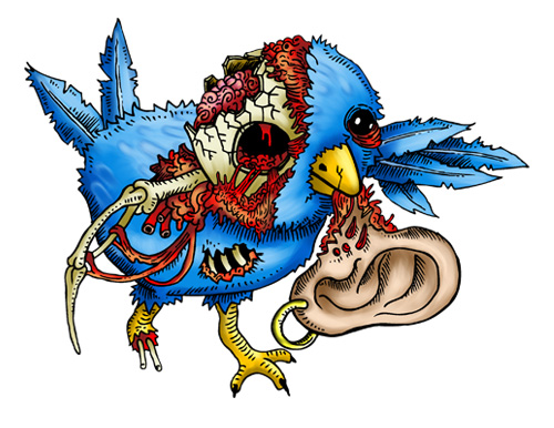
Especially if you pair it with his (her? its?) friends! I mean, you have to consider the branding as a full-experience covering all the facets of the multi-interactions of users with, hmm, ahh, whatever.
Firefox:
Thuderbird:

