Mozilla Rebranding Or: How to Waste Several Hundred Thousand Dollars on Awful Graphic Designs
-
 Now for the fun part of Mozilla’s logo design. – Mozilla Open Design
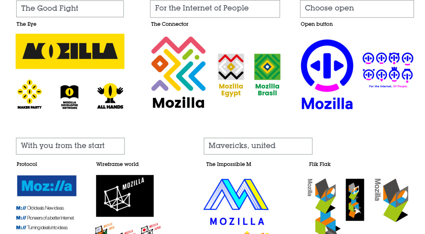
Learn more about how Mozilla works to design its logo. Find out about several paths forward, our seven logo design options, and tell us what you think!
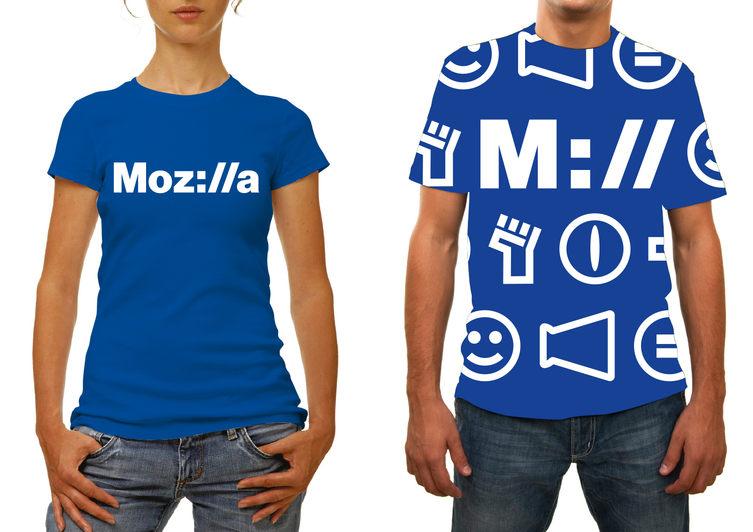
They are all awful. Maybe Moz://a isn't too bad, but dear god the others.
-
@JazzyJosh said in Mozilla Rebranding Or: How to Waste Several Hundred Thousand Dollars on Awful Graphic Designs:
Maybe Moz://a isn't too bad
Super confusing to non techies.
I kind of like the impossible M, but it does look like it was designed in the 80s
-
Urgh. I guess it's part of the on-going trend of "we need a new design every couple of years otherwise people might start to, you know, actually get used to us?"...
What's wrong with a brand that is well known and has some history? How is a design that in a couple of years will look out-dated better ? (given that the proposals look very "2016" and that fashion changes quickly, I'm ready to bet that in 2 years they will look as old as the current Mozilla brand currently does, in terms of graphic style)
I wish the IT industry would stop thinking that anything older than 2 years is old crap to throw away. Especially when it's core stuff like the look-and-feel of the OS (getting 70 years old people to learn Windows 7, then 8, is painful...).
-
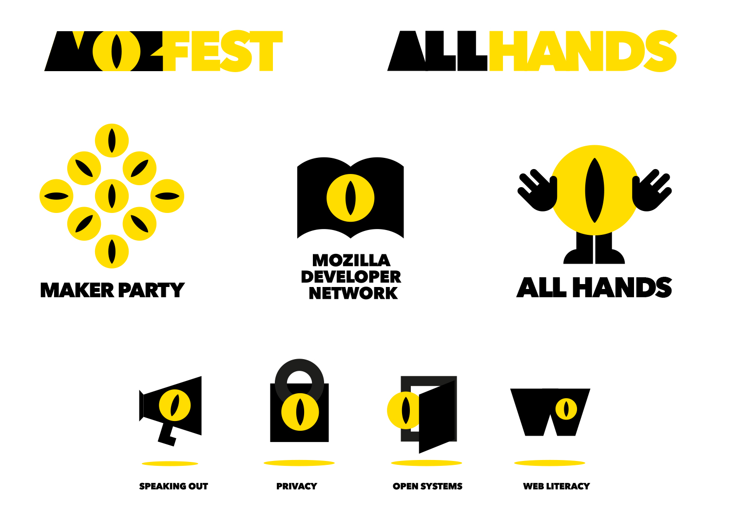
That dino-eye design for "Maker party"? Good luck selling that to people who claim to have Trypophobia:
-
Today our effort—equal parts open crit, performance art piece, and sociology experiment—takes its logical next step, ...
What the hell is an open crit? Is that like a headshot that splits your head in two?
-
@blek said in Mozilla Rebranding Or: How to Waste Several Hundred Thousand Dollars on Awful Graphic Designs:
Today our effort—equal parts open crit, performance art piece, and sociology experiment—takes its logical next step, ...
What the hell is an open crit? Is that like a headshot that splits your head in two?
Naw, that's a closed crit, due to the closed coffin you'll require.
-
I like how when they ask if the dinosaur represents who they are, they get 'nah, it represents the history though, like lizzard and gecko'
WHAT IS THE COMPANY CALLED?
WHAT IS A SIMILARLY NAMED MOVIE FRANCHISE?
WHY WOULD YOU TAKE THAT BRANDING AWAY, WHEN PEOPLE LOVE DINOSAURS?
WHY WOULD YOU PREFER NERD-CRED OVER REGULAR USERS?
WHY SHOULD A NERD GET EXCITED TO SEE COLON SLASH SLASH?
-
COLON SLASH SLASH?
Yuck.
-
@JazzyJosh said in Mozilla Rebranding Or: How to Waste Several Hundred Thousand Dollars on Awful Graphic Designs:
They are all awful.
My exploration of the internet so far on the topic (check the Ars Technica article comments section for some gems) has yielded approximately zero people who are interested in seeing the logo change to any of the 7.
My thoughts:
- A nice Sauron look, to be accompanied by a lawsuit from Opera over all of the "O"-branded characters and an ad campaign touting "Mozilla. The browser for those who think that not being evil... is for search engines."
- Illegible and entirely unrelated to anything that Mozilla does or is.
- A cool concept that actually relates to Mozilla's goals, but really doesn't work because it doesn't read as an M until you know it's supposed to. Just kidding, it doesn't then either.
- The best of the bunch, but it looks like something I could throw together in paint and then discard 15 seconds later without feeling bad.
- The wireframe would be better if they didn't totally derp up on the model. The text doesnt mesh in and that's a huge weakness for this design.
- Hello, DOS Box Art! I know you haven't had a job for a long time, but we're really desparate to get rid of this other cooler dinosaur….
- "Flik Flak". Do I have to say anything more? Other than it being about 102930192% (rough estimate) too complex for a logo, even in the condensed form, being too vertical, etc. ad nauseam.
-
@Jaloopa said in Mozilla Rebranding Or: How to Waste Several Hundred Thousand Dollars on Awful Graphic Designs:
Super confusing to non techies.
The ones that look like a rug have some potential when it comes to the country symbols, etc., but the main logo in that style is a disaster as it is confusing. The Eye branding is creepy, and should be both rejected and the designer reported to his psychiatrist for being weird. The various 3D logos are also highly confusing; branding is best when it is very simple and easy to reproduce. Finally, that ring logo is just a bit odd.
The
Moz://aone is the best overall, as it helps to convey that Mozilla are involved a lot with the web and can be rendered in many subtly different forms to meet the requirements of different media, but needs to be evaluated against the current branding: if the current branding is better, don't change.
-
@JBert Also note the massive irony of having a Lock with a freaking Sauron Eye on it labelled "privacy". Security maybe, but eye for one don't associate malevolent supernatural eyes with privacy. Don't look now, it's the new NSA logo!
-
I want something with the red dinosaur in it.
I guess the most boring one (#6) would be ok?
-
@aliceif Is that The Impossible M? I'd expect you to like that and Flik Flak
-
@Jaloopa said in Mozilla Rebranding Or: How to Waste Several Hundred Thousand Dollars on Awful Graphic Designs:
I kind of like the impossible M, but it does look like it was designed in the 80s
It's the bloody halftones. Hey, Mozilla, most people have moved on past EGA these days.
-
@pydsigner said in Mozilla Rebranding Or: How to Waste Several Hundred Thousand Dollars on Awful Graphic Designs:
A nice Sauron look, to be accompanied by a lawsuit from Opera over all of the "O"-branded characters
Also:
 Netto - sieć sklepów | Netto
Witamy w Netto - sieci sklepów, która oferuje produkty spożywcze, chemiczne i przemysłowe po bardzo korzystnych cenach. Netto - więcej za mniej. Zapraszamy!
Oh, and speaking of lawsuits, that WebMaker thing accompanying the Impossible M is gonna piss off the Visual Studio team.
Oh, and MozFest is MFC. Wow, was someone looking for ideas on their Windows 98 VM?
-
@Maciejasjmj That's a better logo than any of the proposed Mozilla ones…
-
@Magus said in Mozilla Rebranding Or: How to Waste Several Hundred Thousand Dollars on Awful Graphic Designs:
Flik Flak
No no no no no
No
Just no.
-
@Maciejasjmj I vote impossible M because lolretro. It's a logo that's as much an outdated dinosaur as the Mozilla foundation itself.
-
@Magus said in Mozilla Rebranding Or: How to Waste Several Hundred Thousand Dollars on Awful Graphic Designs:
Flik Flak
is that what the younguns are calling it these days?

-
@Magus Actually, now that I looked at the detailed article about the M design ...
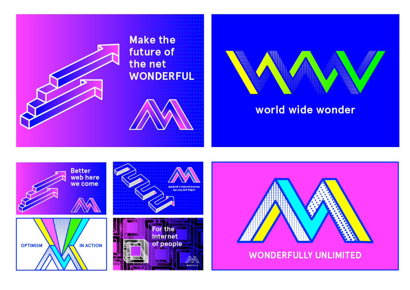
I think I'm in love.
-
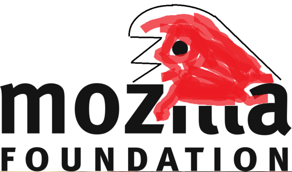
Just for comparison, this is what Mozilla is trying to move away from:
https://wiki.mozilla.org/images/a/a9/Mozilla-foundation-logo.png
-
@aliceif said in Mozilla Rebranding Or: How to Waste Several Hundred Thousand Dollars on Awful Graphic Designs:
I think I'm in love.
I think my eyes are bleeding. I guess that's equivalent…

-
@aliceif Gah. I have PowerPoint 97 flashbacks.
All that's missing is WordArt, really.
-
One of these things is not like the other:
-
@pydsigner Is it Mozilla Foundation trying to rebrand or Mozilla Corporation?
Or is it both?
-

The Internet is made from people! People!
-
@error
@Emilia
-

Maker Parties. So that's what they're calling them these days?
-
@JBert looks vaguely vulvic
-
@aliceif said in Mozilla Rebranding Or: How to Waste Several Hundred Thousand Dollars on Awful Graphic Designs:
I think I'm in love.
Then my accuracy is at least 50%!
-
@Jaloopa said in Mozilla Rebranding Or: How to Waste Several Hundred Thousand Dollars on Awful Graphic Designs:
I kind of like the impossible M, but it does look like it was designed in the 80s
Also, not sure the implication of being "impossible" is a good thing to associate with your brand.
This software is impossible!
-
There are no duds in the mix.
The really sad part is that the poor dope probably actually believes that by now.
Ad agency koolaid is pretty strong koolaid.
-
@JBert said in Mozilla Rebranding Or: How to Waste Several Hundred Thousand Dollars on Awful Graphic Designs:
That dino-eye design
is going to piss off Opera users something chronic.
-
@Magus said in Mozilla Rebranding Or: How to Waste Several Hundred Thousand Dollars on Awful Graphic Designs:
WHY SHOULD A NERD GET EXCITED TO SEE COLON SLASH SLASH
Maybe he's into bottle insertions gone wrong?
-

-
@JBert Re: "All Hands," let's turn those hands inward so they look like they're opening the eye.
heh heh heh
-
@pydsigner said in Mozilla Rebranding Or: How to Waste Several Hundred Thousand Dollars on Awful Graphic Designs:
it doesn't read as an M
Looks like N0Zilla to me.
-

-
@anotherusername You know you're watching the wrong channel when Godzilla's roars get visually bleeped.
-
Not saying this is good at all, but at least you can get an impression from this rough draft I cooked up.
Keeps the identity and history intact.
-
@lolwhat said in Mozilla Rebranding Or: How to Waste Several Hundred Thousand Dollars on Awful Graphic Designs:
turn those hands inward so they look like they're opening the eye
I like it. Put a ring on it.
-
Better yet, why don't they just scrap all of these and call the designers "fucking scam artists".
-
@XanderTheGamer said in Mozilla Rebranding Or: How to Waste Several Hundred Thousand Dollars on Awful Graphic Designs:
scam artists
But you know it's a legit company, because their name is in lowercase! they are innovate!, or such great writhing words as, uttering overmuch.
-
TIL that someone thought it would be a good idea for a NPO to spend a lot of money advertising to the 50-100 non-developers world-wide who know that 'Mozilla' isn't just something that on very rare occasions gets put in front of 'Firefox' for some reason.
When, after 20+ years of public access to the WWW, at a time when Facebook and iPhones are more common than film cameras and CRT televisions, yet the three most common answers to the question 'what browser do you use?' are still 'Internet', 'Word', and 'what's a browser?', it's safe to say that Mozilla and their products have bigger PR issues than their logo.
-
@ScholRLEA said in Mozilla Rebranding Or: How to Waste Several Hundred Thousand Dollars on Awful Graphic Designs:
'Internet', 'Word', and 'what's a browser?',
 source?!
-
Here, I'll save you dumb fuckers at Mozilla some time and just give you the logo you're masturbating over anyways.

There, go jizz in your own mouths over your secret Internet crush, then break into Google Campus and boil their pets.
-
And also, having the gall to use
://as part of their logo is fucking ballsy, given that protocols are "too hard where's Grumpy Cat?"-- so they've stopped showing the protocol in the address bar.Go fuck yourself with Chrome's missing backspace navigation.
-
@xaade said in Mozilla Rebranding Or: How to Waste Several Hundred Thousand Dollars on Awful Graphic Designs:
Not saying this is good at all, but at least you can get an impression from this rough draft I cooked up.
Keeps the identity and history intact.
No, no, no. We need a real rebranding. We need to show we're a modern foundation.

-
@anotherusername Mozirra!
-
@Maciejasjmj They'll like it because the blue colors. Here, have 50k USD and a lowercase m for your name.