Can we have an official NodeBB-Stylish/userscript topic now?
-
@Erufael Actually, with the shade I picked, it works pretty well even on the dark themes. Here's the exact same CSS I posted above when combined with the Darkly theme:
-
For anyone who wants easily visible post numbers (@darkmatter):
a[component="post/anchor"]:after {
    content: attr(name);
}
Edit: Well, that was unexpected; the post numbers count from zero!
-
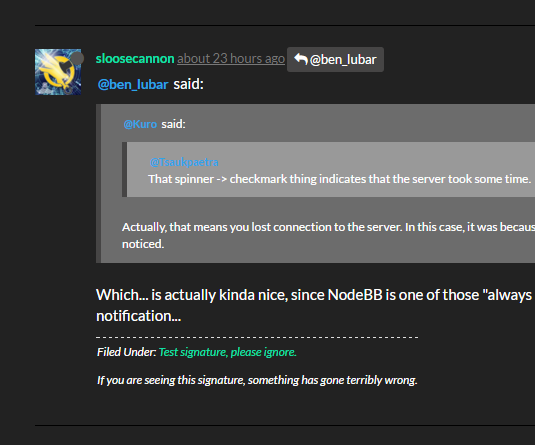
@RaceProUK said:
Edit: Well, that was unexpected; the post numbers count from zero!
At first I was "Wait, WUT?" then I remembered... it's MongoDB, it's all JSON so... it's arrays, internally?
-
It's all glowy!!!!!

-
I got used to status thread being marked...
a:not(.permalink)[href="/topic/12236/the-official-status-thread/41406"]:before {
    content: "\01f500 Status";
    background: #0E76BD;
    color: #FFFFFF;
    margin-right: 5px;
    padding: 0px 4px 2px 4px;
    border-radius: 4px;
    font-size: 0.8em;
}
-
I know with TL3s not being able to edit titles the indicators aren't so necessary, but I do like the idea of having them anyway; @administrators?
-
@RaceProUK said:
but I do like the idea of having them anyway
Pretty much my thinking, yeah. I got used to looking for the thread by the indicator

-
@Onyx click on the little underlined fire icon in the top menu to get to any insanely popular topic quickly.
-
@ben_lubar Fuck you, stop breaking my workflow!
-
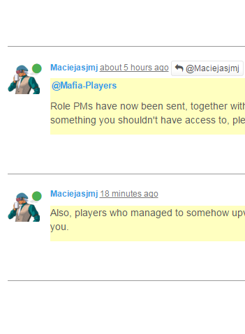
@Mafia-Players, @Mafia-Club-Ded:
If you don't like all the white in this:
Then try this:
ul[component="topic"][data-tid="19459"]>li[component="post"][data-username="Maciejasjmj"] {
    background-color: #ffc;
}

ul[component="topic"][data-tid="19459"]>li[component="post"][data-username="Maciejasjmj"]>div.content {
    background-color: transparent;
}
-
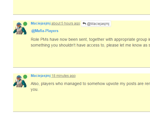
@abarker said:
If you don't like all the white in this:
E_NO_REPRO on dark theme.
However, mentions are atrocious!

-
@abarker said:
So the method that @RaceProUK and I discussed (starting here) wasn't enough for you? You had to put ugly ass borders all the way around the posts? Well, at least it only affects you.
No, it wasn't enough, because it still leaves tons of text floating in a sea of whitespace. There is no distinct, consistent left border for the eye to follow down the page. Your HR doesn't even extend the full width of the post, so to scan through the post list requires an eye zig-zag, rather than a straight flow.
Mine also makes the topic list pages usable.
-
@anotherusername said:
After 3.2 seconds the yellow background color starts fading out to nothing.
I'd rather .highlight not fade out at all. I believe it's the actual class fading out.
@ben_lubar any chance we can remove the fadeout? Usecase: I open a few messages in new tabs. By the time I get around to reading them, .highlight is gone. Or even if I click on one link, get distracted for 15 seconds for any reason, that information is now destroyed.
-
@Lorne-Kates If I do it via CSS, you'd end up with multiple highlights at the same time.
-
@ben_lubar said:
@Lorne-Kates If I do it via CSS, you'd end up with multiple highlights at the same time.
Isn't it just when the page is requested, it slaps .highlight on whatever the current requests' page is? Or is there some ajax framework single-page-app dumbfuckery going on that would make it impossible?
Oh look the input textbox overflows the edge of the screen on my laptop, too.
Filed under: Red Boob
-
@RaceProUK said:
For anyone who wants easily visible post numbers
Here's a new one: easily visible thread IDs.
li[component="category/topic"]:before {
    content: attr(data-tid);
}
I'll be honest, I have no idea how useful this really is; I just felt like making it :)
-
@Lorne-Kates said:
Isn't it just when the page is requested, it slaps .highlight on whatever the current requests' page is?
Yes, but only for... 15 seconds, I think? Are we even able to customize that? Could we set it to... 99,999 seconds or something?
That would be less hacky than adding a transition that makes
.highlighttake90030 seconds to fully disappear when it's removed...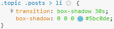
-
totally needs a
* {border-radius:25px !important;}
div.content { padding:10px !important; }
to appropriately round all of the things.
-
Making the boob with a plus into a proper "minimize"-icon while the composer is active:
/* Hide button / boob */
li.taskbar-composer.active i.fa-plus:before{
    content: "\f068" !important;
}
If you want to somewhat recreate the Minimize maximize buttons on whatever OS, this might be a starting step for you:
/* Cover the boobs with buttons since it's considered indecency otherwise... I think */
li.taskbar-composer a{
    background-color:#AAA !important;
    border:2px solid #111 !important;
    border-radius: 5px !important;
}

li.taskbar-composer *{
    color:#000 !important;
}

/* restore button / boob */
    li.taskbar-composer:not(active) i.fa-plus:before{
    content: "\29C9" !important; /* The maximize square: \25FB */
}

/* hide button / boob */
    li.taskbar-composer.active i.fa-plus:before{
    content: "_" !important;
}
/* I have taken the boobs away... why would I do that? I AM A MONSTER! */
Filed Under: I added !important everywhere. Partially because it wouldn't really work otherwise... partially to annoy @RaceProUK
Also Filed Under: Why is !important sometimes red and sometimes white?!
Edit:
Changed the_in the first code sample as by advice from @RaceProUK (also changed the picture)
-
@Kuro said in Can we have an official NodeBB-Stylish topic now?:
Making the boob with a plus into a proper "minimize"-icon while the composer is active:
\f068is probably better as the content; that's the character normally set byfa-minus;)
-
@RaceProUK
I knew randomly mentioning you would yield some advice.
I will add that to the first code sample. On the second one, I'd need a fat line on the bottom. For which I'd probably have to play around with other CSS properties... So the_works there for now.Filed Under: Editing now
-
@Lorne-Kates said in Can we have an official NodeBB-Stylish topic now?:
don't do rounded borders
A desire for rounded borders seems Jeffish. Have you joined the Cult of Civilized Discourse?
-
@r10pez10 Awww, we'd missed Clown Vomit mode!
-
For everyone who wants to ignore a category (even in
/recent/) there is this:/* Ignores every topic from the corresponding category: In this example it's the v Mafia-Category including the v Current-Game-Category*/ .topic-list li.row[data-cid = "31"], .topic-list li.row[data-cid = "29"]{ display:none !important; }For reference, here are the Category IDs I have access to (standard TL3)
8:  General
30: Look At Me
7:  Side Bar WTF
12: CodeSOD
18: Error'd
3:  Meta
10: :disco-fa: bug
13: FAQs
16: The Lounge
23: Flags / Badges
27: Migration
37: Sandbox
19: One Post
11: The I Hate Oracle Club
14: Funny Stuff
15: Coder Challenge
20: Programmers Testing
21: tbd
22: Bot Testing
26: General Help
9:  Coding Help
28: Games
29: Mafia
31: Current Game
Note:
- This simply hides those topics. Including the ones you see if you specifically go to a blocked category. This category will appear empty!
- You should still get notifications from the topic and be able to go inside the topic from said notification!
- Those posts will also still trigger the "New topics/posts" banner. Since they are loaded and then hidden!
Filed Under: No screenshot because it just hides the posts
Addendum: If you want to hide a specific topic from the list you can use the
data-tid, btw.Edit: I hope I have all the categories listed now
-
@FrostCat said in Can we have an official NodeBB-Stylish topic now?:
A desire for rounded borders seems Jeffish. Have you joined the Cult of Civilized Discourse?
Rounded borders are like "Think of the Children". They work in small doses in the correct circumstances.
-
@Lorne-Kates said in Can we have an official NodeBB-Stylish topic now?:
small doses
Not coincidentally, "small doses" is how you start thinking like
 , too.
-
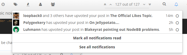
make the notifications list less sucky on desktop (should get rid of scrolliness and make easier to read, usually fits 1 notification per line this way):
.notification-list li, .header .notification-list li {
  width: 650px !important;
  margin: 3px !important;
  padding:0px 7px !important; /* courtesy of @Kuro so potential  vertical scrollbar won't cover the bubbles */
  line-height:24px !important;
  clear: both;
  vertical-align:middle;
}
.notification-list li img, .header .notification-list li img{
  height:24px !important;
  width: 24px !important;
}
  .notification-list li:hover, .header .notification-list li:hover {
  color:white !important;
  background-color: rgb(68, 110, 155) !important;
}
  .notification-list a:hover, .header .notification-list a:hover {
  text-decoration:none !important;
}
  .notification-list li a .text, .header .notification-list li a .text {
  min-height:0px;
}
.notification-list, .header .notification-list {
   max-height: 550px !important;
}
background color for hovering may need to be changed to work well for other themes.
Looks like this for me (I'm hovering my mouse over the one that's highlighted in blue):
-
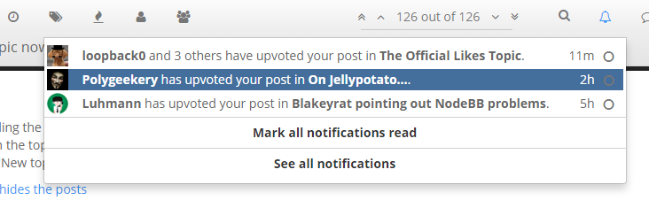
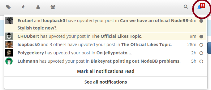
Ok, how does THIS equal NINETEEN notifications????
Clicked the two links and it cleared all 19 notifications

-
@darkmatter
Not really on topic, but here, if you want wrong notification counts, I can give you wrong notification counts.http://gfycat.com/ClumsyDetailedBlackpanther
Filed Under: Actual topic about this
Also Filed Under: ^ is actually a link to my first topic on NodeBB
Also Also Filed Under: No gfycat oneboxing?
-
@Kuro hah.
i didn't even click anything though, it just loaded like that on its own
-
@darkmatter Want a CSS-snippet that removes the entire counter for you?
Filed Under: no counter also means no wrong counter!

-
-
@darkmatter that makes the notification thing much better!
I'd experimented with making it longer, hadn't thought to make it wider.
-
@loopback0
oh yeah, i need to fix the max-height too....notification-list, .header .notification-list { max-height: 550px !important; }might go bigger if i find that i have more notifications, but 550 will hold quite a few....
-
@darkmatter
I changed.notification-list li, .header .notification-list li { padding:0px !important; }to
.notification-list li, .header .notification-list li {
    padding:0px 7px !important;
}
That accomodates for the potential scrollbar.
Filed Under; Thanks for sharing!
-
@Kuro
nice - i'll amend my post to have that thanks (properly attributed of course).
-
I tweaked it to include the chat list, which I made a bit narrower.
.notification-list li, .header .notification-list li {
  width: 650px !important;
  margin: 3px !important;
  padding: 0px 7px !important;
  line-height:24px !important;
  clear: both;
  vertical-align:middle;
}
.notification-list li img, .header .notification-list li img, .chat-list li img, .header .chat-list li img{
  height:24px !important;
  width: 24px !important;
}
.notification-list li:hover, .header .notification-list li:hover, .chat-list li:hover, .header .chat-list li:hover {
  color:white !important;
  background-color: rgb(68, 110, 155) !important;
}
.notification-list a:hover, .header .notification-list a:hover, .chat-list a:hover, .header .chat-list a:hover {
  text-decoration:none !important;
}
.notification-list li a .text, .header .notification-list li a .text, .chat-list li a .text, .header .chat-list li a .text {
  min-height:0px;
}
.notification-list, .header .notification-list, .chat-list, .header .chat-list {
   max-height: 550px !important;
}
.chat-list li, .header .chat-list li {
  width: 380px !important;
  margin: 3px !important;
  padding: 0px 7px !important;
  line-height:24px !important;
  clear: both;
  vertical-align:middle;
}
(credit to @darkmatter @kuro)
-
Change Upvote to a heart like dicsourse:
a[component="post/upvote"].upvoted {
    background-color: white;
}
.fa-chevron-up:before {
    content: "♥";
    font-size:14px;
    vertical-align: middle;
    padding-bottom:3px;
}

a[component="post/upvote"]:hover {
    color:red;
    text-decoration:none !important;
}

a[component="post/upvote"].upvoted .fa-chevron-up:before{
    color:red;
}
Remove the up/down vote buttons from your own posts....
clearly you need to replace YOURUSERNAMEHERE with your username.li[data-userslug="YOURUSERNAMEHERE"] a[component="post/upvote"] , li[data-userslug="YOURUSERNAMEHERE"] a[component="post/downvote"] { visibility:hidden; }
-
@abarker said in Can we have an official NodeBB-Stylish topic now?:
If you don't like all the white in this:
Sounds racist to me.
-
Breaking the rules! Have a userscript to prevent being able to drag the chat box behind the header / above the top of the screen:
$(document).on('mouseup', function(e) {
	$('div[id^=chat-modal]').each(function() {
		var offset = $(this).offset();
		var scroll = $('body').scrollTop();
		var navbarHeight = $('#header-menu').height();
		if(offset.top - scroll < navbarHeight) {
			$(this).offset({top: navbarHeight + scroll, left: offset.left});
		}
	});
});
I'll look into fixing it in NodeBB itself later.
NOTE: might still get a bit covered with our modifications to the topbar (showing the title) but it's still grabbable. I didn't want to monitor the scroll event as well...
-
Fix for the popup chat not actually becoming thinner if you make it thinner (extending via invisible div):
/* chats cannot really be smaller fix */
div.chat-modal div.modal-dialog{
	width:auto;
}

div.chat-modal div.modal-dialog div.modal-content{
	width:600px;	 /* Default width for every new chat popup! */
}
my thanks goes to @RaceProUK for opening my eyes or something like that
Filed Under: should probably be in default CSS, @ben_lubar
-
Maciej's posts not looking like literal vomit in Mafia on Superhero:
/* Mafia V - Corporate Mafia */
[data-tid="19354"]>[data-uid="256"], [data-tid="19459"]>[data-uid="256"], [data-tid="19460"]>[data-uid="256"], [data-tid="19461"]>[data-uid="256"], [data-tid="19462"]>[data-uid="256"] {
    background-color: rgba(255, 40, 40, 0.25);
}
They're red now, so they stand out more and look more pleasing.
-
like/dislike buttons instead of up/down votes....
a[component="post/upvote"].upvoted {
    background-color: white;
}
.fa-chevron-up:before {
    content: "❤";
    font-size:24px !important;
    vertical-align: middle;
    padding-bottom:3px;
}
.fa-chevron-down:before {
    content: "💔";
    font-size:24px !important;
    vertical-align: middle;
    padding-bottom:3px;
}

a[component="post/upvote"]:hover {
    color:red;
    text-decoration:none !important;
}
a[component="post/downvote"]:hover {
    color:black;
    text-decoration:none !important;
}

a[component="post/upvote"].upvoted .fa-chevron-up:before{
    color:red;
}
a[component="post/upvote"].upvoted {
    background:pink;
}
some credit to @abarker for some suggestions on color/sizing of the heart controls.
-
They turned off Likes topic again it seems? But that doesn't seem to be having any effect on whether the site functions or not. All I get is brokenness.
-
@darkmatter There was a rate-limiting experiment as well I believe that's now ended; everything seems to be working again now
-
@RaceProUK said in Can we have an official NodeBB-Stylish topic now?:
rate-limiting experiment
Maybe they should try it with the limit set higher than 0.
-
But seriously, it was obviously set too low to be practical
-
@RaceProUK it was set to 1 request per second.
-
@asdf said in Can we have an official NodeBB-Stylish topic now?:
Hiding tufty's disgusting avatar
@Choonster said in Can we have an official NodeBB-Stylish topic now?:
To replace tufty's avatar with a "T" on a red background
Y'all missed one: the icon for the latest post on the right-hand side of the topic list:
img[data-original-title="tufty"] {
    display: none;
}
Or something like that.
-
@NedFodder said in Can we have an official NodeBB-Stylish topic now?:
@asdf said in Can we have an official NodeBB-Stylish topic now?:
Hiding tufty's disgusting avatar
@Choonster said in Can we have an official NodeBB-Stylish topic now?:
To replace tufty's avatar with a "T" on a red background
Y'all missed one: the icon for the latest post on the right-hand side of the topic list:
img[data-original-title="tufty"] {
    display: none;
}
Or something like that.
My CSS uses
.card a[href="/user/tufty"]for that.