Helvetical Fronting
-
it could also be fixed by having the proper header/meta tag in the server side.
Pull Requests acce... Erm... Yeah :P
-
Eurofurence is a furry convention held in changing places in Europe every year.
In changing places? Like... locker rooms?
-
Probably. Animals like strong smells.
-
In changing places? Like... locker rooms?
No idea. Not really inclined to find out either.
Is there any particular reason you'd like to know that? :)
-
it could also be fixed by having the proper header/meta tag in the server side.
LOL. Go ahead and email ESR and let us know how it works. (If it's actually wrong he'll probably actually fix it.)
-
Adapting for Chrom(?:e|ium) is left as an exercise for the reader
Hamburger -> more tools -> encoding HTH HAND etc.
-
Now do Safari! :D
-
- download Chrome
- the problem is now reduced to one previously solved QED
-
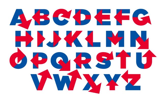
I give you, Hillvetica:
-
Multicolored fonts? Yeah, right.
-
Whoosh?

-
-
-
-
-
-
Whoosh?
No. I was slightly amused by Blakey's literal interpretation of the phrase "changing places", decided to run with it and question Blakey's sexual orientation at the same time, for hilarity.
-
I have succumbed to silliness:

-
I recognise that font…
I assume the other Google results weren't too traumatic?
-
I assume the other Google results weren't too traumatic?
Nope.
I found a problem though:

Let me paste that here:
array('name' => 'Repeat password', 'key' => 'password-repeat', 'type' => 'password')Anyone see a problem here?

-
-
@RaceProUK said:
I assume the other Google results weren't too traumatic?
Nope.
…let me guess; you Googled 'eurofurence font'
<Eurofurence is also a furry convention, but you probably knew that already from upthread ;)Anyone see a problem here?
Yes; the spacing is inconsistent.Probably not as big a deal as the missing hyphen glyph though…
-
eurofurence
Monofur ;)
Yes; the spacing is inconsistent.
It's fine, actually. It's just that the font here is much wider. And larger.
Probably not as big a deal as the missing hyphen glyph though…
Yup. Not sure if font or rendering going wonky. Assuming font, really, tried setting it to bold but no change.
Edit: It's fine in
gedito.O
-
Monofur
Oh.Yeah, that one only finds the font…
@Onyx said:It's fine, actually. It's just that the font here is much wider. And larger.


-
Let me paste that here:
array('name' => 'Repeat password',	'key' => 'password-repeat',	'type' => 'password')
```</blockquote>

:wtf: would you do that‽

---

**EDIT**
@Onyx <a href="/t/via-quote/47605/273">said</a>:<blockquote>It's fine in gedit o.O</blockquote>

:wtf: :wtf: :wtf:
-
Do what? Paste PHP to the forums? I like to see you squirm

-
Do what? Paste PHP to the forums? I like to see you squirm
I meant the hyphen, but your interpretation works too.
-
So... works in Sublime at font sizes >10?

EDIT: No, it's the zoom level? You're broken, Sublime.
-
This may be the first time I've heard of someone being downright unhappy with something sublime does. Still an awesome font.
-
This may be the first time I've heard of someone being downright unhappy with something sublime does. Still an awesome font.
Well can you justify it not rendering hyphens when I set it to a particular zoom level?
Also, I can't find a way to set it to 100%, or even see what zoom level it's at.
-
It works in Notepad at 8pt. Sublime is borked.
-
Is it zooming after rendering, instead of changing the font point size?

-
I suspect the same thing happens in IntelliJ's UI, because I had a similar issue with another font (I don't remember which one off the top of my head). I wonder what rendering engine they have in common...
-
hey! i recognize that code!
you did find it useful!
-
Screenshot might have been deliberate...
-
Screenshot might have been deliberate...
just glad i could help!
now about that <digital> cookie you owe me? :-P
-
Have a virtual one to start with:

-
now about that <digital> cookie you owe me? :-P
That will do just fine.
/me noms the cookie
mm.... monitor flavoured!
-
/me noms the cookie
mm.... monitor flavoured!
*has a mental image of @accalia licking her screen, and her cow-workers looking at her strangely*
-
You're broken, Sublime.
Does Sublime assume that it is dealing with a constant-width font?
-
It is a constant width font.
-
It is a constant width font.
Then why is the spacing messed up? QED.
It might be that the metrics are wrong. It wouldn't be the first time that graphics people have got that wrong; a lot of GTK and Qt themes are buggy that way (as you can find out if you try to use the themes from any other rendering engine than the one they were designed for).
-
Then why is the spacing messed up? QED.
It's not? Where did you get that idea? It's just that:
- Font used for
<code>blocks here is wider - tab size is set to 8, I have it set to 4 in Sublime
- Font used for
-
-
…the image of you eating your monitor is weirder…
-
a mental image of @accalia licking her screen
I think you'd find it would leave all sorts of annoying marks over the display surface. Keep a soft cloth (of the kind for cleaning pairs of glasses) handy…
-
And it might fry your tongue if you have a CRT ...
-
-
CRT
Who has those now? (Apart from my neighbour, who operates approximately 30 years behind everyone else in the world. He's a historian of science, of course.)
-
I do. It's also green monochrome for even more coolness.
Now to figure out how to hook VGA output up to it...


