Helvetical Fronting
-
Thank you, got the same but I can't find the snip tool in Windows 8
-
it's also sprinkled rather liberally with these glyphs (for me at least)
And me.
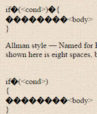
@accalia said:i usually use a hybrid of K&K and Allmans styles
Allmans in C#, K&R for JS. Mostly because that's how VS auto-formats the code
-
win + s
then start typing
snipping tool. at some point it's at the top of the list.press enter.
boom!
-
Thank you, got the same but I can't find the snip tool in Windows 8
, snip; should be the first result ;)Edit:
 d by the fox with the alternate method!
-
Edit: d by the fox with the alternate method!
yeah. because the Win+S shortcut is learning by now it's
Win+S
S
<enter>for me.
.... i use the snip[ping tool a lot
-
Yeah, that was what I was doing until I figured this shit is in Spanish, so it's "Recortes"

-
oh.....
right I18N.i always forget about that.
-
Allmans with tabs at Intel and then here, so also on my own projects. Makes everything nice and simple. If I want to have a project where indentation is evil, I could set it to 8 or 12 or whatever would make it painful in my font. Because that's dumb, 5 works well.
-
If I want to have a project where indentation is evil
Set tabs to φ spaces?
Oh, set tabs to -4i spaces!
-
Oh, set tabs to -4i spaces!
Every time you indent something it flies out of the screen and smacks you across the face?
I know, that's not how polar coordinates work, shut up.
-
I know, that's not how polar coordinates work, shut up.
It's actually a complex number, but whatever, you got a Like ;)
-
It's actually a complex number
Yes, and I always graphed them using polar coordinates:
I know, not the only way, nor the only use of polar coordinate system, but as soon as I see imaginary numbers in relation to space I remember that. Must be my EE training, used that a lot when dealing with impedance values...
-
Ah; I was going from a pure maths POV ;)
-
Hey, I just noticed something:
_hello
___ _hello___
____hello ___
___hello_ ___Probably not a bug, since it ___happens any time ___ a space comes before or after the inner bit. Still odd.
-
And that explains the weird Google results.
Yeah, but I bet @raceprouk already knew about it.
-
You'd think, but no. Was a nice surprise though

-
-
Guess who forgot to anonymize her screenshots again
What, her last name? That's on all her FP articles anyway. I don't see anything else non-anonymous.
-
What, her last name?
We went through this a while back. Her last name on the articles is spelled differently than her Windows login name, and for some reason I CBA to go back and look for it mattered at the time.
-
The articles are written under a Nome de plume that resembles my real first and middle names, so nothing is technically misspelled.
Fuck it though. Hi I'm Bay.
-
nothing is technically misspelled.
I didn't say it was. I was just trying to troll you a bit. I mean, we all had so much fun the last time you forgot to sanitize a screenshot.
Fuck it though. Hi I'm Bay.
Hi, Bay!

(Like you haven't seen that one before.)
-
My starter :D
-
-
Not in that gen. But I did in X and Y
-
Hey, I just noticed something:
It gets [odder], and odd_er and odd_er.
It gets [odder], and odder and odder.TRWTF is that
_and*do ostensibly the same thing but have behave slightly differently to each other...
-
Says the guy with a blurry chalkboard/comic sans setup.
Your editor theme is bad and ugly. If you're selecting fonts based on a single feature of one of one single letter, you don't know shit about typography and you can keep your half-baked ideas about which things are easier to read than other things to yourself, thank you very much.
-
Bay
As long as you have no connections to a certain Michael, I'll forget it in 2 minutes anyway, so, in my case at least, your anonymity is ensured
-
Every time you indent something it flies out of the screen and smacks you across the face?
You'd only get that with quaternions, which have four main directions instead of just the two of complex numbers. Like that you can represent left-right, up-down, in-out and … one more. Look, they make my brain ache too.

-
left-right, up-down, in-out and … one more.
left-right, up-down, forward-backward, future-past?
-
-
-
Am I whooshing here?
Maybe. Maybe you didn't yet but you will. Maybe you will have whooshed some time later in the last week.
-
Am I whooshing here?
To be honest, I have no idea. What I know is that quaternions are strange. I don't remember exactly how they're supposed to be used to represent things in 3-space — the advantage has something to do with a lack of phantom singularities in the phase space — or even if it's actually necessary to go to octonions to do it properly.
I think I'll just let this be and stop trying to think about it.
-
they're supposed to be used to represent things in 3-space
Huh. I just assumed four dimensions.
I never studied quaternions but I did do relativity. (That was a great course. Though not sure what my lecturer would think about the fact that the two things I most remember from the class are that all those bad sci-fi things that use distance units for time are not, technically, wrong after all, and that Naked Singularity would be a great band name)
-
People frequently say to always pick red, because it's the strongest, but I've never had any issues always picking green. Especially in first gen, where special was broken.
Says the guy with a blurry chalkboard/ comic sans setup.
No. I avoided that. Also, nothing is blurry. I don't use OS X.Your editor theme is bad and ugly.
Subjectivity is cool.If you're selecting fonts based on a single feature of one of one single letter
Look, I like diagonal 'e's. You don't have to. But really, that was an added bonus, since eurofurence is one of the only proportional fonts with dotted zeroes and sufficient letter differences for programming. The font one, not the furry one. I think.half-baked ideas about which things are easier to read than other things to yourself, thank you very much.
I'll put my half-baked ideas on a public forum if I want! You can't stop me! Down with the establishment!
-
⇈⇊⇆⇆BA
-
Subjectivity
Usability isn't as subjective as all that. Typography has hundreds of years of wisdom about exactly what is and isn't easy to read, and if you're going to come along, not knowing any of that, and spout your own crackpot nonsense, you are going to be objectively wrong.
I avoided that
I don't mind. If you're not producing solid paragraphs of text you're not allowing the true badness of comic to really shine anyway.
diagonal 'e's
If that's what gets you off, go ahead knock yourself out. The issue is that you've been telling people that text fonts are better for programming than fonts specifically designed for programming, and now you're saying that the only font that happens to have the features you need is a joke font made for a furry conference.And that's not counting the features you don't even know you need, which—and I really hope I'm getting through to you here—is a lot.
-
comic
Where?
Usability isn't as subjective as all that.
Ugliness is, in fact, subjective. Try again.
The issue is that you've been telling people that text fonts are better for programming than fonts specifically designed for programming
No, I haven't said that. Fixed width fonts are where all computers started, because of programming on cards. Proportional fonts, because they were more readable, were later added to computers. When I use a proportional font, it is usually one designed for programming.
With people re-imagining the things I say like this, I feel like Blakey!
-
To be honest, I have no idea. What I know is that quaternions are strange. I don't remember exactly how they're supposed to be used to represent things in 3-space
I was under the impression that a quaternion represents a 3D vector, combined with an angle around that vector, but I don't have the necessary tools to be able to back that up with anything substantive...
-
All I know is that it's impossible to multiply triples.
-
The reason people use them is because of the issues of rotating something with only 3 dimensions. I saw it explained on the GameDev SE once (Which I now don't visit much, since it's all 'how i mk geam in Unity pls') - maybe I'll search for it some time.
EDIT: AHA! They don't:
-
I was under the impression that a quaternion represents a 3D vector, combined with an angle around that vector, but I don't have the necessary tools to be able to back that up with anything substantive...
I don't think it's an angle round the vector, since that would make that dimension have a repeating component for the symmetry to work. I don't know what the real component of the quaternion represents though. (I know that the other components work well for coordinates in 3space, giving the right sort of rotational symmetries.)
It might be that rotations are where you get into tensors. I never studied them; I was too busy dealing with transfinite sets in discrete math. :-)
-
I don't know what the real component of the quaternion represents though.
Ah! Looking at:
I see that rotations are represented by “pure” quaternions: the real component is zero. :)
-
Proportional font designed for programming
Where?
-
When I use a proportional font, it is usually one designed for programming.
It's not the same if it isn't printed on green bar by a line printer…
-
Now, see, the interesting part of all this is that the time I needed to know it was back when I was making that solar system generator. 4 years ago. I learned it last year. It hasn't been a problem, because I'm making a 2D fighter now. All I know is, I am incredibly happy that I will, therefore, not have to worry about this problem in my project. Someone else can deal with magical 4-dimensional matrices.
Speaking of my fighting game though, I bought some nice controllers lately, because
- I love retro games
- The controllers I picked are ideal for my game and most other fighters
- It's really hard to find a modern controller with a d-pad that isn't squishy or secretly analog
- All my numbered lists always use a chain of the same number
I can definitely recommend these Buffalo classic USB SNES replica controllers. The things are wonderful and sufficiently clicky!
-
-
-
it's also sprinkled rather liberally with these glyphs (for me at least)
That's an encoding issue.
In Firefox, you can do this to fix: View → Character Encoding → Western
Adapting for Chrom(?:e|ium) is left as an exercise for the reader.
-
it could also be fixed by having the proper header/meta tag in the server side.
 Polar coordinate system - Wikipedia


