Why does a lowercase 'L' look uppercase in some code sections?
-
```
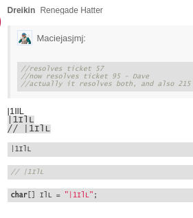
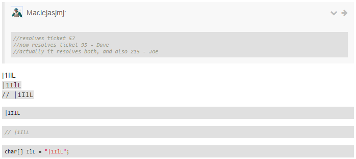
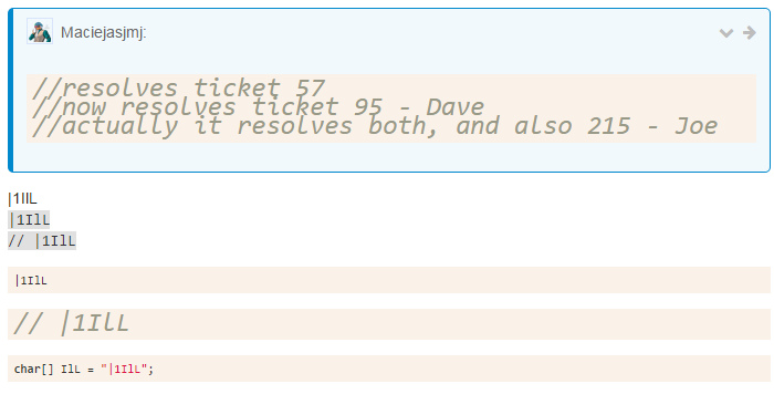
//resolves ticket 57
//now resolves ticket 95 - Dave
//actually it resolves both, and also 215 - Joe|1IlL `|1IlL` `// |1IlL`|1IlL
```c
// |1IlL
char[] IlL = "|1IlL";
-
So apparently it only happens in comments. And just in case anyone else sees it differently:
-
This topic was automatically closed after 60 minutes. New replies are no longer allowed.
-
-
-
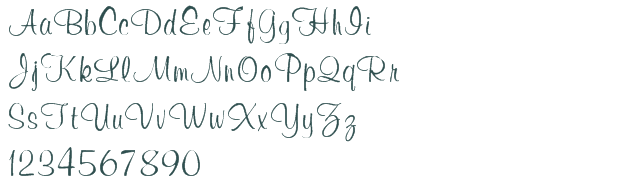
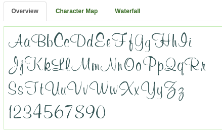
I think Consolas is just a shitty font in italic.
Editing the CSS in-console to Lucida Console made things look good!
-
And just in case anyone else sees it differently:
Well, in text-only it looked ok to me.
In the image, lowercase l and uppercase L should be definitively very distinct - the uppercase L should have a sharp corner on the left bottom (where the lowercase l is rounded), that is a clearly visible™ pixel more in that place.
Edit: Made a snapshot of a window with an alphabet italic Consolas. As far as I can see it, it is exactly that, plus the last pixel of the horizontal line shifted up one unit.
-
Local problem it seems - no repro here:
Ditto....I guess this is a Windows problem:
I think Consolas is just a shitty font in italic.
-
Ditto....I guess this is a Windows problem:
Ditto on my Linux machine - on my Windows machine there is a font called "Consolas". Took me quite a while to find it.
I'm homesick for the time when we had half a dozen fonts on our machines. And believed that was plenty.
-
Luddite.
-
Sorry, not heard / experienced that particular font
-
Sorry, not heard / experienced that particular font
You're lucky. Neither did I until a few minutes ago. Where the Belgium is my brain bleach?!
-
Luddite.
Let me suggest a compromise: The four most important fonts right handy for those that want to do actual work with their machines, and one mouse click further the 16383 fancy fonts for those that want to hurt their readers' eyes. And another single mouse click for the fonts with symbols etc.
-
-
Sorry, not heard / experienced that particular font
-
/me is seriously temped to come up with some random, proper, word just to see if...
-
Paging @Magus, we need more of your unique fonts in here.
Filed under: MS Gothic 9pt with ¥ and \ swapped is good enough for me, though
-
Ditto....I guess this is a Windows problem:
Might be. I can definitely repro it on Chrome 44 on Windows 7 Enterprise. I'm also going to note that I've never changed the fonts Chrome uses.
-
I'm also going to note that I've never changed the fonts Chrome uses.
Wouldn't matter:
@some CSS File said:
```css
body code,body pre {
font-family:Consolas, Menlo, Monaco, "Lucida Console", "Liberation Mono", "DejaVu Sans Mono", "Bitstream Vera Sans Mono", "Courier New", monospace
}
-
I tried pretty much all the fonts VS let me that are built into Windows, and there weren't that many that work at all. Lucida Handwriting was nice, but Buxton Sketch was really the best bizarre font. I'm a huge fan of OCR-A Extended, though.
-
You mean you don't code in Comic Papyrus?
-
I tried using that awesome old english font, but that got old in about two seconds. I've never claimed sanity, but there is such a thing as too far.
-
If you temporarily increase the font-size, the difference becomes apparent:
Basically, Concolas adheres to the style that dictates that a lower-case L should have a tail[1]. The curve of the tail just becomes less distinct at smaller font sizes.
[1] This is actually how I was taught to write lower-case L, but I've gotten lazy and don't use the tail anymore.
-
They look nearly identical, even at that size. That's bad design.
-
They look nearly identical, even at that size. That's bad design.
Still better than lowercase l and uppercase I looking the same save for being a pixel or two further to the right resp. left.
-
They look nearly identical, even at that size.
The hell you say? In relation to the upper-case L, the lower-case L in my screen cap:
- has a lower baseline
- has a higher top line
- has an obviously curved tail as opposed to a sharp angle where two lines meet
- the width appears to be narrower as well (on mobile so I'll let someone else verify that)
Bullshit they're nearly identical at that size.
-
Bullshit they're nearly identical at that size.
Yeah, if anything it's the
1and thelthat look damn similar.
-
Not again...