DEAR FIREFOX
-
@hungrier I've seen this kind of satire every time there is a logo change from a company. What would be very interesting (and hopefully worth a good laugh) would be to dig some of those spoofs from 10 (?) years ago, when FF started changing its logo, and see how they compare with the actual logo now.
It would be hilarious if the spoofs were not going far enough in uglyfying the logo...
-
@remi said in DEAR FIREFOX:
@hungrier I've seen this kind of satire every time there is a logo change from a company. What would be very interesting (and hopefully worth a good laugh) would be to dig some of those spoofs from 10 (?) years ago, when FF started changing its logo, and see how they compare with the actual logo now.
It would be hilarious if the spoofs were not going far enough in uglyfying the logo...
That's what makes it so funny.
Parody:

Is only slightly less stupid and ugly than reality:

-
@hungrier said in DEAR FIREFOX:
I just got the newest preview of the next Firefox update
It's still clearly Firefox

-
@boomzilla said in DEAR FIREFOX:
@levicki said in DEAR FIREFOX:
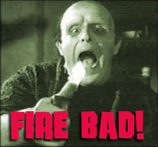
@error So, if people are forming habits so easily, with the advent of "undo philosophy" soon (when we become total Idiocracy) they will start thinking that there's Undo for everything, including when you get ran over by a car because you were not paying attention to that red warning light across the street.
Damn, and I thought I was the anti-
 .
.And yet... you are, since @levicki is just another alt.

-
@Zerosquare said in DEAR FIREFOX:
Readability is now greatly improved on under- or overlined texts, including links. The lines will now be interrupted instead of crossing over a glyph.
Ugh. I remember when Chrome decreased readability by doing this.
-
@JBert said in DEAR FIREFOX:
@Atazhaia Which one?
EDIT: Do mind that this image is mirrored, the one on the top-right is the oldest one and the one in the left-bottom corner is the newest.
They amputated the fox's
pawspaw — only one was ever visible!
-
@HardwareGeek said in DEAR FIREFOX:
@JBert said in DEAR FIREFOX:
@Atazhaia Which one?
EDIT: Do mind that this image is mirrored, the one on the top-right is the oldest one and the one in the left-bottom corner is the newest.
They amputated the fox's
pawspaw — only one was ever visible!The old icons were ableist.
-
@pie_flavor said in DEAR FIREFOX:
Cross platform is vendor lock in. You can't make this **** up.
Are you familiar with the differences between a vertical monopoly and a horizontal monopoly?
-
@dcon said in DEAR FIREFOX:
@dkf said in DEAR FIREFOX:
@Tsaukpaetra said in DEAR FIREFOX:
Never forgive, never forget!
 What are we supposed to never forgive?
 I've forgotten.
You forgot the rest:
But we'll continue fighting to the death for it!As long as they can remember whom to never forgive...
-
-
@Zerosquare said in DEAR FIREFOX:
@Zecc said in DEAR FIREFOX:
Also I'm pretty sure something about the font or text rendering has changed, because everything seems... off.
Readability is now greatly improved on under- or overlined texts, including links. The lines will now be interrupted instead of crossing over a glyph.
It's bogus, of course, because in the link in the doodad box, you can (on older FFs) see one link, while I see three separated by blue commas, and yet somehow they all highlight when I point the mouse at one of them...
EDIT: I'm on 70.0.1.
-
@Zerosquare said in DEAR FIREFOX:
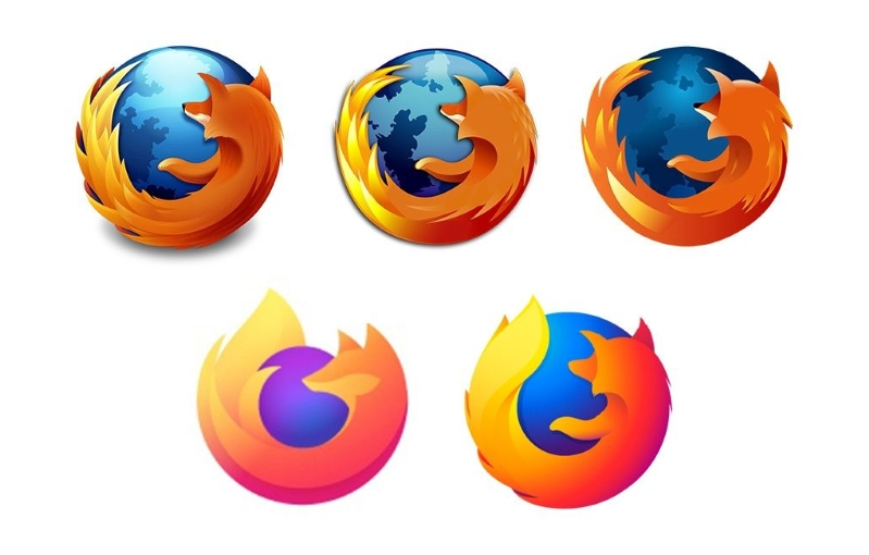
@JBert said in DEAR FIREFOX:
It's a good example of how a logo evolves from an initial rough sketch to a detailed, finished result. The only problem is that it's backwards.
It's actually quite common for logos to go from more detailed to less detailed over time, until they are just a tape worm-ish crude joke of the original logo.
A couple of examples for you:
Old:

New:


-
-
@boomzilla said in DEAR FIREFOX:
@Zerosquare said in DEAR FIREFOX:
Readability is now greatly improved on under- or overlined texts, including links. The lines will now be interrupted instead of crossing over a glyph.
Ugh. I remember when Chrome decreased readability by doing this.
I've been saying that every decision Firefox makes is a decision Chrome made and found out was a bad idea months earlier, but nobody's listening to me.
-
@ben_lubar said in DEAR FIREFOX:
I've been saying that every decision Firefox makes is a decision Chrome made and found out was a bad idea months earlier, but nobody's listening to me.
I MEAN I AGREE WITH YOU, BUT THESE VOICES IN MY HEAD MEAN I CAN'T LISTEN TO YOU. ALSO I'M SHOUTING BECAUSE THE VOICES ARE SO LOU- oh. someone just took off my headphones and now I can hear properly.....
you were saying?
-
I wonder what fox headphones look like.
-
@Zerosquare said in DEAR FIREFOX:
I wonder what fox headphones look like.
something like this maybe?

but actually mine look like this:
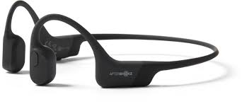
Because they use bone conduction they let me listen for rabbits to eat and dogs to flee while i listen to my tunes. At least if i don't have the volume up to 11.
Not to mention they don't pinch my ears against my head or fall out of my ears like all the other human designed headphones have to date
-
@ben_lubar said in DEAR FIREFOX:
I've been saying that every decision Firefox makes is a decision Chrome made and found out was a bad idea months earlier, but nobody's listening to me.
Except when it comes to privacy.
-
While Firefox is better than Chrome regarding privacy, it didn't prevent Mozilla from making some boneheaded moves on that matter (like doing "experiments" without user consent).
-
@loopback0 said in DEAR FIREFOX:
@ben_lubar said in DEAR FIREFOX:
I've been saying that every decision Firefox makes is a decision Chrome made and found out was a bad idea months earlier, but nobody's listening to me.
Except when it comes to privacy.
Container tabs are cool, but from what I've heard, also not very useful.
-
@dkf said in DEAR FIREFOX:
@El_Heffe That's the sort of thing that gets you idiots accused of being just a bunch of homogenous yankee cowboys, riding alligators down the streets of California.
"Accused" makes it sound like it isn't true.
-
@jinpa said in DEAR FIREFOX:
@dkf said in DEAR FIREFOX:
@El_Heffe That's the sort of thing that gets you idiots accused of being just a bunch of homogenous yankee cowboys, riding alligators down the streets of California.
"Accused" makes it sound like it isn't true.
course it isn't aligators are native to florida not california.
They ride armadillos.
-
@levicki said in DEAR FIREFOX:
@Vixen said in DEAR FIREFOX:
course it isn't aligators are native to florida not california.
They ride armadillos.
I like to ride fire foxes.
-
@Steve_The_Cynic said in DEAR FIREFOX:
@Zerosquare said in DEAR FIREFOX:
@Zecc said in DEAR FIREFOX:
Also I'm pretty sure something about the font or text rendering has changed, because everything seems... off.
Readability is now greatly improved on under- or overlined texts, including links. The lines will now be interrupted instead of crossing over a glyph.
It's bogus, of course, because in the link in the doodad box, you can (on older FFs) see one link, while I see three separated by blue commas, and yet somehow they all highlight when I point the mouse at one of them...
EDIT: I'm on 70.0.1.
Chrome Version 79.0.3945.88 (Official Build) (64-bit) here, can confirm!

-
@Carnage said in DEAR FIREFOX:
It's actually quite common for logos to go from more detailed to less detailed over time, until they are just a tape worm-ish crude joke of the original logo.
So, in other words, the people at Mozilla aren't the only ones who are stupid and incompetent.
-
@El_Heffe said in DEAR FIREFOX:
@Carnage said in DEAR FIREFOX:
It's actually quite common for logos to go from more detailed to less detailed over time, until they are just a tape worm-ish crude joke of the original logo.
So, in other words, the people at Mozilla aren't the only ones who are stupid and incompetent.
I remember that the Microsoft Office logos became more sophisticated until they reached the point that they could not go any further in that direction. So then they made them simpler.
-
@levicki said in DEAR FIREFOX:
@Zecc @Zerosquare @Steve_The_Cynic @Tsaukpaetra
On the other hand, IE11 renders it normally:
Same on Edge. But there's a reason for this...
So much for stable .vs. Agile.
Edit1: Here is what causes it...
In Chrome 57 we shipped support for
text-decoration-skip: ink;which allows skipping descenders in underlines. We initially suggested making it the default in the intent process but dropped this part for shipping because we had assumed a spec change was required. We would now like to enable ink skipping by default.That was made default in Chrome 64 and above, and it seems Firefox now also supports that useless shit which makes a single link look like several links. There is an extension to disable it (not checked personally and not endorsing it, use at your own risk).
Edit2: I wish web browsers had a way of blacklisting certain CSS gimmicks, I might suggest this to uBlock Origin author.
Let's look at two pages on MDN:
 text-decoration-skip - CSS: Cascading Style Sheets | MDN
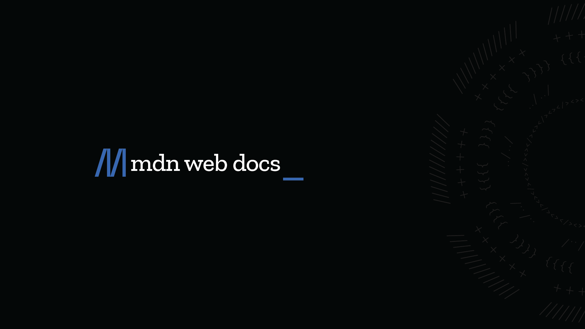
The text-decoration-skip CSS property sets what parts of an element's content any text decoration affecting the element must skip over. It controls all text decoration lines drawn by the element and also any text decoration lines drawn by its ancestors.
text-decoration-skip-ink - CSS: Cascading Style Sheets | MDN
The text-decoration-skip-ink CSS property specifies how overlines and underlines are drawn when they pass over glyph ascenders and descenders.
Neither of these abortions is supported on IE, nor on Edge, and much of what's on both those pages works wildly differently on Edge vs FF 71.0.
-
@levicki said in DEAR FIREFOX:
Edit2: I wish web browsers had a way of blacklisting certain CSS gimmicks, I might suggest this to uBlock Origin author.
If only there were an extension that let you do it yourself or even let others do the work for you. :)
-
@levicki said in DEAR FIREFOX:
@Parody said in DEAR FIREFOX:
If only there were
Cool, wasn't aware of Stylus. However, that's like using an M60 to kill a cockroach. I had something simpler in mind.
Sure, but once you've got the
M60hammer, you'll find out so manycockroachesnails tokillhit!
-
@Tsaukpaetra It's nice to be able to decrapify sites that either don't bother or actively have bad design. Or add dark mode where they don't have it, etc
-
@Parody said in DEAR FIREFOX:
@levicki said in DEAR FIREFOX:
Edit2: I wish web browsers had a way of blacklisting certain CSS gimmicks, I might suggest this to uBlock Origin author.
If only there were an extension that let you do it yourself
If only we didn't have to add more and more extensions to undo Mozilla's stupid design decisions.
-
@El_Heffe said in DEAR FIREFOX:
@Parody said in DEAR FIREFOX:
@levicki said in DEAR FIREFOX:
Edit2: I wish web browsers had a way of blacklisting certain CSS gimmicks, I might suggest this to uBlock Origin author.
If only there were an extension that let you do it yourself
If only we didn't have to add more and more extensions to undo Mozilla's stupid design decisions.
This one you can blame on Google; they set it as the default long before Firefox did. Firefox also has an about:config setting for it.
FWIW, I get quite a bit of use out of user styles and have the extension installed on all my desktop browsers. (Same with uBlock Origin.) That's about it, though.
-
@levicki said in DEAR FIREFOX:
@Steve_The_Cynic said in DEAR FIREFOX:
Neither of these abortions is supported on IE, nor on Edge
Don't get me wrong, I understand the need to control underlining (though it is more important for Asian languages)
For sure, but the default (if the thing is unspecified) should be "like it was before", and for preference also it should match what people do. In English (for sure, but I'd bet all other Roman-alphabet languages do it the same), conventionally we underline the whole thing, with a few oddities like whether we put gaps between words. However, the underline in a web link is not normal underlining (for emphasis), but the in-text equivalent of the frame around a GUI button - it shows that the link is an active element - and should not be treated like underline-for-emphasis.
-
Firefox 75 redesigned the url bar in a horrible way.
https://www.reddit.com/r/firefox/comments/fwhlva/address_barawesomebar_design_update_in_firefox_75/
-
@marczellm said in DEAR FIREFOX:
Firefox 75 redesigned the url bar in a horrible way.
Is there something that describes what happened? There's nothing obvious when I follow the link to reddit. Looking at FF now (it updated this morning) I don't see anything obvious, but I mostly just use it to play music via pandora.
-
@marczellm
Changelog:- Occasionally market share field required two digits to display. Fixed.
-
@boomzilla said in DEAR FIREFOX:
@marczellm said in DEAR FIREFOX:
Firefox 75 redesigned the url bar in a horrible way.
Is there something that describes what happened? There's nothing obvious when I follow the link to reddit. Looking at FF now (it updated this morning) I don't see anything obvious, but I mostly just use it to play music via pandora.
The only thing I notice is that when I click in the bar to type, it kinda pops out some. And immediately has a drop down of recent places. Different, but not annoying.
-
@dcon hmm...I'm not seeing any popping out. It gets a blue border to indicate focus (instead of dark gray). I do get the drop down when I start typing. But again, I don't remember really using it previously so
 .
.Maybe the pop out is a platform thing? Are you using Windows? I'm on Linux.
-
@boomzilla said in DEAR FIREFOX:
@dcon hmm...I'm not seeing any popping out. It gets a blue border to indicate focus (instead of dark gray). I do get the drop down when I start typing. But again, I don't remember really using it previously so
.Maybe the pop out is a platform thing? Are you using Windows? I'm on Linux.
Yes. Win10. It's not much of a pop out, I just don't remember it before. (checks ubuntu) Yeah, looks pretty much the same between the systems.
-
@boomzilla said in DEAR FIREFOX:
Maybe the pop out is a platform thing? Are you using Windows? I'm on Linux.
Oh..wait...no, the URL bar does pop out. I was looking at search, since that's what the first post I saw at Reddit was talking about.
Doesn't seem like a big deal to me.
-
@levicki Ah, that's the difference. I actually like the pop out better. Now, they just need to compress the whitespace back down to where it was before.
-
@levicki said in DEAR FIREFOX:
There is also another issue -- now when you press Alt+D to get to URL bar it automatically expands search suggestions! If you just wanted to copy the URL now you also have to hit Esc to dismiss that. For fuck sake...
It's still too early. No new tabs, just reading here...
-
@levicki said in DEAR FIREFOX:
Hitting Esc doesn't dismiss the enlargement of the entry box -- it is enlarged as long as it has focus.
Which makes sense. I wouldn't expect any different. It's not even that big. (That's what she said.) You and the reddit people are crazy.
-
@levicki I guess it emphasizes the focus. Probably a reaction / adaptation to the complete retardation that is flat design.
-
@levicki said in DEAR FIREFOX:
@boomzilla said in DEAR FIREFOX:
@levicki I guess it emphasizes the focus. Probably a reaction / adaptation to the complete retardation that is flat design.
The focus is already shown by the rather hard to ignore (and configurable) blinking caret.
Not well.
There are also other ways such as changing the background color of the focused control slightly.
And then you'd bitch about that choice.
I hate flat design, but I hate a mix of flat and 3D even more. They should make up their own fucking minds already.
No, adding some 3D sort of stuff is a step towards sanity for me.
Also, enlarging a textbox control to show focus is retarded -- it even partially obscures the bookmark bar.
Hmmm...I can't even figure out how to turn that on in FF but currently it expands down to the end of the border between the chrome and the actual web page display.
And finally, automatically opening search suggestions on focus and having too cancel it with Esc should DIAF along with whoever thought of that.
I haven't used it enough to have an opinion there but this sentiment is less obviously dumb prima facie like the rest of your so-called issues.
-
@levicki said in DEAR FIREFOX:
@boomzilla said in DEAR FIREFOX:
Hmmm...I can't even figure out how to turn that on in FF
View menu -> Toolbars - > Bookmarks Toolbar.
Here's my menu: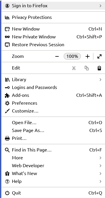
-
@levicki said in DEAR FIREFOX:
IMO it looks like dog shit
Yes
@levicki said in DEAR FIREFOX:
The focus for textbox controls is already shown by a rather hard to ignore (and OS configurable) blinking caret.
Except for shitty apps that reimplement the textbox in a shitty way so that it shows a caret despite not being focused.
@boomzilla said in DEAR FIREFOX:
View menu -> Toolbars - > Bookmarks Toolbar.
Here's my menu:
The traditional menus are unhidden by pressing Alt.
In the big all-in-one menu you can use Customize to disable the bookmarks toolbar.
-
@levicki said in DEAR FIREFOX:
@boomzilla said in DEAR FIREFOX:
Here's my menu:That's not the right menu.

I guess it's because you are on Linux?
Have you tried Alt or F10 to see if something similar shows up?
Not until @marczellm mentioned it to me. Like I said, I don't really do much more than listen to pandora in that browser.
-
@levicki said in DEAR FIREFOX:

Adding to this (since people are seeing different things), the above picture is similar to what I get in 75.x as soon as I click into the address bar, before I've typed anything. It's not a search at that point, just some "here's where we think you're going to go" suggestions. They didn't appear to have any ads/"paid suggestions" in them, but I would guess that's what's coming.
For now you can disable these changes in about:config by turning these off:
browser.urlbar.openViewOnFocus
browser.urlbar.update1
browser.urlbar.update1.interventions
browser.urlbar.update1.searchTips
Then it goes back to the way it looked before 75, without the pop-up of suggestions and without enlarging the address bar text box. These settings may not remain, though. :(
-
@marczellm said in DEAR FIREFOX:
Firefox 75 redesigned the url bar in a horrible way.
Did it? Looks the same to me.
edit: Yeah yeah, the popout thing is slightly different. Big whoop.

 Firefox 70.0, See All New Features, Updates and Fixes