Octopus Deploy (and overly flat designs in general)
-
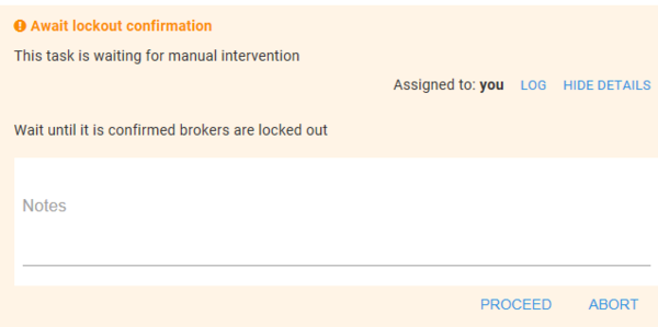
Quiz time. Where do you click to write notes in the above screenshot?
- the top of the white area which all looks like a text box
- the word Notes which is styled exactly like most placeholder text in things like this
- Below where it says Notes. Unfortunately, I can't think of a rationalisation for this that makes sense.
If you guessed 3, congratulations. Where were you when I spent far too long trying to work out why I couldn't type any notes in?
-
@jaloopa said in Octopus Deploy (and overly flat designs in general):
Below where it says Notes. Unfortunately, I can't think of a rationalisation for this that makes sense.
It's below the label for what it is, and there's a line to write stuff on. Maybe it would be clearer if only the input area was a white box rather than the whole thing including the label, or if the entire white box was clickable, but as it is it's not hard to figure out.
-
@hungrier said in Octopus Deploy (and overly flat designs in general):
there's a line to write stuff on
Yeah, I can see how that makes sense. Or, rather, it's a convention I've seen before, except that the "Notes" placeholder should be there, except that of course it's not a placeholder.
This is a great example of the sort of inconsistent styling that blakey should be railing about instead of going all CDO about capitalization. Because this has serious impact on usability.
-
@jaloopa said in Octopus Deploy (and overly flat designs in general):
If you guessed 3, congratulations. Where were you when I spent far too long trying to work out why I couldn't type any notes in?
I'm just shocked they actually colored the rest of the background in something other than "the-exact-same-flat-white-as-the-input-box"
-
@hungrier said in Octopus Deploy (and overly flat designs in general):
It's below the label for what it is
If the label had less whitespace above it/was aligned to the top of that container, it would've been a lot easier to figure out:
-
@bb36e said in Octopus Deploy (and overly flat designs in general):
If the label had less whitespace above it/was aligned to the top of that container, it would've been a lot easier to figure out:
Even then, it should be above the box entirely. And clicking anywhere in the box should get you a cursor and let you start typing.
-
@boomzilla said in Octopus Deploy (and overly flat designs in general):
@hungrier said in Octopus Deploy (and overly flat designs in general):
there's a line to write stuff on
Yeah, I can see how that makes sense. Or, rather, it's a convention I've seen before
I think it's supposed to mimick real-world notebooks with lines to write on. In the pure tradition of skeuomorphic designs, which are now supposed to be soooo last-millenium, and thus dead and replaced by the new and much easier to use "flat" design.
-
@remi I congratulate Octopus on skilfully and perfectly combining the worst of both approaches
-
@remi said in Octopus Deploy (and overly flat designs in general):
I think it's supposed to mimick real-world notebooks with lines to write on. In the pure tradition of skeuomorphic designs, which are now supposed to be soooo last-millenium, and thus dead and replaced by the new and much easier to use "flat" design.
Yeah, and it can make sense as placeholders for inline editing. Just that they totally blew it.
-
@remi It might also have worked if there were more lines to fill that giant white box, because that line now just looks like some CSS artifact.
-
@jbert said in Octopus Deploy (and overly flat designs in general):
@remi It might also have worked if there were more lines to fill that giant white box, because that line now just looks like some CSS artifact.
Speaking of-- is it just the screenshot, or is the inputbox actually off-center with no right border?
-
@lorne-kates said in Octopus Deploy (and overly flat designs in general):
Speaking of-- is it just the screenshot, or is the inputbox actually off-center with no right border?
As luck would have it, I need to push out another one. Here's a less cropped screenshot
-
@hungrier said in Octopus Deploy (and overly flat designs in general):
but as it is it's not hard to figure out.
Don't be an ass.
The FP in this thread contains incontrovertible proof that it is hard to figure out.
The correct response to a demonstrable usability problem isn't, "well you're just a dummy dum dum idiot moron", it's "ok; how do we fix this problem?"
-
@boomzilla said in Octopus Deploy (and overly flat designs in general):
This is a great example of the sort of inconsistent styling that blakey should be railing about instead of going all CDO about capitalization. Because this has serious impact on usability.
What makes you think I wouldn't have criticized this had I seen it before?
-
@blakeyrat You're right, it's not like I suggested some ways it could be better in that same post or anything
-
@blakeyrat said in Octopus Deploy (and overly flat designs in general):
@boomzilla said in Octopus Deploy (and overly flat designs in general):
This is a great example of the sort of inconsistent styling that blakey should be railing about instead of going all CDO about capitalization. Because this has serious impact on usability.
What makes you think I wouldn't have criticized this had I seen it before?
What makes you think I don't think you would have? I was just making fun of you for getting mad about your food touching again.
-
@hungrier The "it's not hard to figure out" line after a post demonstrating that it is indeed hard to figure out is what annoyed me.
It's like you're LOOKING at a house on fire and saying "that house isn't on fire".
-
@blakeyrat said in Octopus Deploy (and overly flat designs in general):
It's like you're LOOKING at a house on fire and saying "that house isn't on fire".
Then again, some on this forum would pull out the gasoline.
-
@jbert True dat.
UI Rage is a powerful force. Earlier this week when the news was like "active shooter in YouTube headquarters", I was thinking, "I'm surprised it took THIS long for their shitty-ass software to anger someone to active shooter levels. I've been there and I just upload dumbshit gaming videos."
Maybe also the real reason Git is decentralized.
-
@jbert
Assuming they weren't already walking away with a smile on their face coughPolygeekerycough
-
#3 because I too use Octopus.
-
@blakeyrat said in Octopus Deploy (and overly flat designs in general):
active shooter in YouTube headquarters
I was completely unaware of that. Wow.
And back on topic, that UI is horrible.
-
@blakeyrat said in Octopus Deploy (and overly flat designs in general):
FP
I literally have never seen this initialism used for what I assume is "first post".
-
@weng said in Octopus Deploy (and overly flat designs in general):
#3 because I too use Octopus.
We upgraded while I was off on paternity leave. In some ways it's a bit nicer than the old version but they've really jumped the shark with the flat design
-
Multiline textareas in Material Design are poorly designed, I think because Google's preferred behaviour is that they "autosize".
I've played with Octopus 4 and I see the same behaviour. As Octopus 4 is built using React, I tried the textfield component on their website on Chrome 65 and I see the same behaviour happening. However...
#1 works, but only when I double click the white space above the label (The Angular version of MD allows single clicking)
#2 works as expected
#3 also just works@Jaloopa which browser do you use?
-
@blakeyrat said in Octopus Deploy (and overly flat designs in general):
Maybe also the real reason Git is decentralized.
I think this really may be the best reason ever presented.
-
@jaloopa said in Octopus Deploy (and overly flat designs in general):
We upgraded while I was off on paternity leave. In some ways it's a bit nicer than the old version but they've really jumped the shark with the flat design
I'm not its biggest fan, but I'll take it in exchange for the new infrastructure page. Trying to work with some 700 servers on the old one was a mess.
-
@jaloopa said in Octopus Deploy (and overly flat designs in general):
guessed 3
Only because material design has recently taught me so.
-
@tsaukpaetra said in Octopus Deploy (and overly flat designs in general):
@jaloopa said in Octopus Deploy (and overly flat designs in general):
guessed 3
Only because material design has recently taught me so.
Yeah, the styling is pretty clearly material flavored.
Of course, it's wrong because it should have some kind of definition for the input field and the input field should be at the top of that box. But yeah, it's poorly implemented material design so I'd probably figure it out fairly quickly.
-
Since "notes" is a label, clicking on it should have focused the text box. That's the first thing I'd change to fix this.
-
@hungrier said in Octopus Deploy (and overly flat designs in general):
It's below the label for what it is, and there's a line to write stuff on. Maybe it would be clearer if only the input area was a white box rather than the whole thing including the label, or if the entire white box was clickable, but as it is it's not hard to figure out.
Btw, I wonder if there had anyone proposed a style for textarea that can specify lower border for each line?
AFAIK we have to use workarounds like this now.
-
@jaloopa said in Octopus Deploy (and overly flat designs in general):
Quiz time. Where do you click to write notes in the above screenshot?
- the top of the white area which all looks like a text box
- the word Notes which is styled exactly like most placeholder text in things like this
- Below where it says Notes. Unfortunately, I can't think of a rationalisation for this that makes sense.
If you guessed 3, congratulations. Where were you when I spent far too long trying to work out why I couldn't type any notes in?
Also, what's with the color choice? If your contrast is low enough or you're looking at your screen with the right angle, then the white text box is indistinguishable from the pink dialog.