Trivia time: did you know??????????????
-
@aliceif I do, sometimes.

-
@Zecc said in Trivia time: did you know??????????????:
@Zecc said in Trivia time: did you know??????????????:
But I concede the current icon might be a better solution for mobile.
@aliceif said in Trivia time: did you know??????????????:
Uh, the last time I checked, the editor on phones is full screen ...
Does not necessarily mean what I said is wrong.

Why does the autocompletion of
:grin:(there when I type:gr) go away after I type ani(ie, if I type:gri)?Autocomplete has been completely fucked for about a week.
-
@abarker I need that puppy now.
-
@anonymous234 Talk to Cesar Millan.
-
I agree with @blakeyrat that the icon is bad. Or rather, the icon itself is relatively good but using a button with an icon to resize is (at least on desktop, I'm less sure for mobile) not seen anywhere. On desktop, what you expect is to drag the boundary of the text area, as many people have said, and having an button instead is retarded.
Also, if we absolutely must keep the button, I have a feeling that it would be best located on the right. You have buttons to post or cancel, red boob to maximise, both on the right. Also on a desktop app the buttons to interact with the window (minimise, close...) are on the right, and they are conceptually the closest thing to this stupid button. And on the left, you've got the buttons to edit the text you're typing and this resize button has nothing to do with that. So move that button to the right.
-
@aliceif I do as well (I'm doing it right now). But when holding it on landscape mode, I get the not-full-screen composer, which is entirely broken an unusable in this case (it pops up nicely but when I touch anywhere in it to show the keyboard, I end up with only the composer area - not in full screen, just messed up).
In portrait mode, I get the full screen composer, which at least I can use, so it's better than in landscape...
-
@remi said in Trivia time: did you know??????????????:
red boob to maximise,
Uh, no.
That's not what it does.
-
@remi said in Trivia time: did you know??????????????:
on a desktop app the buttons to interact with the window (minimise, close...) are on the right
On Windows.
On OS X, they're on the left, and on Linux, it depends on the distro/desktop environment.
The best spot for a resize button would be in the middle, since that's where everyone seems to put whatever other indicator that a pane could be resized.
-
Here.
.composer .resizer {
    left: 0;
}

.composer .resizer .trigger {
    width: 100%;
    height: 20px;
    top: -24px;
    left: 0;
    margin: 0;
    padding-left: 20px;
    background: none !important;
    border: none !important;
    border-radius: 0;
    line-height: 26px;
    cursor: ns-resize;
    text-align: left;
}

.composer .resizer .trigger i {
    color: #333;
    background: rgba(255,255,255,.5);
    border-radius: 50%;
    height: 22px;
    width: 22px;
    text-align: center;
}

.composer .resizer:hover .trigger i {
    visibility: hidden;
}
edit: cross-posted in Can we have an official NodeBB-Stylish/userscript topic now?.
-
@ChaosTheEternal said in Trivia time: did you know??????????????:
The best spot for a resize button would be in the middle
+1
-
@remi said in Trivia time: did you know??????????????:
I agree with @blakeyrat that the icon is bad.
I agree with @blakeyrat that literally every icon, UI hint, UX interaction, design decision, layout and css choice for NodeBB is bad.
-
@flabdablet said in Trivia time: did you know??????????????:
@blakeyrat said in Trivia time: did you know??????????????:
This forum just wants a punching bag,
We have more than enough Bozos here already; we don't need any more.
-
@Lorne-Kates said in Trivia time: did you know??????????????:
@remi said in Trivia time: did you know??????????????:
I agree with @blakeyrat that the icon is bad.I agree with @blakeyrat that literally every icon, UI hint, UX interaction, design decision, layout and css choice for NodeBB is bad.
I wouldn't say all of them, maybe not even most of them, but an awful lot of them are bad. The divider between the panes is almost invisible. The resize widget doesn't follow any UI conventions. But I don't agree with Blakey that it's undiscoverable — the double-headed arrow makes it fairly obvious, IMHO — nor that it blends in with the avatars. Its close proximity to avatars depends on your window size; it isn't necessarily near them. Even when it is vertically aligned with them, which it is at my normal desktop window size, it doesn't scroll with them; the proximity of the avatars probably makes the widget less noticeable, but the scrolling behavior is so different that it never even occurred to me to associate it with the avatars until Blakey mentioned it.
The red boob, OTOH, is probably the most illogical, unintuitive UI widget I've ever seen. An absurdly grinning pile of
 would convey the meaning of its function equally well — i.e., not at all.
-
@HardwareGeek said in Trivia time: did you know??????????????:
nor that it blends in with the avatars. Its close proximity to avatars depends on your window size; it isn't necessarily near them
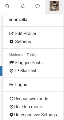
Depends on whether you're browsing in responsive or desktop mode.
-
@HardwareGeek said in Trivia time: did you know??????????????:
maybe not even most of them
The lack of borders makes it impossible to visually deliminate the start and end of posts, so everything bleeds into each other. There formatting of lists between different list pages is inconsistent. The choice of alignment of widgets is all over the place. There is no consistent "reading line" that you can follow from top to bottom due to random indentation. The font size is too small. Input fields don't have borders to distinguish them from read-only labels. Following a hyper-link to a thread takes you to last read instead of first unread. Information density on list pages is at most 1-2 posts instead of dozens that is standard in other forums. Information is intentionally truncated in stupid places. Notifications (toaster and menu) don't sufficiently indicate which which post was acted upon, making them useless. Formatting of the notification menu has inconsistent alignment, you there's no scan-line to run down the list to see what's happened. Post streaming is broken enough to be unusable and unreliable, leading to gaps in the conversation. Mute/ignore is inconsistent and doesn't meet user expectation. Chat's don't follow the same formatting or workflow as posts. Searching sucks. Pagination is inconsistent across lists and STILL results in paging errors.
Off the top of my head.
-
@Lorne-Kates said in Trivia time: did you know??????????????:
Notifications (toaster and menu) don't sufficiently indicate which which post was acted upon, making them useless. Formatting of the notification menu has inconsistent alignment, you there's no scan-line to run down the list to see what's happened.
Speaking of notifications, the one that bothers me the most is that, AFAICT, when there are more new notifications than the list currently feels like displaying, there is absolutely no discernible rhyme or reason to which it shows and which it hides.
-
@boomzilla said in Trivia time: did you know??????????????:
Depends on whether you're browsing in responsive or desktop mode.
What's the difference? Besides one pixel?

-
@aliceif said in Trivia time: did you know??????????????:
@remi said in Trivia time: did you know??????????????:
red boob to maximise,
Uh, no.
That's not what it does.You're right. Still, it changes the size of the composer area, so there is no reason for the resize button not to be next to it.
But if we're talking about the UI of the composer, the red boob is even worse than the resize button anyway (you might have an idea of what the resize button dies before clicking it, for the red one there is absolutely no chance of that... not only the "+" is not expressive, the little idea that it may convey is wrong!), so maybe get rid of both and put something sane instead.
-
@ChaosTheEternal said in Trivia time: did you know??????????????:
@remi said in Trivia time: did you know??????????????:
on a desktop app the buttons to interact with the window (minimise, close...) are on the right
On Windows.
On OS X, they're on the left, and on Linux, it depends on the distro/desktop environment.
Yeah well, you can't ever use Linux as a comparison for UI since there will always be someone who found one weird WM that doesn't follow whatever convention you might be mentioning. Anyway, my main point is that it is beyond retarded to put controls for similar things (manipulating the text area) in widely different places. The only thing that these controls manage to do is that they are close to the object they manipulate (i.e. the resize button is not in the top of the window).
But saying so is really like someone trying to find something nice to say about a 3-years old craft project... (though since we're talking of
 might be something of the truth)
The best spot for a resize button would be in the middle, since that's where everyone seems to put whatever other indicator that a pane could be resized.
The best spot for a resize button would be nowhere at all, since that's the wrong UI. The best spot for a resize widget might be in the middle, yes.
-
@Lorne-Kates said in Trivia time: did you know??????????????:
The lack of borders makes it impossible to visually
deliminatedelineate the start and end of posts, so everything bleeds into each other.ThereTheir formatting of lists between different list pages is inconsistent. The choice of alignment of widgets is all over the place. There is no consistent "reading line" that you can follow from top to bottom due to random indentation. The font size is too small. Input fields don't have borders to distinguish them from read-only labels. Following ahyper-linkhyperlink to a thread takes you to last read instead of first unread. Information density on list pages is at most 1-2 posts instead of dozens that is standard in other forums. Information is intentionally truncated in stupid places. Notifications (toaster and menu) don't sufficiently indicate whichwhichpost was acted upon, making them useless. Formatting of the notification menu has inconsistent alignment,youthere's no scan-line to run down the list to see what's happened. Post streaming is broken enough to be unusable and unreliable, leading to gaps in the conversation. Mute/ignore is inconsistent and doesn't meet user expectation. Chat's don't follow the same formatting or workflow as posts. Searching sucks. Pagination is inconsistent across lists and STILL results in paging errors.Off the top of my head.
Man, you really gave @accalia a run for her money there.
-
@abarker said in Trivia time: did you know??????????????:
@Lorne-Kates said in Trivia time: did you know??????????????:
The lack of borders makes it impossible to visually
deliminatedelineate the start and end of posts, so everything bleeds into each other.ThereTheir formatting of lists between different list pages is inconsistent. The choice of alignment of widgets is all over the place. There is no consistent "reading line" that you can follow from top to bottom due to random indentation. The font size is too small. Input fields don't have borders to distinguish them from read-only labels. Following ahyper-linkhyperlink to a thread takes you to last read instead of first unread. Information density on list pages is at most 1-2 posts instead of dozens that is standard in other forums. Information is intentionally truncated in stupid places. Notifications (toaster and menu) don't sufficiently indicate whichwhichpost was acted upon, making them useless. Formatting of the notification menu has inconsistent alignment,youthere's no scan-line to run down the list to see what's happened. Post streaming is broken enough to be unusable and unreliable, leading to gaps in the conversation. Mute/ignore is inconsistent and doesn't meet user expectation. Chat's don't follow the same formatting or workflow as posts. Searching sucks. Pagination is inconsistent across lists and STILL results in paging errors.Off the top of my head.
Man, you really gave @accalia a run for her money there.
ony 5 "errors" in taht post? i tnihk that yuo misunderstimate me.
-
@accalia Toby fare, I may have missed something. It was a quick proof read. But you are correct, I am sorry to impugn your (dis?)honour.
-
@abarker said in Trivia time: did you know??????????????:
Man,
youewe really gave @accalia a run for her money there.
-
@Lorne-Kates said in Trivia time: did you know??????????????:
ewe
I really don't want to know what you do when you're not murdering trans hookers. (No, I don't want to know what you do when you are murdering them, either.)
Ob trivia: My phone has learned to suggest "trans" as the word to follow "murdering," and "hookers" to follow "trans."
-
@aliceif said in Trivia time: did you know??????????????:
@abarker said in Trivia time: did you know??????????????:
Are tablets not mobile anymore? Do I need to update my internal dictionary?
Does anyone even use tablets to read forum posts?
No, only to create topics.
-
@HardwareGeek said in Trivia time: did you know??????????????:
(No, I don't want to know what you do when you are murdering them, either.)
Unsurprisingly, then answer is "murdering trans hookers".
-
@HardwareGeek said in Trivia time: did you know??????????????:
Ob trivia: My phone has learned to suggest "trans" as the word to follow "murdering," and "hookers" to follow "trans."
If I type "fist" my phone suggests "-fucking" to follow.
-
@blakeyrat said in Trivia time: did you know??????????????:
Fuck all of this. Delete this topic. Delete this forum. Delete it all.
Yaaaay! Welcome back. You've been missed!
-
@Lorne-Kates said in Trivia time: did you know??????????????:
Unsurprisingly, then answer is "murdering trans hookers".
I figured you probably get some sort of ... enjoyment ... besides the murder itself. No, I don't want to know. I already know you're a sick sociopath
; I don't need details.
-
@HardwareGeek said in Trivia time: did you know??????????????:
@Lorne-Kates said in Trivia time: did you know??????????????:
Unsurprisingly, then answer is "murdering trans hookers".
I figured you probably get some sort of ... enjoyment ... besides the murder itself. No, I don't want to know. I already know you're a sick sociopath
; I don't need details.So I shouldn't tell you to just imagine the sound of popcorn and Vasoline in an industrial blender?
-
@abarker said in Trivia time: did you know??????????????:
it was likely that your reading of @Yamikuronue's post was colored by having just read @Polygeekery's
polyleakery
-
@jaming said in Trivia time: did you know??????????????:
Do you all honestly think the current design is better than his proposal?
No
Or are you all just assholes?
Yes. More or less.
@Lorne-Kates said in Trivia time: did you know??????????????:
Searching sucks.
What searching?
I have no fucking sense of design or art or that crap and I am sure my design would be more descoverable than current

 's
's
BTW, you have to click on the button then it opens up a shell and you have to use
gitto commit the new height in yards/pixel.
-
@blakeyrat said in Trivia time: did you know??????????????:
Fuck all of this. Delete this topic. Delete this forum. Delete it all.
I'm doing my part of it.
-
@dse said in Trivia time: did you know??????????????:
BTW, you have to click on the button then it opens up a shell and you have to use
gitto commit the new height in yards/pixel.It's been 2 months and this post only has 2 upvotes. I can only assume it's because the joke is too close to reality.
-
@Polygeekery said in Trivia time: did you know??????????????:
Nonsense. For you it left off with you rage quitting because someone called you out for insulting Ben.
He is offensive but writes interesting rants I liked to read. Fuck you for bullying him out of the forum again.
-
@ben_lubar it has only 2 upvotes because people come to this topic only to read @blakeyrat's rant.
-
@fbmac said in Trivia time: did you know??????????????:
He is offensive but writes interesting rants I liked to read.
Interesting? No. More like entertaining.
-
@Gąska Remember when your tiny European country is annihilated in WWIII it was because 1. you ALL WERE ASSHOLES to @blakeyrat 2. he rage quit and as a result 3. president Trump grabbed the president's daughter by the pussy.
-
@dse Poland gets annihilated only on even numbered world wars.
Also:
@dse said in Trivia time: did you know??????????????:
- you ALL WERE ASSHOLES to @blakeyrat
Not all of us. Some people registered after he stopped posting.
@dse said in Trivia time: did you know??????????????:
- he rage quit and as a result
He's still lurking, so not really a ragequit. TBH, he has a terrible record of ragequitting.
@dse said in Trivia time: did you know??????????????:
- president Trump grabbed the president's daughter by the pussy.
That photo was shopped.
-
@Gąska said in Trivia time: did you know??????????????:
people come to this topic only to read @blakeyrat's rant.
I thought blakey was back until I saw it was an old topic :(
-
@fbmac said in Trivia time: did you know??????????????:
@Polygeekery said in Trivia time: did you know??????????????:
Nonsense. For you it left off with you rage quitting because someone called you out for insulting Ben.
He is offensive but writes interesting rants I liked to read. Fuck you for bullying him out of the forum again.
Oh fuck off. If his skin is that thin, he could not handle the shit he lumps on other people. That would make him a hypocrite.
-
This post is deleted!
 Amazon.com: WARM FUZZY Toys - The Original 46" Bozo The Clown Inflatable 3-D Bop Bag (452) Works Great for Ages 3+ and at Home, in The Classroom or as an Energy/Stress Reliever : Toys & Games