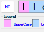
Bad choice of font
-
-
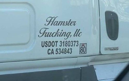
@boomzilla What does “Trucking, Uc" mean?
-
@Gurth said in Bad choice of font:
@boomzilla What does “Trucking, Uc" mean?
In case of mishap they are only required to issue a sympathetic "Uc" sound.
-
@Gurth said in Bad choice of font:
@boomzilla What does “Trucking, Uc" mean?
No, no, they do hamster fucking, you see.
-
Not so much bad font as it is bad layout, but
-
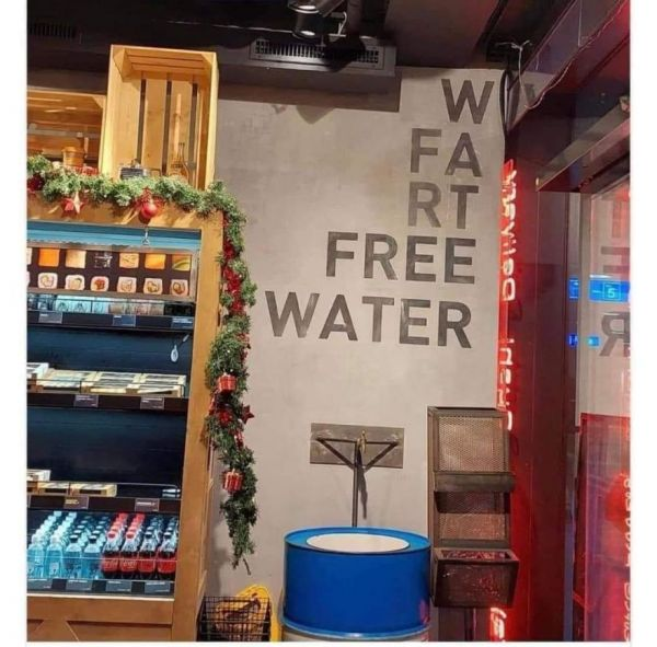
@Zecc, you prefer your water with farts in it? (or w-farts at the very least)
-
@kazitor Does the loose w stand for wet?
-
@PleegWat If so, I don't want any of the water ...
-
-
@PleegWat said in Bad choice of font:
@kazitor Does the loose w stand for wet?
I first read it as "we". They have drugs for loose stools, ya know...
-
-
-
Not anywhere I want to find crabs.

-
-
@boomzilla Reminds me of this:
-
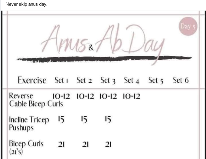
One I noticed yesterday, in my own home of all places:

-
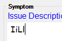
Status: This is meant to be the password descriptor.
Assholes.
Which is even more egregious because elsewhere they use a font that at least has distinction!
-
@Tsaukpaetra said in Bad choice of font:
Status: This is meant to be the password descriptor.
Assholes.
Which is even more egregious because elsewhere they use a font that at least has distinction!
And once again, we see why Comic Sans is the best font.
-
@da-Doctah Great choice for user-hostility for a bug report- "... yeah, it looks pretty stupid written out, I must be the problem..."
-
-
-
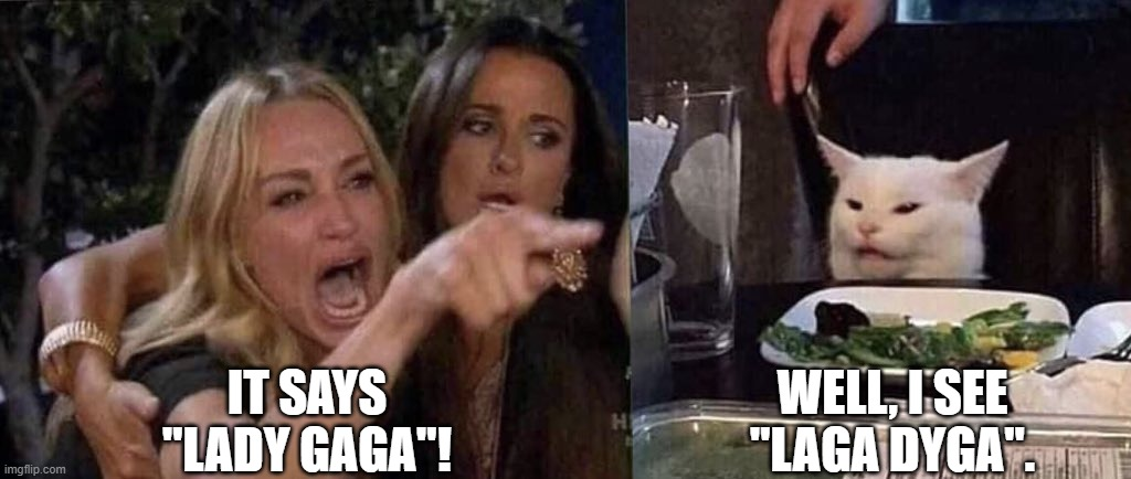
@dkf LAGA DYGA has a nice ring to it unlike her name or the music that she makes.
-
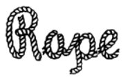
Bad choice of 'o' design, considering the font's own name.
-
@Zecc said in Bad choice of font:
Bad choice of 'o' design
That simply ain't no o, cursive o connects from the top of the loop.
-
There’s some bad ligatures attached to that for sure.
-
-
-
@Arantor said in Bad choice of font:
There’s some bad ligatures attached to that for sure.
I rather think there aren't and that's the problem. Checking the site, it looks like all connectors are in the same vertical position, while in real cursive the position of the connector very much depends on which letters are being connected.
-
@PleegWat said in Bad choice of font:
@Arantor said in Bad choice of font:
There’s some bad ligatures attached to that for sure.
I rather think there aren't and that's the problem. Checking the site, it looks like all connectors are in the same vertical position, while in real cursive the position of the connector very much depends on which letters are being connected.
Even that wouldn't be that much of a problem if they chose a higher point for the connection—which they totally could, because the stroke for each minuscule cursive letter starts raising to the median (top of the low letters) except for e, which starts with the horizontal stroke midway between the baseline and median. So if they let the trailing connection raise that high, the difference between a, with the stroke going all the way to baseline before raising up again and o with the connector just descending from the median, would be clear enough.
Looking again, the real problem is that the design of o is just plain wrong. The connection should start with a little loop at the top of the letter and lead down from there (before turning up into the next letter).
-
@PleegWat said in Bad choice of font:
@Arantor said in Bad choice of font:
There’s some bad ligatures attached to that for sure.
I rather think there aren't and that's the problem. Checking the site, it looks like all connectors are in the same vertical position, while in real cursive the position of the connector very much depends on which letters are being connected.

-
@Bulb Yeah, the o->p connector is just bad when it appears in the typeface's own name (ffs), but the one that makes my teeth itch is the p->e connector, where the heights of the two sides of the junction don't match.
Overall, a badly designed typeface.
-
@Steve_The_Cynic One would think all of those connectors should be handled with ligatures rather than being hardcoded into the glyph. But it's a free font (for memes, if the fontmeme.com domain is to be believed) so the maker has no incentive to put that much effort into it.
-
@hungrier In that context, the o/a confusion may even be intentional.
-
@hungrier Contextual alternates should work fine. Have a normal set of lowercase letters, and an alternate set to use if the preceding character was one of
b|o|r|v|w.
-
Just up today on xkcd:
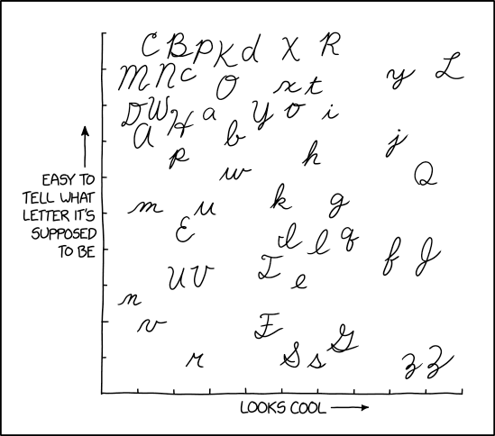
I don't see an uppercase Q like the ones they taught us back in elementary school. I do see something Q-shaped, but it doesn't look anything like our Qs.
-
-
@da-Doctah said in Bad choice of font:
I don't see an uppercase Q like the ones they taught us back in elementary school. I do see something Q-shaped, but it doesn't look anything like our Qs.
Yeah, our Q was a big 2, basically. We did most of the capital letters with a loop at the start: sort of like the H here, but the loop was a bit larger.
We also did T and F with just a ^ type of stroke (curve up-straight down-hook right into the next letter and come back later to add the top and cross marks) instead of a top and a partial 2.
Not that any of this matters these days; the only thing I write in cursive with any regularity is my signature, and that's more of a scribble.
-
I was about to draw how I've learned cursive, but someone's already done the work for me:
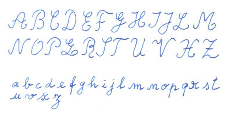
My A, M and N would be pointier though. And the G and J would definitely reach under the baseline, and the S shape better defined.
-
@Zecc Your font is missing some letters — K, W, Y. That's a weird way of writing an X; it looks more like an H to me. And
 is that bizarre squiggle between P and R?
-
@HardwareGeek said in Bad choice of font:
Your font is missing some letters — K, W, Y.
More like: our alphabet was missing those letters. And in fact still does except for loan words.
@HardwareGeek said in Bad choice of font:
That's a weird way of writing an X; it looks more like an H to me.
I agree. I would have written it with the two halves touching, even if I kept the horizontal stroke.
@HardwareGeek said in Bad choice of font:
And
is that bizarre squiggle between P and R?I know. I always questioned why that one looked like... that.

-
@Zecc said in Bad choice of font:
our alphabet was missing those letters.
Your alphabet is defective.

the two halves touching,
The way I was taught looked like it was supposed to be written as at left (edit: come to think of it, I think the arrows on the diagram explicitly showed drawing it that way), but eventually I figured out it was much more reasonable, at least to me, to write it as at right.
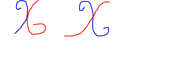
I always questioned why that one looked like... that.
Looking at it again, I can see a semblance to a captial version of
q.
-
-
@dcon said in Bad choice of font:
@Parody said in Bad choice of font:
and that's
more ofa scribble.FTFM
It'd be more legible if digital signature pads had a polling rate and dpi upwards of the KoalaPad I used for drawing with my Commodore 64. Sure, my pen-and-paper signature isn't great, but at least you can make out some letters. :)
-
@Parody My pen-and-paper signature is
completelymostly readable. It's gotten sloppier as I've gotten older, more hurried, and less careful, but only the last two letters of my first and last names are too sloppy to make out individual letters.I'm happy if my signature on a digital signature pad even vaguely resembles my real signature.
-
@Parody said in Bad choice of font:
Sure, my pen-and-paper signature isn't great, but at least you can make out some letters. :)
I can make out the first letter of each part. About 30% of the other make sense - but only because I know what my name is. The rest? Pure scribbles.
-
@hungrier said in Bad choice of font:
so the maker has no incentive to put that much effort into it
Apparently not even pride in a job well done...
-
-

Alternatively could have been a candidate for 'things that remind you of WDTWTF members'.