Can we have an official NodeBB-Stylish/userscript topic now?
-
I figure since the instance on Bens Server is not active anymore, I might as well post this again:
1 Stylish to remove a lot of the white-space (and remove tags from the frontpage):
@namespace url(http://www.w3.org/1999/xhtml);

@-moz-document domain("what.thedailywtf.com") {
  .forum-logo{
    height:50px !important; /* "Make my Logo bigger"-cream */
    width:50px !important;
  }

  nav.navbar.header{
    border-bottom:2px solid #000; /* Preference of mine*/
  }

  /* This "New Topic"-button was HUGE! */
  button.btn#new_topic, .breadcrumb{
    margin-bottom:5px;
    padding-bottom:2px;
    padding-top:0px;
  }

  /* This seperator was HUGE (and pointless) */
  hr.hidden-xs{
    display:none; /* Whitespace can be annoying */
  }

  /* Everything (including the warnings) was HUGE! */
  div.alert.alert-warning{
    padding-bottom: 2px !important;
    padding-top: 2px !important;
    margin-bottom: 5px !important;
    margin-top: 5px !important;
  }

  /* slimming down means less content somehow :D */
  div#content.container{
    padding-top:10px !important;
  }

  ul.topic-list{
    border-bottom: 1px solid #111;
  }

  ul.topic-list li.row{
    border:1px solid #111 !important;
    border-bottom-width: 0px !important;
    padding-top:2px !important;
    padding-bottom:1px !important;
  }

  /* let's contain Zalgo */
  ul.topic-list li.row .content h2.title{
        overflow:hidden !important;
  }

  li.row .avatar.pull-left{
    padding-top:4px; /* center the avatars on the y-axis */
  }
  li.row span.tag{
    display:none; /* Why would I want to see the tags on the frontpage? */
  }

  /* Why are quotes inside the preview so big? */
 div.composer-container div.row.write-preview-container div.preview.well blockquote{
   font-size: inherit !important;
 }
 div.composer-container div.row.write-preview-container div.preview.well blockquote p{
   margin-bottom:0px !important;
 }

/* Disappearing composer is annoying! */
 div.composer .write-preview-container{
 min-height:inherit !important;
 }

/* Ben, you can do better than this
Commented this out for now
 .highlight, .highlight *{
 -webkit-animation: none !important;

 -moz-animation: none !important;

 -o-animation: none !important;

 -ms-animation: none !important;

 animation: none !important;
 }*/
}
and one stylish to make Darkly work mostly (haven't been able to figure all the classes out, yet):
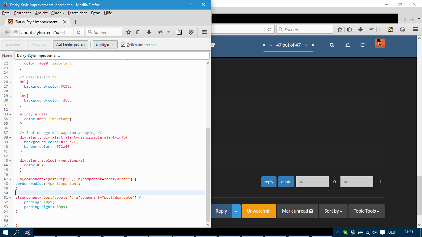
@namespace url(http://www.w3.org/1999/xhtml);

/* Mozilla-stuff? */
@-moz-document domain("what.thedailywtf.com") {

  /* Give me some Zebra-Stripes */
  ul.topic-list li.row:nth-child(odd){
    background-color:#191919 !important;
  }

  /* Topic list read just looks muddy */
  ul.topic-list li.row:not(.unread) div.content h2.title a{
    color:#FFF !important;
  }

  /* New Notifications are almost unreadable on Darky */
  ul.notification-list li.unread, ul.chat-list li.unread{
    background-color: inherit !important;
    border:1px solid #375a7f;
  }
  /* The chatlist is white on white */
  ul.chats-list li, ul.notifications-list li.unread{
    color: #000 !important;
  }

  /* del/ins-fix */
  del{
    background-color:#C55;
  }
  ins{
    background-color: #5C5;
  }

 a del, a ins{
    color:#000 !important;
}

 /* That orange was way too annoying */
  div.alert, div.alert.alert-dismissable.alert-info{
    background-color:#375a7f;
    border-color: #072a4f;
  }

  div.alert a.plugin-mentions-a{
    color:#5AF;
  }

 /* Take care of the drop down arrow on nested quotes */
 i.fa.fa-angle-down.pointer.toggle{
    color:#000000 !important
 }

/* Chat dropdown was unreadable */
ul.chat-search-list li{
 color:#000 !important;
}
}
Feel free to use these as you please and post your own stuff, I guess?
Filed Under: Darkly is still the best skin, though
Edit: Added Zalgo-Overflow protection on the first stylish-set.
Edit2: made link-color in ins/del black
Edit3: Put the quotes inside the preview in line with the actual quotes.... @ben_lubar fixitpls
Edit4: Fixed the stupid composer-half-disappearing bug and relaxed the rules on the notification so that one elusive toaster is hopefully included.
Edit5: Darkly had white on white chat-selection popup.
-
Are you good enough to make one that swaps the little link on the right's URL with the big link on the left in the topic list?
-
That can't be done with CSS; that'd need a userscript
-
@Yamikuronue Pretty sure that is plugin territory and should be handled by the nodeBB-devs.
Filed Under: I agree completely that it should change, though
-
Most of that works well on Superhero too:
-
@Yamikuronue Why is the alert still orange for you, though?
I have it blue like the header...
Filed Under: Should have put more !important in there
-
@Kuro I removed that rule, seemed like it'd clash with my skin choice.
-
@Yamikuronue That is fine then. I was just worried my rule wouldn't work on other skins :D
Filed Under: I might update the OP in a bit
-
Superhero tweaks on top of part of your Darkly tweaks:
/*DARKLY FIXES FROM KURO*/

 /* del/ins-fix */
  del{
    background-color:#C55;
  }
  ins{
    background-color: #5C5;
  }

/* New Notifications are almost unreadable on Darky */

 ul.notification-list li.unread,
 ul.chat-list li.unread {
     background-color: inherit !important;
     border: 1px solid #375a7f;
 }
 /* The chatlist is white on white */

 ul.chats-list li,
 ul.notifications-list li.unread {
     color: #000 !important;
 }
 /* Give me some Zebra-Stripes */

 ul.topic-list li.row:nth-child(odd) {
     background-color: #191919 !important;
 }

/* SUPERHERO: */
/* Notification mark read button*/
#menu .notification-list li .mark-read, .header .notification-list li .mark-read {
    color: #000 !important
}

/*Mentions are low contrast now*/
a.plugin-mentions-a {
    color: #df691a !important
}
-
@Kuro Finally fixed the white on white issue the "return to last read"-toaster had!
Filed Under: That was quite some work
-

-
Page Not Found
The requested page was not found.
-

-
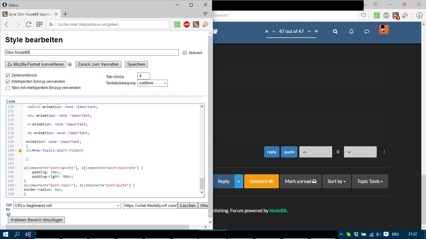
Padding the up/down vote area (copied from another topic):
a[component="post/upvote"], a[component="post/downvote"] {
    padding: 10px;
    padding-right: 8px;
}
span[component="post/vote-count"] {
    padding: 10px 13px;
}
-
-
@ben_lubar You might want to make it mobile only. It's not entirely terrible but having the space for ~3 numbers used for mostly 0s is wasted space :D
Filed Under: Not priority, though... fix the Mod-Abuse
-
Might as well bump this a bit.
Have done some edits to the original styles.
Including (but not limited to):
Making the composer not disappear halfway when it becomes smaller.Just in case anybody was fighting with that.
Filed Under: I know I was
-
Hello,
I'm pretty much just a lurker here, but thanks for posting these Stylish CSS things! They really make things look a lot better.
-
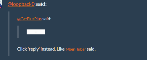
Not sure if this is the place for this, but I discovered that nested quotes have this little white box thing in them, that when clicked shows the text from that post. I'm guessing that the box/button is meant to say something, but if so it's white on white. Is this a CSS thing? I don't really know how this all works. Heh.
-
@Erufael you'll be pleased to find out that the box does not have anything useful written on it.
-
@ben_lubar Noted! Though I'm not sure 'pleased' is the correct word... hehe
-
@Erufael I believe all that's on the box is an arrow...
-
Tree quotes?
-
-
@Erufael Fixed it in the second styling (the last lines).
Thanks for pointing it out.
Filed Under: Going to sleep now, have a good night
-
@Kuro Thanks and you're welcome! As a note, there is an up arrow, too. This works for it:
i.fa.fa-angle-up.pointer.toggle{
    color:#000000 !important
 }
-
Hiding tufty's disgusting avatar:
img[component="user/picture"][data-uid="291"] {
  visibility: hidden;
}

.avatar-wrapper[data-uid="291"] > img {
  visibility: hidden;
}
-
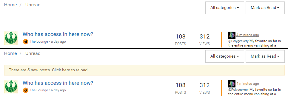
Messing with the padding and margins so the "new posts" bar doesn't shift items in the unread list.
[href="/unread"] .alert, [href="/recent"] .alert {
    margin-bottom: -6px;
    margin-top: -40px;
    padding: 7px 15px;
}
-
I didn't like the "no new topics" bar being the same colour as "some new topics" in Unread, so
  #category-no-topics{
    background-color: #575a7f
  }
-
Added:
/* Ben, you can do better than this */
 .highlight, .highlight *{
 -webkit-animation: none !important;

 -moz-animation: none !important;

 -o-animation: none !important;

 -ms-animation: none !important;

 animation: none !important;
          }
until @ben_lubar stops being hungry, or whatever it is that makes him do this.
Filed Under: sigh
-
@Kuro I think he's reverted it already
-
Cross-posted from the Status thread:
Adding a background to the highlighted post for a time, to help visibility. Here's the original post, including an example set of screenshots.
li[component="post"] { transition:background 5s ease-out; }
li[component="post"].highlight { background-color:rgba(127, 127, 127, 0.25); transition:background 0s linear; }
-
@RaceProUK I wouldn't know :D
Filed Under: thanks, I'll take it off next time I update the style
-
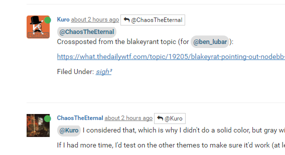
@ChaosTheEternal
Crossposted from the blakeyrant topic (for @ben_lubar):https://what.thedailywtf.com/topic/19205/blakeyrat-pointing-out-nodebb-problems/201
Filed Under: sigh³
-
@Kuro I considered that, which is why I didn't do a solid color, but gray with only 25% opacity.
If I had more time, I'd test on the other themes to make sure it'd work (at least well enough), but my lunch break is ending.
-
I ended up injecting
div.alert-window{top:70px;bottom:auto}with my userscript. That forces the notification toasters (including, notably, the "scroll to the last unread post" toaster) to the upper right corner. (
div.alert-windowis more specific than, and overrides, the default rule which is just.alert-window.)You may need to adjust
topto your liking, since it looks like you've changed a whole bunch of the paddings and margins.edit: a fix got merged that made this unnecessary, so I removed it. I liked my fix better, though.
-
For people who want to more easily distinguish mentions from links:
a.plugin-mentions-a {
    text-decoration: none;
    background-color: #dfdfdf;
    padding: 0.4em;
    border-radius: 1em;
    font-weight: bold;
}
Produces:
-
@ChaosTheEternal Doesn't really work for me... Vivaldi weirdness or... anyone else having trouble with it?
-
@Onyx Have you tried adding !important to everything?
Filed Under: !important; the brute-force approach of CSS
-
@Kuro said:
!important; the brute-force approach of CSS
Used by those who don't understand how the selectors work.
Which is 95% of web developers/designers, as the CSS selector rules are black magic.
-
@Kuro Nope. There's something weird about that selector, I can't figure out what it should be targeting when looking at my DOM tree... I suspect browser-specific shennanigans. Gonna try Opera now, latest Vivaldi snapshot is being... weird, anyway.
-
@RaceProUK Let's be honest here, if you add your own CSS via stylish to overwrite whatever the devs wrote and the approach of "not adding !important" doesn't work, adding !important might be a crude approach... but before I start to try to understand what the devs wanted to tell me with their magical approach, I feel justified
Filed Under: Sorry for being a terrible web-dev (not really a web-dev anyway :D
-
@Kuro !important inverts the order of application. It goes user agent->stylesheet->inline->inline !important->stylesheet !important->user agent !important
-
@Onyx said:
There's something weird about that selector
I couldn't tell you what, it's a valid selector.
@Onyx said:
I suspect browser-specific shennanigans
The only shenanigans I know of from it is that they're using "component" instead of "data-component", because I thought you were supposed to only do custom attributes with a data-* prefix, and component is not a stock attribute.
IE11, Edge, and Chrome all take it fine. If I was still at work, I'd test Firefox too, but there's nothing really special about that selector.
-
@ChaosTheEternal said:
I couldn't tell you what, it's a valid selector.
I didn't realize you were on the
unreadtab, I was looking at/recentand didn't put 2 and 2 together
Anyway, it seems that both Opera and Vivaldi complain at targeting that
.alert, I'm assuming it's because it hasdisplay: noneset. I'll play with it tomorrow, right now I should go to sleep.
-
@Onyx Oh, derp, I thought you were talking about the highlighting. Last time I tried clicking on the "in reply to", it put me closer to the highlight post than the "new posts" bar one.
Yeah, that rule will only work onChanged what I had so it should apply on both pages.unread. Shouldn't be hard to add it torecentas well, just expanding the rule.
-
I'm unable to get the a[component] stuff to work in Stylish>
This is what I have.
a[component="post/reply"], a[component="post/quote"] {
border-radius: 4px !important;
}
try 2
a[component="post/upvote"], a[component="post/downvote"] {
    padding: 10px;
    padding-right: 80px;
}
-
-
-
@Onyx said:
@Kuro said:
Filed Under: Ignore the German
Trying, but you keep popping up!
Pop-up German? Sounds like a wack-a-mole game! Just watch out for the one with the spike on his helmet