Whitespace, whitespace everywhere!
-
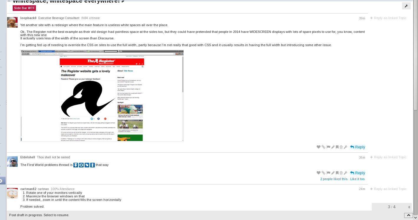
Yet another site with a redesign where the main feature is useless white spaces all over the place.
Ok, The Register not the best example as their old design had pointless space at the sides too, but they could have pretended that people in 2014 have WIDESCREEN displays with lots of spare pixels to use for, you know, content with this new one.
It actually uses less of the width of the screen than Discourse.I'm getting fed up of needing to override the CSS on sites to use the full width, partly because I'm not really that good with CSS and it usually results in having the full width but introducing some other issue.

-
The First World problems thread is


 that way
-
- Rotate one of your monitors vertically
- Maximize the browser windows on that
- If needed, zoom in until the content fills the screen horizontally
Problem solved.
-
You hate whitespaces? I give you blue spaces:
-
Yet another site with a redesign where the main feature is useless white spaces all over the place.
Hmm - what can you mean...

vs
-
Quite.
What CSS are you using to fix Discourse? I tried it myself but (as mentioned) I'm not too good at it and just caused a few issues with some of the objects which apparently overlap each other.
-
Currently (and this includes stuff for admin screens) under Stylish:
@namespace url(http://www.w3.org/1999/xhtml);

@-moz-document domain("what.thedailywtf.com") {
    html {
        font: 14px/14px Helvetica,Arial,sans-serif;
    }
    .container {
        max-width: 20000px;
    }
    .topic-body {
        width:85%;
        max-width: 20000px;
    }
    .admin-contents table td, .admin-contents table th {
        padding: 0;
    }

   .user-main .user-stream .item {
       padding: inherit;
   }
    .post-cloak .reply-to-tab {
        right: auto;
        left: 420px;
    }
    .admin-content table.report .bar-container .bar {
        margin-top: 0;
    }

    .nav-stacked > li > a {
        padding: 2px 2px 2px 30px;
    }

    .setting {
       padding-bottom: 5px;
    }
    .content-list {
        overflow-y: auto;
        height: 850px;
    }
    .content-list ul li a {
        padding: 5px;
    }
    .current-style .ace-wrapper {
       height: 800px;
    }
    .user-badge {
        padding: 0px;
        margin: 0px
    }
    .badges .form-horizontal textarea  {
       width: 600px;
        height: 150px;
    }
    .topic-body {
/*        padding: inherit; */
    }
    .post-menu-area {
        margin-bottom: inherit;
        margin-top: inherit;
    }
    .content-list ul li a {
        padding: 5px;
    }
    .topic-list th, .topic-list td,
    .topic-list .main-link a.title {
        padding: inherit;
    }
    nav.post-controls .show-replies{
        padding: inherit;
    }
    .bottom-round nav.post-controls .show-replies {
        padding-bottom: inherit;
    }
    nav.post-controls button.create {
        padding: inherit;
    }
    nav.post-controls button {
        padding: inherit;
    }
    nav.post-controls button.bookmark {
        padding: inherit;
    }
    .user-main .user-stream .notification p {
        margin-top: 0px;
        margin-bottom: 0px;
    }
    .user-main .user-stream .notification .fa,
    .user-main .user-stream .notification .icon {
        font-size: 16px;
    }
}
-
I should probably get around to doing a custom site-sheet with that stuff in and get round to being able to swap between them in the site header somehow...
-
Much better - thanks!
-
It starts to break down under around 940px under normal zoom (can go lower if zoomed out), but the whole point of that CSS is to cope with wider anyway...
-
That's cool, all 3 monitors are 1920x1080 here at work anyway.
-
Well, we all know were Discourse comes from:
-
That's nice, I simply zoom to 125% and looks well.
-
That's nice, I simply zoom to 125% and looks well.
My problem is I zoom to about 80%...
-
Not sure if this is because now that the issue has been raised, I see this happening more & more or simply all graphic designers (UX Engineers) are getting stupider.
-
or simply all graphic designers (UX Engineers) are getting stupider.
I'm pretty sure it's that.
-
or simply all graphic designers (UX Engineers) are getting stupider.
I assume they're catering to tablets and junk and people like me who don't want to read super wide lines because my eyes can't reliably find the next one as I read down the page. You people are all crazy.
-
Yes.
Widescreen is for tv, movies, games and peripheral vision.
It's not for text.
-
Well, and fixed width (for some lowest common denominator of screens) gives you the "advantage" of being able to lay things out knowing you'll get a consistent look across all displays, and that you won't have your floats breaking in at wierd points.
I can see the benefit for news articles, where you don't want that quote box showing up 6 paragraphs late/early, or for line of business applications where you want your users to be able to memorize the workflow (consciously or otherwise). But not sold on it for most standard usages.
-
I think the real answer to all of these concerns is, "who the fuck maximizes browsers?"
-
people who want ALT-TAB to be an effect bosskey?
-
Maybe as a suggestion, stop surfing porn sites at work?
-
who said anything about porn? there are other things you'd want to bosskey with.
minecraft....
EVE online....
Monster.com...
-
I maximise almost everything at work - the exception being putty where I tend to have windows using half the display each.
-
I don't need a boss key - there's only 4 of us in our room, 2 of them usually aren't there, and no-one really cares anyway. I'm also not exactly watching filth at work.
My boss is in another country so no danger of him being there.
-
Not sure if this is because now that the issue has been raised, I see this happening more & more or simply all graphic designers (UX Engineers) are getting stupider.
That's because it makes sense. You can put some side panels, navigation menus, or other cruft in that whitespace, but I really prefer to have the whole column of text I'm reading in my focused FOV instead of having to trace my eyes all over the page.
Also, being able to side-by-side things on my resolution-challenged laptop is a nice addition too.
I think the real answer to all of these concerns is, "who the fuck maximizes browsers?"
People who don't do anything outside of the browser for the time being?
-
Here's a thought. Why not make a web design that automatically flows into a two or three column layout whenever the white floods become too wide?
-
Everything is a 480x800 smartphone.
-
Here's a thought. Why not make a web design that automatically flows into a two or three column layout whenever the white floods become too wide?
Too much logic and work detected, proposition denied.
Also: people don't like multiple content in columns. The articles on the second column would have a hard time getting a glance beyond the first one. Columns are fine when every column is a different type of info. Like an old skool web page where the left part contained links to other things in the website.
-
Like an old skool web page where the left part contained links to other things in the website.
Or like a forum where the left column is people's avatars, the centre column is the content, and the right column is cross-references scavenged from the content…
-
-
I guess that page sums it ups quite nicely:
Who is responsible?
The interpreter was written by someone who shouldn't have stayed up so late, Edwin Brady, and the language was designed by two people who shouldn't have had so much to drink, Edwin Brady and Chris Morris. No doubt Andrew Stribblehill isn't entirely blameless either. Thanks also to the residents of #compsoc for their helpful suggestions and programs.
-
Why not make a web design that automatically flows into a two or three column layout whenever the white floods become too wide?
Whirlpool.net.au used to do this but they stopped some years ago for some reason. There is still some "responsive design" but nothing like it was (before that buzzphrase).
-
Since everything on the web is designed like that, whenever I'm using Widescreen I have two browsers per monitor, each docked to half the monitor.
Works pretty well for most sites.
-
Interesting... The way I have emacs set up is in three columns, with focus on the middle one. The left is in follow-mode to give more context and the right is for reference material.
...So I guess you are right, only one column gets any attention, but not necessarily the leftmost...
-
A nice feature for browsers should allow to place tabs side by side.
-
Everything is a 480x800 smartphone
He was a fine developer until the brain worms got him.
http://discovermagazine.com/~/media/import/images/0/7/e/brainworms.jpg?mw=900
-
.... that looks like CJD
is it?
oooh. no it isn't.
DO NOT WANT!
-
everythingggg iss a phooooonnneeeee..... joooiiiiinnnnn usssssssss......
-
/me freaks out and runs away screaming
ZOMBIES! I'M SURROUNDED BY IPHONE ZOMBIES!
-
Brain parasites!

-
Is that from a Babylon 5 card game?
-
Actually, it's from Star Fluxx.
-
It totally looks like the Drakh Keepers from Babylon 5 that were used for mind control at the end of the series.
-
Star Fluxx cards intentionally look like various things from well known sci-fi series.
For example, the Engineer card looks suspiciously like Kaylee from Firefly and the Teleport Chamber looks suspiciously like the transporter rooms on Star Trek ships.
-
I know one that lets you do that, actually!

VS2013.
-
When I was writing that I was thinking about Eclipse but you can imagine how well that would go.
-
If only Eclipse didn't make the browser windows it embeds suck.
Actually, if only Eclipse didn't insist on fucking up focus management when I have two or more windows open at once. I want to use my second screen fully, not spend my time finding I've typed into the wrong window again because the focus has been set to the wrong place again.

-
ZOMBIES! I'M SURROUNDED BY IPHONE ZOMBIES!
foonnnnnddddllllle the touccchhhhh screeeeeennnnnn.... fooooooonnnnnnnnddddddlllllle.... yoooouuuuu waaaaannnnnttttt ttooo toooouuucchhhh tthhee SSSSSCREEEEEEEEENNNNNN....
-
