Outlook being Outlook
-
@dkf at least the kerning looks about right?
-
@Arantor That's handled by the font and the font renderer, not the GUI designer, so yes.
-
@dkf I wouldn’t put it past MS to decide that Mac rendering looked wrong and did it themselves.
-
@Arantor More likely by choice of font though, and then that would likely be of one of MS's own fonts, and many of those have actually been done by proper font designers. [Carefully packs the earth down tighter over Comic Sans's muffled "I'm not dead yet" mumbles.]
-
@dkf you mean a guy who also worked on Trebuchet MS, Marlett and part of Webdings might not be a real designer? The maker of “Levitating Man in Business Suit” not a real designer?

But seriously, MS of recent years feels like it’s off the deep end at times. I make no assumptions about them now.
-
@Arantor said in Outlook being Outlook:
@dkf I wouldn’t put it past MS to decide that Mac rendering looked wrong and did it themselves.
IIRC, Word at least has its own text layout engine. I once, long ago, came across a comparison of OS X, MS Word, and Adobe text rendering, showing differences between them in line lengths for the same sample text (IIRC, just the alphabet and numbers in increasing point sizes).
Of course, it makes sense for Word: you probably want the text to look the same in it on both Windows and macOS. (Which its dependence on the selected printer to paginate the document then largely negates, of course.)
-
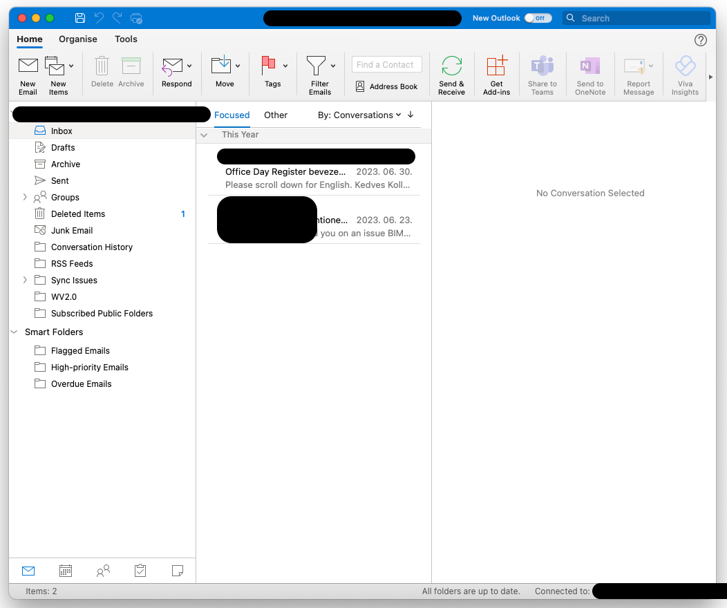
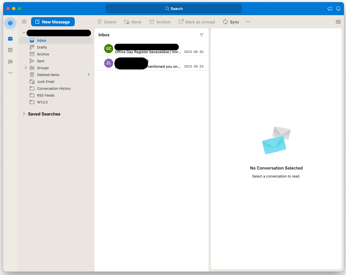
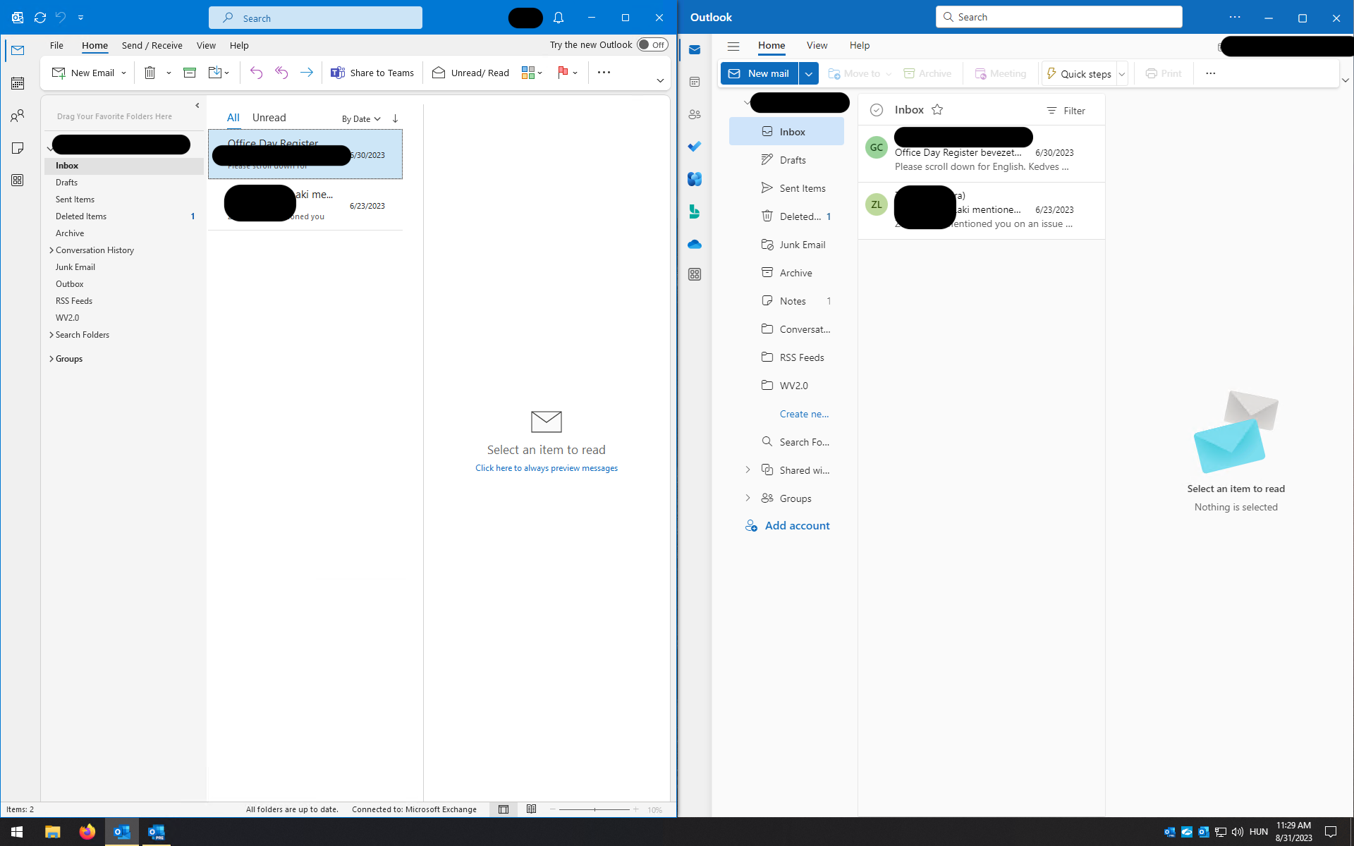
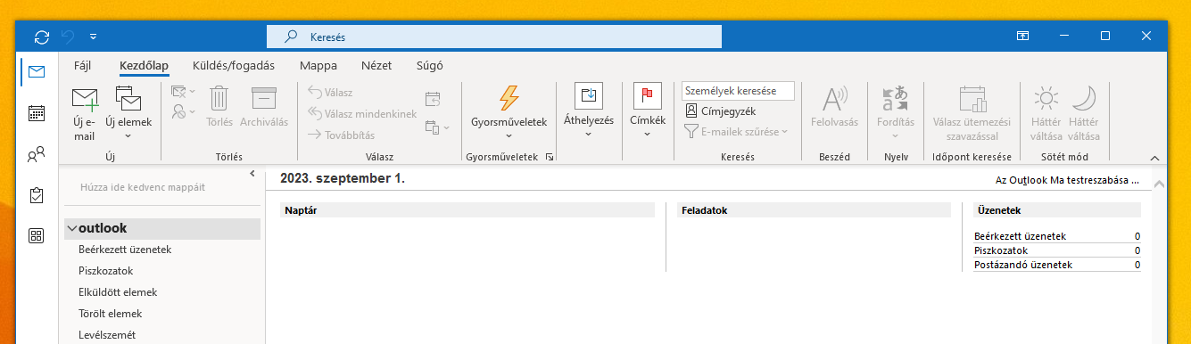
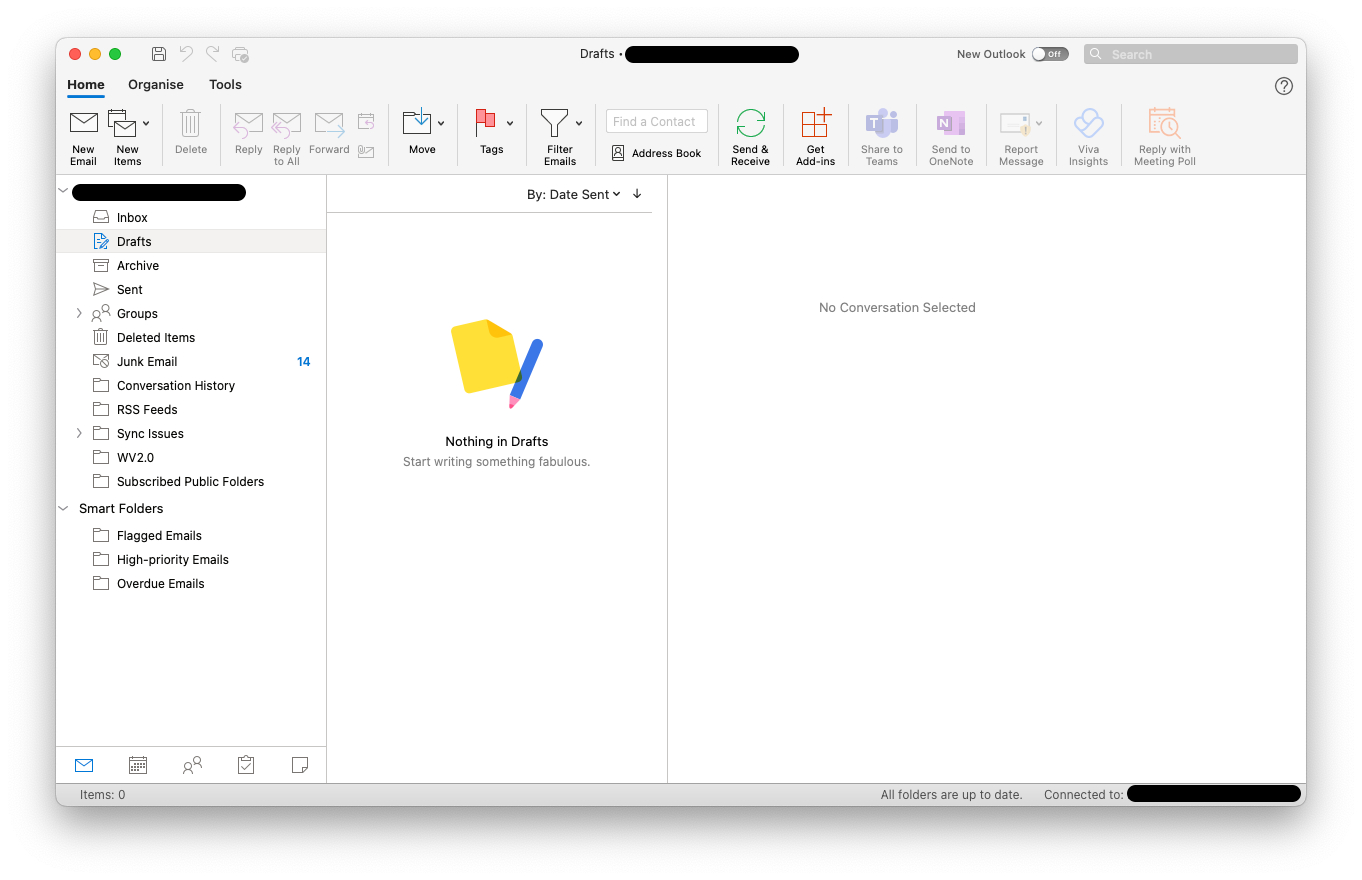
I spent around half an hour this week fiddling around with the 4 different desktop versions of Outlook comparing different screens and feature sets. I now understand why they want to throw out the old Windows desktop app. There are infinite number of complex but mostly meaningless UI customization options and each of them is subtly broken in a different way.
Old Outlook for Mac
New Outlook for Mac
Old and new Outlook for Windows
-
@marczellm said in Outlook being Outlook:
Old and new Outlook for Windows
We're not even on the version you claim is old yet. I'm somewhat thankful for that.
-
@Arantor said in Outlook being Outlook:
@dkf I wouldn’t put it past MS to decide that Mac rendering looked wrong and did it themselves.
Funny enough, that's what Apple used to do (still does?) on Windows.
You want to sync your iPhone? Well, you need fucking iTunes for it. Also, our whole rendering subsystem.
-
@topspin I think it still does, yes. To be fair though, Apple of old actually gave shits about typography in ways Windows wishes it did.
-
@Arantor just different priorities.
Apple cared about things on your screen looking like they would in print. Windows cared about things on your screen looking sharp and readable.
I don’t usually print my iTunes windows, even if the printer manufacturers would like that.
-
@topspin Windows doing something useful by intent? Citation needed

-
@Tsaukpaetra said in Outlook being Outlook:
We're not even on the version you claim is old yet.
Just out of curiosity, which one?
-
-
@marczellm said in Outlook being Outlook:
@Tsaukpaetra said in Outlook being Outlook:
We're not even on the version you claim is old yet.
Just out of curiosity, which one?
All of the above.
Well, "old Apple" looks close. But then they were always known to be several years behind in Microsoft ports.
-
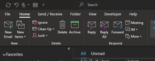
@Tsaukpaetra I mean which version (which look) are you on?
If I use "Old Outlook" on Windows, but switch "Simplified Ribbon" to "Classic Ribbon" it becomes this:
But if I turn off the "Visual Refresh" it becomes this:
-
@marczellm said in Outlook being Outlook:
@Tsaukpaetra I mean which version (which look) are you on?
Older.

-
@marczellm said in Outlook being Outlook:
@Tsaukpaetra I mean which version (which look) are you on?
This is @Tsaukpaetra you're talking to.
-
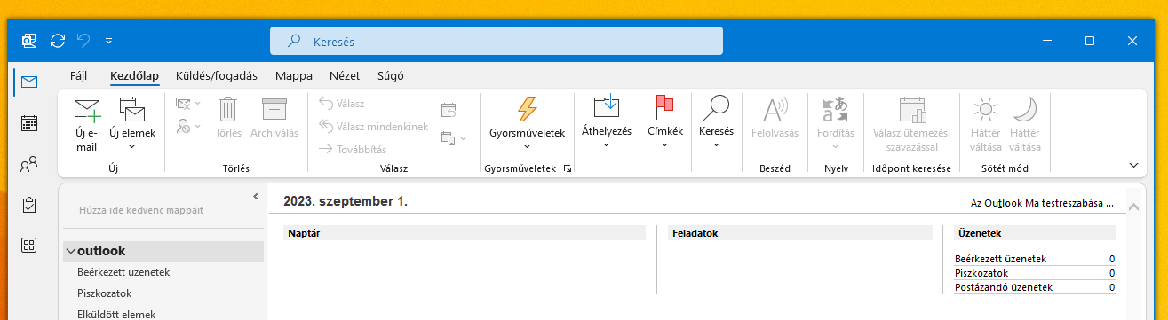
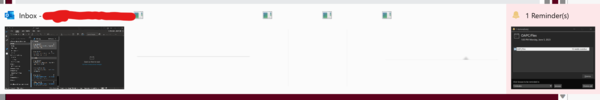
@marczellm Oh dear oh deer... That looks even worse than polish.
Gyorsmüveletek,Beérkezett üzenetek,As Outlook Ma testreszabása, ...
AndHáttér váltásaexists even twice...
Gaahhhh! Súgó!
-
Status: Perfectly balanced as all things should be.
-
@marczellm said in Outlook being Outlook:
There are infinite number of complex but mostly meaningless UI customization options and each of them is subtly broken in a different way.
That's obviously unacceptable, indeed. There should be only one standard UI, and it should be broken in a consistent way.
-
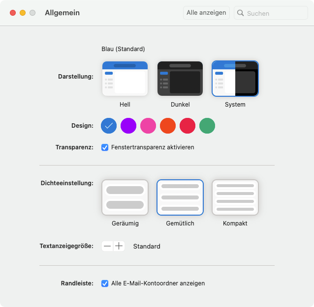
There's a new theme that arrived in Mac Office with an update. It just basically turns off the coloring of the title bar
You cannot activate the new theme in New Outlook. Only in the old one.
-
@marczellm That's not a new theme - that's been around (in 'old' Outlook for Mac) for ages.
New Outlook has 6 solid colour themes that colour some elements, as well as (for reasons best discussed
 ) some LGBTQ gradiant themes.
-
@loopback0 said in Outlook being Outlook:
@marczellm That's not a new theme - that's been around (in 'old' Outlook for Mac) for ages.
Yep but at some point they took it out just to put it back again now.
-
@marczellm said in Outlook being Outlook:
There's a new theme that arrived in Mac Office with an update. It just basically turns off the coloring of the title bar
-
@loopback0 said in Outlook being Outlook:
@marczellm That's not a new theme - that's been around (in 'old' Outlook for Mac) for ages.
New Outlook has 6 solid colour themes that colour some elements, as well as (for reasons best discussed
) some LGBTQ gradiant themes.
-
@topspin I also looked for those unsuccessfully. Some blog post makes a passing mention of them only being available for Insiders. No idea how you become an Insider in Mac Outlook.
-
@marczellm said in Outlook being Outlook:
@topspin I also looked for those unsuccessfully. Some blog post makes a passing mention of them only being available for Insiders. No idea how you become an Insider in Mac Outlook.
Well, first, you follow a guy down a shady dark alley. Then he checks to make sure you have two working kidneys. Then you wake up with one working kidney and half a liver.
-
@izzion said in Outlook being Outlook:
@marczellm said in Outlook being Outlook:
@topspin I also looked for those unsuccessfully. Some blog post makes a passing mention of them only being available for Insiders. No idea how you become an Insider in Mac Outlook.
Well, first, you follow a guy down a shady dark alley. Then he checks to make sure you have two working kidneys. Then you wake up with one working kidney and half a liver.
And then a mysterious toggle in the upper-right corner of outlook beguiles you with the promise of becoming Beta....
-
@izzion said in Outlook being Outlook:
Then you wake up with one working kidney and half a liver.
And an even buggier Outlook
-
@TimeBandit said in Outlook being Outlook:
@izzion said in Outlook being Outlook:
Then you wake up with one working kidney and half a liver.
And an even buggier Outlook
But you’ll be lighter. Dare I suggest that’s an Express version?
-
Pride, transgender, lesbian, bisexual, non-binary.
-
@marczellm said in Outlook being Outlook:
@topspin I also looked for those unsuccessfully. Some blog post makes a passing mention of them only being available for Insiders.
It's just not on Insiders now.
Release notes for Office for Mac - Office release notes

Provides IT Pros with release notes for Office for Mac releases for Microsoft 365 Apps subscribers
16.74.
-
Outlook can be tricked with a zero font size approach, such that it displays you the subject line followed by e.g. "Scanned and secured by Isc®Advanced Threat protection (APT): 9/22/2023T6:42 AM". Phishermen have fun with that.
 Hackers Trick Outlook Into Showing Fake AV Scan

Researchers spot attackers using an existing phishing obfuscation tactic in order to better ensure recipients fall for their scam.
-
@BernieTheBernie I look forward to seeing that in our next internal phishing test.
-
Article @BernieTheBernie posted said:
The tiny font size breaks email-scanning techniques that depend on semantic analysis, confusing the system while email recipients don't detect the text because it's too small to read.
What the fuck kind of scanner is looking at "Hur dur this was scanned" and going "Yup. seems legit, approved!"

-
@Tsaukpaetra said in Outlook being Outlook:
Article @BernieTheBernie posted said:
The tiny font size breaks email-scanning techniques that depend on semantic analysis, confusing the system while email recipients don't detect the text because it's too small to read.
What the fuck kind of scanner is looking at "Hur dur this was scanned" and going "Yup. seems legit, approved!"
It took me a while to figure this one out. I was wondering how small font size breaks scanners that I would expect to look at the bytes, not at the actual text as it appears to the viewer … But what they meant to say is that the text itself, regardless of font size, deceives the scanner, while the small size means humans overlook it.
Still seems stupid that a virus scanner would just take that line at face value. Also, I wonder why, if you’re going to use this technique, you stick it into the message body rather than just including something like
X-AntiSpam: Scanned and secured by Isc®Advanced Threat protection (APT): 9/22/2023T6:42 AMin the header?
-
Okay. And what possible legitimate purpose does font size zero serve that it is a valid value to begin with?
-
@Gurth said in Outlook being Outlook:
@Tsaukpaetra said in Outlook being Outlook:
Article @BernieTheBernie posted said:
The tiny font size breaks email-scanning techniques that depend on semantic analysis, confusing the system while email recipients don't detect the text because it's too small to read.
What the fuck kind of scanner is looking at "Hur dur this was scanned" and going "Yup. seems legit, approved!"
It took me a while to figure this one out. I was wondering how small font size breaks scanners that I would expect to look at the bytes, not at the actual text as it appears to the viewer … But what they meant to say is that the text itself, regardless of font size, deceives the scanner, while the small size means humans overlook it.
Still seems stupid that a virus scanner would just take that line at face value. Also, I wonder why, if you’re going to use this technique, you stick it into the message body rather than just including something like
X-AntiSpam: Scanned and secured by Isc®Advanced Threat protection (APT): 9/22/2023T6:42 AMin the header?It mentions the the "listing pane" of Outlook, and that the text appears there. Since I don't use Outlook
 I'm guessing that this gives an unstyled preview of the body of the email? Being at the start of the body, the line would appear legibly there as part of the preview.
-
@Applied-Mediocrity said in Outlook being Outlook:
Okay. And what possible legitimate purpose does font size zero serve that it is a valid value to begin with?
Over in web land we use this sort of bollocks (along with “massive negative indent”) to provide textual hinting for otherwise visual elements. Think logos that aren’t images (thus no alt text) that you want to give a textual hint for accessibility reasons.
Or, better, for all sorts of intra-document navigation for accessibility reasons where it will be read out by speech readers but not shown to the regular users. Think a link to “skip navigation” because you want to be nice to the blind people so they don’t have to hear every goddamn link in your menu when they don’t want the menu.
In an email however… not sure.
-
@Tsaukpaetra said in Outlook being Outlook:
Article @BernieTheBernie posted said:
The tiny font size breaks email-scanning techniques that depend on semantic analysis, confusing the system while email recipients don't detect the text because it's too small to read.
What the fuck kind of scanner is looking at "Hur dur this was scanned" and going "Yup. seems legit, approved!"
The article says that in this case it is not to fool the scanner but to fool the user into thinking it was scanned when it was not.
The article also mentions that 0-pixel font is also used to fool the scanners, but that is different type of attack. And mixing the two makes the article a bit … confusing.
-
@Bulb said in Outlook being Outlook:
makes the article a bit … confusing.
"Article" ⇒ "journalist"
"Journalist" ⇒ "confused"
"Confused journalist" (redundant) ⇒ "confusing article"
-
-
@Gurth said in Outlook being Outlook:
Still seems stupid that a virus scanner would just take that line at face value. Also, I wonder why, if you’re going to use this technique, you stick it into the message body rather than just including something like X-AntiSpam: Scanned and secured by Isc®Advanced Threat protection (APT): 9/22/2023T6:42 AM in the header?
It's not trying to fool a scanner, it's trying to fool users.
edit:

-
@loopback0 said in Outlook being Outlook:
It's not trying to fool a scanner, it's trying to fool users.
Oh, wait, now I get it … The listing pane, which I suppose is the middle column or something, will show that 0pt line fully readable, but because of the font size, it won’t be visible in the actual message. That way the user thinks it’s a notice from Outlook that the message is safe to open.
-
@Gurth said in Outlook being Outlook:
the message is safe to open.
How could they know if the mail requires you do to do some work or not?
-
The same way the sender of this message knows of my interest in drones:
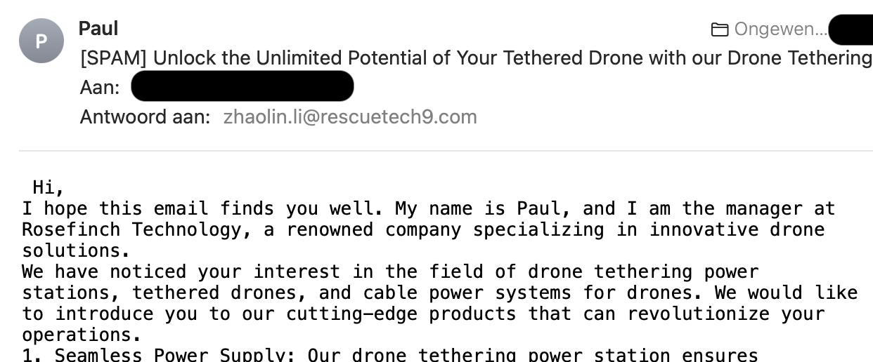
That is to say, shooting with buckshot in the hopes of scoring a hit.
-
@Gurth looking for the Targeted Advertising Fail thread? 🙃
-
Status: Apparently (at least one of) my machines are running 32-bit Office, which has prompted this email...
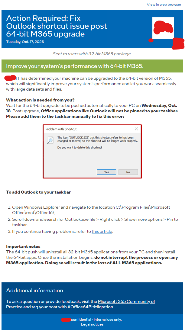
Yes, apparently the Office Setup tool still can't pin apps that it had reinstalled.
Oh well. Not like I have them pinned anyways. But I do find it hilarious that they want you to pin them via drilling through File Explorer and not using the Start menu...
-
Status: The quick search no longer gives Duration. Been a problem for some months. Decided to check the Googles.

Turns out, if you use the "Advanced Find" it still works as expected.
Thanks, Microshaft.


