I've been wronged. A tale of being forced to use Android
-
@lucas1 said in I've been wronged. A tale of being forced to use Android:
Search on the Gmail app never works properly.
Works fine for me...

-
@Tsaukpaetra said in I've been wronged. A tale of being forced to use Android:
@kt_ said in I've been wronged. A tale of being forced to use Android:
incredibly awkward way of taking screenshots
Power+Volume down? So much more terrible then Power+Home on iPhone!
After careful reconsideration, I realize that this isn't indicative of how Android defaults to taking screenshots, but the fact that the manufacturer did the dumb and put the power button right next to the volume controls.
See, in standard phones, this is not the case, the power button is quite separated from the volume keys, and as an example, I can do a screenshot with my thumb and middle finger (if I wanted to do it single-handedly), or thumb and index finger if feeling lazy.
Obviously the manufacturer was trying to be Schick or something, especially as you mentioned a separate "take photo" button, which is another thing that didn't really take off...
-
@RaceProUK said in I've been wronged. A tale of being forced to use Android:
I have a Nexus 7 (the original 2012 model with 32GB storage;
I wish I could get my Nexus 7 2012 to work again. That model had a serious hardware problem where it was possible for the battery to discharge completely, to the point it couldn't be charged anymore. I revived it once when it did that but I can't remember how, I've tried everything I could Google in the past month or so and I don't think it'll come back to life again... :(
That was an awesome tablet in all other respects.
-
@heterodox said in I've been wronged. A tale of being forced to use Android:
I revived it once when it did that but I can't remember how, I've tried everything I could Google in the past month or so and I don't think it'll come back to life again...
I remember parallel-chaining two 3-amp chargers and a 2-amp charger together to get my sister's galaxy tab to charge. The issue was that by default the thing only draws 200ma (I think that's USB standard?) so it's enough to activate the CPU and stuff, but as soon as the bootloader starts getting it to load the power draw far exceeds that and so it fails. Cue bootloop. Due to the dumb-chargers providing ample current regardless of protocol, when I added them into the system it provided enough for the system to continue booting into the kernel in "charge mode" and finally start charging.
What a joke...
-
@wharrgarbl said in I've been wronged. A tale of being forced to use Android:
Motorola updates their middle range better than Samsung updates their high end, at least that was my experience.
Samsung used to be crap in that respect but they have improved. My S7 has gotten almost monthly updates since I've had it; the Moto G before wasn't exactly a top model at any time but I think I only ever got two updates in the 18 months that I used it.
-
@Tsaukpaetra said in I've been wronged. A tale of being forced to use Android:
Cue bootloop.
Yeah, with the Nexus 7 the symptom is definitely a boot loop and while there SHOULD be a key combination or adb command you can give it to tell it "SHUT DOWN ALL THE WAY AND JUST CHARGE" it's hard to get the timing just right as it keeps suicidally keeps doing its best to turn on so you can use it.
Coming back to me now. Not sure I understand the prospective solution, though, from what you're saying other than to get a dumber charger.
-
@heterodox said in I've been wronged. A tale of being forced to use Android:
Not sure I understand the prospective solution, though, from what you're saying other than to get a dumber charger.
Yeah, and it might just be anecdotal anyways.
@heterodox said in I've been wronged. A tale of being forced to use Android:
there SHOULD be a key combination or adb command you can give it to tell it "SHUT DOWN ALL THE WAY AND JUST CHARGE" it's hard to get the timing just right as it keeps suicidally keeps doing its best to turn on so you can use it.
Weeellll... If you've unlocked the bootloader in some units, you can enter a special "fastboot" mode (or even better, a vendor-specific "this phone is accepting commands to talk to the flash chip directly now" mode) that sleeps the processor until something happens.
But it's highly unlikely that you bricked your device well enough that you had to flash it into that state where such a thing were possible to do as easily as I can on my phone (luckily I don't need to reboot my phone by hand all that often).
-
@sloosecannon said in I've been wronged. A tale of being forced to use Android:
@kt_ said in I've been wronged. A tale of being forced to use Android:
That's one of the indicators of good design decisions:.you.can see that a decision has been made.
Agreed, clearly the Chrome design team decided to show more information rather than less to empower the users.
If seeing those few characters more makes you feel empowered, your brain is washed.
Again, most of your complaints here are either subjective or because you've got a shitty phone with a bad OEM.
Yeah, sure. Cause Gmail app works entirely different on other phones. Chrome's ui probably too! Are you suggesting that Android has a shitty phone ui mode, where features get removed and ui changes for worse?
I understand your mind is made up, but some of us like having a choice other than the walled-garden overpriced shitty looking crap put out by a certain fruit manufacturer.
I don't know what manufacturer you're talking about, but you should try apple hardware some time. ui looks good on every phone, you can feel each step of the way that they care about UX and they did try and make sure it's well designed (well, sure, apart from the first iteration of the Music app. Still, it's much better now) and their devices and os look and feel finished, something one can't say about apps made by Google.
Oh, and the colors. Does the Google design team really think that the key to good design is to fucking throw flat colors at the problem?!
I fucking hate flat design made the Google way, it's so unintuitive it can kill. Like these enigmatic lines indicating textboxes. Like these buttons that look like regular text. I had a chance to look at older (50+) people try and set up Google Drive up. Nightmare!
But you can see Google's design impotency everywhere, from Gmail login page (yeah, the new and improved one. Improved my assignment!), to Google Apps. Seriously, does anyone use sheets or word processor without having to feel their eyes are being gouged? And you start thinking it has to be this way, that professional online apps are going to be built the Linux way: ugly as shit, hard to operate like a forklift and then you see Microsoft entering the field with Office Online and you can't stop thinking, how come Google, with all of its money and power, can't design stuff for shit?! Why do they keep failing so spectacularly? Google Cloud control panel, anyone?
I understand what's nice and what pulls people to Android: cheap development environment, ability to install anything, ability to root phones, too customize it. But it's all for nothing, NOTHING, I say, until Google learns how to do proper design. And unfortunately this day seems like it's never going to come.
-
@sloosecannon said in I've been wronged. A tale of being forced to use Android:
@kt_ said in I've been wronged. A tale of being forced to use Android:
It's funny how people keep downvoting my posts, yet no one has taken the time to defend these shitty design choices, which the most important that aren't about aesthetics are:
- Too large fonts and icons, that steal real estate
- Gmail app not being able to default to showing unread email, you need to use search function to get there (and wait a moment or two while the app actually performs the search!)
- Stolen real estate in the Gmail's drawer to show irrelevant stuff
- Inconsistent behaviour when clicking in the line of a completely devoid of meaning arrow icon
- Allowing apps to be preloaded without required authorizations
- Allowing apps to be preloaded, when they duplicate the existing functionality, ie take space and annoy users
Come on, these are so bad it's hard they go unnoticed. Oh, wait, they don't
I'm on mobile, so sorry for the multipost and ugly response.
- Get a better DPI
It's funny you sold say that, cause I got Gmail app installed on my iPhone (retina, mind you) and I removed it for the same fucking reason. I'll post a screenshot once I've got my device back.
- Never needed to show unread before, to be honest. Although I also use Inbox exclusively. So...
Sure, cause this feature that literally every other mail app has is definitely redundant?
- I consider the thing that allows me to switch between my 5 Google accounts on my device to be fairly essential. But hey, maybe that's just me.
Learn to parse. Never said this functionality shouldn't exist, I said it's a fucking moronic design to hide it where it's hidden now with the access path being as it is.
Again, real estate wouldn't be nearly as much of a problem if your phone wasn't a terrible budget device with a DPI of -10000
So now you're saying it yourself. It still would be a problem, only not as big one.
And they're saying that Apple users are fanboys!
- Ok, sure, minor bug involving the sound effects or whatever. What's the big deal?
Normally, something I would just shrug. When it's a part of such a shitty design, then it's a further indicator of these people not being able to get the design right. Oh, and their lack of attention to detail. I heard it's important in software development.
- Would you rather your manufacturer preload bloatware that can read your internal sdcard without any notification and upload it? Because that's kinda the alternative.
I would rather the apps weren't preloaded. Tell me, how is it that Google can force manufacturers to have to authorize with the system when the app is first launched, but they can't force them not to put the bloatware in? Or leave it as an option for the user after they ran the phone for the first time?
The only apps that have super cow powers and can "ignore" the permissions system are Google's own first party apps and system apps. Anything else has to go through that gateway.
That's actually sensible.
-
@Tsaukpaetra said in I've been wronged. A tale of being forced to use Android:
@Tsaukpaetra said in I've been wronged. A tale of being forced to use Android:
@kt_ said in I've been wronged. A tale of being forced to use Android:
incredibly awkward way of taking screenshots
Power+Volume down? So much more terrible then Power+Home on iPhone!
After careful reconsideration, I realize that this isn't indicative of how Android defaults to taking screenshots, but the fact that the manufacturer did the dumb and put the power button right next to the volume controls.
See, in standard phones, this is not the case, the power button is quite separated from the volume keys, and as an example, I can do a screenshot with my thumb and middle finger (if I wanted to do it single-handedly), or thumb and index finger if feeling lazy.
Obviously the manufacturer was trying to be Schick or something, especially as you mentioned a separate "take photo" button, which is another thing that didn't really take off...
Yeah, I agree with you here. Obviously I like the home button + power button combination from iPhone, because these are so easy to pish together. But the way the buttons are in my phone are Sony's issue, not Google's.
Still, I hate the fact that you need to keep them pressed for a few seconds before the screenshot is made. And too often I end up turning volume down. :(
-
@Tsaukpaetra said in I've been wronged. A tale of being forced to use Android:
@heterodox said in I've been wronged. A tale of being forced to use Android:
I revived it once when it did that but I can't remember how, I've tried everything I could Google in the past month or so and I don't think it'll come back to life again...
I remember parallel-chaining two 3-amp chargers and a 2-amp charger together to get my sister's galaxy tab to charge. The issue was that by default the thing only draws 200ma (I think that's USB standard?) so it's enough to activate the CPU and stuff, but as soon as the bootloader starts getting it to load the power draw far exceeds that and so it fails. Cue bootloop. Due to the dumb-chargers providing ample current regardless of protocol, when I added them into the system it provided enough for the system to continue booting into the kernel in "charge mode" and finally start charging.
What a joke...
My cousin had the same issue with one Motorola Defy, a few years ago. He got it discharged doing system upgrade and the phone wasn't able to start. He managed to do it by directly charging the battery.
-
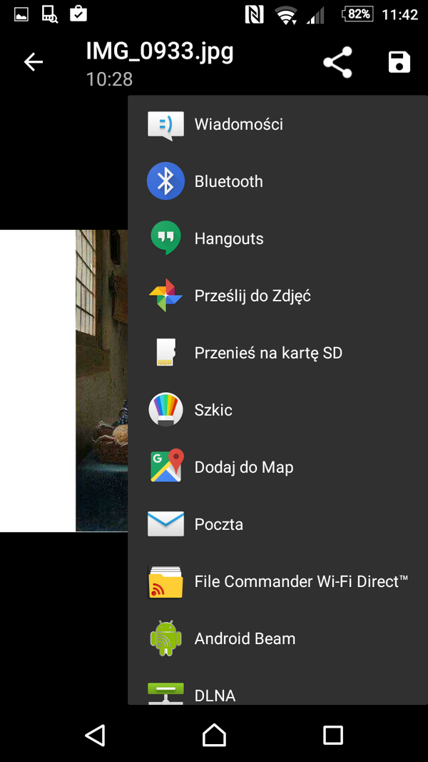
Another damning evidence. I got an image in a text message and I wanted to send it via email. I opened the photo, I saw the ugly three dots in the center, I clicked it and this is what I saw:

The sole and lonely thing: save.
Why can't it be in a menubar at the bottom? Why can't there be a menubar at the bottom? Why does it have to be a menu which you need to open to get this one lonely position?
The answer is simple: because Google hates its users.
BTW, @Gąska, @Maciejasjmj, this image is pretty funny, right?
-
@LaoC Motorola is getting better as well. My Z Play has received more or less one update per month since I bought it. I'm currently on the March 1st security patch level, so they're far from perfect (security updates are delayed by 1-2 months), but it's something. Definitely better than some other manufacturers.
-
@kt_ What app is that, anyway? Because it's not the standard app for (SMS/MMS) messages as I recognize it. The standard app has the buttons for share and save in the top right corner, for easy sending to any mail client (or other image-handling) app.
-
@Atazhaia said in I've been wronged. A tale of being forced to use Android:
@kt_ What app is that, anyway? Because it's not the standard app for (SMS/MMS) messages as I recognize it. The standard app has the buttons for share and save in the top right corner, for easy sending to any mail client (or other image-handling) app.
Hangouts definitely, because for some reason they wanted to have an internal photo viewer in Hangouts.
I'll admit the Hangouts App is really dumb in many ways and doesn't really conform to Google's own design guidelines on a few critical areas.
-
@Atazhaia said in I've been wronged. A tale of being forced to use Android:
@kt_ What app is that, anyway? Because it's not the standard app for (SMS/MMS) messages as I recognize it. The standard app has the buttons for share and save in the top right corner, for easy sending to any mail client (or other image-handling) app.
I don't know which app is it. It's called "Messages". Bit it must be Google's, because it's got this green boob at the bottom, and we all know how obsessed Google is with boobs.
-
@Tsaukpaetra Oh. I never used Hangouts because I thought it looked kinda dumb. Seems I was right in that case. Hangouts doesn't even do SMS anymore, as they removed that functionality from it. Even though when Hangouts was new they wanted it to be the go-to app for both SMS and mail.
-
@Atazhaia said in I've been wronged. A tale of being forced to use Android:
@Tsaukpaetra Oh. I never used Hangouts because I thought it looked kinda dumb. Seems I was right in that case. Hangouts doesn't even do SMS anymore, as they removed that functionality from it. Even though when Hangouts was new they wanted it to be the go-to app for both SMS and mail.
I don't think it's hangouts, there's a separate app that's called Hangouts. This one is called "Messages".
-
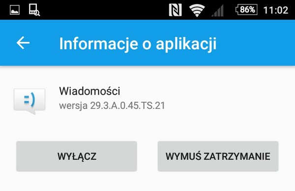
Went into settings and this is what I found
-
@kt_ said in I've been wronged. A tale of being forced to use Android:
This one is called "Messages".
Oh, that one. I always used Signal as my default SMS/MMS app. It's just more convenient to have all messages in the same app, no matter whether they were encrypted and sent over the internet or not.
-
@kt_ Yeah, that's not the standard app. I would guess it's Sony's app by the icon, as I seem to remember it from the last time I touched an Xperia.
-
@Atazhaia said in I've been wronged. A tale of being forced to use Android:
Hangouts doesn't even do SMS anymore, as they removed that functionality from it.
Wait, what? Since when? That's practically all I use Hangouts for, since I certainly don't call people!
Whenever I start a new conversation it asks whether I want it to send from my carrier number or Google voice.
-
@Tsaukpaetra
Which Android version do you use? I can't even choose Hangouts as the default app for SMS/MMS on my phone from the settings menu…
-
@kt_ As an addendum, here's the standard Messages app:
-
@Atazhaia said in I've been wronged. A tale of being forced to use Android:
@kt_ As an addendum, here's the standard Messages app:
Thanks.
As an addendum, what's this with Google and circles? I mean circled avatars?!

-
@kt_ said in I've been wronged. A tale of being forced to use Android:
As an addendum, what's this with Google and circles? I mean circled avatars?!
Everyone's doing that these days
-
@Atazhaia said in I've been wronged. A tale of being forced to use Android:
@kt_ As an addendum, here's the standard Messages app:
Installed it. The view image thing is much better, as in it still has these godawful icons but at least they're there and not behind a redundant triple-dots menu.
Is there a way to customize this drop-down? There's a lot I don't use, don't want or even don't know what it does:
-
@RaceProUK said in I've been wronged. A tale of being forced to use Android:
@kt_ said in I've been wronged. A tale of being forced to use Android:
As an addendum, what's this with Google and circles? I mean circled avatars?!
Everyone's doing that these days
I still hate it.
btw, I don't have an account there so I wouldn't know: does Facebook and Twitter do that, too?
-
@kt_ No on both counts
-
@kt_ said in I've been wronged. A tale of being forced to use Android:
Is there a way to customize this drop-down?
Apparently, yes. Are you willing to pay $1-2?
http://www.makeuseof.com/tag/edit-clean-androids-share-menu-root-required/
-
@kt_ The way this is sorted, I believe it will put your most recent choice (or the one you used most... not sure if there is an algorithm for it) to the top. So while most of the options are not what you want, they will always stay at the bottom of the list.
Filed Under: At least my phone does that
Also Filed Under: But then again, I have a phone where I take my screenshots with a stylus like a pro
-
@kt_ said in I've been wronged. A tale of being forced to use Android:
@Atazhaia I'm not aware of any case where apple would block an app because it didn't conform to some guidelines. I could be wrong here, though. It is true, however, that the average iOS app has much better design than the average Android app.
I know of an example. My company's app requires a rebuild because a web view plus notifications is not native enough and Apple has refused it, even after our CEO got a call out of their approval team to try to negotiate.
-
@kt_ said in I've been wronged. A tale of being forced to use Android:
I'm not aware of any case where apple would block an app because it didn't conform to some guidelines.
And yet, whenever there's a story about an app being rejected for a reason that makes no sense, it's always about an iOS app…
-
@RaceProUK said in I've been wronged. A tale of being forced to use Android:
@kt_ No on both counts
;(
-
Since Unread keeps being brought up again and again... have you tried visiting GMail with a web browser?
Turns out it doesn't have a button to view only unread messages. So is it really a surprise the app version doesn't have it either?
-
@kt_ said in I've been wronged. A tale of being forced to use Android:
Sure, cause this feature that literally every other mail app has is definitely redundant?
I don't think it's as popular as you think. I've never seen anyone using a mailreader that only shows unread by default. Seems a bit weird.
-
@Cursorkeys said in I've been wronged. A tale of being forced to use Android:
I've never seen anyone using a mailreader that only shows unread by default.
Who said that this should be the default behavior? But it's a very useful filter that should be easily accessible.
-
@asdf said in I've been wronged. A tale of being forced to use Android:
@Cursorkeys said in I've been wronged. A tale of being forced to use Android:
I've never seen anyone using a mailreader that only shows unread by default.
Who said that this should be the default behavior? But it's a very useful filter that should be easily accessible.
Apologies to @kt_ then, I read that totally wrong. I still disagree slightly though, I don't think a button is necessary. As long as you can search on flags then that seems fine. You shouldn't need it very often unless you've lost an unread email 30 pages back or something.
-
Decathlon Polska
Decathlon is the worst sports store I've ever been to
-
@asdf said in I've been wronged. A tale of being forced to use Android:
@kt_ said in I've been wronged. A tale of being forced to use Android:
Is there a way to customize this drop-down?
Apparently, yes. Are you willing to pay $1-2?
http://www.makeuseof.com/tag/edit-clean-androids-share-menu-root-required/
I would if I were in a situation where I'd be stuck with this phone for a longer period of time. Fortunately, I'm not. :D
-
@Kuro said in I've been wronged. A tale of being forced to use Android:
@kt_ The way this is sorted, I believe it will put your most recent choice (or the one you used most... not sure if there is an algorithm for it) to the top. So while most of the options are not what you want, they will always stay at the bottom of the list.
Filed Under: At least my phone does that
Also Filed Under: But then again, I have a phone where I take my screenshots with a stylus like a proIt would be great if you were right. You're not. If you were, then Outlook, the only app I used there, would be at the top, instead it's at the very bottom.
-
@Arantor said in I've been wronged. A tale of being forced to use Android:
@kt_ said in I've been wronged. A tale of being forced to use Android:
@Atazhaia I'm not aware of any case where apple would block an app because it didn't conform to some guidelines. I could be wrong here, though. It is true, however, that the average iOS app has much better design than the average Android app.
I know of an example. My company's app requires a rebuild because a web view plus notifications is not native enough and Apple has refused it, even after our CEO got a call out of their approval team to try to negotiate.
I thought this was because they want apps to be more than just a Web view, not because they were ugly.
-
@RaceProUK said in I've been wronged. A tale of being forced to use Android:
@kt_ said in I've been wronged. A tale of being forced to use Android:
I'm not aware of any case where apple would block an app because it didn't conform to some guidelines.
And yet, whenever there's a story about an app being rejected for a reason that makes no sense, it's always about an iOS app…
I'll be thankful for a link. ;)
-
@powerlord said in I've been wronged. A tale of being forced to use Android:
Since Unread keeps being brought up again and again... have you tried visiting GMail with a web browser?
Turns out it doesn't have a button to view only unread messages. So is it really a surprise the app version doesn't have it either?
It has the option to show unread first. Trust me, I know, I use it all the time, since 2012.
-
@kt_ they want them to be more than a web view and by making them native, it has an indirect consequence of really encouraging following native behaviours and all the guidelines. So it inherently makes them less ugly even though there isn't a formal 'make your apps not ugly' requirement.
-
@Cursorkeys said in I've been wronged. A tale of being forced to use Android:
@asdf said in I've been wronged. A tale of being forced to use Android:
@Cursorkeys said in I've been wronged. A tale of being forced to use Android:
I've never seen anyone using a mailreader that only shows unread by default.
Who said that this should be the default behavior? But it's a very useful filter that should be easily accessible.
Apologies to @kt_ then, I read that totally wrong. I still disagree slightly though, I don't think a button is necessary. As long as you can search on flags then that seems fine. You shouldn't need it very often unless you've lost an unread email 30 pages back or something.
Unread is my inbox zero. I don't always archive stuff, if somethings unread it means I haven't processed it. This is my goto mode. Furthermore, it's Gmail that made me do this, because they support unread first since at least 2012 in their Web app.
-
@blek said in I've been wronged. A tale of being forced to use Android:
Decathlon Polska
Decathlon is the worst sports store I've ever been to
Tots. They have a nice online store, though.
-
@kt_ Yeah, I guess that's true. Still, that's like putting lipstick on a pig.
-
@Arantor said in I've been wronged. A tale of being forced to use Android:
@kt_ they want them to be more than a web view and by making them native, it has an indirect consequence of really encouraging following native behaviours and all the guidelines. So it inherently makes them less ugly even though there isn't a formal 'make your apps not ugly' requirement.
Agreed. This doesn't mean they reject apps solely based on them following ui guidelines.
I'm curious, what's your view on this? I mean, your company suffered because of this, on the other hand this seems to be a good thing for end users.
-
@blek said in I've been wronged. A tale of being forced to use Android:
@kt_ Yeah, I guess that's true. Still, that's like putting lipstick on a pig.
Sure, but if you want a cheap pair of running pants for the weekend and you cant be assed to go to a store yourself, knowing it's gonna be delivered to a delivery point nearby (paczkomat, don't know if you have them in Czechia) is a great thing. ;)