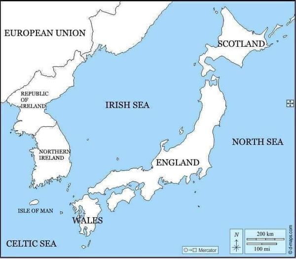
Fun with maps
-
-
Looks like Montana's gonna blow.
-
-
-
-
@Carnage said in Fun with maps:
@boomzilla said in Fun with maps:
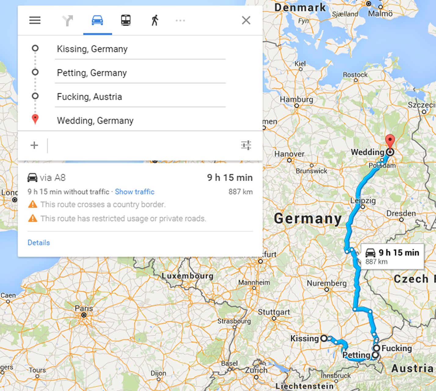
Kissing --> Petting --> Fucking --> Wedding
-
-
@Gern_Blaanston said in Fun with maps:
@Carnage said in Fun with maps:
@boomzilla said in Fun with maps:
Kissing --> Petting --> Fucking --> Wedding
-->

-
@Zecc said in Fun with maps:
@boomzilla said in Fun with maps:
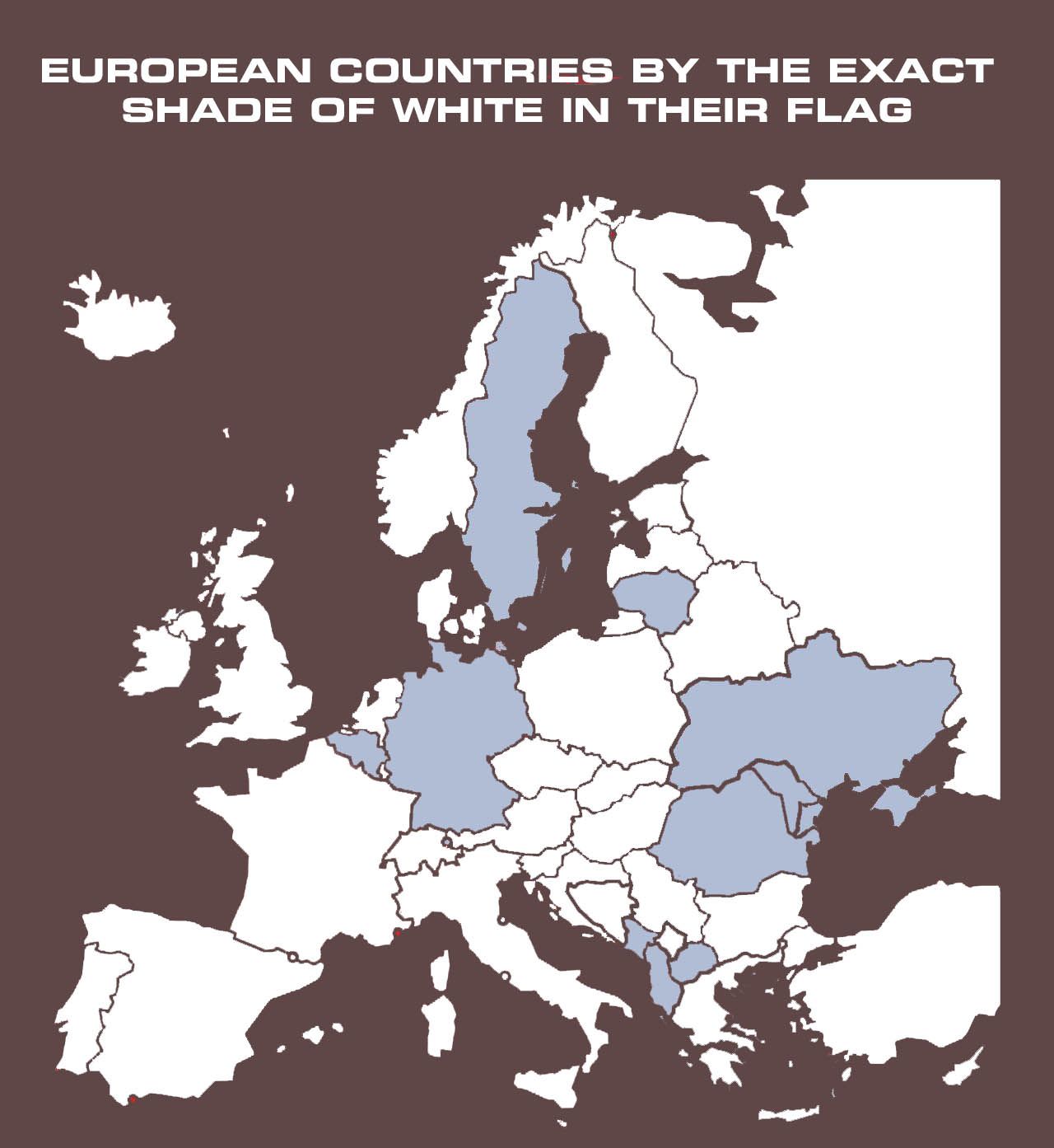
That map seems to be in pt-br.
How do you know the -br? I know the Portuguese don't find this funny
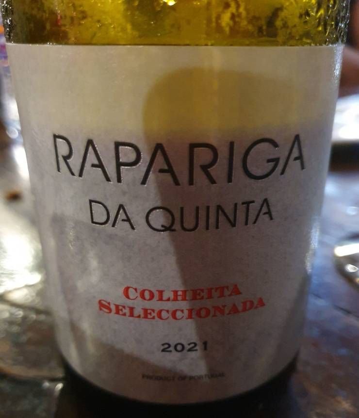
but do they call places differently, too?
-
@LaoC said in Fun with maps:
How do you know the -br?
Besides the sticking-out-as-a-sore-thumb fact they spell 'Chéquia' with a T, there's the subtle fact they use circumflex accents were -pt would use acute accents; ie, Polônia vs Polónia, Romênia vs Roménia (but not Lituânia, because we spell it the same, based on how we pronounce it).
@LaoC said in Fun with maps:
I know the Portuguese don't find this funny
Not by default, but I get why Brazilians would think it is. "Rapariga" just means "girl" to us, not "prostitute"..
-
@LaoC said in Fun with maps:
but do they call places differently, too?
Oh, and beyond accents I know for a fact that yes there are other name differences.
Eg, Moscow: Moscou (BR) vs Moscovo (PT).Probably others.
-
@boomzilla

E_OUTDATED_MAPSuch a shame they killed that joke.
-
@Zecc said in Fun with maps:
@LaoC said in Fun with maps:
How do you know the -br?
Besides the sticking-out-as-a-sore-thumb fact they spell 'Chéquia' with a T, there's the subtle fact they use circumflex accents were -pt would use acute accents; ie, Polônia vs Polónia, Romênia vs Roménia
TIL
(but not Lituânia, because we spell it the same, based on how we pronounce it).
If you did write it like you pronounce it, all the vowels would look like Hebrew's

-
@ixvedeusi At least Fucke, Sweden is being forced to keep their name as the authorities are refusing a name change.
-
@ixvedeusi said in Fun with maps:
@boomzilla
E_OUTDATED_MAPSuch a shame they killed that joke.
Well, Fucking before Wedding was clearly crossing the line. Now you first have to get to Wedding and then, uh...
 babies happen?
-
@Atazhaia said in Fun with maps:
@ixvedeusi At least Fucke, Sweden is being forced to keep their name as the authorities are refusing a name change.
Finally, some authoritarianism we can all get behind.
-
@remi said in Fun with maps:
@ixvedeusi said in Fun with maps:
@boomzilla
E_OUTDATED_MAPSuch a shame they killed that joke.
Well, Fucking before Wedding was clearly crossing the line. Now you first have to get to Wedding and then, uh...
babies happen?
-
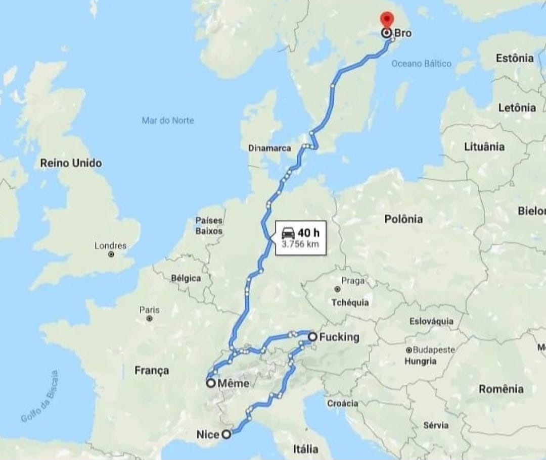
@Gern_Blaanston said in Fun with maps:
Kissing --> Petting --> Fucking --> Wedding
Can confirm that the relative distances are accurate.
-
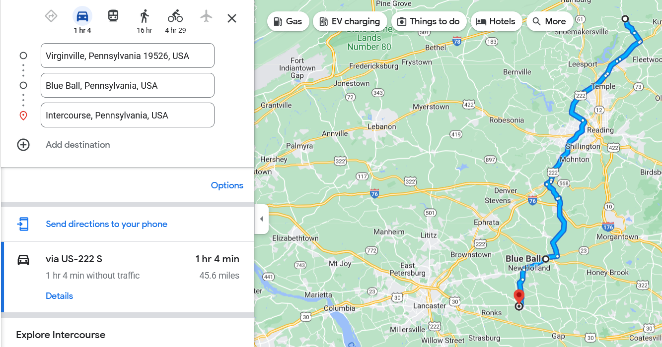
Edit: Mount Joy is nearby.
-
-
@Zecc "Blue Ball"? Why? Were
Red Ballsnot available?
-
edit: src
-
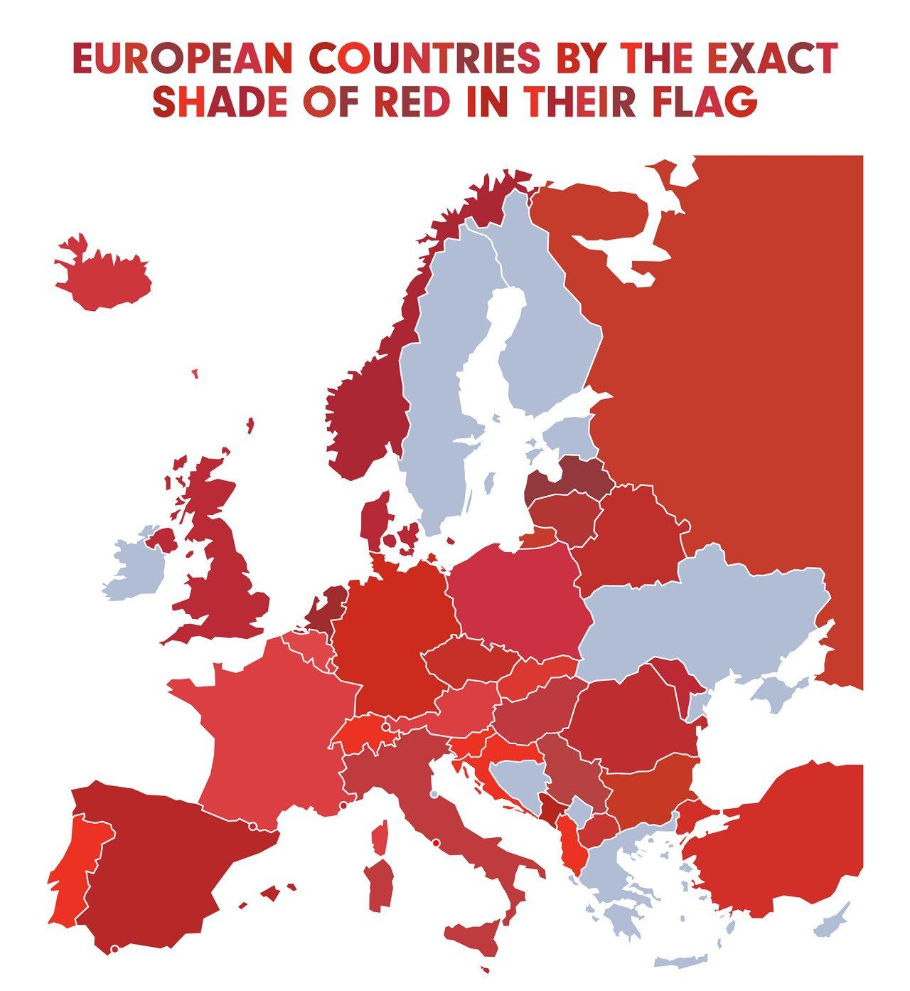
@loopback0 Now I'm wondering, is it actually defined that accurately anywhere? Because I'd think not.
-
@Bulb
For the UK flag there is a Parliamentary committee that takes advice, including Pantone colour specifications:https://www.flaginstitute.org/wp/uk-flags/british-flag-protocol/#index30
However, the bill to enter that into legislation stalled at the first reading.
-
@Bulb said in Fun with maps:
@loopback0 Now I'm wondering, is it actually defined that accurately anywhere? Because I'd think not.
At least some of Europe probably has it in a regulation somewhere
-
The color for France doesn't look right ; it's too light (the map uses
#db3f42; official government sites use#e1000f, which looks pretty similar to the real-life flag color). to check for other countries.
-
@Zerosquare said in Fun with maps:
The color for France doesn't look right
FWIW it came from Terrible Maps.
-
: Terrible and correct are not mutually exclusive.
-
@Zerosquare no but each one lowers the expectation of the other.
-
@Bulb said in Fun with maps:
@loopback0 Now I'm wondering, is it actually defined that accurately anywhere? Because I'd think not.
The red in the Netherlands flag is officially defined as helder vermiljoen (“bright vermillion”), which in practice equates to:—
Chromatic X=18.3 Y=10.0 Z=3.0
CMYK 0.83.78.32
RGB 173,29,37
Hexadecimal #AD1D25
RAL 2002
-
-
@Gurth said in Fun with maps:
bright vermillion
Y=10.0
(I have no idea what scale is being used here. But that doesn’t sound very bright.)
-
@kazitor said in Fun with maps:
(I have no idea what scale is being used here. But that doesn’t sound very bright.)
Apparently, CIE-1931 XYZ. But since the diagram for that seems to run from 0 through 0.9 for the y-axis, I wonder if Y=10.0 actually means 0.100? Except X=0.183 Y=0.100 puts you firmly into blue rather than red. Oh, wait, reading on a bit, “it’s complicated” seems to sum it up well. I see all kinds of mathematics that I CBA to understand.
-
@Gurth said in Fun with maps:
But since the diagram for that seems to run from 0 through 0.9 for the y-axis,
y ≠ Y; y = Y / (X+Y+Z). Y alone determines luminance,¹ but the use of x and y extracts only the non-luminance information (chrominance).² Since one of the purposes of XYZ is that none of the primaries are ever negative for real colours, that naturally ensures 0 < x < 1 and 0 < y < 1, and y actually turns out to be less than 0.835 for all real colours.³
The point is, if the value for Y is greater than 1, the scale obviously doesn’t run from 0 to 1 like you’d expect. And it doesn’t run from 0 to 10, because X is 18.3 and we’re not discussing a white point anyway. So if it runs from 0 to 100, we’re talking only 10% the luminance of the white point, which isn’t much for something called ‘bright’, even if saturated. sRGB red alone is 21% the luminance of the sRGB white point (D65).
Which is to say… I have no idea what the scale is.
¹ X and Z, despite affecting the colour of anything they’re added to, have zero luminance. The maths works out but none of these primaries are real.
² z is redundant because x + y + z = 1. To actually specify a complete colour, you need to know an unscaled primary, which usually means x, y, and Y.
³ y ≈ 0.834 at 521 nm. x approaches 0.735 at long wavelengths.INB4 PURPLE
-
-
-
-
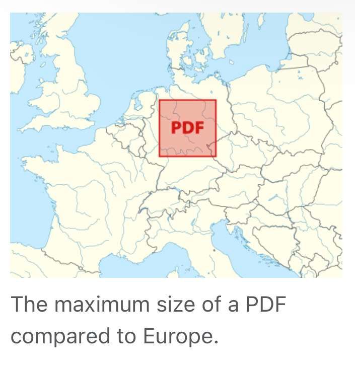
@Watson in the past I worked with some documentation PDFs that really pushed that limit. I'm pretty sure the physical dimensions of some UML diagrams I've seen there were larger than ISO B0.
-
@Gustav Apparently, that is a 381 km × 381 km square. The smallest B-series paper you could fit this on is B−19, if I’m not mistaken.
-
I’ve been having fun with maps. I have a map generated by Azgaar’s Fantasy Map Generator that I got it to export big enough, then with some contortions, converted into a series of square tiles (thanks Mercator) of ever increasing zoom, such that zoom 0 produces 1 tile, zoom 6 produces 4096 tiles.
Then plugged it into Google Maps (which supports custom tiles), as a custom MediaWiki plug-in.
Not the typical sort of fun, I’ll grant you, but I’ve had my share of fun with doing it. And swearing.
-
@Arantor I can relate to swearing at Azgaar's FMG, a lot, though I must also acknowledge it's very good.
-
@GOG I was swearing more at MediaWiki to be honest. And now fixing the latitude (only) for all 400+ cities large enough to be on the map.
-
@GOG said in Fun with maps:
I must also acknowledge it's very good.
Except for the way that it does weird things with placement of biomes, yes. Placement of deserts properly requires climate and hydrographic modelling. Which is horribly expensive to do properly...
OTOH, that 3D view is delicious.
-
@dkf said in Fun with maps:
Placement of deserts properly requires climate and hydrographic modelling.
Stephen Player designed a map of the Discworld. He says that one of the first things Terry Pratchett noticed on seeing it was that Player had stuck a rainforest downwind from a mountain range.
-
@Watson said in Fun with maps:
@dkf said in Fun with maps:
Placement of deserts properly requires climate and hydrographic modelling.
Stephen Player designed a map of the Discworld. He says that one of the first things Terry Pratchett noticed on seeing it was that Player had stuck a rainforest downwind from a mountain range.
Then again, AIUI while pterry designed it with the polar region at the hub and tropics at the rim, the messed-up astrodynamics would make the reverse more likely.
-
-
-
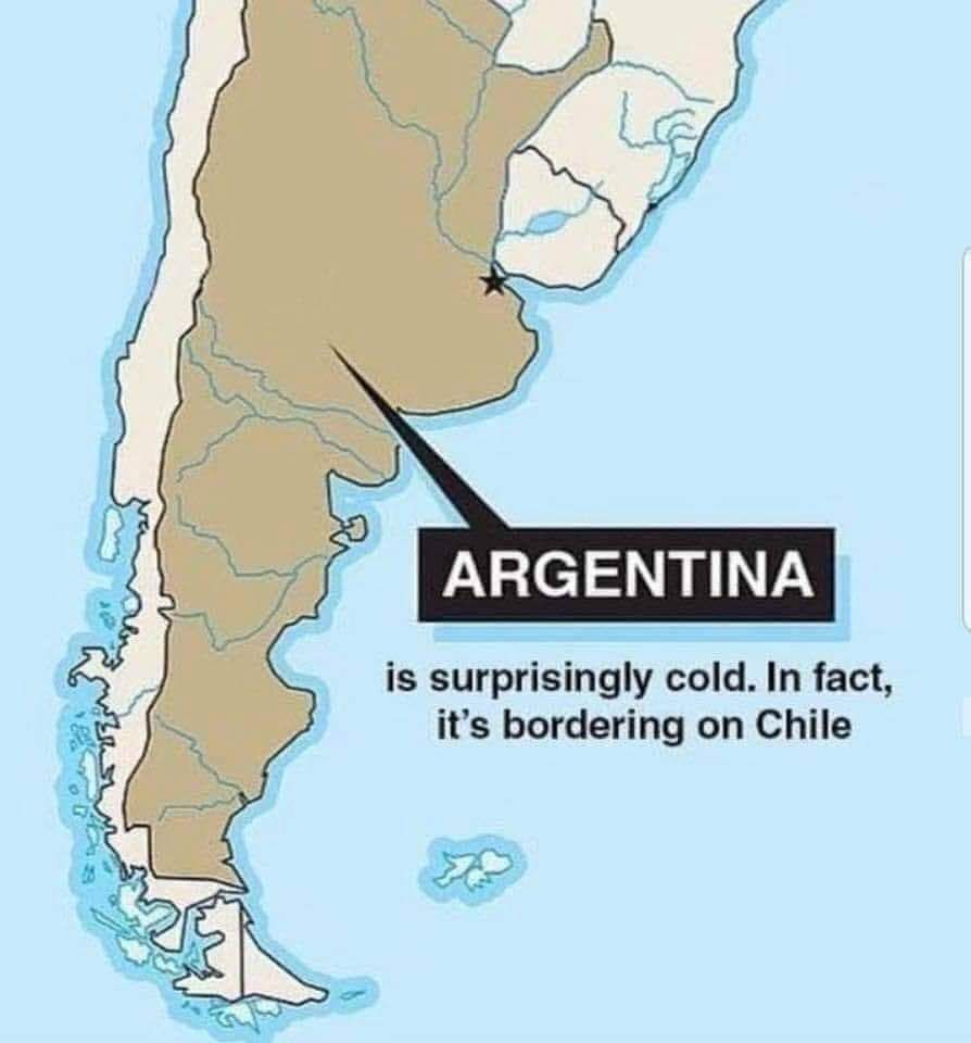
@loopback0 I just noticed that if you look at it with a squint, Argentina looks like a New York Strip steak. Which is appropriate, since Argentina is known for its beef.
-
@Benjamin-Hall said in Fun with maps:
Argentina is known for its beef
I thought east coast vs. west coast was a thing of the 90s.
-
@topspin gone but not forgotten!
 Last living suspect in 1996 drive-by shooting of Tupac Shakur indicted in Las Vegas on murder charge
A grand jury in Las Vegas has indicted the last living suspect in the 1996 killing of Tupac Shakur in a long-awaited breakthrough in one of hip-hop’s most enduring mysteries.