Mobile vertical confusion
-
Sometimes, but not always, node BB send to be shifting stuff up about one line of text worth. This means that the cancel and post buttons are hidden under the browser's title bar. Also, trying to tap on things in menus often end up selecting the item right above whatever I actually touched.
Meanwhile the keyboard and built in browser stuff works correctly wtf
-
Ok, yeah, it's when the browser bar shoes up, which normally happens when I scroll up but I'd also happening when I go to the composer, which prevents scrolling (I guess unless I had a super long post- nope).
-
@boomzilla can confirm. For me, it requires a manual page navigation (from the address bar) to fix.
-
This has also gotten notably worse in the past few days. Now it happens almost every time I try to post.
-
I certainly think submitting at all on mobile is a clusterfuck, and tend to hit the <abbr> button about as much as I actually successfully hit the send button, but it's never off screen for me.
-
This is now happening fucking constantly. Very frustrating.
-
@polygeekery said in Mobile vertical confusion:
This is now happening fucking constantly. Very frustrating.
It's happening for me constantly on the side menu and frustrating is a fucking understatement.
-
@boomzilla said in Mobile vertical confusion:
Also, trying to tap on things in menus often end up selecting the item right above whatever I actually touched.
No repro. Well, sort of. For me, it's the item below whatever I touched. I sometimes have the problem when trying to select text to quote, too.
-
@pie_flavor said in Mobile vertical confusion:
hit the button about as much as I actually successfully hit the send button
Yeah, that too.
-
I have had this happen 30-40 times today. Prior to this it was once or twice a day which is mildly annoying. Now the forums are almost completely unusable on mobile.
-
Me and my dumb phablet seem to be doing grand!
 👌
👌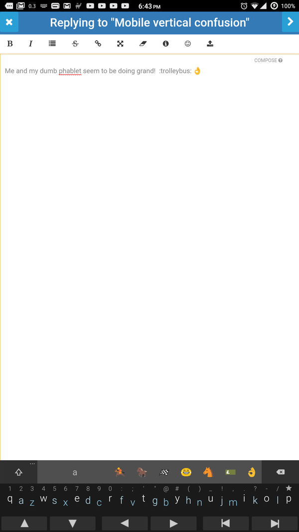
Then again, I do have it in "App Mode".
-
@pie_flavor said in Mobile vertical confusion:
but it's never off screen for me.
Jinxed it, fuck.
Edit: Title bar is off screen too, including the sidebar. The mobile interface has gone from 'piece of shit' to 'almost entirely unusable' overnight. 10/10.
-
I gave up on mobile because it always auto-logs me out, my password is 18 miles long, and my phone is too slow to load my KeePass database.
-
@mott555 said in Mobile vertical confusion:
my password is 18 miles long
Ah, should have made it 9.4697e-5 miles long.
@mott555 said in Mobile vertical confusion:
too slow to load my KeePass database.
How big could it possibly be?
-
@tsaukpaetra It isn't from size, it's from the encryption strength, apparently, because for whatever reason I cranked that up to insane levels when I set it up years ago. My PC opens it in 2 - 3 seconds. My phone runs out of battery before it's opened.
-
@mott555 said in Mobile vertical confusion:
I cranked that up to insane levels
Can you un-crank it? (asking somewhat genuinely, I'd assume re-encrypting the database should be a totally doable thing in today's world)
-
-
-
I tried over at church community.nodebb.org and couldn't reproduce. Also, coming straight back over here it's working correctly.
So now I suspect some custom css. @ben_lubar
-
@boomzilla said in Mobile vertical confusion:
I tried over at church community.nodebb.org and couldn't reproduce. Also, coming straight back over here it's working correctly.
So now I suspect some custom css. @ben_lubar
I should add an override for disabling all our custom CSS like the one for changing the current date.
-
Is there any progress toward fixing this at all? It's been an issue for at least a couple weeks now and it makes the mobile usability fucking awful. The behavior on my phone is that without any refreshing, a couple taps will require an offset above my target, then everything is back on track, then a couple taps will require an offset below my target. This ruins spatial memory (the value of which is something with which I actually agree with blakeyrat). Totally trash tier UX.
-
I'm curious: to those that have the "Add to Home Screen" posit option, can you try that and see if it opens the site without tabs or navigation (i.e. No address bar or buttons) and see if that helps?
Mine looks like this to tell Chrome it's supposed to be an "App":

Chrome recently (not really) changed how it reacts to the viewport resizing especially wrt the URL bar hiding mentioned by @boomzilla, and this should help conclusively test if this is part of the culprit.
-
This shit needs fixed. Now the nav bar is disappearing until refresh.

I am a patient guy, I will work around a lot. If I could make my mobile screen 3px larger and fix it I would, but the screen size is rather fixed.
-
@polygeekery said in Mobile vertical confusion:
I am a patient guy, I will work around a lot. If I could make my mobile screen 3px larger and fix it I would, but the screen size is rather fixed.
That's why it's a meme. There's exactly one website I've used in the past year where pushing 'desktop site' didn't actually bring up a desktop site, and you're looking at it.
-
@pie_flavor said in Mobile vertical confusion:
There's exactly one website I've used in the past year where pushing 'desktop site' didn't actually bring up a desktop site, and you're looking at it.
Um, actually, you get the desktop site every time already.
-
@boomzilla Pretty sure you know what he means.
-
@heterodox said in Mobile vertical confusion:
@boomzilla Pretty sure you know what he means.
Yes but this is actually an important distinction. On nodebb you get the same stuff irregardless. There's no "mobile site" or "desktop site." It's just responsive so that you get different CSS activated based on the size of the window (as seen via the DOM).
-
@boomzilla said in Mobile vertical confusion:
It's just responsive
But it's responsive in a highly broken way where it's not just the layout of the site that changes, but the features of the site.
-
@blakeyrat said in Mobile vertical confusion:
@boomzilla said in Mobile vertical confusion:
It's just responsive
But it's responsive in a highly broken way where it's not just the layout of the site that changes, but the features of the site.
I wasn't making any claims about it. Just pointing out why @pie_flavor was wrong.
-
@boomzilla said in Mobile vertical confusion:
@blakeyrat said in Mobile vertical confusion:
@boomzilla said in Mobile vertical confusion:
It's just responsive
But it's responsive in a highly broken way where it's not just the layout of the site that changes, but the features of the site.
I wasn't making any claims about it. Just pointing out why @pie_flavor was wrong.
I'm not. A desktop site is optimized for desktop. A mobile site is optimized for mobile. When the screen is >=768 pixels, I get the desktop site, and when the screen is <768 pixels, I get the mobile site. No shit I get a different CSS, that's what makes it a desktop vs mobile site.
-
-
OK, when ard we going to get a fix on this? This is beyond old now. It is unusable. I have to do a refresh before I do almost anything. Trying to navigate the sidebar menu now sometimes causes me to logout.
This is fucking clown shoes at this point.
-
@polygeekery said in Mobile vertical confusion:
OK, when ard we going to get a fix on this?
I'm certain @ben_lubar has that "Disable our custom CSS" button nearly ready for deployment any day now...
-
@tsaukpaetra It'll probably be about the same time he deploys my fix to :arrows:.
-
@pie_flavor said in Mobile vertical confusion:
@tsaukpaetra It'll probably be about the same time he deploys my fix to :arrows:.
Hopefully he finishes my "shit in @pie_flavor's mouth" option first. I have been waiting for that one.
-
@polygeekery said in Mobile vertical confusion:
@pie_flavor said in Mobile vertical confusion:
@tsaukpaetra It'll probably be about the same time he deploys my fix to :arrows:.
Hopefully he finishes my "shit in @pie_flavor's mouth" option first. I have been waiting for that one.
I haven't received that pull request.
-
@ben_lubar said in Mobile vertical confusion:
@polygeekery said in Mobile vertical confusion:
@pie_flavor said in Mobile vertical confusion:
@tsaukpaetra It'll probably be about the same time he deploys my fix to :arrows:.
Hopefully he finishes my "shit in @pie_flavor's mouth" option first. I have been waiting for that one.
I haven't received that pull request.
That's because it's a push request?
-
I don't know if 1.10.0 did something, but anecdotally though I've seen this still, I've seen it a lot less. Haven't disabled any CSS yet. It's also possible a Chrome update or something was responsible; I haven't checked yet.
-
I think I've just run into this. It was totally unusable.
Started a reply just fine then tried to move the cursor. This broke everything, seemed to be selecting random menu options mostly.
Decided to submit and fix it in the edit. The edit menu option didn't seem to be selectable at all...then I ended up with a 'reply as new topic' and wasn't able to discard that only submit it.
-
@heterodox said in Mobile vertical confusion:
I don't know if 1.10.0 did something, but anecdotally though I've seen this still, I've seen it a lot less. Haven't disabled any CSS yet. It's also possible a Chrome update or something was responsible; I haven't checked yet.
Why would I SAY this?!
As if to spite me, the forum has been doing this to me constantly since this post. "Fuck you, I'm fixed. I'll show you fixed."
-
So... I may have found a "fix" for when the slideout menu is "detached" from the top of the screen, though what I found doesn't seem to fix the other issues that manifests when this bug does.
First, the "fix":
#menu, #chats-menu { bottom:unset !important; max-height:100%; }Screenshots of Remote Debugging with the "fix" off and on:
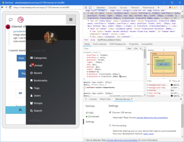
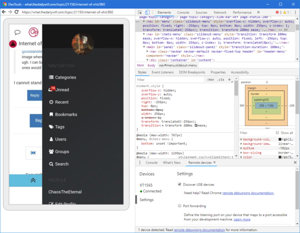
This fix corrects both what is pictured and the reverse where the slide out menu appears under the address bar. It likely doesn't correct any other issues related to this bug (primarily where items appear vs. where they are activated, like with the pagination bar or post controls).
As an FYI, I was able to replicate the issue on https://try.nodebb.org/, again now, and verified my fix corrects both position issues with the slide out menu. My "fix" is really a workaround, the issue is either in NodeBB's base CSS or is a Android Chrome/Webkit issue.
-
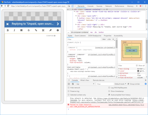
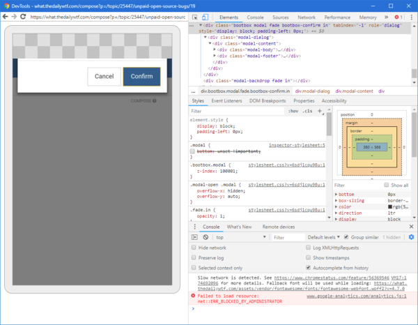
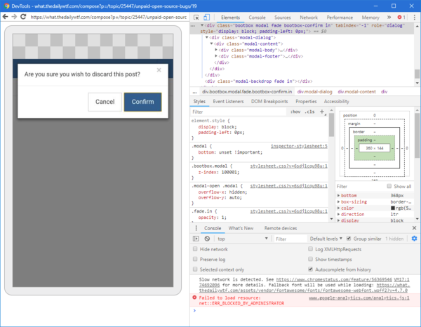
Well this is just silly. Here's a more complete "fix" for the issue:
/* Only apply these styles to "Mobile" mode */
@media (max-width: 767px) {
    /* fixes Slide Out menu whether under address bar or detached */
    #menu, #chats-menu { bottom:unset !important; max-height:100%; }
    /* fixes Composer and popups when top bar is under address bar */
    .composer, .modal { bottom:unset !important; }
}
Screenshots of "fix" off and on for Composer:
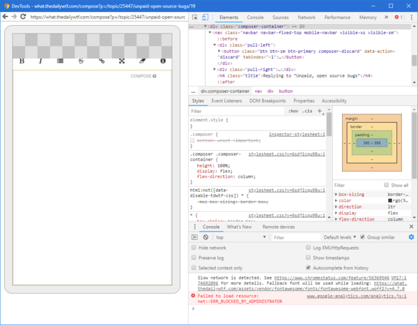
Screenshots of "fix" off and on for Modal:
One thing I can't seem to fix is the "where am I" bar at the bottom (
.pagination-blockis likely the best way to target it), since it's fixed to the bottom of the page, so when Chrome (or in my case, Brave) thinks the page height is stuck whether or not the address bar is visible, it is just shifted while appearing like it's in the right spot.
-
can someone submit a PR to boomzillawtf/tdwtf? I would do it myself, but

-
Strangely enough, even on my new phone that went into Wreckit Ralph mode, I still don't have these issues...
I guess I should be thankful....
-
Oh good, it's not just me then...
 URL bar resizing | Blog | Chrome for Developers
