UI Bites
-
@Rhywden But for those in need, here's how you do it:
Though they "solve" the problem by scaling the whole display (and not merely the top):
-
Though they "solve" the problem by scaling the whole display (and not merely the top):

-

Easy. Put all the Macs in a shipping container (or a bunch of containers; whatever). Put the container(s) on a ship. Then torpedo the ship.
-
@HardwareGeek said in UI Bites:

Easy. Put all the Macs in a shipping container (or a bunch of containers; whatever). Put the container(s) on a ship. Then torpedo the ship.
But only if the ship is above the Mariana Trench.
-
@Rhywden Ideal, but not strictly necessary. The crushing pressure is adequate anywhere in the deep ocean, and the salt water will cause irreparable corrosion anywhere, if left underwater long enough.
-
@HardwareGeek said in UI Bites:
@Rhywden Ideal, but not strictly necessary. The crushing pressure is adequate anywhere in the deep ocean, and the salt water will cause irreparable corrosion anywhere, if left underwater long enough.
It's from the Ripley School Of The Only Way To Be Sure.
-
@HardwareGeek said in UI Bites:

Easy. Put all the Macs in a shipping container (or a bunch of containers; whatever). Put the container(s) on a ship. Then torpedo the ship.
Or just send the ship to San Diego. CA will take it from there...
-
@HardwareGeek said in UI Bites:
the salt water will cause irreparable corrosion anywhere, if left underwater long enough.
True, but you don't need to resort to such extreme means. Merely breathing in the general vicinity of an device causes the water sensors inside it to trigger, and their "geniuses" "bartenders" to say "Sorry, it's water damaged, we can't fix it. Would you like to buy a new one?"

-
@loopback0 said in UI Bites:
@Rhywden in that video it's the OS that's not designed for the notch. It puts the status bar behind it.
There's a follow up video where he demonstrates that some app actually Does It Right™ by having the menu straddle the notch, and the mouse cursor immediately jump over it if you move it there
-
@hungrier Yeah. So third party apps can be updated to get it right but the OS can't.
-
@loopback0 I would be surprised if it can't be updated, but it's mystifying that that wasn't the first thing they did when they introduced the notch
-
@hungrier Can't get the
 off its knees.
-
I would be surprised if it can't be updated
Of course it can, but...
it's mystifying that that wasn't the first thing they did when they introduced the notch
It's a new version of macOS released when these shipped. There's no excuse.
-
@loopback0 said in UI Bites:
It's a new version of macOS released when these shipped.
Yeah, that should've been the fi--
refresh to see the edit
Yeah
-
What the absolute fuck. That’s two orders of magnitude dumber than removing the headphone jack and calling it brave.

-
@Rhywden But for those in need, here's how you do it:
Though they "solve" the problem by scaling the whole display (and not merely the top):
Even if they wanted to keep the aspect ratio
Even if they wanted to keep the window centered horizontally
They could have not added the bottom padding.
-
I'm just surprised they didn't do a similar to what they do with the dock. Make the menu scroll around, no biggie!

-
Discord is such a bountiful fount of WTFery it could flood an entire thread, no less than you’d expect from a Electron WebApp™ sewage dump, if only I could afford the investment.
Yet this one is so egregious it couldn’t go unrealised:
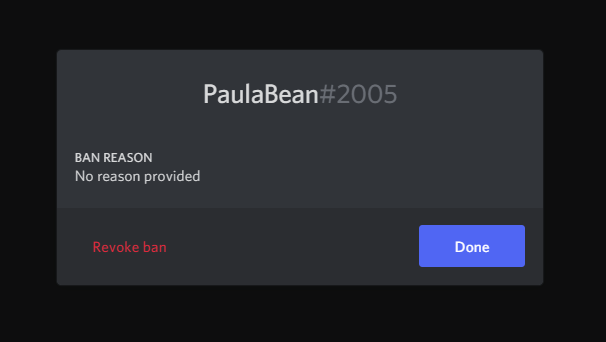
Your mission is to deduce the effect of the button labelled “Done”.
Spoiler!
I don’t actually know, I’m too chicken to check. All I have is that the “Revoke ban” bit is underlined when hovered over. Otherwise I’ve been clicking outside the modal to dismiss it.How lovely that a ModernⓇ UI can consist of only two (?) buttons and the function still isn’t clear.
-
Your mission is to deduce the effect of the button labelled “Done”.
Dismisses the dialog.
no less than you’d expect from a Electron WebApp™ sewage dump
It ain't perfect, obvs, but Discord manages to be one of the few (only?) that doesn't suck.
-
@loopback0 said in UI Bites:
Dismisses the dialog.
Indeed, if it was labeled "OK", it would imply that you're perfectly OK with the ban, when in fact it's a complex moral choice you'd rather not bother with and just be Done with it

-
@Applied-Mediocrity said in UI Bites:
complex moral choice
Most of my banhammering has been against people who have removed the complex bit of the choice and made it perfectly easy to apply the appropriate action.
-
Discord is such a bountiful fount of WTFery it could flood an entire thread, no less than you’d expect from a Electron WebApp™ sewage dump, if only I could afford the investment.
Yet this one is so egregious it couldn’t go unrealised:

Your mission is to deduce the effect of the button labelled “Done”.
Spoiler!
I don’t actually know, I’m too chicken to check. All I have is that the “Revoke ban” bit is underlined when hovered over. Otherwise I’ve been clicking outside the modal to dismiss it.How lovely that a ModernⓇ UI can consist of only two (?) buttons and the function still isn’t clear.
It is as Brilliant as Paula!
-
@BernieTheBernie said in UI Bites:
It is as Brill
iant as Paula!There is no second i in brillant. Learn how to spell!
-
@Atazhaia Beware of me spelling the spell!
-
Discord is such a bountiful fount of WTFery it could flood an entire thread, no less than you’d expect from a Electron WebApp™ sewage dump, if only I could afford the investment.
Yet this one is so egregious it couldn’t go unrealised:

Your mission is to deduce the effect of the button labelled “Done”.
Spoiler!
I don’t actually know, I’m too chicken to check. All I have is that the “Revoke ban” bit is underlined when hovered over. Otherwise I’ve been clicking outside the modal to dismiss it.How lovely that a ModernⓇ UI can consist of only two (?) buttons and the function still isn’t clear.
Of all the things wrong with Discord, you picked the least wrong one to rant about.
No matter which word they'd use as a label for the close button, there would always be some nerd in some remote corner of Earth complaining that it isn't 100% clear to him personally. That it was you this time around? If you're superstitious, you should take it as a sign to buy a lottery ticket.
-
Discord is such a bountiful fount of WTFery it could flood an entire thread, no less than you’d expect from a Electron WebApp™ sewage dump, if only I could afford the investment.
Yet this one is so egregious it couldn’t go unrealised:

Your mission is to deduce the effect of the button labelled “Done”.
Spoiler!
I don’t actually know, I’m too chicken to check. All I have is that the “Revoke ban” bit is underlined when hovered over. Otherwise I’ve been clicking outside the modal to dismiss it.How lovely that a ModernⓇ UI can consist of only two (?) buttons and the function still isn’t clear.
Of all the things wrong with Discord, you picked the least wrong one to rant about.
No matter which word they'd use as a label for the close button, there would always be some nerd in some remote corner of Earth complaining that it isn't 100% clear to him personally.
Label the right hand button "Go back". And make "Revoke Ban" a button.
Anyone who's confused at that point is wrong.
-
@BernieTheBernie said in UI Bites:
@Atazhaia Beware of me spelling the spell!
Spell the spelling spellars!
-
If you're superstitious, you should take it as a sign to buy a lottery ticket.
I just did, for shits and giggles. Whatever the result, I'm going to blame you

-
@GuyWhoKilledBear said in UI Bites:
And make "Revoke Ban" a button.
You mean have actions consistently use the same UI metaphor instead of random shit wherever?
Heresy.
-
@GuyWhoKilledBear said in UI Bites:
And make "Revoke Ban" a button.
You mean have actions consistently use the same UI metaphor instead of random shit wherever?
Heresy.I mean if you ABSOLUTELY NEED to have one thing as a button and one thing be a link, I'd argue that "Revoke Ban" should be a button because it changes the program's state, and "Go Back" should be a link because it just changes the display and not the state.
But that's only a thing if your budget for buttons was used up by people paying the increased New Topic Fee or something.
-
@Applied-Mediocrity said in UI Bites:
If you're superstitious, you should take it as a sign to buy a lottery ticket.
I just did, for shits and giggles. Whatever the result, I'm going to blame you

E12FD8F9 (Gąska 2021-11-08 06:29:34 -0600 18) If you're superstitious, you should take it as a sign to buy a lottery ticket.
-
@Applied-Mediocrity said in UI Bites:
If you're superstitious, you should take it as a sign to buy a lottery ticket.
I just did, for shits and giggles. Whatever the result, I'm going to blame you

But if you win, are you going to share the proceeds?
-
@HardwareGeek said in UI Bites:
@Applied-Mediocrity said in UI Bites:
If you're superstitious, you should take it as a sign to buy a lottery ticket.
I just did, for shits and giggles. Whatever the result, I'm going to blame you

But if you win, are you going to share the proceeds?
-
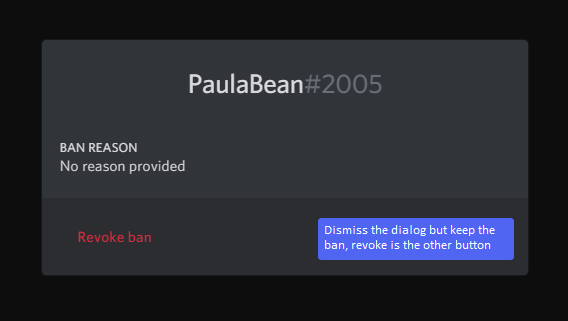
No matter which word they'd use as a label for the close button, there would always be some nerd in some remote corner of Earth complaining that it isn't 100% clear to him personally.
-
@hungrier somewhere, there's a visually impaired person who uses 250% font size everywhere. Half the label is now off the button, and probably unreadable due to bad CSS, bad contrast, and bad CSS. You'll never please everyone.
-
@hungrier somewhere, there's a
visually impaired persontechnical rarity with a 5K 27" monitor who uses 250% font size everywhere. Half the label is now off the button, and probably unreadable due to bad CSS, bad contrast, and bad CSS. You'll never please everyone.
-
@Applied-Mediocrity
visuallyimpaired person.
-
@GuyWhoKilledBear said in UI Bites:
I'd argue that "Revoke Ban" should be a button because it changes the program's state, and "Go Back" should be a link because it just changes the display and not the state.
Funny, I'd argue the reverse. "Go Back" should be a button, since this is a modal dialog and it represents the default action for that dialog. "Revoke Ban" should be interactable, but since it isn't used very often and is dangerous to use, it should be visually de-emphasized to reduce false acquisition, and the best tool for that is a link.
-
I'd argue there should be only one button on the bottom, and the only close button should be an X in top right corner. But I'm sure somebody will hate that obvious and very intuitive solution too.
-
I'd argue there should be only one button on the bottom, and the only close button should be an X in top right corner. But I'm sure somebody will hate that obvious and very intuitive solution too.
That + Revoke ban should not be in this modal dialog at all. Modal dialogs should serve no more than one function only - here it displays the reason for the ban. In a UI not designed by webmorons we would not need any popup dialog just to display some lines of text, but here we are.
-
-
Bonus WTF - while doing more research on this dialog window, I stumbled upon this article:
It contains not two, not three, not four, but SEVEN REPETITIONS OF THE EXACT SAME STEPS. SEVEN.
-
It contains not two, not three, not four, but SEVEN REPETITIONS OF THE EXACT SAME STEPS. SEVEN.
It even points out the steps are the same, and then repeats them anyway... more than once.
If you use Carl, you might wonder if the steps for unbanning someone will be different compared to MEE6 or Dyno. Fortunately, they’re all the same.
Unbanning someone on Discord via PC is the same across different operating systems. That said, follow the steps below whether you use Mac, Windows, or Chromebook:
-
If you unban Carl, you might wonder if the steps for unbanning someone else, such as MEE6 or Dyno will be different. Fortunately, they’re all the same.
is something I wouldn't have been surprised to read.
-
@TwelveBaud said in UI Bites:
"Revoke Ban" should be interactable, but since it isn't used very often and is dangerous to use, it should be visually de-emphasized to reduce false acquisition, and the best tool for that is a link.
No. Links are for navigation only, they never ever should lead to a state change. The only thing in there that could possibly be acceptable to use a link for is the "go back" / "dismiss" / "done". In fact your basic idea of "this is dangerous so make it inconspicuous" seems incredibly backwards to me and I hope I'll never have to use a UI you designed.
But actually, both of these should be buttons, with "Done" the default button (Outline it and maybe make it a bit bigger if you're scared about false aquisition) and "Revoke Ban" marked as dangerous (probably should include some red).
-
@ixvedeusi Tell that to Microsoft. They use button styling for the link and link styling for closing the "banner ad".
-
They use button styling for the link and link styling for closing the "banner ad".
Yeah, well, they're not doing that for the user's benefit.
-
@ixvedeusi A lot of UI is just conventions. A "link" isn't a link, it's text written in a styling that by convention we use mostly for link. Same for a "button." And your ideas would violate what other people consider to be a convention as well (buttons of different sizes, button's text of different colours...).
Ultimately, apart from truly physiological aspects such as larger objects attracting more attention or Fitt's law, there is no absolute should in UI. We're progressively and collectively learning that a "link" may actually act like a "button" and that's neither right or wrong, it's just conventions changing. If that works here and is understandable (and it is, since even this discussion that says it's not the "right" way to do it still perfectly understands what it does!), then why not?
-
A lot of UI is just conventions.
A "link" isn't a link, it's text written in a styling that by convention we use mostly for link.
A link is clickable text used for navigation (a concept that's literally as old as, and one of the central founding elements of, the world wide web). If something isn't a link, then it shouldn't look like a link.
There's also the even older concept of a button, which is a clickable surface that triggers an action.
Both of these are useful, meaningful, and time-honored conventions. You start out by stating that UI is just conventions, and then continue to say that we should feel free to throw all conventions over board for no reason because conventions may change or something.
If that works here and is understandable (and it is, since even this discussion that says it's not the "right" way to do it still perfectly understands what it does!)

The conversation started with someone daring us to guess what UI element there does what (even worse actually, daring us to guess how many different interactive UI elements there even were), The discussion about if it's the right way or not got going once we established what it does.
-
@ixvedeusi said in UI Bites:
You start out by stating that UI is just conventions, and then continue to say that we should feel free to throw all conventions over board for no reason because conventions may change or something.
Yes, that is exactly my point. A convention isn't an axiom or a hard rule. It may, and often does, change with time (and other things). 10 years ago (ass pull), making text-that-looks-like-a-link act as an action button was breaking convention. Nowadays, whether you like it or not, it's actually become part of the conventions.
The other part of the point is that a UI convention (usually) isn't something that was explicitly set out from the start, but rather a rationalisation of the actual use. Nobody sat down to say "hey, we're going to invent something called a 'link', and let's have a vote around the table to pick which colour it'll be and from now one everyone should follow it." UI rules are (or should be, IMO...) just formalising not what "should be done" but what "users understand." If users understand text-that-looks-like-a-link as an action button, then de facto it's now part of the convention.
If that works here and is understandable (and it is, since even this discussion that says it's not the "right" way to do it still perfectly understands what it does!)

The conversation started with someone daring us to guess what UI element there does what (even worse actually, daring us to guess how many different interactive UI elements there even were), The discussion about if it's the right way or not got going once we established what it does.
 to re-read the whole discussion in details, but my impression is that no-one ever contested what the text-that-looks-like-a-link does. Several (?) people criticised this UI choice, but I don't think anyone said "I have no idea what will happen if I click that link." Actually, the discussion focused on the other main UI element, the one that actually does follow the convention you describe and thus should be, according to your logic, the less controversial, i.e. the button!

