UI Bites
-
It's hard to be very sure if the damn thing is on or off at a glance. Colour isn't enough of an indicator (it's very culturally-dependent)
The actual colour might be but the presence of colour vs the lack of it makes them easier to figure out at a glance IMO.
-
Issue 1: there isn't a standard way of indicating an inconsistent or indeterminate state.
Issue 2: they have crossed over between environments to the point that using them on a web interface implies to people that there is an immediacy and a permanence to the state even if the form as a whole requires submission anyway.
Issue 3: while filled + indicator on the right is the usual state for 'on' and unfilled + indicator on left is usual for 'off', this is not entirely consistent in web implementations. Some reverse the orientation, some add red/green, some add text in the middle.
It's a very muddled and abused control at this point, in a way checkboxes aren't.
-
Colour isn't enough of an indicator (it's very culturally-dependent)
It is when you’re dealing with an Apple device, because physical switches like these on Apple hardware also show green next to the slider when “on” and no particular colour when “off” — check the switches on an Apple wireless keyboard or a Magic Mouse, for example. However, even then I suspect most users won’t realise that the software switches on-screen are meant to be just like the physical switches that they never actually use (who turns a keyboard off anyway?).
-
@loopback0 said in UI Bites:
It's hard to be very sure if the damn thing is on or off at a glance. Colour isn't enough of an indicator (it's very culturally-dependent)
The actual colour might be but the presence of colour vs the lack of it makes them easier to figure out at a glance IMO.
Unless they used the wrong color and the colors appear the same to the many color blind people.
-
Issue 1: there isn't a standard way of indicating an inconsistent or indeterminate state.
Issue 2: they have crossed over between environments to the point that using them on a web interface implies to people that there is an immediacy and a permanence to the state even if the form as a whole requires submission anyway.
Issue 3: while filled + indicator on the right is the usual state for 'on' and unfilled + indicator on left is usual for 'off', this is not entirely consistent in web implementations. Some reverse the orientation, some add red/green, some add text in the middle.
As I said, cultural expectations about colours also vary. There's an app I use that shows ads from time to time (it's otherwise a very good game) and those don't just appear in English, but also French, German, Korean, and Japanese. (Why?
 ) The cancel/close button in the ads with European languages tends to be the dark coloured option, but it's the opposite in the East Asian language ads. (Fortunately, I've not seen any in Hebrew, Arabic or Hindi yet.)
It's not safe to assume either side is "on" or that "intense" coloured is either. There's no cultural agreement.
-
The actual colour might be but the presence of colour vs the lack of it makes them easier to figure out at a glance IMO.
Unless they used the wrong color and the colors appear the same to the many color blind people.
If it’s colour vs. lack of colour, you have to be a very peculiar kind of colourblind to see those as the same. Unless your site or app was designed in the 1970s but the switch’s “on” colour is green, or something, of course.
-
@loopback0 said in UI Bites:
What's the actual issue with this style of toggle?
Assuming they're used consistently like on an iPhone, and not the hot mess that Edge uses which would be just as shit with checkboxes.Wrong way to look at it. What’s the issue with a checkbox?
I have never looked at a checkbox and didn’t know if it was checked or not. I have on several occasions had to to think about if one of these toggles is on or off. It’s design-wankery-over-usability at its peak.
-
-
@loopback0 said in UI Bites:
What's the actual issue with this style of toggle?
Assuming they're used consistently like on an iPhone, and not the hot mess that Edge uses which would be just as shit with checkboxes.Wrong way to look at it. What’s the issue with a checkbox?
Not really. There doesn't have to be an issue with something to use something else.
But either way I was just wondering what issue everyone had with them.
-
@loopback0 said in UI Bites:
@loopback0 said in UI Bites:
What's the actual issue with this style of toggle?
Assuming they're used consistently like on an iPhone, and not the hot mess that Edge uses which would be just as shit with checkboxes.Wrong way to look at it. What’s the issue with a checkbox?
Not really. There doesn't have to be an issue with something to use something else.
Not if that something else is strictly worse.
-
@topspin Another implementation inconsistency, at least on touchscreens: Some change state on a tap; others require a swipe. FFS, people; one way or the other, but pick a standard behavior and stick to it.
-
Or even better: allow both.
-
: checkboxes/sliders are just devs that chicken out on deciding what the Right
 behaviour is. Just remove them all.
-
: checkboxes/sliders are just devs that chicken out on deciding what the Right
behaviour is. Just remove them all.And replace them with a button with an icon that represents what state you want it to become if clicked!
-
Status: Now that's a new one!
https://cdn.discordapp.com/attachments/951768947475230770/1201705662372118558/image.png
https://cdn.discordapp.com/attachments/951768947475230770/1201705853778927646/image.png
All my window previews have extra stuff around them!
Heck, some of the game windows I have open also get them somewhat arbitrarily.
I don't really want to reboot, but I don't know of any other way to reload the graphics safely...
-
-
@Zerosquare said in UI Bites:
@Tsaukpaetra said in UI Bites:
I don't really want to reboot
Lies.
He might not want to, but that doesn’t usually preclude it when it is the needful.
-
@Tsaukpaetra said in UI Bites:
extra stuff
I kinda wonder if any useful data can be gleaned from the noise, I do notice the graphic does change depending on what was focused last.

-
It's often I edit some wiki pages on Firefox. If a page is big and the wiki has no convenient section-editing feature, this means using Ctrl+F (find in page) to get to the part I wanted to edit.
I don't know exactly how Firefox managed to screw up their keyboard input queue that badly, but if you Ctrl+F and continue typing immediately, focus will remain on the wiki's TextArea for one second or so, and with it, the first few characters you meant for the searchbox.
-
@Medinoc is this every wiki or specific ones? Is it possible that the wiki is pulling shenanigans to initially intercept Ctrl-F?
-
@Arantor Technically the only wiki I edit with any regularity currently is TV Tropes. But I have no knowledge of it doing any kind of keyboard shortcut management and am fairly confident I could reproduce the problem with a simple "edit page" on Wikipedia.
-
@Medinoc the reason I ask is that I do a lot of editing on a wiki with Firefox and I’ve never seen the behaviour you mention. And we have seen shitty web apps hijack the Ctrl-F behaviour in the past.
-
Anecdotally, not in a wiki but with the text entry on this forum, Ctrl+F in firefox immediately pulls focus to the find box
-
Speaking of Ctrl+F in Firefox, I either have Mandela effect or I remember a time where typing Ctrl+F in Firefox would put the current selection into the search bar. Like it does everywhere else and is the only Correct Way
to work.
But now it doesn't work like that anymore. You have to manually copy+past text from your current selection into the search bar.
-
I remember a time where typing Ctrl+F in Firefox would put the current selection into the search bar.
TIL, but

-
@topspin It does move the focus to the search bar for me
-
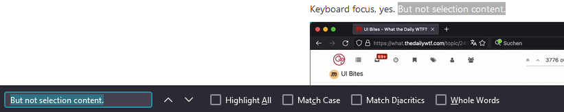
@topspin It does move the focus to the search bar for me
Keyboard focus, yes. But not selection content.
Also, what's with the cursor flickering in the screen grab?

-
-
@loopback0 I'm on the latest Firefox version, but it's not worked for at least a year now.
-
@topspin seems it works on Windows Firefox but not Mac Firefox.
-
@loopback0 I'm on the latest Firefox version, but it's not worked for at least a year now.
Still does, just not in this here forum because


 grabs
grabs ^F
-
@loopback0 said in UI Bites:
@topspin seems it works on Windows Firefox but not Mac Firefox.
There's a setting that defaults to off for some reason.
-
@loopback0 said in UI Bites:
@topspin seems it works on Windows Firefox but not Mac Firefox.
 prediction: The code to bring up the search bar uses Ctrl on Windows and Cmd on Mac. The for hysterical
  separate code path to put the selection in there just looks for Ctrl.
ETA:
 damn, my idea was
 nicermuch more insane.
-
@loopback0 said in UI Bites:
@topspin seems it works on Windows Firefox but not Mac Firefox.
If, on pressing Ctrl+F, copying the selection to the search box before doing the search is expected behaviour on Windows, then it makes sense that it doesn’t copy the selection to the search field on a Mac if you press ⌘F — because it isn’t expected behaviour under macOS. The norm there is that ⌘E copies the current selection to the search field, after which ⌘G searches. ⌘F only opens/focuses on the search field.
So if you have a selection you want to search for, you don’t need to hit ⌘F at all: use ⌘E followed by ⌘G instead.
-
-
But now it doesn't work like that anymore.
as well, not just @loopback0's. ( on why)On the other hand, it really annoys me how typing in the search input field in a private window makes the focus jump to the address bar. In particular because I have it set to have a separate search bar.
The effect is particularly jarring when the browser window is maximized; ie, always.
Also,
is up with WebMCam capturing its own window plus some weird offset?
-
makes the focus jump to the address bar. In particular because I have it set to have a separate search bar.

But that might be just me, I always hated the separate search bar and used search shortcuts basically since Konqueror introduced them over 20 years ago.
-
@loopback0 said in UI Bites:
I'm getting the same in linux. Including highlighting the paste in the search box, so if you hit ctrl-f and start typing it does not matter whether you had a selection or not.
-
Speaking of Ctrl+F in Firefox, I either have Mandela effect or I remember a time where typing Ctrl+F in Firefox would put the current selection into the search bar. Like it does everywhere else and is the only Correct Way
to work.
But now it doesn't work like that anymore. You have to manually copy+past text from your current selection into the search bar.Fuck. No, that definitely used to work on FF. It's always annoyed me that it worked on FF but not on Chrome. But now it's working on Chrome and not on FF for me.
-
@boomzilla fortunately, @loopback0 found the fix already.
-
@topspin yeah, I'm on Linux. But Chrome is my primary browser so actually I'm happy that they finally fixed that oversight.
-
@boomzilla oof, I've linked the wrong post. Scroll up to find the
about:configsetting to fix it. Worked for me.
-
@topspin It does move the focus to the search bar for me
Keyboard focus, yes. But not selection content.
Only if the search textbox is clear.
-
Anti-
 , in case @boomzilla decides to Ctrl+F for
 about:config, which isn't actually in the post.@loopback0 said in UI Bites:
There's a setting that defaults to off for some reason.
-
@boomzilla oof, I've linked the wrong post. Scroll up to find the
about:configsetting to fix it. Worked for me.Oh, wait...it's working. And that setting is correctly set. I was looking at the search up top, which I guess is a web search thing. Forgot that FF's page search was at the bottom.

-
Meanwhile, I've never done select-and-find in Firefox, but have used it in other apps and was delighted to learn that it Just Worked™ for me
-
@hungrier I haven't either. But I've wished before that Firefox had a Ctrl+F3 equivalent. So this was a nice TIL.
-
@loopback0 said in UI Bites:
@topspin seems it works on Windows Firefox but not Mac Firefox.
And Linux Firefox. I have neither access nor interest in Mac Firefox.
-
-
@boomzilla said in UI Bites:
a web search thing
I've been reading @DogsB too much. I read that as "a weeb search thing".
