Dear blakeyrat. I fixed the css. Signed The Desktop View
-
@Magus explain.
-
@anotherusername I already did. If that was remotely true, it would show that way on my phone if I had that landscape.
-
@Magus that depends entirely on what viewport size your phone claims to have when you've rotated it in landscape. And if you don't like it... blame your phone.
-
@Magus any idea about the resolution of your phone?
-
@RaceProUK said in Dear @blakeyrat. I fixed the css. Signed The Desktop View:
The screen may be high resolution, but the viewport (which is what CSS uses) will be narrower. I can't say how narrow exactly, as it's device-dependent, but a viewport pixel will be (somewhere in the region of) two device pixels.
That still makes no sense at all, and you know it. If it is able to always detect a phone successfully, it should be able to always detect not a phone successfully, or it is an innately broken mechanism. Designing something based on an innately broken mechanism is completely utterly abhorrently stupid.
-
@Magus said in Dear @blakeyrat. I fixed the css. Signed The Desktop View:
That still makes no sense at all, and you know it.
It's in the CSS specification specifically because different devices have different device pixel sizes. Take, for instance, Retina displays. For a given size, a Retina display has (roughly) twice as many pixel per inch. If CSS used device pixels only, then everything would be half-sized on Retina displays. However, if the HTML has a special
metatag, then CSS switches to using viewport pixels, which don't always map 1:1 to device pixels; for Retina, it's more like 2:1, and for a phone, closer to 1.5:1.@Magus said in Dear @blakeyrat. I fixed the css. Signed The Desktop View:
If it is able to always detect a phone successfully, it should be able to always detect not a phone successfully, or it is an innately broken mechanism.
It's not detecting it's a phone though; it's detecting a narrow viewport.
People are getting so hung up on 'mobile vs not mobile' and 'phone vs not phone' that they're missing what's really going on: it's all about the viewport.
-
@RaceProUK said in Dear @blakeyrat. I fixed the css. Signed The Desktop View:
People are getting so hung up on 'mobile vs not mobile' and 'phone vs not phone' that they're missing what's really going on: it's all about the viewport.
No, what's happening is that no one cares what's actually going on. It's cool that you know so much. But it's still broken.
-
@Magus Aside from the missing preview, what's actually missing in 'mobile' mode that's otherwise present?
-
@RaceProUK said in Dear @blakeyrat. I fixed the css. Signed The Desktop View:
@Magus Aside from the missing preview, what's actually missing in 'mobile' mode that's otherwise present?
The "I DON'T HAVE PROBLEMS WITH IT AND IF YOU THOUGHT ABOUT IT YOU WOULDN'T EITHER" defense? No. It is not less broken and wrong because you don't mind that it is broken and wrong.
-
@Magus I asked a straight question expecting a straight answer; clearly I shouldn't have bothered
-
@RaceProUK You asked a stupid question ignoring the problem so you could act all offended when someone called you out on it, as always. You are the irrational one here.
-
@Magus Fuck you then you fucking shit
-
@RaceProUK said in Dear @blakeyrat. I fixed the css. Signed The Desktop View:
People are getting so hung up on 'mobile vs not mobile' and 'phone vs not phone' that they're missing what's really going on: it's all about the viewport.
Why it's stupid doesn't matter. It's still stupid.
-
@loopback0 Whatever; I'm done caring. No-one can give me a straight answer to anything; all I get is "It's fucking obvious it's stupid.". So fuck it. Piss and moan all you fucking like; you won't get a single fucking ounce of sympathy from me.
-
Here's Chrome snapped to half of a 1920x1080 display. Preview is gone. The rest of the topic is gone.
-
@loopback0 Finally, someone actually bothered to explain what's wrong instead of whining like a bitch.
-
@RaceProUK the parts that strike me as stupid are:
- it jumps up to take the entire height for no apparent reason
- there's a blue bar at the top that isn't there at all in the wider mode
- Submit turns into for no apparent reason
- Discard jumps over to the other side for no apparent reason
- aka "red boob" goes away completely for no apparent reason
- actually, there's apparently no way to minimize or hide it without trashing your post
-
@anotherusername Thank you for answering my question and helping me understand the issues at hand
-
@RaceProUK Yes, I know. The point is, by boiling it down to four, they encourage people to assume they're looking at four devices: phone, tablet, desktop, and widescreen desktop. Without bootstrap's handy breakdown, people have to figure out where to put breakpoints themselves, which means understanding what their userbase is doing and adapting to that.
-
@Yamikuronue Out of interest, I had a look at Materialize; that only has three sizes, mobile, tablet, and desktop. The dumb thing is both frameworks assume tablets are 992px or narrower; the iPad mini in landscape has 1024px.
-
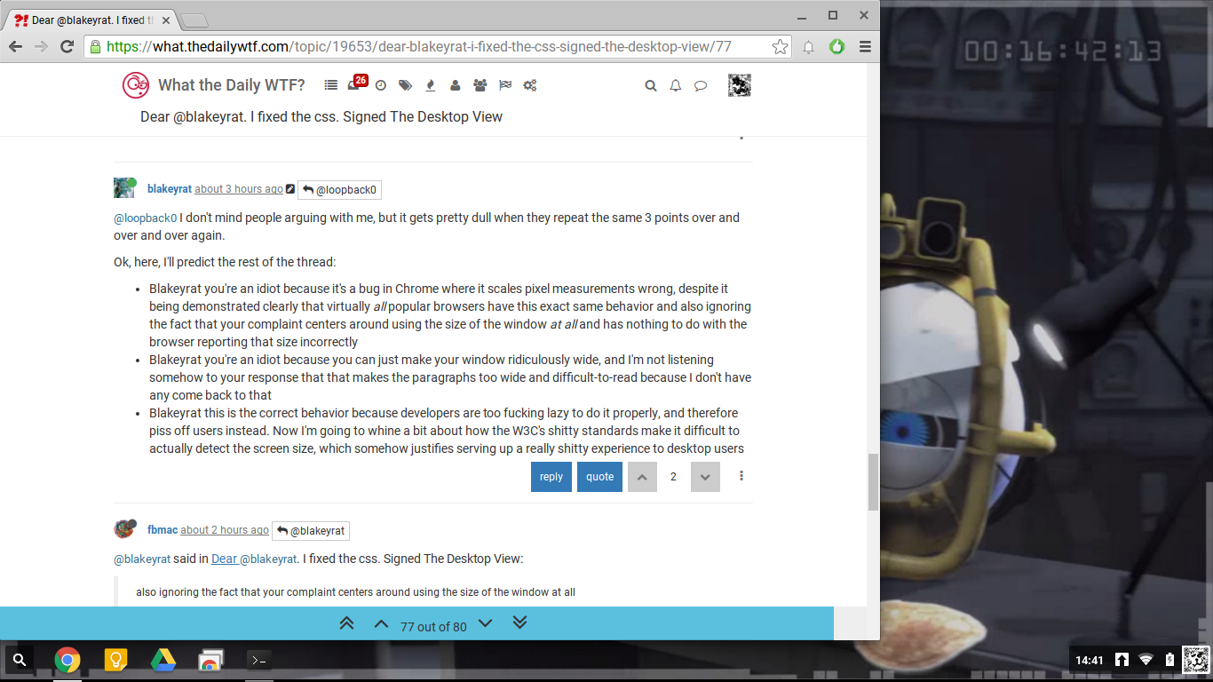
@blakeyrat said in Dear @blakeyrat. I fixed the css. Signed The Desktop View:
Blakeyrat you're an idiot because you can just make your window ridiculously wide, and I'm not listening somehow to your response that that makes the paragraphs too wide and difficult-to-read because I don't have any come back to that
Since any number of people have said "increase your browser width by 3 pixels", this proves once again that either you don't read what people wrote (hint: 3 pixels is not going to convert a window from "not-ridiculously wide" to "ridiculously wide", or possibly that there's something with you if those extra 3 pixels make your paragraphs too wide and difficult-to-read.
-
@flabdablet said in Dear @blakeyrat. I fixed the css. Signed The Desktop View:
so I don't understand why you refuse
Because he'd rather call people names. Isn't it obvious after all these years?
In addition to possibly-pretend depression and insomnia, he's going to wind up with an ulcer eventually, probably.
-
@FrostCat said in Dear @blakeyrat. I fixed the css. Signed The Desktop View:
In addition to possibly-pretend depression and insomnia, he's going to wind up with an ulcer eventually, probably.
Because why wouldn't he?
-
@ben_lubar said in Dear @blakeyrat. I fixed the css. Signed The Desktop View:
Here's the browser width that @blakeyrat is using:
Here's the minimum browser width to not have the mobile view:

That's clearly goofy behavior, but if you think that the second screenshot consists of "ridiculously-wide" paragraphs, you should seek professional help.
-
@blakeyrat said in Dear @blakeyrat. I fixed the css. Signed The Desktop View:
What's happening on this forum are people are going way out of their way to tell me how wrong I am at every possible occasion. Even when I am not wrong.
I wonder how that could have happened. It's probably a mystery lost to time.
-
@Magus said in Dear @blakeyrat. I fixed the css. Signed The Desktop View:
On a desktop PC, no one ever wants mobile
Well, now I want mobile. See what you did? ARE YOU HAPPY?
-
@RaceProUK said in Dear @blakeyrat. I fixed the css. Signed The Desktop View:
The screen may be high resolution, but the viewport (which is what CSS uses) will be narrower. I can't say how narrow exactly, as it's device-dependent, but a viewport pixel will be (somewhere in the region of) two device pixels.
*cough* my 2560x1440 phone will still give me "mobile" "mode" held sideways.
-
@RaceProUK said in Dear @blakeyrat. I fixed the css. Signed The Desktop View:
Aside from the missing preview, what's actually missing in 'mobile' mode that's otherwise present?
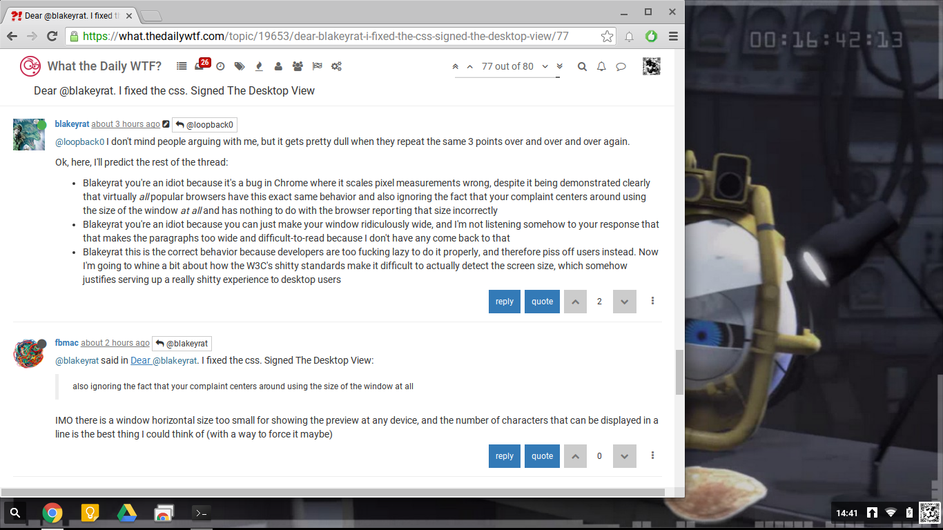
Well, for one, you can't see the posts any more, because the composer takes up the full window, which looks pretty stupid on a 1000-ishx1000-ish window.
-
@RaceProUK said in Dear @blakeyrat. I fixed the css. Signed The Desktop View:
Finally, someone actually bothered to explain what's wrong instead of whining like a bitch.
I'm pretty sure someone explained it before.
-
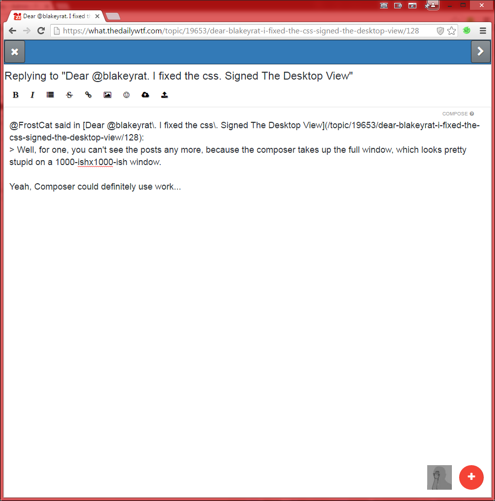
@FrostCat said in Dear @blakeyrat. I fixed the css. Signed The Desktop View:
Well, for one, you can't see the posts any more, because the composer takes up the full window, which looks pretty stupid on a 1000-ishx1000-ish window.
Yeah, Composer could definitely use work...
Huh. The Red Boob still shows in Limbo mode. TIL.
-
@anotherusername said in Dear @blakeyrat. I fixed the css. Signed The Desktop View:
aka "red boob" goes away completely for no apparent reason
@Lorne-Kates probably prefers that, though.
-
@FrostCat said in Dear @blakeyrat. I fixed the css. Signed The Desktop View:
@RaceProUK said in Dear @blakeyrat. I fixed the css. Signed The Desktop View:
The screen may be high resolution, but the viewport (which is what CSS uses) will be narrower. I can't say how narrow exactly, as it's device-dependent, but a viewport pixel will be (somewhere in the region of) two device pixels.
*cough* my 2560x1440 phone will still give me "mobile" "mode" held sideways.
Well, yeah, since it's 2560x1440 device pixels, but probably more like 800x480 viewport pixels, and CSS uses the latter in
widthandheightmedia queries (there aredevice-versions too, but I've never seen them used by, well, anything).Also, that's one hell of a mobile screen; what's the phone?
-
@RaceProUK said in Dear @blakeyrat. I fixed the css. Signed The Desktop View:
2560x1440 device pixels, but probably more like 800x480 viewport pixels
Well, you just went from a 2-1 to a 3-1 shrink there, but I'm not actually trying to argue with you.
@RaceProUK said in Dear @blakeyrat. I fixed the css. Signed The Desktop View:
Also, that's one hell of a mobile screen; what's the phone?
LG G3, so a 2yo flagship. I actually don't like that because it's far more dpi than you can really see, meaning it's wasted (and so I'd rather they spent the money on an actually more useful feature), but more importantly, because it causes the GPU to struggle in some games.
Compare the stats of the G3 with a Galaxy Note II, which is 1280x720 and has a significantly slower max CPU speed, and ponder that a game like Farmville 2 is massively more responsive. That's just crazy.
-
@FrostCat said in Dear @blakeyrat. I fixed the css. Signed The Desktop View:
Well, you just went from a 2-1 to a 3-1 shrink there, but I'm not actually trying to argue with you.
True, but I went with 2:1 as an example as IIRC that's the ratio for Retina displays; phones evidently have a wider range of scaling factors than I thought. And according to this list, the G3 does in fact have a 3:1 scaling; my Nokia Lumia 920 has a ratio of 2.4:1, which is higher than I thought it was.
-
@Magus said in Dear @blakeyrat. I fixed the css. Signed The Desktop View:
On a desktop PC, no one ever wants mobile.
There is no mobile view at all, so no worries there.
-
@loopback0 said in Dear @blakeyrat. I fixed the css. Signed The Desktop View:
Here's Chrome snapped to half of a 1920x1080 display. Preview is gone. The rest of the topic is gone.
So what? Give it enough area to display all of that, and it will do so. No worries.
-
@Polygeekery said in Dear @blakeyrat. I fixed the css. Signed The Desktop View:
So what?
It's a ridiculous waste of space. Even on my iPhone that composer is massive.
@Polygeekery said in Dear @blakeyrat. I fixed the css. Signed The Desktop View:
Give it enough area to display all of that
It's got enough, it's just choosing not to.
I use a few forums, and not a single one of them disappears into "mobile" view when I use the perfectly acceptable Windows snap feature to snap a browser window to the side.
-
@ben_lubar said in Dear @blakeyrat. I fixed the css. Signed The Desktop View:
It's exactly the same content
Minus the ability to milti quote, continue to read posts while composing, see what your post will look like, etc.
-
@blakeyrat said in Dear @blakeyrat. I fixed the css. Signed The Desktop View:
I'm more encouraged by Lorne's statement that the NodeBB devs are actually fixing the CSS to enable us to add a toggle, but I have no idea where he got that information, I have no corroborating information, and I suspect he pulled it out of his ass.
It's possible. I honestly am sure I saw a "fix is being worked on".
@ben_lubar @julianlam are you working on (in wtdwtf or base nodebb) splitting the @media queries into separate .css, so they can be ignored by people who don't want certain views?
If not, care to adopt my js to be reversible, and slap it behind a "always show desktop" toggle?
-
@Lorne-Kates They can either put the @media queries into a different CSS file, then enable/disable that file enmasse, or add a selector to all of the @media queries to ensure they will only work if a specific class is present. (Or not present, I suppose.) The latter solution makes for one less file to fetch, but slightly more additional data to download. Since the CSS is already like 45k (somehow!), it's small beans in either case.
-
@fbmac said in Dear @blakeyrat. I fixed the css. Signed The Desktop View:
if he gets to this size using a windows shortcut he is right about being annoyed,
So what I'm hearing is that the bug is actually a Windows bug? Which is to say: bad hardware.
-
I just noticed my tablet is rendering the full desktop mode when I rotate it sideway. But preview is unusable because it only fit 1 line of text in it anyway. Other than the composer everything is better, so I like it.
-
@fbmac said in Dear @blakeyrat. I fixed the css. Signed The Desktop View:
Other than the composer everything is better, so I like it.
Other than the composer everything is exactly the same on both sizes.
-
@ben_lubar it looks better in my galaxy tab pro than in my asus zenphone 5 with a broken screen, maybe it's the hardware
-
@Lorne-Kates said in Dear @blakeyrat. I fixed the css. Signed The Desktop View:
Userscript. I'm sure you could adapt it to a bookmarklet.
I'm thinking it should be a plugin, somehow. What license should this code be under?
-
This post is deleted!
-
So I started playing around with this. It doesn't work at all on chrome. That was fairly easy to fix.
However. Running this has a bit of an opposite effect of what's desired. Now the page keeps everything too wide. I guess the max/min width replacements were just too aggressive.
-
@boomzilla said in Dear @blakeyrat. I fixed the css. Signed The Desktop View:
What license should this code be under?
is "fuck you, give me money." a license?
because it probably should be if it isn't

-
So, playing around with @Lorne-Kates' script, I found these unique media max / min width settings:
(max-width: 1199px)
(max-width: 1199px) and (min-width: 992px)
(max-width: 500px)
(max-width: 767px)
(max-width: 767px), (max-height: 480px)
(max-width: 768px)
(max-width: 979px)
(max-width: 991px)
(max-width: 991px) and (min-width: 768px)
(max-width: 992px)
(min-width: 1000px)
(min-width: 1200px)
(min-width: 768px)
(min-width: 979px)
(min-width: 992px)
screen and (max-width: 767px)
screen and (max-width: 991px)
screen and (min-width: 768px)
I found these variables defined in nodebb's less, which account for most of those things:
@screen-sm:                  768px;
@screen-md:                  992px;
@screen-lg:                  1200px;
@screen-xs-max:              (@screen-sm-min - 1);
@screen-sm-max:              (@screen-md-min - 1);
@screen-md-max:              (@screen-lg-min - 1);

// These are deprecated:
@screen-phone:               @screen-xs-min;
@screen-desktop:             @screen-md-min;
@screen-lg-desktop:          @screen-lg-min;
I guess we'd want to change the
@screen-smand@screen-mdto be 0..0 or whatever then expand the@screen-lgranges to 1..max?
-
@boomzilla said in Dear @blakeyrat. I fixed the css. Signed The Desktop View:
I guess we'd want to change the
@screen-smand@screen-mdto be 0..0 or whatever then expand the@screen-lgranges to 1..max?That would get the job done. I assume this'll be a user setting or something?
