New: Occasional new 'crossed-arrows' icon in topic list
-
This is new. Is the Featurefreeze over?
Filed Under: New Heatmap anyone?
Addendum: I don't see any red over at meta.d ... so custom CSS?
-
No. Just me marking /t/1000 and the Status thread with something that's a little more permanent than their topic names.
http://what.thedailywtf.com/t/the-official-coffee-party-topic-bawston-style/1000/32810?u=pjh
Summary:
@xaade: "oh - new thread - shiny...."
@xaade: "...oh - fuck. Someone's renamed /t/1000. Again"
@riking: "Here's some stylish you could use"
@someone else: "shouldn't this be site wide?"
@pjh: <catches up>
-
Filed Under: New Heatmap anyone?
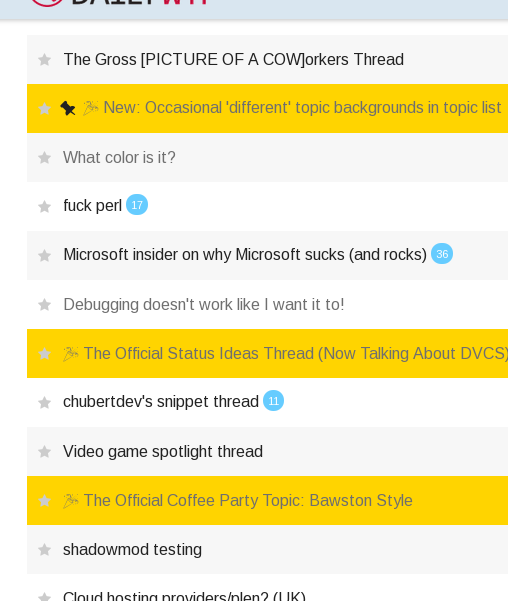
Well sorta. But it's manual. And just here. Criteria I just ass-pulled:
- Is it a long running thread?
- Do people fuck around with the topic title a lot?
Gives a quick visual indicator (especially on mobile) that it's 'one of those threads that I can't fucking stand' for people who can't fucking stand them.

-
it's butt ugly, wasn't there any other color? The idea is fine though.
-
I'm open to suggestions. I just copied the one @riking used.
-
I tried blue first, but it clashed with the "This is an OLD TOPIC, GUYS!" indicator.
-
http://www.colourlovers.com/color/A3C00F/Chemo_Puke_Green perhaps?
Though bear in mind it didn't go down too well when I changed the hearts to that color way back...
-
-
I was wondering if it was just me. Glad it's not.
-
And people will start having seizures.
-
I'm surprised you didn't make this one red too.
-
-
I'm surprised you didn't make this one red too.
Good point... at least for a couple of days.
-
Even after a hard refresh the 'pinned' topic isn't at the top?
It was still set to pinned at the time, I've since unpinned it.
-
It's pinned to the top of Meta, not everything - clicked the wrong button. I don't think it really matters that much for this.
-
Maybe, instead of a full background color, a new icon in the same place as the pin one would make more sense?
-
:lost:
Why does the pin need to change? This is a pinned topic.
-
I mean for the >1K topics

-
Gotcha. May have to think about that one...
-
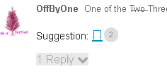
Suggestion: 🎉
-
I don't think it really matters that much for this.
Not really no. Just wasn't expecting a Discopin to behave like that.
Really should expect the unexpected with Discosauce by now though.
-
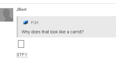
Why does that look like a carrot?
-
Why does that look like a carrot?
I dunno. Probably because Unicode doesn't contain a codepoint for carrot and this character can be used as a homoglyph?
-
-
Ignoring the color scheme (was making sure I had the right preview while grubbing around the DOM) - not too sure about the 'carrot' - looks a bit... weak? (I can't use FA here since there's no
ito attach a glyph to.)http://what.thedailywtf.com/?preview-style=4b418f90-300d-440f-a2b0-1308cf0c6cfd
-
That's the problem - it doesn't scale well when used in-situ.
-
-
-
You could use 🎔 for the Likes thread ;)
-
I'm not having different glyphs for different threads - the SCSS is bad enough as it is..
/* Highlight topics that change regularly in topic list
http://what.thedailywtf.com/t/the-official-coffee-party-topic-bawston-style/1000/32759
*/
tr[data-topic-id="1000"], /* Likes */
tr[data-topic-id="1673"], /* Status */
tr[data-topic-id="6951"], /* Notification topic - remove sometime after 10 Jan '15 */
tr[data-topic-id="4285"] /* First World Problems */
{
   background-color: rgb(255, 212, 0) !important;
   .main-link > .title:before {
       content: "🎉 ";
    }
}
-
I'm not having different glyphs for different threads
It wasn't a serious suggestion (hence the :) ). It's not really easy to find a generic glyph for those topics that's intuitive-ish though.
Or I need more coffee.
Or both.
-
-
@OffByOne said:
intuitive
Like the rest of Discourse?
If that was what I meant, I'd have written Discotuitive.
I mean normal-people-intuitive
-
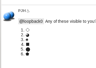
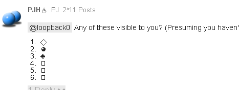
@loopback0 Any of these visible to you? (Presuming you haven't done anything in that FAQ yet..)
- ⃟
- ◕
- ♣
- ⬛
- ⬤
- ⬟
-
Reference rendering:
-
-
Do people fuck around with the topic title a lot?
That is just an invitation for more topic fuckery
-
-
Ok - I'll go with that, and tone down the highlight color to one of the blues.
Just a shame that desktop CSS doesn't show the glyph on mobile... :sigh:
-
I'm open to suggestions. I just copied the one @riking used.
tr[data-topic-id='1000'] {
    opacity: 0.2 !important;
}
-
doesn't show the glyph on mobile
Ok - having messed around with Chrome device emulation, this may be a local problem...
-
Doesn't look any different on Chrome Mobile for me. No colour difference, no glyph. Looking at the post with the glyphs in, it doesn't show there either.
-
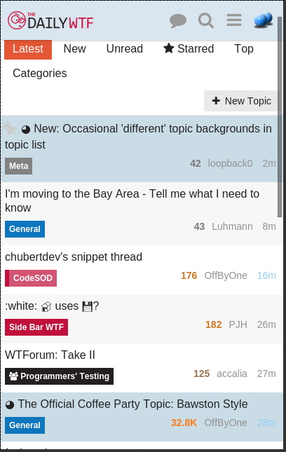
Hmm. Galaxy S3 (Chrome):
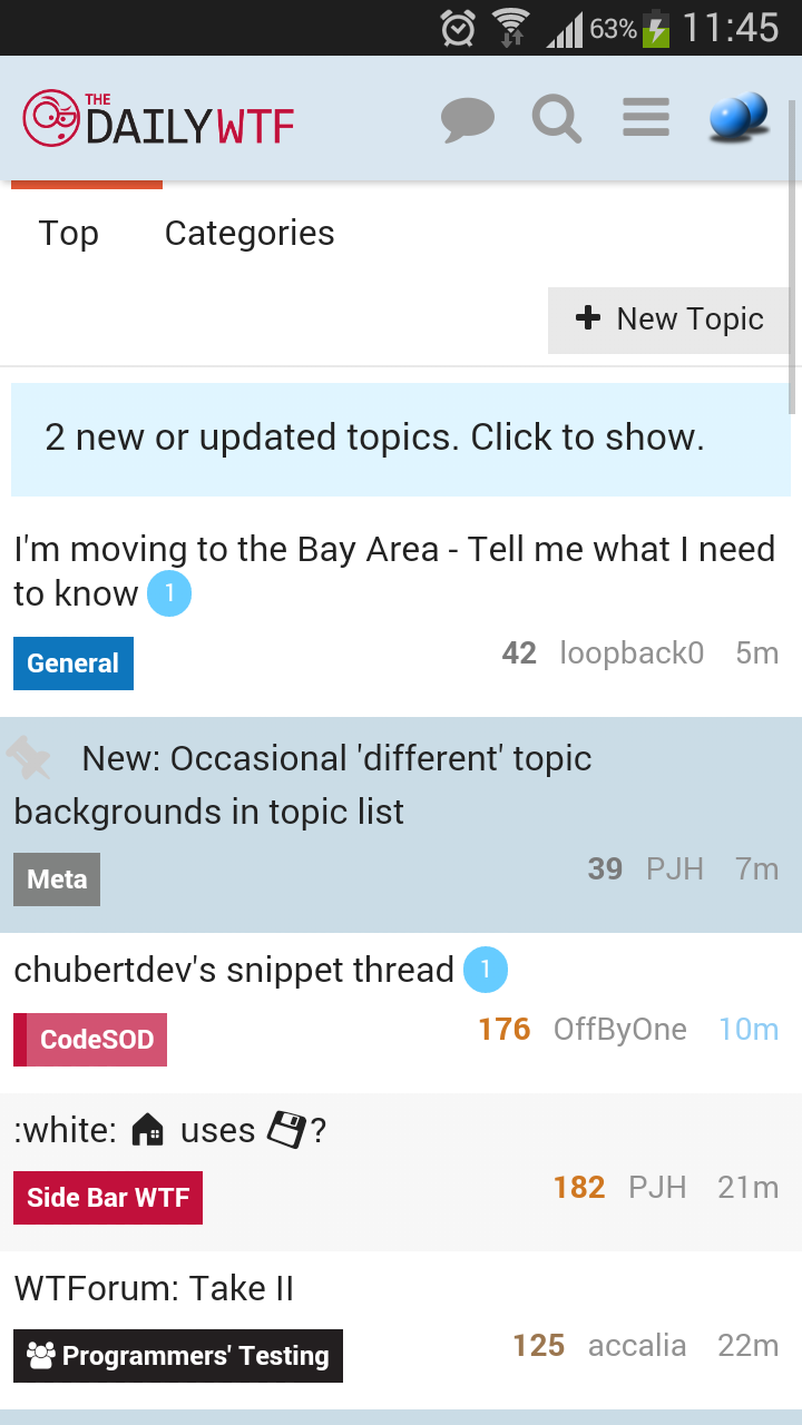
(Desktop) Chrome in S3 mode:
-
Wouldn't it be great if Discourse could automatically threat starred topics like that?

-
Presuming you mean 'treat' - there won't be any starred topics soon.
-
Nevermind - seemingly I needed to actually close Chrome and reopen it.
-
Are you getting both glyph and background?
-
Just the background.
-
Ok - ta.
-
...
Gah! I'm gonna sound like @dhromed here (and I never thought I'd be making a post like this) but either fix your font rendering or stop posting screen shots of them.