New: Occasional new 'crossed-arrows' icon in topic list
-
ClearTune was off for some reason, although I think it's RDP doing it now.
-
Ok - I'll go with that, and tone down the highlight color to one of the blues.
Thanks - this looks more palatable than the original implementation.
Also nice to immediately see which topics I'm ignoring.
-
(I can't use FA here since there's no i to attach a glyph to.)
You don't need a <i> to attach to just to use FontAwesome:
tr[data-topic-id="1000"] .main-link>.title:before,
tr[data-topic-id="1673"] .main-link>.title:before,
tr[data-topic-id="6951"] .main-link>.title:before,
tr[data-topic-id="4285"] .main-link>.title:before
{
    font-family: "FontAwesome";
    content: "\f10e\00a0\00a0";
}
I grabbed the "content" from the Quote Reply button.
-
I was kinda being sarcastic.
-
-
Ah - thanks....
.. and works on my mobile too. Looks like I need to figure out how to get Unicode on there - if it's even supported...
-
That latest iteration of the indicator character, could we tone that down or something? I feel like I've got Sauron's all-seeing eye watching me now.
-
I feel like I've got Sauron's all-seeing eye watching me now.

http://fortawesome.github.io/Font-Awesome/icons/
Suggestions?
-
-
:man_with_moustache: - should really get that aliased...
-

Yup - definitely a moustache...
-
fa-random?
-
Looks like I need to figure out how to get Unicode on there
tr[data-topic-id="1000"] .main-link>.title:before,
tr[data-topic-id="1673"] .main-link>.title:before,
tr[data-topic-id="6951"] .main-link>.title:before,
tr[data-topic-id="4285"] .main-link>.title:before
{
    content: "🔙🔁🔄🔃🔀";
}
-
-
-
Suggestions?
fa-bell, fa-certificate, fa-check?
fa-meh-o?
I didn't mind the symbol small. It seemed jarring when you increased the size of it.
Something inappropriate like fa-bitcoin would fit in this site's idiom.
-
fa-randomseems to fit, unless someone really has a problem with it...
-
-
fa-random seems to fit, unless someone really has a problem with it...
I object to the name. It should be fa-crossover, or else something like fa-arbitrary.
glyph's cromulent, though.
-
Shouldn't those topics be glyphed with
 ?
?
-
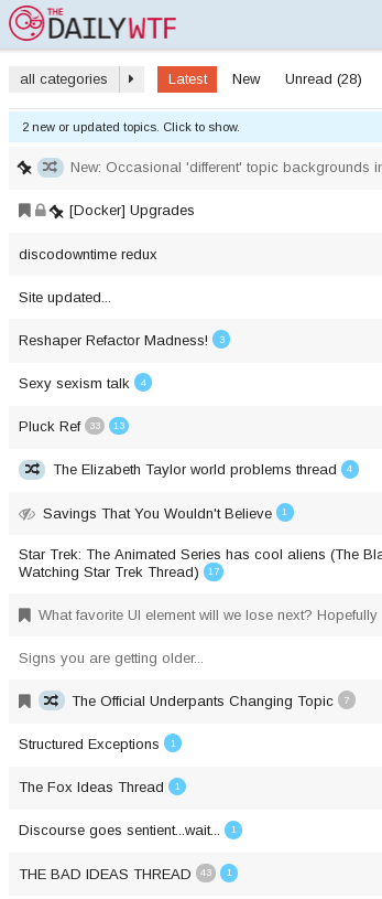
Shouldn't there be a tooltip for the crossing ways icon?
Until finding this topic somewhere in the bottom of the second page, I had no idea what that icon and that background could mean.
[size=8]Figuring out which topic is which is half the fun[/size] [size=5]Maybe also all the fun.[/size]
-
@created_just_to_disl said:
Until finding this topic somewhere in the bottom of the second page
Discopinned.
-
Suggestion: Why not make a 'The official "The official ${thread_purpose} thread" category' category, as a subcategory of "General", for all the long "general purpose" threads?
(i.e. the likes thread, bad ideas thread, good ideas thread, status thread, probably some others)
Might need a shorter name though.
Filed under: proper syntax
-
Alternative suggestion: hide /t/1000 from the thread list, and let people access it by typing that in the URL bar/clicking one of the notifications they surely have from there.
It would be like a secret club!
-
It would be like a secret club!
I kind of like new users stumbling into it and looking around, mouth agape, wondering WTF is this shithole I just fell in....
-
FWIW: the image is okay, but I had absolutely no idea what it was supposed to mean. It really needs a tooltip or something.
-
@PJH I fixed a bunch of bugs around site customizations which are not in your current build.
I had to do a restart just now because again we are seeing the unicode errors. I think it is a good time to upgrade to latest, stuff is in a stable state and we will be tagging a beta real soon. I am concerned about leaving stuff as it is now cause it only took 48 hours for the unicode error to pop up again. The pg fix may correct this issue. (its in latest)
Also ... @everyone ... I am going to be out for the next 2 weeks, don't let me get started on my idiocy ... but my daughter had a passport with 2 months validity this morning ... I spent much time begging at the passport office.
So don't expect to hear from me till I am back.
-
The icon is enough, no need to give it a special color imo
-
Have a nice trip.
-
-
Suggestion: Why not make a 'The official "The official ${thread_purpose} thread" category' category, as a subcategory of "General", for all the long "general purpose" threads?
What's wrong with 'Meta'? ;)
The icon is enough, no need to give it a special color imo
Color came first - the icon was an afterthought... once we'd figured out how to get it to appear on mobile.
-
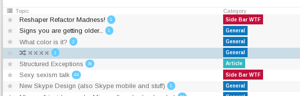
Actually - I think some color indication is still required....
cf:

vs.
-
I think it is a good time to upgrade to latest, stuff is in a stable state and we will be tagging a beta real soon.
Also ... @everyone ... I am going to be out for the next 2 weeks
So don't expect to hear from me till I am back.
Two of those quotes don't inspire a great deal of confidence about the third..
-
I am not gonna be around every 48-72 hours to do restarts and the unicode thing is going to hit you again soon... we upgraded virtual host (which hosts all our business customers to latest) earlier today, stuff is in a pretty stable state. I really want the pg update here, its real important.
-
Actually - I think some color indication is still required....
I like it, too, but I know some people are allergic to stuff like that. And I use those threads, so it's not a problem for me to be drawn into the color.
-
This is the type of a site that makes a "select your theme" page a pretty compelling sell ...
-
I like it, too, but I know some people are allergic to stuff like that.
I think it’s a bit obtrusive. What about slightly changing the text colo[spoiler]u[/spoiler]r? Or put the background only on the fa-random icon?
-
This is the type of a site that makes a "select your theme" page a pretty compelling sell ...
I was contemplating trying to get a list of links into the header of the type:
a href="?preview-style=6e274271-7192-4265-9ceb-2fd873486c2e"
a href="?preview-style=5ac5a5e9-c6ed-4197-9ec3-40811fd6ee5d"
a href="?preview-style=bc948921-2deb-4b12-b543-7894a05820fb"
a href="?preview-style="
a href="?preview-style=default"
-
you are going to need
&sticky=trueif you want it to work, otherwise the theme will go away on refresh. (sticky shoves that in a cookie)
-
-
That changes live btw :) and now you have the site customisation fixes so its changing live more reliably.
-
-
also, you now have a "maximise" button so you don't have to struggle in the tiny site customisation window.
-
The upgrade seems to be stuck...
[...]
I, [2015-01-09T12:31:07.964309 #16058] INFO -- : Writing /var/www/discourse/public/assets/admin-9500ad1cd5bd6cf19f0a3a1ad184e168.css
I, [2015-01-09T12:31:13.728367 #16058] INFO -- : Writing /var/www/discourse/public/assets/common-b92658b7816a5e90fc2093d8b8bc0a8f.css
I, [2015-01-09T12:31:20.285939 #16058] INFO -- : Writing /var/www/discourse/public/assets/desktop-8e5e6a99600e523b9354d97dc0e24954.css
I, [2015-01-09T12:31:25.733328 #16058] INFO -- : Writing /var/www/discourse/public/assets/mobile-31ea89f3ae27438066d3976139dbc626.css
It's 12:53 now...
-
that is not to be trusted, I did an upgrade using docker behind the scenes. just reset that.
-
ok I reset it, you are up-to-date now.
-
How's that?
Not sure... It could look better with some padding and borders, I think. Adding
    padding: .2em .2em .2em .4em;
    margin-right: .5em;
    border-radius: 10px;
produces

-
Filed under: Your mockup while much better, is 1px off
-
 ?
?
-
ok, site is looking good, logs are good, rest of the team are online ... time for me to catch some sleep before a crazy morning ahead, wrestling kids and packing.


