What favorite UI element will we lose next? Everything?
-
I saw the discussion. I didn't see them live on the site.
No, I don't visit often. Why do you ask?
-
-
ENOQUESTIONFOUND
Is it true that John Cale caught you "servicing the boiler" on the kitchen table?
-
We lost the green elevator bar!
By which I mean we lost the green one and got a blue one. I actually don't mind it. I say keep it, it's more consistent with the rest of the interface, and it wasn't something I personally looked at that much, so the apparent lack of contrast doesn't bother me.
Then again, I've been using this thing for ages, maybe green would help the new users?
-
-
Yes. @abarker seems to agree, actually. This will fit his custom styles nicely methinks.
-
We lost the green elevator bar!
It really goes a lot better with the theme. It always looked ugly.
-
Shouldn't we make it TDWTF red?
(I personally find the light blue newlevator hard to see at a glance)
-
hard to see at a glance
it seems to jump a lot further too ... It used to stay rather in place ...
Up thread, it really is in the bottom right of the browser window:

At the bottom of a thread, it now aligns horizontally with the buttons (ok) but moves from within the gutter to within the main block:

Is this something new? I don't remember that behavior like that
-
-
-
(I personally find the light blue newlevator hard to see at a glance)
Also, it's harder to use the %-age of filling as an indicator for progress now.
-
%-age of filling
That it is only handy in either short topics or long topics where you are still at the top.
-
I like that term ...
I use it as a name for the restyled elevator, though. Not for the concept of elevator bars in general.
-

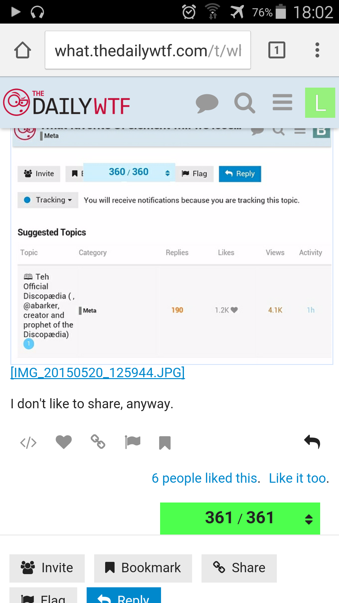
I don't like to share, anyway.
-
Its still green?
-
On mobile; on desktop and tablet, it's blue
-

-
@lightsoff said:
Its still green?
On mobile; on desktop and tablet, it's blue
Discorsistency at its finest!
-
Not anymore, the antibiotics cleared it right up.
-
Indeed. I wonder how their extensive testing missed that......
I prefer the green version to this new product of Jeff's Bikeshedding Corp.
-

-
I'm glad that they are following DRY guidelines.
Inspires great confidence in the quality of the application.Strike that, inverse it.
-
On mobile; on desktop and tablet, it's blue
Oh, you're on mobile? Yeah, that's different
-
"It was just before dawn
One miserable morning in black 'forty four.
..."
-
Check out the round-all-the-things newlevator on this discourse install: http://talk.polygonalweave.com/t/the-witcher-3-wild-hunt/130
BTW, Jeff really loves their custom look, so expect default Discourse style to move in this direction.... Tiger striping now removed from category list page.
-

They clearly don't have very long topics. The silly thing runs out of space quite quickly.

-
The thread style is OK; it could work for some places anyway.
The circular newlevator is idiocy personified though.
-
We need to make the oneboxes circular. For great justice!
-
And posts of course!
*mumble mumble* spherical posts in a vacuum.
-
Only if you buy me a circular monitor

-
They allow animated avatars... Batman's blinking eyes aren't too bad, but I know we'd get some really obnoxious ones if we did it here. I don't want to see blinkenstuph all over the page while reading.
-
Yeah, definitely best it's turned off here.
-
-
I want Godzilla goddamnit.
Godzilla was a FIXTURE on the old forums. A NATIONAL HERO.
-
For you:

-
I can dig it.
-
I bring you a gift in return.

-
MREEAW
-
You can barely even see its progress color.
-
For a great example of the toxicity of animated avatars, look at the hummingbird Discourse instance (I only know them because someone pointed out that they had a bunch of 10k+ threads)
-
Tiger striping now removed from category list page.
That has been removed in Discourse already. We have it put back in for our custom style. Switch back to "Discourse Default" (on the menu you get when you click your avatar in the upper right) to see how they think this place should look.
-
-
We have it put back in for our custom style.
That was the topic list tiger striping. The category list was changed at meta.d just yesterday, I think. I don't see it striped here, but I dunno if we got that update or just already had it styled differently.
-
SHEDWOOD!!!


-
Oooh....right. Yeah, no one looks at that page, but I remember the proposals for the retardation of that bit.
-
It's actually in the color of $tertiary.
https://forum.riking.org/t/testing-readonly-with-global-notice/254
-
mumble mumble spherical posts in a vacuum.
Spherical, massless, frictionless forum posts in a vacuum.
-
..... what about my test of what happens when the site is set to readonly with a global notice?
-
The progress bar is colored yellow, just like the reply buttons. No CSS.