I'm A Grumpy Cat: An open letter to Alex
-
And here is how that looks for me:
Speaking of inline (oneboxed?) images: their href is
//what.thedailywtf.com/path/to/fullsize.image, which works fine in browser, but doesn't work in e-mails (since the default protocol there isn't http). Can this be fixed so that the protocol is included in e-mail notifications?
-
tufty said:
I haven't got the faintest clue where the "page" bounds areSure you do. Look at the scrollbar. When it reaches the bottom, more will load. (Versus having to find the tiny "load next page" button, move your mouse or finger to it, and click it.)
Except in this case, the "page" is what has been loaded. Because Discourse unpeels things further up (at least until the commit @sam mentioned goes live), the definition of the page is disconnected between Discourse and what the user expects.
Case in point, regarding search. I know Lorne used the word "biology" a few times in his post. Maybe I want to see who else used the word in this thread/topic/. As a user, because I haven't clicked any "Next Page" or "Page X" links, I expect everything I've just scrolled past to still be loaded (after all, I haven't left the page. A user would expect it to be like any other long article in a web page or document). But using the browser's built-in search returns no results.
As developers, we (I and others here from TDWTF) understand the technical reasons why the search returns no results, and why the unpeeling happens to not hog resources. But if a UI/UX design decision breaks standard, user-expected behaviour/convention (which the current implementation of infinite scrolling is), then it's undoubtedly the wrong decision and users are going to (perhaps rightfully) call your product shit.
-
Except in this case, the "page" is what has been loaded. Because Discourse unpeels things further up (at least until the commit @sam mentioned goes live
We unpeel now on TDWF after 50 screens, which should be ample just like 640KB is :)
-
sounds like a good idea, should we try that?
Didn't Jeff find Ben's fix ugly and pulled it back out?
I'd link to the post concerned, but having spent far too long searching for the post I gave up.
-
Didn't Jeff find Ben's fix ugly and pulled it back out?
Nothing was pulled back, but nested quoting was broken and remains broken on expansion.
-
This post is deleted!
-
Open-world games also do infinite scrolling.
Texture and object popping are still problems.
Maybe we could program a horse or a fast car you could get on & in to navigate the forums.I thought the point of my post was that infinite scrolling is being done wrong by websites.
But, fuck me for trying to help.
-
Whether I agree with the changes or not.
Butt-hurt users do not add constructive criticism.
So, I'm sorry you have to deal with this.
-
@Lorne_Kates said:
Re-implementing browser/OS UI controls. Wow
Lotus Notes is (in)famous for doing this, and has developed a large base of users who despise it but are forced to use it by corporate policy. I should know - I'm one of them. It leads to horrible usability and user confusion.
The general mentality also leads to such ridiculousness as conversations like "We need to represent a boolean value in two ways in our user interface - one for viewing and one for editing. Here are several ways we've come up with - which should we use?" I actually participated in such a conversation here at work (I'm a developer focusing almost exclusively on UI). My answer was "um, there's already a way to do that. It's called a checkbox, and it's been UI-standard forever. Why are we even having this conversation?"
To their credit, everyone involved listened, and that's what we went with. Had we rolled our own, our users would have been confused, and usability would have been negatively affected.
And that's what infinite scrolling does. There are two solutions to large vertical amounts of data that have been UI-standard forever BECAUSE THEY WORK:
- Pagination
- Scrollbars with finite, known boundaries, which have visual indication of those boundaries.
In both cases, you are presenting the user with controlled, consumable chunks of information, with a visual indication of how much information there is in total and how much of that information you are seeing at once.
For pagination, that indicator is usually numeric, when you're given the number of pages total, a set of page numbers to click on to page around, and so forth. Since you are thinking in terms of pages, that is appropriate.
For scrollbars, that indicator is visual (as Lorne has described). That is appropriate, since scrolling is a visual thing. Noone thinks "oh, I've got 57 lines on my screen, and there are 1379 lines in total, and I'm on the 12th screenful, so therefore I'm 684/1379th of the way through the document" or "I'm seeing 2 1/7 conversations on-screen, and there are 192 conversations, and I've already read 19 conversations, so I'm 21 1/7 / 192 of the way through the thread." That's useless. Whereas a visual indicator showing the size of a screen and where you are relative to the entire document or thread gives you all of that information at a glance.
In fact, I'd say that the ideal interface for a forum conversation (or any long X) would be one that offers me a choice - paged (where I can set number of units per page) OR all-on-one-page-and-scrolled. Then, if I want to think in terms of numbers of units, I can page it, and if I don't I can scroll it.
Heck, you could even give me an OPTION to do infinite scrolling if I want it. Because that's really a form of paged interface - it serves up chunks at a time instead of the entire document at a once. So why not give me, the user a choice?
Oh, I know why: because Joel Spolsky says options are bad. Guess what: he's wrong.
Unless you can come up with a UI that pleases all of your users in every single way[1], options are good. REQUIRED options are bad. Forcing your users to make lots of choices to make your application function at all is bad. So pick defaults that produce a functional UI. But for fsck's sake, don't assume your users all think the way you do, and stop trying to roll your own controls just for the sake of forcing them to do so.
[1] If you can do that, you are $DEITY. But I'm an atheist.
-
Lotus Notes is (in)famous for doing this, and has developed a large base of users who despise it but are forced to use it by corporate policy. I should know - I'm one of them. It leads to horrible usability and user confusion.
And that's what infinite scrolling does. There are two solutions to large vertical amounts of data that have been UI-standard forever BECAUSE THEY WORK:
- Pagination
- Scrollbars with finite, known boundaries, which have visual indication of those boundaries.
I agree with lotus notes. I have also worked for a shop that thought Alt-S for Search and Alt-C for clone (Save As) was a good idea. It followed with their users for generations, until windows was introduced. Now, a few generations later and users have to train themselves for the application.
So I get it. I understand your point.
However, one thing I'd like to point out is that pagination isn't inherently supported by the browser UI. There's no controls built into the UI like a scrollbar that allows the user to paginate. They have to find a tiny little web element and click it (the complaint about the infinite scrolling ui elements).
And often, the vast majority of sites force you into pagination + scrolling.
Yes, you get the scrollbar that shows you how far you are on the current page, but that gives zero visual information about how much content is left. Especially when you are in the middle of the page (the pagination controls being at the top, bottom, or both, are being hidden at that point).
I'd have to say, at that point by your own argument, the vast majority of websites are also doing things wrong.
-
Yes, you get the scrollbar that shows you how far you are on the current page, but that gives zero visual information about how much content is left. Especially when you are in the middle of the page (the pagination controls being at the top, bottom, or both, are being hidden at that point).
I'd have to say, at that point by your own argument, the vast majority of websites are also doing things wrong.
Good point! I hadn't thought of that, because I am so used to knowing that I have to scroll all the way to the top or bottom to get to the pagination controls. I think that means that the combination of the two techniques is either easy enough to use or has become common enough to work in spite of its being imperfect in an ideal sense. But I need to think about that a bit more.
One solution would be to put the entire paginated section into a scrollable DIV, with the pagination controls outside the DIV. An enterprise browser-based app I worked on a decade-ish ago did that, and it was well-received by the users. It still had the problem of the scrollbar only showing how much of the current page you were looking at, but you could also see, via the always-visible pagination controls, where you were in the overall table of information AND navigate to other pages easily. (as an aside, we gave the user control over page size in that application, and they loved it)
In any case, part of the difficulty (and fun!) of UI development is that you can't always stick to ideals.
Ideally, we'd just dump the entire document/list/thread to the user at once and use a normal scrollbar. But for various reasons, from biology to performance to whatever else, that's not realistic, so we have to find other solutions that balance idealistic UI vs practical UI.
I'm pretty certain that infinite scrollbars don't do that and that some combination of pagination and real scrollbars does, but I'm also absolutely certain that the balance varies from user to user and application to application.
-
One solution would be to put the entire paginated section into a scrollable DIV, with the pagination controls outside the DIV
That sounds insecure.
Filed Under: Let's securely mediate
-
>RobFreundlich said:
One solution would be to put the entire paginated section into a scrollable DIV, with the pagination controls outside the DIVThat sounds insecure.
Filed Under: Let's securely mediate
The DIVs were generated server-side in MS Word, run through a multimedia tool that created IFRAMES and then converted them to DIVs. So they were extremely secure.
-
Good point! I hadn't thought of that, because I am so used to knowing that I have to scroll all the way to the top or bottom to get to the pagination controls. I think that means that the combination of the two techniques is either easy enough to use or has become common enough to work in spite of its being imperfect in an ideal sense. But I need to think about that a bit more.
One solution would be to put the entire paginated section into a scrollable DIV, with the pagination controls outside the DIV. An enterprise browser-based app I worked on a decade-ish ago did that, and it was well-received by the users. It still had the problem of the scrollbar only showing how much of the current page you were looking at, but you could also see, via the always-visible pagination controls, where you were in the overall table of information AND navigate to other pages easily. (as an aside, we gave the user control over page size in that application, and they loved it)
In any case, part of the difficulty (and fun!) of UI development is that you can't always stick to ideals.
Ideally, we'd just dump the entire document/list/thread to the user at once and use a normal scrollbar. But for various reasons, from biology to performance to whatever else, that's not realistic, so we have to find other solutions that balance idealistic UI vs practical UI.
I'm pretty certain that infinite scrollbars don't do that and that some combination of pagination and real scrollbars does, but I'm also absolutely certain that the balance varies from user to user and application to application.
Can't you use a floating div to host the controls in reverse of your idea. The problem with a full page dump is bandwidth and user information overload. One thing I like about the ajax infinite scrolling is not having to load a new page. I think the best compromise is to paginate, but ajax load the pages, and update the browser address so history is faked for the pages. That way you get the benefit of URLing to pages, and you don't have to wait for a whole new page to load.
If you really want to get wild.
The only thing linear about posting on a topic is the post time.
Other than that, posting in a forum is really hierarchical. Each quote/reply thread should be its own mini-thread.
-
Can't you use a floating div to host the controls in reverse of your idea.
That's definitely a possibility. I tend to not like those, but it'd make a great user option.
The problem with a full page dump is bandwidth and user information overload.
Agreed. Those are my "biology and performance" reasons.
One thing I like about the ajax infinite scrolling is not having to load a new page. I think the best compromise is to paginate, but ajax load the pages, and update the browser address so history is faked for the pages. That way you get the benefit of URLing to pages, and you don't have to wait for a whole new page to load.
I think in the original version of the application I was describing, we used iframes, because Ajax hadn't really taken hold yet. So we got the same net effect. Our users weren't really interested in browser history, because they were really thinking about this as an application that happened to be delivered in-browser, rather than a web application (back then, you didn't really expect history in Word, Quicken, etc). But if I were writing it nowadays, I'd do what you're describing.
If you really want to get wild.
The only thing linear about posting on a topic is the post time.
Other than that, posting in a forum is really hierarchical. Each quote/reply thread should be its own mini-thread.That'd be a fun UI to design and write. Alas, my wild days have been replaced by more mundane things like kids, after-school activities, and errands.
-
I just wanted to say...
Yay!
Constructive discussion.
-
@xaade said:
If you really want to get wild.
The only thing linear about posting on a topic is the post time.Other than that, posting in a forum is really hierarchical. Each quote/reply thread should be its own mini-thread.
That'd be a fun UI to design and write. Alas, my wild days have been replaced by more mundane things like kids, after-school activities, and errands."Every quote/reply thread is its own mini-thread"

You can even collapse the parts you don't want to read!
-
I agreed with your arguments. After reading Alex's reply I thought: First World Problems. Now I realize I am an adaptable human, whatever adversity we face we will overcome. And if you Lorne want to leave a community for whatever reasons you are really hiding from, someone will take your place.
Edit: I don't imply to be mean, even if it comes across that way. I just feel you over reacted, and can do better.
-
Uh, this is terrible when all parts are the parts you want to read (often the case here).
You have a topic, you read it, and then the next day you come back, and new replies are all over the page.
-
Hmm, so maybe threaded isn't such a good idea after all ;)
-
Uh, this is terrible when all parts are the parts you want to read (often the case here).
Maybe you could have some indicator system whereby new posts you haven't read yet are highlighted in some way...

-
Maybe you could have some indicator system whereby new posts you haven't read yet are highlighted in some way...
A bit better, but you still have to scour the whole tree.
I don't know. For me, nesting a few quotes for context is enough, and flat view is convenient for reading the whole thread.
-
A bit better, but you still have to scour the whole tree.
In Thunderbird's threaded mode instance, there are ways to reduce that need - you can display only top level trees with unread content, view only unread content, keyboard shortcuts to go to next unread item....
Thing is, everyone has different ideas of how they'd like to view content, and it can often dependent on context; for example I'm happy reading usenet using TB in threaded mode, and was quite happy reading TDWTF under CS in paged flat-mode.
Thing is both TB and CS offer a choice in how to interact with them. Imagine that - those that want flat mode can have it, and those that prefer threaded mode can have it. Two groups of people kept happy by offering a choice.
Now, about that infiniscroll vs paged mode option...
[FWIW, I don't have any particular problem with infiniscroll per-se - well I'm starting to get used to it anyway...]
-
Maybe you could have some indicator system whereby new posts you haven't read yet are highlighted in some way...
Great, now I have to click everything to read it. That's definitely a barrier to reading.
I just want to press one button and read. Something like "down".
-
I just want to press one button and read. Something like "down".
keyboard shortcuts to go to next unread item....
-
jjjjjjjjjjjjjjjjjjjjjjjjjjjjjjjjjjjjjjjjjjjjj
-
@PJH said:
keyboard shortcuts to go to next unread item....
Reading if undamentsl!
(actual typo uncorrected)
-
The scrollbar is massively suppressed in OS X and iOS already. It's not even visible most of the time. So to argue that the scrollbar, in a world of infinite content (can you get to the end of the Internet?) is this hugely massively important bit of UI, just doesn't make sense to me. If it's so important, why would Apple go so far to suppress it?
That may be the case, but in my experience, using OSX every day, it is very very irritating. A fail in Apples usability efforts.
-
That may be the case, but in my experience, using OSX every day, it is very very irritating. A fail in Apples usability efforts.
I don't think you understand, Apple does nothing wrong and everybody copies them.
Filed Under: What was that sarcasm/irony character again?
-
-
That's an interrobang, not what was asked for.
A sentence ending with an interrobang asks a question in an excited manner, expresses excitement or disbelief in the form of a question, or asks a rhetorical question.
-
That's an interrobang, not what was asked for.
>A sentence ending with an interrobang asks a question in an excited manner, expresses excitement or disbelief in the form of a question, or asks a rhetorical question.
That's what's been suggested, once or twice, for use on here. Don't ask me to find it as the search apparently has a minimum character requirement.
The "official" sarcasm/irony punctuation, or percontation point
⸮, doesn't show up on here: ⸮.
-
The "official" sarcasm/irony punctuation, or percontation point
⸮, doesn't show up on here: ⸮.Cannot reproduce:

Shows fine here.
-
All I'm getting is a missing character box.
From previous conversations, that's seems what is happening for many people. You're not using a custom style, are you?
-
FWIW, works for me, Chrome on OSX with no special stylesheets. I'm guessing the font you're getting your output rendered in doesn't have that glyph.
-
You're not using a custom style, are you?
Nope. You're probably missing a font (Search for the Unicode section).
-
FWIW, works for me, Chrome on OSX with no special stylesheets. I'm guessing the font you're getting your output rendered in doesn't have that glyph.
After investigation, it appears that it may be that you and @PJH may be rendering in the default Helvetica, which is not installed on my system, so I'm reverting to Arial, which doesn't appear to have that glyph on my Win 7 box.
-
I'm using Chrome on Windows 8, without Helvetica installed on the system, and I can see it.
-
I'm using Chrome on Windows 8, without Helvetica installed on the system, and I can see it.
Whatfont indicates mine is using Helvetica on FF33 and Chrome34 (Linux)
-
I think the font/glyph system of an OS is a little smarter than just using one font, and merges several system fonts with the pretty font you want, so that nulls in your pretty font can still display special glyphs when the code point refers to it.
So installing a glyph font can fix your text boxes.
My brain is slightly fucked so that may not have been a scrumptious explanation.
-
Using that tool, I see Helvetica as well. There must be some web font magic going on, though, as I still don't have the font on my system.
-
Weird, I'm not seeing any fonts in Firebug's network tab.
-
Aha! It appears that Windows 7 only includes support for Unicode 5.1:
The culture-sensitive sorting and casing rules used in string comparison depend on the version of the .NET Framework. In the .NET Framework 4, sorting, casing, normalization, and Unicode character information is synchronized with Windows 7 and conforms to the Unicode 5.1 standard.[1]
While Windows 8 supports Unicode 6.0:
Windows 8 and the APIs for developing Windows 8 applications, including Metro style applications, support Unicode 6.0.[2]
This is also interesting to note:
[T]his does not imply support for the full character repertoire or all algorithms, but rather a subset of the repertoire, UCD properties, and algorithms.[2]
So, it appears, that the missing glyphs on my box are probably not a shortfall of any fonts on my system, but rather a shortfall of the OS.
-
Aha! It appears that Windows 7 only includes support for Unicode 5.1:
I'm going to have to fire up my Windows VM tomorrow aren't I?...

-
I'm on Chrome on Windows 8.1, without Helvetica installed, and can't see it, yet WhatFont says it's Helvetica. I'm just using the Bookmarklet, and I bet it is just looking at the CSS styling, not the actual font itself. The style used is:
font:14px/19px Helvetica,Arial,sans-serif;If I switch the font to "Segoe UI Symbol" in the Chrome inspector, that symbol shows up on Windows 8.1, but not on Windows 7. So either that font is updated between Windows 7 and Windows 8, or what @abarker said is right and Windows 7 just doesn't support it. Personally, I'm leaning toward the former, but not ruling out the latter.
-
I'm going to have to fire up my Windows VM tomorrow aren't I?...
VMs... hey, I have those!
I can repro on stock Win7 install (font-wise) in every major browser. And Opera.
Also, inspector claims it's using Arial.
-
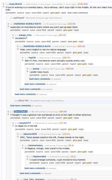
Maybe you could have some indicator system whereby new posts you haven't read yet are highlighted in some way...
<img src='/uploads/default/1992/9e6b2cdf12ceb96e.png'>
Um....
I was thinking more of a bubble web. Not a treeview.Basically, you navigate by keystroke or hover. The bubble contains the title.

Treeview is just horrendous to read.
-
Treeview is just horrendous to read.
I'm not too sure that image there is much better to be honest with you....
-
I'm not too sure that image there is much better to be honest with you....
That's because it is a tree…
-
Fair enough.
But I'm a visual person. I find this to be easier to understand.
At a glance I can see the conversation density. I can find the post I want to reply to quicker. I can navigate to the post I want to read faster.I get a link to a post, it loads this and puts that bubble on focus. I instantly know how many replies, what it was replying to, and how significant the thread is.
With flattened forums, I can guess at density by using the scrollbar..... oh wait... nope can't. Even if there wasn't infinitely scrolling, I can't tell how significant the post is until I scroll.
I'm sorry, vertical conversations work when people always reply to the previous post.
They don't when the conversation becomes splintered.