Fitting a Round Logo in a Square Space
-
Our university logo is a round shape, as per the mockup below (Don't mock my design skills, I spent all of five minutes in LibreOffice making it!):

Once upon a time (let's call it spring 2015), I was making a poster together with a couple of other universities. I noticed that these other universities had a round logo but with their university name next to it. This consumed more space, but also resulted in our tiny round logo to be less noticeable to the exent that it almost disappeared. I thus sent a request to our marketing department:
 Behold yon poster. Seeth thou how tiny our logo looketh in comparison to ye bigge university logos around it. Canst thou please suggest to me a means to amend this lamentable state of affairs?
This resulted in the following logo. Which, for the purpose, was good. All was well.

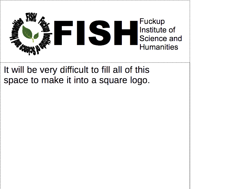
A year passes, and then we get new directives from our propaganda department that we must now only use this wide logo. The original one is now banned, and must not be used.
"This is not good", we said. "It consumeth too much space, and is not as versatile as the previous. May we please have a square logo to use for example in our presentations?" All to no avail. This was the New Logo and Must Be Used.
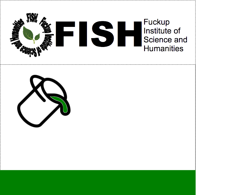
We insisted, and eventually got a new proposal from them:

"This is not good", we said. "It consumeth too much space, it is not square, and it is thrice redundant! May we please have a square logo?"
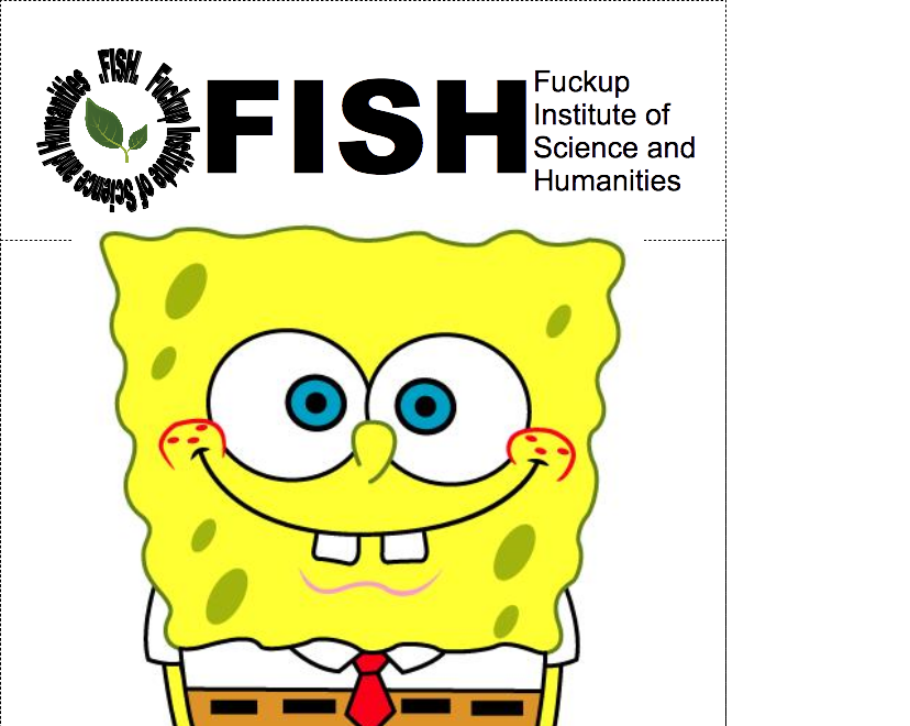
Time passed, as it is wont to do, and we eventually heard back from the propaganda department. For our benefit, they said, they have this time contracted an Expensive External Marketing Company to produce a square logo for us. "Ok", thought we. "Was that really necessary?", mulled we. But nevertheless, we were very excited to see what this Expensive External Marketing Company would have produced for us:
Thus looketh the New Square Logo! Our head of department, who is a conscientious person, posted this on a bulletin board and requested comments or improvements. The currently leading suggestion, courtesy of yours truly is:

-
Hmmm ... I think it would look better with a black-and-white picture ... and while you are at it: try flipping it so the face looks to the right.
Filled under: Paint ALL the bikesheds!
-
I don't think the logo and name were quite prominent enough. My suggestion:

-

That'll be £10000.
-
It's a work in progress, but I started on it...
-
@cvi, @Boner
I would be happy to pay for both your suggestions rather than the one the propaganda department ended up paying for.
-
Do what our marketing people insisted on, and have the logo design such that it only works when it is coloured and in the exact corner of the paper or presentation. Because printing into the corner is simple and cheap, and projectors are always correctly configured and match their configuration to what you made the presentation for.
Marketing are dicks.
-
Crop meatspin to a square and send it to them.
-
Done.
-
@Rhywden said in Fitting a Round Logo in a Square Space:
Done.
This is actually really well thought out. Not only is it resistant to being rotated (e.g., if you happen to put up your poster up-side-down), but also to scaling (in case you print your A5 leaflet on A2 by mistake).
-
@dkf said in Fitting a Round Logo in a Square Space:
Do what our marketing people insisted on, and have the logo design such that it only works when it is coloured and in the exact corner of the paper or presentation. Because printing into the corner is simple and cheap, and projectors are always correctly configured and match their configuration to what you made the presentation for.
If they continue to insist, that's roughly what I am planning to do. I'll put the logo in the top right corner, hanging far enough outside the page so that only the round bits are showing
 .
.Marketing are dicks.
Being dicks require some level of drive. I perceive them more as an undescended testicle.
-
@tufty said in Fitting a Round Logo in a Square Space:
Crop meatspin to a square and send it to them.
I am not going to google for that!
-
@Mikael_Svahnberg said in Fitting a Round Logo in a Square Space:
@tufty said in Fitting a Round Logo in a Square Space:
Crop meatspin to a square and send it to them.
I am not going to google for that!
a wise choice.
it's second only to goatse in levels of distastefulness.
-
@accalia It's not second.
-
@accalia said in Fitting a Round Logo in a Square Space:
it's second only to goatse in levels of distastefulness.
No, it is not. I wish I did not know this.
http://angry.net/blog2/wp-content/uploads/2014/08/Brain-Bleach.jpg
-
-
@Mikael_Svahnberg Do they want to market this to the people with reading comprehension problem? also also, where is your mascot? Add a roaring rat or something to the background, and remove the picture of joints, students should learn how to get high on their own

-
-
-
@Tsaukpaetra it's not really square, or even a cube. it's a deformed box
-
@Mikael_Svahnberg said in Fitting a Round Logo in a Square Space:
The currently leading suggestion, courtesy of yours truly is:
I worked for a company that rebranded a product several times. At one point, the New Corporate Overlords put out a contest looking for a new logo. One of the submissions was a guy in a muscle-flexing pose, with all the names of the product listed on the biceps, all but the last crossed out.
-
@blakeyrat said in Fitting a Round Logo in a Square Space:
@Mikael_Svahnberg Hm, what's something square we could use...
Aha!

hu-uh....... I LIKE IT!
-
@aliceif ?
-

-
-
@aliceif said in Fitting a Round Logo in a Square Space:
@Fox I thought you knew what meatspin is about ...
Filed under: threatening avocadoes@fox, if you don't know what meatspin is about..... save your sanity..... never find out.
-
@accalia meatspin seems like the kind of thing he'd find mesmerizing.
-
-
@aliceif I do know what it's about, but I'm not sure what you wanted me to say about it
-
@accalia There's a site called efukt which I was tricked into visiting a couple of times. That was a much greater threat to my sanity than meatspin.
-
@Captain Nah, it's kind of boring, really.
-
@Fox said in Fitting a Round Logo in a Square Space:
There's a site called efukt which I was tricked into visiting a couple of times.
I still can't get the images from rotten.com out of my head, 15 years after I was tricked into visiting that site.
Edit: Holy shit, that site still exists.
-
@asdf The internet is dark and full of terrors.
-
@asdf the rotten library is pretty good. See, for example, the article on
http://rotten.com/library/crime/road-rage/
(There's no ikky pictures on it, promise)Road ragers are quick to personalize a common affront: you cut them off, forcing them to slam on their brakes. The anger is further compounded when a road rager is acutely aware his brakes haven't been serviced recently; he knows that every unnecessary application of his foot on the pedal leads him closer to the repair shop. And do you really have to merge so slowly? Grow a cock and balls, you goddamn jizz bucket. If it's not man versus man, or man versus woman, it's man versus society: everyone is moving too slowly. The multi-lane highway is beginning to narrow, and motorists in front of you are still half-riding the shoulder. Pick a lane and stick with it, you stupid Ching Ping Chinaman. Even the passengers in your own car become a reliable source of anger: nothing makes a road rager more pissed off than being told by a spouse or co-worker to just calm down.
-
Meatspin ain't bad. It's actually rather funny.
Somewhere there exists a video of a friend who had just installed a projector in his house. He is standing such that the beam projects into his crotch, meatspinning away. He is gyrating in perfect synchronization.
This guy has political ambitions. Itll be a race to see who can sell it to Gawker first, and he knows it.
-
Don't worry, I got this:

-
@Fox efukt has a couple of interesting things on it that aren't just gross/freaky.
-
@bb36e lolwut.
-
@Fox said in Fitting a Round Logo in a Square Space:
There's a site called efukt which I was tricked into visiting a couple of times.
@asdf said in Fitting a Round Logo in a Square Space:
I still can't get the images from rotten.com out of my head, 15 years after I was tricked into visiting that site.
Trick sites? From forever ago? Did trolls exist back then? Now I'm curious...
-
@Tsaukpaetra You've missed like 4 golden ages of Trollery.
-
@Tsaukpaetra said in Fitting a Round Logo in a Square Space:
Trick sites? From forever ago?
I mean, I guess in Internet time, 2009 was forever ago.
-
@bb36e said in Fitting a Round Logo in a Square Space:
interesting things
I thought my monitor was having really weird ghosting, but then I discovered it was actually frame-by-framed like that...

@Fox said in Fitting a Round Logo in a Square Space:
I mean, I guess in Internet time, 2009 was forever ago.
Pretty much an Eon, yeah. The last thing to go viral happened only ten minutes ago, and it's already been supplanted.

-
@Weng said in Fitting a Round Logo in a Square Space:
Meatspin ain't bad
Seriously.... it's no Goatse, that's for sure. It's just human anatomy, doing what it does. Woo?
-
@Yamikuronue I mean, when Meatspin first surfaced in 2005, the shock factor was basically "OMG GAY PORN!". Which was barely even a thing then.
Eleven years later, we're thoroughly over the gay thing in the civilized parts of the world.
Fun fact, though: It's not actually a cut from gay porn. It's from trans porn. We kind of still aren't over that in much of the allegedly civilized part of the world.
-
Here is the solution.

-
I have created you a flat design with the appropriate Blue:
-
@Lorne-Kates said in Fitting a Round Logo in a Square Space:
with the appropriate Blue:
That's kind of loud. Could you make it a little more grayish?
-
@accalia said in Fitting a Round Logo in a Square Space:
goatse
Why does nobody spell goatsecx correctly?
-
Here’s my attempt at solving the problem:

-
@Yamikuronue said in Fitting a Round Logo in a Square Space:
Seriously.... it's no Goatse, that's for sure.
Nor is it tubgirl.
