Population of China
-
From: http://www.peiwuyang.com/shoulder-pole-design-research
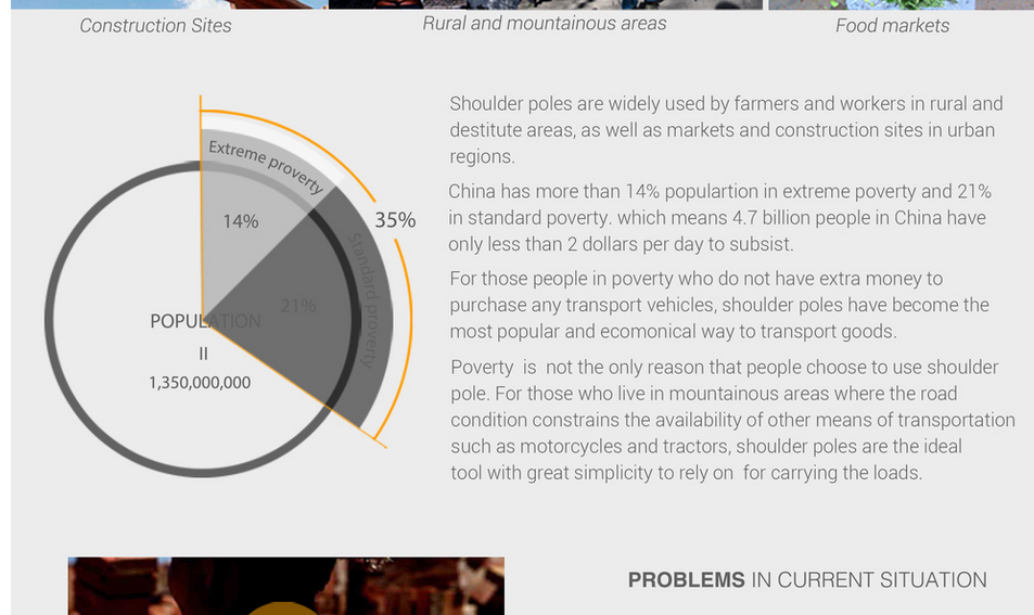
Apparently, 35% of the population of China is 4.7 billion people.
-
14% + 35% = well short of half, visually
-
Is this from a shoulder pole advertisement? Because it sounds like it.
-
The chart is correct somehow. The text is wrong in a really strange way.
-
Off by factor of 10. Should be 0.47 billion, a.k.a. 470 million.
-
Maybe they are showing off the skill level of those in poverty.
I wonder why the first three words in the last paragraph are so tracked out.
-
14% + 35% = well short of half, visually
That's 14% + very badly shaded 21%, 35% in total as represented by the orange arc.
-
That's 14% + very badly shaded 21%, 35% in total as represented by the orange arc.
Ahhh, gotchya. Not the most intuitive to read.
-
It's from some idiot researchers who are trying to improve the world by inventing a better shoulder pole. The problem is, they've invented poles that are probably twice as expensive as, say, a wheelbarrel.
We've already invented replacements for the shoulder pole, wheelbarrels, handtrucks, actual trucks. The problem is one of wealth.
-
Maybe they're expecting interested people to subsidize the purchase of expensive poles, rather than say just support the people with what they really need.
-
From: http://www.peiwuyang.com/shoulder-pole-design-research
If you are promoting yourself as a UI/UX design specialist, maybe don't make your page content a single image?
-
We've already invented replacements for the shoulder pole, wheelbarrels, handtrucks, actual trucks. The problem is one of wealth.
They made a good point with mountains restricting wheeled devices. Also, there are probably storage considerations, and some other stuff.
But yeah, it sounds like one of those Kickstarters gone wrong.
-
They made a good point with mountains restricting wheeled devices.
It'd have to be a REALLY steep-ass mountain to make this useless:

-
It'd have to be a REALLY steep-ass mountain to make this useless:
I presume that what's not made useless by the mountains is made useless by the cost. Unless it's one hell of a shoulder pole.
-
don't make your page content a single image?
It isn't.
It's split into three images. And there a couple of lines of text at the top and bottom.
-
Also, as a final slap in the face:
-
It'd have to be a REALLY steep-ass mountain to make this useless:
Apart from the cost, there were a couple of pictures of people using shoulder poles in situations where that would not be useful: Crossing a narrow (12"?) plank bridge. A couple of rather steep stairways; it could probably manage it, but sure wouldn't be the ideal way to go up or down stairways.
-
It's split into three images. And there a couple of lines of text at the top and bottom.
In that case, I retract my objection.
-
In that case, I retract my objection.
I'm not saying it isn't terrible; it certainly is. I'm just being pedantic about the number of images involved. (Strictly speaking, there are 4; there's also the little logo and text in the header.)
I'm not sure what he used to create that page, but it should be killed with fire:
<body id="collection-54c6940be4b0455a4fa06d10" class="transparent-header enable-nav-button nav-button-style-outline nav-button-corner-style-pill banner-button-style-outline banner-button-corner-style-square banner-slideshow-controls-arrows meta-priority-date hide-entry-author hide-list-entry-footer hide-page-sidebar hide-sidebar-title hide-blog-sidebar center-navigation--info gallery-design-grid aspect-ratio-auto lightbox-style-light gallery-navigation-bullets gallery-info-overlay-show-on-hover gallery-aspect-ratio-32-standard gallery-arrow-style-no-background gallery-transitions-fade gallery-show-arrows gallery-auto-crop product-list-titles-under product-list-alignment-center product-item-size-11-square product-image-auto-crop product-gallery-size-11-square show-product-price show-product-item-nav product-social-sharing event-thumbnails event-thumbnail-size-32-standard event-date-label event-date-label-time event-list-show-cats event-list-date event-list-time event-list-address event-icalgcal-links event-excerpts event-item-back-link opentable-style-light newsletter-style-light small-button-style-solid small-button-shape-square medium-button-style-solid medium-button-shape-square large-button-style-solid large-button-shape-square button-style-solid button-corner-style-square native-currency-code-usd collection-54c6940be4b0455a4fa06d10 collection-type-page collection-layout-default mobile-style-available force-mobile-nav" data-pin-hover="true">Why is that syntax-highlighted in preview, but not in the baked post?
... And now that I've reloaded the page, it is highlighted.
-
I'm not sure what he used to create that page, but it should be killed with fire:
So a body is a header is a button is a gallery is a product is a collection.
I wonder how the hell that even works if the classes are in any way descriptive.
-
It's also an HTML (not XHTML) document that specifies 3 XML namespaces and 33 classes in the <html> element.
-
Apparently, it was done with http://www.squarespace.com/ if hints in the code are of any use (the classes are absolutely not, it seems).
-
http://www.squarespace.com/
Nausea-inducing home page. Killing it with fire is insufficient. Nuke it from orbit; it's the only way to be sure.
-
Yeah, I knew you were being pedantic so I threw some sarcasm in :) But seriously, I thought web accessibility would be ux/ui 101.
-
Judging by the home page of the WTF he apparently used to make it, UX/UI is not even on the radar.
-
Judging by the home page of the WTF he apparently used to make it, UX/UI is not even on the radar.
Hey, they got The Dude on it. That's like, +2 to user experience on any page.
-
they got The Dude on it.
I don't care if they have The Duke on it.
That's like, +2 to user experience on any page.
-100 + 2 = -98However, I will say it's not the worst web page I've ever visited. That honor would probably go to one that had no visible content at all, but tried to install an update to Flash (I already had the latest) to view whatever they supposedly had.
-
However, I will say it's not the worst web page I've ever visited. That honor would probably go to one that had no visible content at all, but tried to install an update to Flash (I already had the latest) to view whatever they supposedly had.
Does it count if it's done on purpose? http://budugllydesign.com
-
That's a body with a lot of class.
-
-
OOOOHHH I DID THAT IN ONE TAKE. I NEED WATER. WAtterrrrrr
-
-
Even worse:
Java-applet-based "websites".
Good thing those are dead for good.
-
Are "Shoulder Poles" what you start to hear after spending too long in this thread: http://what.thedailywtf.com/t/eastern-european-politics-special-the-new-political-party-is-named-exactly-like-its-leader/7414/71

-
Are "Shoulder Poles" what you start to hear after spending too long in this thread: http://what.thedailywtf.com/t/eastern-european-politics-special-the-new-political-party-is-named-exactly-like-its-leader/7414/71
Nope, those are Shoulder Aliens.
-
Even worse:Java-applet-based "websites".Good thing those are dead for good.
Even more worse: a website that loads over half a minute and has big old Java logo and progress bar on loading screen, but actually it's JavaScript.
-
We've already invented replacements for the shoulder pole, wheelbarrels, handtrucks, actual trucks. The problem is one of wealth.
Even better: the "better shoulder pole" has already existed for centuries.
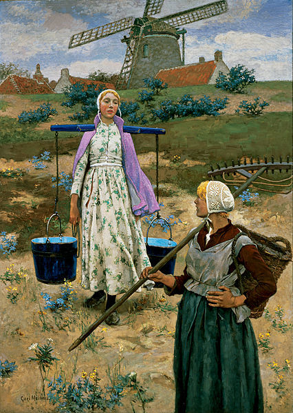
It has a bend in it, so it goes around her neck and rests on both her shoulders, solving the pressure issue. Welcome to the 1100s. Next he might invent the wheel.
-
-
-
I thought Al Gore invented the wheel.

(wheels were needed for the trucks, before they used tubes)
-
Maybe in US. In Australia, it was that dude, in 2001.
-
Why is that syntax-highlighted in preview, but not in the baked post?... And now that I've reloaded the page, it is highlighted.
The thing that shows after you submit is actually just a half-baked post. Discocaching ensures that you won't see the fully baked one without a full reload.
-
-
The thing that shows after you submit is actually just a half-baked post. Discocaching ensures that you won't see the fully baked one without a full reload.
TDEMSJAR
-
And... Blakeyrat's second law strikes again.
-
-
I am disappointed. I would have expected someone to comment upon the spelling error in the graph by now.
Tut, tut.
-
I would have expected someone to comment upon the spelling error in the graph by now.
IIRC you are ESL so maybe you don't know that proverty is a word meaning being a subhuman due to lack of wealth*.
* wait, it looks to actually have "definitions" vs. my make believe definition
-
Also "populartion" in the 2nd paragraph.
-
And... Blakeyrat's second law strikes again.
Everyone who cares called and...oh, wait, the line's dead.