Windows 10 is crap once again
-
I haven't used Windows daily for years. I have it on my "music PC" which I basically use as a dedicated device (open DAW, start recording). Now with my new Chinese spyware laptop I'm basically forced to use Windows (it's a new computer, it has a Ryzen CPU, it won't probably be well supported under Linux and battery life will be terrible). And it's an insufferable piece of shit. For starters, the initial setup crashed on me (yes), then it worked again, then it asked me to give lots of personal data (no, no, no, no again). The font rendering is shit, the hodgepodge of applications is inconsistently rendered (often blurry, or tiny), and Cortana could be useful but it only allows you to use Bing and Edge (instead of my preference for Google and Firefox). Presumably you can hack it to work how I want it but meh. It does that thing where the icons on the desktop refresh every time you install something which really triggers my OCD. Then there are all those
 things I could probably change in Linux but can't in Windows (for example, I'd like gestures to switch between desktops to be "natural", ie. reversed, while I want my scroll up/down to be regular, ie. the opposite of what macOS does). The apps too are unreliable; take Microsoft's Skype. It works wonderfully on Linux (well, it was only slow on my old PC but it was reliable). It's actually worse on Windows than on Linux, it crashed on me twice during a video lesson (that never happened to me before). Bah.
-
@admiral_p said in Windows 10 is crap once again:
take Microsoft's Skype. It works wonderfully on Linux (well, it was only slow on my old PC but it was reliable). It's actually worse on Windows than on Linux
This just tells me the version you have on Linux is older than the one on Windows.
-
I'm not suggesting newer versions of Skype are worse than older versions.
I'm very explicitly stating newer versions of Skype are worse than older versions.
-
@admiral_p said in Windows 10 is crap once again:
The font rendering is shit, the hodgepodge of applications is inconsistently rendered (often blurry, or tiny)
Check your scaling in the Display settings. If it's a multiple of 25 and not a multiple of 50, a lot of stuff will look garbage for some reason. I don't know why they persist with letting one set it at 125%, 175% etc. because I've never seen it look good.
-
@Douglasac said in Windows 10 is crap once again:
@admiral_p said in Windows 10 is crap once again:
The font rendering is shit, the hodgepodge of applications is inconsistently rendered (often blurry, or tiny)
Check your scaling in the Display settings. If it's a multiple of 25 and not a multiple of 50, a lot of stuff will look garbage for some reason. I don't know why they persist with letting one set it at 125%, 175% etc. because I've never seen it look good.
Probably because (taking 125% as an example) each four pixels you think you're drawing get smeared across five real pixels. At 150%, it's two-across-three, and probably looks less fuzzy. At 200%, it's a whole-number factor, and there's no blurring.
-
@admiral_p said in Windows 10 is crap once again:
and Cortana could be useful but it only allows you to use Bing and Edge (instead of my preference for Google and Firefox).
-
@Dragoon yeah, I saw that, but it feels like a kludgy hack.
-
@Steve_The_Cynic said in Windows 10 is crap once again:
@Douglasac said in Windows 10 is crap once again:
@admiral_p said in Windows 10 is crap once again:
The font rendering is shit, the hodgepodge of applications is inconsistently rendered (often blurry, or tiny)
Check your scaling in the Display settings. If it's a multiple of 25 and not a multiple of 50, a lot of stuff will look garbage for some reason. I don't know why they persist with letting one set it at 125%, 175% etc. because I've never seen it look good.
Probably because (taking 125% as an example) each four pixels you think you're drawing get smeared across five real pixels. At 150%, it's two-across-three, and probably looks less fuzzy. At 200%, it's a whole-number factor, and there's no blurring.
If the font rendering engine was any good, it wouldn't matter at all. The macOS renderer does great across all sorts of resolutions, so it's definitely possible. Alas, it sounds like the renderer used by Windows is not so good…
-
@Dragoon said in Windows 10 is crap once again:
@admiral_p said in Windows 10 is crap once again:
and Cortana could be useful but it only allows you to use Bing and Edge (instead of my preference for Google and Firefox).
I'd be happy if my Start Bar search only searched my local PC and didn't hit the Internet at all.
-
@error Inb4 I mention Launchy
-
@dkf said in Windows 10 is crap once again:
@Steve_The_Cynic said in Windows 10 is crap once again:
@Douglasac said in Windows 10 is crap once again:
@admiral_p said in Windows 10 is crap once again:
The font rendering is shit, the hodgepodge of applications is inconsistently rendered (often blurry, or tiny)
Check your scaling in the Display settings. If it's a multiple of 25 and not a multiple of 50, a lot of stuff will look garbage for some reason. I don't know why they persist with letting one set it at 125%, 175% etc. because I've never seen it look good.
Probably because (taking 125% as an example) each four pixels you think you're drawing get smeared across five real pixels. At 150%, it's two-across-three, and probably looks less fuzzy. At 200%, it's a whole-number factor, and there's no blurring.
If the font rendering engine was any good, it wouldn't matter at all. The macOS renderer does great across all sorts of resolutions, so it's definitely possible. Alas, it sounds like the renderer used by Windows is not so good…
Or it's a question of vector fonts (TrueType, Adobe Type 1, etc.) versus bitmap fonts. Bitmap fonts will not scale correctly, while vector fonts shouldn't scale, but just get bigger.
Or it might be the renderer is crap, I guess, but I'm more inclined to believe that it's the bitmap thing.
-
@Steve_The_Cynic said in Windows 10 is crap once again:
Bitmap fonts will not scale correctly
People still use those?
-
I've just tried setting my scaling to 125% and the text does in fact render correctly. Maybe there are some apps that are

-
@dkf said in Windows 10 is crap once again:
@Steve_The_Cynic said in Windows 10 is crap once again:
Bitmap fonts will not scale correctly
People still use those?
dir /w \windows\fonts\*.fonon my system that has only ever been Windows 10 gives five megabytes of the damned things, in 192 files.
-
@hungrier said in Windows 10 is crap once again:
I've just tried setting my scaling to 125% and the text does in fact render correctly. Maybe there are some apps that are
Mostly older stuff, I'd say.
-
@Steve_The_Cynic Probably. VirtualBox has some weird scaling issues but they're not related to font rendering, more like sizing and positioning graphical elements based on the wrong measurement
-
@Steve_The_Cynic I was under the impression that the naive way of doing it should be good enough. 125% means 5/4, so basically multiply everything bitmap by 5 and divide by 4.
-
@dkf said in Windows 10 is crap once again:
@Steve_The_Cynic said in Windows 10 is crap once again:
Bitmap fonts will not scale correctly
People still use those?
I think I read once that bitmap fonts work out more readable when printing very small text on a screen. But of course with modern high DPI that's a marginal usecase.
-
@PleegWat well, it makes sense, you can draw pixel by pixel what you want instead of rendering a vector-based font (which may or may not have information on which information to discard at small sizes).
-
@PleegWat said in Windows 10 is crap once again:
@dkf said in Windows 10 is crap once again:
@Steve_The_Cynic said in Windows 10 is crap once again:
Bitmap fonts will not scale correctly
People still use those?
I think I read once that bitmap fonts work out more readable when printing very small text on a screen. But of course with modern high DPI that's a marginal usecase.
Back in the stone age when the maximum resolution of a screen was 640x480 with 16 colours (or even monochrome), it would have been difficult to render a non-bitmap font that didn't look like a dog's breakfast. However now that we have way higher pixel density, lots more colours and predictable subpixel effects, vector fonts can be rasterized nicely on screen.
-
@dkf said in Windows 10 is crap once again:
@Steve_The_Cynic said in Windows 10 is crap once again:
Bitmap fonts will not scale correctly
People still use those?
Not really. You can still set them as the Console font (under "Raster Fonts") but they're mostly there for backwards compatibility.
-
@Steve_The_Cynic said in Windows 10 is crap once again:
@Douglasac said in Windows 10 is crap once again:
@admiral_p said in Windows 10 is crap once again:
The font rendering is shit, the hodgepodge of applications is inconsistently rendered (often blurry, or tiny)
Check your scaling in the Display settings. If it's a multiple of 25 and not a multiple of 50, a lot of stuff will look garbage for some reason. I don't know why they persist with letting one set it at 125%, 175% etc. because I've never seen it look good.
Probably because (taking 125% as an example) each four pixels you think you're drawing get smeared across five real pixels. At 150%, it's two-across-three, and probably looks less fuzzy. At 200%, it's a whole-number factor, and there's no blurring.
You're probably right, but the problem is 100% is too small and 150% (or more) is way too big.
-
@admiral_p said in Windows 10 is crap once again:
it feels like a kludgy hack.
It feels like Windows

-
@admiral_p said in Windows 10 is crap once again:
@Steve_The_Cynic I was under the impression that the naive way of doing it should be good enough. 125% means 5/4, so basically multiply everything bitmap by 5 and divide by 4.
Yes, of course, but almost all the naïve ways will cause some kind of unwanted effect (and, frankly, so do most of the less naïve ways). Inserting copies of rows and columns produces a ghastly effect called tartaning, where some columns are wider than others, and the same for rows. Smearing four pixels across five produces a blurry effect. Etc.
If the visual DPI is very high relative to the retina's resolving power at the distance to the screen, the pixels are too small to resolve cleanly, and we have an iPhone, er, sorry, we have fewer problems with this, but as soon as the pixelly nature of the screen is visible, any and all of the effects, or any others that I haven't mentioned, will crawl out of their holes and bite us.
-
@admiral_p said in Windows 10 is crap once again:
@PleegWat well, it makes sense, you can draw pixel by pixel what you want instead of rendering a vector-based font (which may or may not have information on which information to discard at small sizes).
It's not just about discarding or keeping information, but things like e.g. rounding errors when rendering capital H in a font that's supposed to have both legs be the same width. At certain sizes, if the required hint's not there, you get e.g. one leg that's two pixels wide and the other that's three. When it's seventeen and eighteen pixels, nobody's going to notice unless they zoom in a screenshot and count them, but if one's fifty percent wider than the other, you'll see it.
-
@dkf said in Windows 10 is crap once again:
@Steve_The_Cynic said in Windows 10 is crap once again:
@Douglasac said in Windows 10 is crap once again:
@admiral_p said in Windows 10 is crap once again:
The font rendering is shit, the hodgepodge of applications is inconsistently rendered (often blurry, or tiny)
Check your scaling in the Display settings. If it's a multiple of 25 and not a multiple of 50, a lot of stuff will look garbage for some reason. I don't know why they persist with letting one set it at 125%, 175% etc. because I've never seen it look good.
Probably because (taking 125% as an example) each four pixels you think you're drawing get smeared across five real pixels. At 150%, it's two-across-three, and probably looks less fuzzy. At 200%, it's a whole-number factor, and there's no blurring.
If the font rendering engine was any good, it wouldn't matter at all. The macOS renderer does great across all sorts of resolutions, so it's definitely possible. Alas, it sounds like the renderer used by Windows is not so good…
It's not about the font renderer. The font renderer works fine and if only the application uses proper DPI scaling, everything works flawlessly and looks as sharp as ever. It's only the applications that DON'T do DPI scaling that look blurry, because Windows has to choose between scaling what's essentially an arbitrary bitmap image, or not scaling anything at all - and it chooses the former unless you override it in program compatibility properties (next to "use 256 colors" checkbox).
-
Although old Windows 10 editions (pre-Anniversary, IIRC) did the scaling of non-compatible apps MUCH better than now. It was like, everything looks fine, BAM obligatory update you cannot cancel, and now Steam looks like shit.
-
@Gąska Steam has always looked like shit.

-
@error said in Windows 10 is crap once again:
I'd be happy if my Start Bar search only searched my local PC and didn't hit the Internet at all.
Mine doesn't. It might be because if you set the region to Hungary, Cortana is disabled and you get a quite different Search.
-
@Steve_The_Cynic said in Windows 10 is crap once again:
Yes, of course, but almost all the naïve ways will cause some kind of unwanted effect (and, frankly, so do most of the less naïve ways). Inserting copies of rows and columns produces a ghastly effect called tartaning, where some columns are wider than others, and the same for rows. Smearing four pixels across five produces a blurry effect. Etc.
The main way that is used is sub-pixel rendering, which effectively allows the appearance of a pixel to be placed on a third-of-a-pixel basis, It works because pixels are made out of three consistently-placed colour elements (not sure what the actual order is):
+---+---+---+---+---+---+---+---+---+
| R | G | B | R | G | B | R | G | B |
| E | R | L | E | R | L | E | R | L |
| D | E | U | D | E | U | D | E | U |
|   | E | E |   | E | E |   | E | E |
|   | N |   |   | N |   |   | N |   |
+---+---+---+---+---+---+---+---+---+
Manipulate different picks of three elements, and you can make pixels appear to be moved sideways by less than a pixel amount. This works very well for high-contrast transitions, which is what you have in text.
The other trick is antialiasing, where you logically render the text at a higher resolution and then estimate how much of each real pixel is light and how much is dark. This works well too, especially with high resolution displays.
The two techniques can be combined. I don't know the details.

-
@Gąska I know there used to be a special case for WPF apps, both for HiDPI and for the Magnifier accessibility feature. That might have gotten dropped.
-
@Steve_The_Cynic said in Windows 10 is crap once again:
@admiral_p said in Windows 10 is crap once again:
@Steve_The_Cynic I was under the impression that the naive way of doing it should be good enough. 125% means 5/4, so basically multiply everything bitmap by 5 and divide by 4.
Yes, of course, but almost all the naïve ways will cause some kind of unwanted effect (and, frankly, so do most of the less naïve ways). Inserting copies of rows and columns produces a ghastly effect called tartaning, where some columns are wider than others, and the same for rows. Smearing four pixels across five produces a blurry effect. Etc.
Even using multiple whole pixels rather than fractional ones often ends up looking bad in a UI. Compare:
For starters I’m amazed Netscape 9 works at all under macOS 10.14, but it shows well how crap 200% scaling looks on a high-resolution screen, even though that same app will look fine on an “old-fashioned” display. (It also shows that Netscape is one of those who roll their own: I had to try several programs at least as old as that one to find one that did look crap, because the rest apparently used the OS standard controls that adapt just fine to a Retina display.)
-
@dkf said in Windows 10 is crap once again:
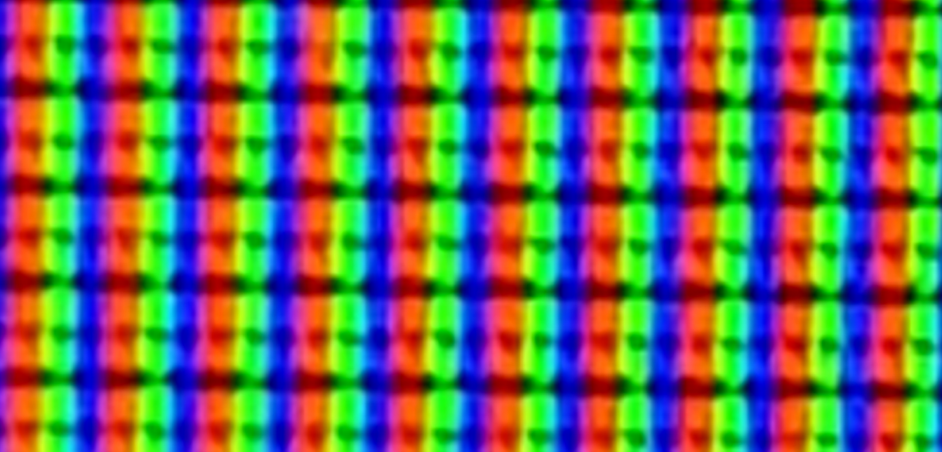
pixels are made out of three consistently-placed colour elements (not sure what the actual order is):
If you have a semi-decent smartphone (or just a decent camera, I guess), you can probably see the individual pixels on a zoomed in photo. Here's a picture of my full-HD screen:
-
@dkf On your typical desktop monitor it's either RGB or BGR, or (if rotated) vertically RGB or BGR. (There are others, like the Pentile types that are/were popular on phones.)
Subpixel rendering and antialiasing are used together (it's augmenting the antialiasing by using the subpixels).
I recommend everyone run the ClearType Tuner ("Adjust ClearType Text" in Settings/Personalization/Fonts or the Fonts Control Panel) at least once on their Windows install to make sure it picked the right setting and it's going as dark/bold as you'd like. It's not going to fix scaling issues, though.
I'm glad I haven't had to deal with anything but 100% yet.
-
@Parody said in Windows 10 is crap once again:
I'm glad I haven't had to deal with anything but 100% yet.
100 percent forever!
-
@cvi said in Windows 10 is crap once again:
@dkf said in Windows 10 is crap once again:
pixels are made out of three consistently-placed colour elements (not sure what the actual order is):
If you have a semi-decent smartphone (or just a decent camera, I guess), you can probably see the individual pixels on a zoomed in photo. Here's a picture of my full-HD screen:
I tried that with an iPhone 11 Pro taking pictures of a 4K/UHD 28-inch panel. It couldn't focus close enough to see the individual pixels.
-
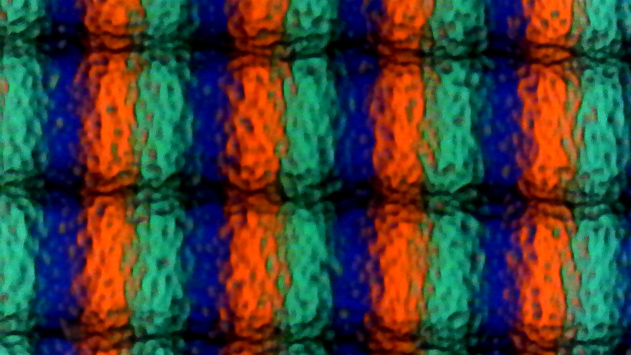
I happen to have a USB microscope.
Here's an LCD (HP LA2405WG). The "grainyness" is due to the anti-glare surface.
This one is a Galaxy Note 8 ("Super AMOLED")
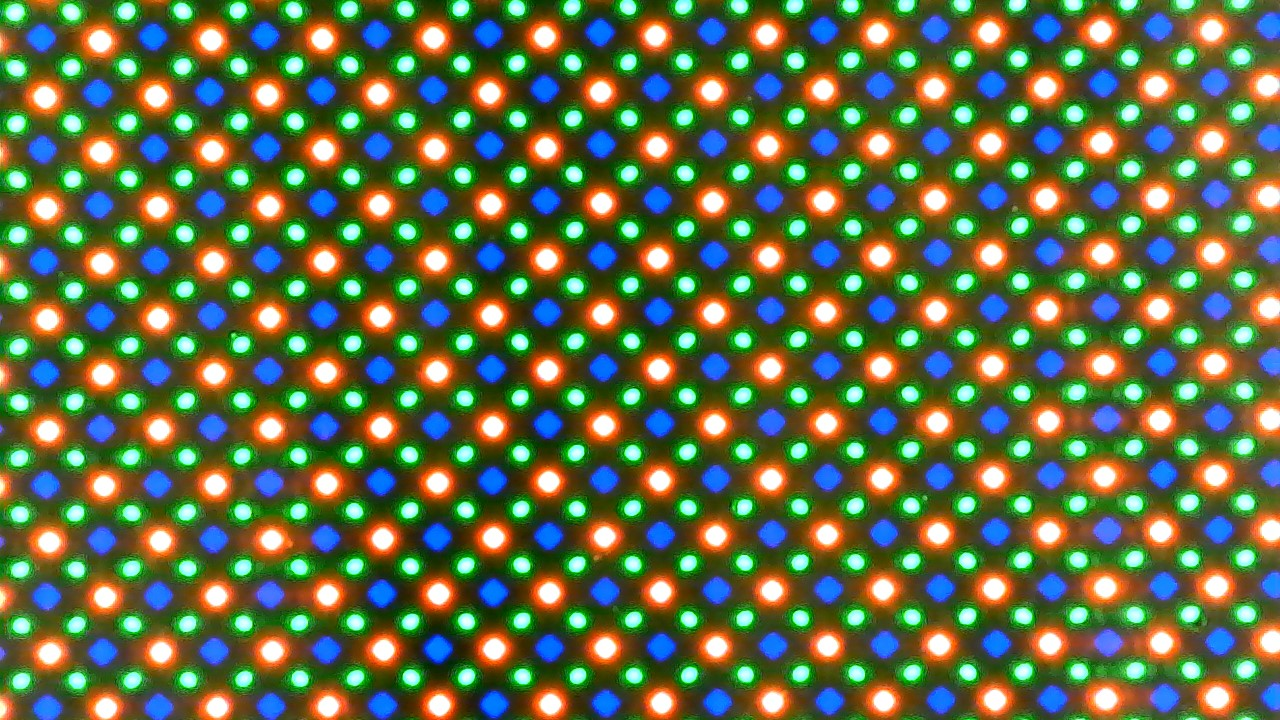
It's 4:30 in the morning, so both are on night mode, so increased red.
Same magnification, allegedly 250x.
-
@SirTwist I've read recently that some TVs use RGBW instead RGB - the fourth white subpixel is there to boost brightness. Some cheaper TVs don't use 4-element subpixels, but rather replace every fourth subpixel with white - so you get something like RGBWGBRWBRGW. According to TV equivalents of audiophiles, it looks like shit.
-
@SirTwist Nice.
Seen screens with double the green subpixels before, but never one with that 45 degree rotated pattern. Makes me wonder how they map bitmap images (which are still square arrays of RGB, though perhaps with the components permuted) to it.
-
@cvi This pattern has a 90° rotational symmetry. That may be an advantage when rotating the screen.
-
@Gąska said in Windows 10 is crap once again:
I've read recently that some TVs use RGBW instead RGB
Some lights do this, too — at least commercial/industrial/theatrical lights. Some go one step further and add amber LEDs, too, so the "white" is warmer and blends better with other, non-LED light sources that may be in use.
-
@dkf said in Windows 10 is crap once again:
The macOS renderer does great across all sorts of resolutions, so it's definitely possible.
For debatable definitions of "great". Some people absolutely loathe macOS' font rendering. And I'm not even mentioning some Macbooks which use a non-integer scaling ratio by default, making everything fuzzy.
Windows uses font hinting (small alterations of vector coordinates so that they fall on pixel boundaries when rendering at specific, small sizes), macOS doesn't. It creates crisper text at the expense of geometric fidelity. Asking which one is better is a good way to create an argument, when you've exhausted the usual "tabs or spaces?", "vi or emacs?", etc.
-
@Zerosquare said in Windows 10 is crap once again:
@dkf said in Windows 10 is crap once again:
The macOS renderer does great across all sorts of resolutions, so it's definitely possible.
For debatable definitions of "great". Some people absolutely loathe macOS' font rendering. And I'm not even mentioning some Macbooks which use a non-integer scaling ratio by default, making everything fuzzy.
Windows uses font hinting (small alterations of vector coordinates so that they fall on pixel boundaries when rendering at specific, small sizes), macOS doesn't. It creates crisper text at the expense of geometric fidelity. Asking which one is better is a good way to create an argument, when you've exhausted the usual "tabs or spaces?", "vi or emacs?", etc.
The Windows way was always objectively better for
real workeverything besides graphic design, but since going higher resolution the Mac way turned out better.
-
@Zerosquare said in Windows 10 is crap once again:
Windows uses font hinting (small alterations of vector coordinates so that they fall on pixel boundaries when rendering at specific, small sizes), macOS doesn’t.
A long time ago (10+ years, at a guess) I came across a site that compared OS X, Windows and Adobe text rendering at a range of sizes. I found it quite interesting to see the three side by side, because it exposed odd, unexpected quirks of all of them. Not a clue what site that was, and whether it even still exists, though.
-
@Zerosquare said in Windows 10 is crap once again:
Some people absolutely loathe macOS' font rendering.
Technically, that's part of how the whole screen renders; it's not just fonts that are aliased, but also all the other graphical elements. Combined with high resolution screens, that produces superb output. Prefer SVG over other formats for your icons, everyone…
-
This post is deleted!
-
@dkf said in Windows 10 is crap once again:
@Steve_The_Cynic said in Windows 10 is crap once again:
Bitmap fonts will not scale correctly
People still use those?
At WTFcorp, oh yes, we do. Imagine the horror that occurred when our German Corporate Overlords said that our applications need to scale by any factor expressed in a floating-point number between 1.0 and 2.0.
And we have our own remote desktop protocol, too, but that's a story for another time.
-
@strangeways said in Windows 10 is crap once again:
our applications need to scale by any factor expressed in a floating-point number between 1.0 and 2.0.
Hm. A laptop I have came with a default of 250%. Seems like an incomplete range there...