Do people actually like poor quality user interfaces?
-
I really don't understand this.
- Why is "oops something happened, try again later" an acceptable error message?
- Why is a page whose elements keep jumping around as parts load so you can't click anything for a full minute acceptable?
- Why is server side, and only server side validation, considered efficient?
- Why is validation done one field at a time considered efficient?
- Why do so many form fields (besides passwords and the like) reset on a failed form submission?
- Why is not focusing on any fields upon loading considered user friendly?
- Why is a postback on filtering and sorting and paging lists of less than 50 items acceptable?
- Why is the even worse infiniscroll abomination not just tolerated but embraced?
- Why don't sites underline regular links anymore?
- Why can't we just have actual buttons for actions instead of styled links?
- Why is there a push to remove borders that would define the edges of elements, in particular mouse-activated elements?
- Why doesn't anything online ever print right?
- Why do people reinvent the selectbox if they're not going to do anything that the browser's built-in selectbox can't do?
- Why do some sites render checkmarks and radiomarks the same way?
- Why do mobile-optimized storefronts have pictures that only zoom in ~20% because they're constrained by being inline elements inside a fixed viewport?
- Why don't "specifications" tabs include physical dimensions, OS requirements, or other critical details?
- Why are window sizes fixed and unscrollable when they're clearly way too small for the content?
- Why didn't anybody involved with HTML standards ever make table headers/footers fixed so the rest of the rows could scroll?
- Why is absolute positioning still such a kludge that I can still see headers/footers jump away from the edge when I scroll?
- Why did non-IE browsers fight against a modal/blocking dialog window?
These are all easily solved problems. Yet, somehow, they persist. Does somebody out there like it this way or what?
-
Replying to just the stuff where I think you're wrong. If a point is omitted, either I think you're right, or I think it's up to each user's style & not worth arguing over. ;)
@Zenith said in Do people actually like poor quality user interfaces?:
- Why is "oops something happened, try again later" an acceptable error message?
If it's not something the user can address, better to keep it generic to avoid leaking information. No benefit to giving them "techy" information, only downsides.
- Why is server side, and only server side validation, considered efficient?
I don't think it's considered "efficient", just "effective". You can do client-side validation too, but it can't be the only validation. Unfortunately some devs are lazy & only want to do it once.
- Why do so many form fields (besides passwords and the like) reset on a failed form submission?
Either shitty site dev or shitty browser dev. Hard to be sure from just this.
- Why is not focusing on any fields upon loading considered user friendly?
Because there may be content above the first field, that focusing on it would scroll past.
- Why is a postback on filtering and sorting and paging lists of less than 50 items acceptable?
Because coding separate pages depending on the number of items being returned is a lot of dev overhead for no real UI gain.
These are all easily solved problems. Yet, somehow, they persist. Does somebody out there like it this way or what?
For the items that are driven by CSS: yes, obviously someone does or they never would have added it to the stylesheet.

-
@Zenith said in Do people actually like poor quality user interfaces?:
Why is "oops something happened, try again later" an acceptable error message?
The user can't do anything about it anyway, so yes.
@Zenith said in Do people actually like poor quality user interfaces?:
Why is the even worse infiniscroll abomination not just tolerated but embraced?
It doesn't always suck.
Most of this seems like just moaning about modern Web development, in which case once it becomes the "in" trend, what choice do users have anyway? Completely stop using it or hate it but use it regardless, and in a lot of cases the former will be the only actual option.
-
@Zenith said in Do people actually like poor quality user interfaces?:
- Why did non-IE browsers fight against a modal/blocking dialog window?
I agree with most of the ones you said. However, I hate modal dialogs, as they're often used when they're not necessary.
-
My best guesses for each:
@Zenith said in Do people actually like poor quality user interfaces?:
Why is "oops something happened, try again later" an acceptable error message?
Probably because people think "Users don't want to see all the technical stuff, it's confusing to them, so just make it a simple "oops".
Why is a page whose elements keep jumping around as parts load so you can't click anything for a full minute acceptable?
Because it's fancy, of course!
Why is server side, and only server side validation, considered efficient?
Clients are untrustworthy and may be compromised.
Why is validation done one field at a time considered efficient?
Because it's haaaaaaaaaaaard
Why do so many form fields (besides passwords and the like) reset on a failed form submission?
"Security"
Why is not focusing on any fields upon loading considered user friendly?
To avoid wresting control away from the user if they happen to be doing something else, probably
Why is a postback on filtering and sorting and paging lists of less than 50 items acceptable?
"Efficiency"
Why is the even worse infiniscroll abomination not just tolerated but embraced?
Infiniscroll isn't terrible, if implemented properly and in an application where it makes sense. I wouldn't mind an infiniscrolling e-reader.
Why don't sites underline regular links anymore?
Because they have to be "unique", just like everyone else.
Why can't we just have actual buttons for actions instead of styled links?
Buttons don't exist. They're a figment of your imagination. Links are everything. Obey the links. Love the links. Submit to the links.
Why is there a push to remove borders that would define the edges of elements, in particular mouse-activated elements?
"Aesthetics", so "form over function"
Why doesn't anything online ever print right?
Because it's haaaaaaaaaaaard
Why do people reinvent the selectbox if they're not going to do anything that the browser's built-in selectbox can't do?
Because they can!
Why do some sites render checkmarks and radiomarks the same way?
What are those? We'll just use checkmark emoji.
Why do mobile-optimized storefronts have pictures that only zoom in ~20% because they're constrained by being inline elements inside a fixed viewport?
You said words that sounded like technical something. Are you gonna buy it or not?
Why don't "specifications" tabs include physical dimensions, OS requirements, or other critical details?
Because that would require the seller to actually know something about what they're selling.
Why are window sizes fixed and unscrollable when they're clearly way too small for the content?
Because ze content must look EXACTLY ze same all ze time!
Why didn't anybody involved with HTML standards ever make table headers/footers fixed so the rest of the rows could scroll?
Because they have an intense phobia of scrollbars.
Why is absolute positioning still such a kludge that I can still see headers/footers jump away from the edge when I scroll?
Because the guy who was supposed to fix that went on a bender 7 years ago. We haven't seen him since. If you see him, please call us. His wife and kids miss him.
Why did non-IE browsers fight against a modal/blocking dialog window?
They were bored on a Thursday.
...I may have gotten somewhat more snarky as this went on.
-
@Unperverted-Vixen said in Do people actually like poor quality user interfaces?:
@Zenith said in Do people actually like poor quality user interfaces?:
- Why is "oops something happened, try again later" an acceptable error message?
If it's not something the user can address, better to keep it generic to avoid leaking information. No benefit to giving them "techy" information, only downsides.
The problem is that you don't actually know because "oops" is used for everything. Time outs, missing form fields, locked accounts, the works. I actually had this with PayPal some time back where they disconnected my bank account and this was what happened when I tried to reconnect it. After seven or eight calls, it turned out my account was blocked, and that never would've been resolved no matter how many times I tried again later.
- Why is not focusing on any fields upon loading considered user friendly?
Because there may be content above the first field, that focusing on it would scroll past.
Except when there's not? Every storefront would benefit by having that search bar right at the top of the page take focus.
- Why is a postback on filtering and sorting and paging lists of less than 50 items acceptable?
Because coding separate pages depending on the number of items being returned is a lot of dev overhead for no real UI gain.
But you're not coding separate pages, You're basically doing this:
foreach row in search_results
{
echo ("<div><div>$product_name</div><img src='$product_image'><div>$product_price</div></div>");
}
And XSLT, even way back in IE6, can sort and filter client side. I just don't see the point of browsing a catalog, especially a ridiculously slow catalog, 9 items at a time.
-
@Zenith said in Do people actually like poor quality user interfaces?:
- Why is "oops something happened, try again later" an acceptable error message?
Because error messages are hard. Leaking, schmeaking, try catch return false.
- Why is a page whose elements keep jumping around as parts load so you can't click anything for a full minute acceptable?
Please wait. Loading. Forever.
- Why do so many form fields (besides passwords and the like) reset on a failed form submission?
Because doing otherwise means work.
- Why is not focusing on any fields upon loading considered user friendly?
See above.
- Why is the even worse infiniscroll abomination not just tolerated but embraced?
Ask Jeff.
- Why don't sites underline regular links anymore?
Art school dropouts. Be thankful they don't start bar brawls instead.
- Why can't we just have actual buttons for actions instead of styled links?
I CAN HAS JAVASCRIPT! SO JAVASCRIPT ERRYWHERE!
- Why is there a push to remove borders that would define the edges of elements, in particular mouse-activated elements?
Comes and goes. Give it 5 years. There's only two chances: skudomorphic will come back or something more hideous than this will appear.
- Why doesn't anything online ever print right?
Better get it to display right first, then we can talk about adapting to print. Also, it's work.
- Why do people reinvent
the selectbox if they're not going to do anything that the browser's built-in selectbox can't do?

- Why do some sites render checkmarks and radiomarks the same way?
Art school dropouts are getting antsy at your disinclination to conform. Juice?
- Why don't "specifications" tabs include physical dimensions, OS requirements, or other critical details?
Because that's difficult and useful.
- Why didn't anybody involved with HTML standards ever make table headers/footers fixed so the rest of the rows could scroll?
Because that's difficult and useful.
- Why is absolute positioning still such a kludge that I can still see headers/footers jump away from the edge when I scroll?
Everything on the webs is a kludge.
- Why did non-IE browsers fight against a modal/blocking dialog window?
while (true) window.alert("Are we there yet?")Alternatively: everything that can be abused, misused or overused, will be
These are all easily solved problems. Yet, somehow, they persist. Does somebody out there like it this way or what?
Dunno if all of them are easily solved. Anyway, lots of somebodies out there just don't give a damn.
@Zenith said in Do people actually like poor quality user interfaces?:
Except when there's not? Every storefront would benefit by having that search bar right at the top of the page take focus.
Almost every storefront isn't interested in you searching things you need, but selling you things you don't.
-
@loopback0 said in Do people actually like poor quality user interfaces?:
@Zenith said in Do people actually like poor quality user interfaces?:
Why is the even worse infiniscroll abomination not just tolerated but embraced?
It doesn't always suck.
Most of this seems like just moaning about modern Web development, in which case once it becomes the "in" trend, what choice do users have anyway? Completely stop using it or hate it but use it regardless, and in a lot of cases the former will be the only actual option.
It sucks when you need to refer back to anything in the list, either as an entry point or navigating backwards.
Also, yes, I do feel like complaining because of these job descriptions. Write a shitty cookie cutter website riddled with usability and security issues.
-
@Zenith said in Do people actually like poor quality user interfaces?:
Except when there's not? Every storefront would benefit by having that search bar right at the top of the page take focus.
No that'd annoy me. Why is search so special? Why would the software assume I want to search?
-
@loopback0 said in Do people actually like poor quality user interfaces?:
@Zenith said in Do people actually like poor quality user interfaces?:
Except when there's not? Every storefront would benefit by having that search bar right at the top of the page take focus.
No that'd annoy me. Why is search so special? Why would the software assume I want to search?
The scroll wheel doesn't stop working because a textbox is selected.
I also should've added "pressing Enter after typing doesn't activate a search" to my list. I hate having to reach for a mouse (because tab order is busted too) or pinpoint a microscopic button a 5-inch touchscreen.
-
@Zenith said in Do people actually like poor quality user interfaces?:
I really don't understand this.
- Why is "oops something happened, try again later" an acceptable error message?
- Why is a page whose elements keep jumping around as parts load so you can't click anything for a full minute acceptable?
- Why is server side, and only server side validation, considered efficient?
- Why is validation done one field at a time considered efficient?
- Why do so many form fields (besides passwords and the like) reset on a failed form submission?
- Why is not focusing on any fields upon loading considered user friendly?
- Why is a postback on filtering and sorting and paging lists of less than 50 items acceptable?
- Why is the even worse infiniscroll abomination not just tolerated but embraced?
- Why don't sites underline regular links anymore?
- Why can't we just have actual buttons for actions instead of styled links?
- Why is there a push to remove borders that would define the edges of elements, in particular mouse-activated elements?
- Why doesn't anything online ever print right?
- Why do people reinvent the selectbox if they're not going to do anything that the browser's built-in selectbox can't do?
- Why do some sites render checkmarks and radiomarks the same way?
- Why do mobile-optimized storefronts have pictures that only zoom in ~20% because they're constrained by being inline elements inside a fixed viewport?
- Why don't "specifications" tabs include physical dimensions, OS requirements, or other critical details?
- Why are window sizes fixed and unscrollable when they're clearly way too small for the content?
- Why didn't anybody involved with HTML standards ever make table headers/footers fixed so the rest of the rows could scroll?
- Why is absolute positioning still such a kludge that I can still see headers/footers jump away from the edge when I scroll?
- Why did non-IE browsers fight against a modal/blocking dialog window?
These are all easily solved problems. Yet, somehow, they persist.
Because doing otherwise means work.
-
@Applied-Mediocrity said in Do people actually like poor quality user interfaces?:
while (true) window.alert("Are we there yet?")
Alternatively: everything that can be abused, misused or overused, will beAnd, yet, they left both Alert() and Confirm() in these browsers. It's like they thought the only options were "no modals" and "modal that locks the entire application."
-
@Zenith said in Do people actually like poor quality user interfaces?:
The scroll wheel doesn't stop working because a textbox is selected.
The mouse doesn't stop working because it isn't.
Things randomly stealing focus is annoying IMO and I'd imagine significantly more people (that is typical users, not developers) share that opinion than don't.
@Zenith said in Do people actually like poor quality user interfaces?:
I also should've added "pressing Enter after typing doesn't activate a search" to my list
Yeah this is frustrating.
-
@Zenith said in Do people actually like poor quality user interfaces?:
@Applied-Mediocrity said in Do people actually like poor quality user interfaces?:
while (true) window.alert("Are we there yet?")
Alternatively: everything that can be abused, misused or overused, will beAnd, yet, they left both Alert() and Confirm() in these browsers. It's like they thought the only options were "no modals" and "modal that locks the entire application."
What did you expect them to do about all the code still using those calls? Return
undefined? They can't just go and break thin... oh wait.
-
@loopback0 said in Do people actually like poor quality user interfaces?:
Things randomly stealing focus is annoying IMO and I'd imagine significantly more people (that is typical users, not developers) share that opinion than don't.
Less annoying than autoscrolling or having some sort of banner slide across 3/4 of the page.
When I go shopping online, I usually want to find something (needed or not) right away and buy it. If you make that difficult for me - moving search boxes, autoplaying/autoscrolling noise, dancing layout, laggy paging, infinite scroll that keeps resetting my position - I turn elsewhere pretty quickly. I can't believe people put up with that for what are essentially commodities that can be purchased practically anywhere. But I guess with seemingly EVERY SINGLE STOREFRONT PACKAGE having the same dopey behaviors, it's safe to play the lottery.
@Applied-Mediocrity said in Do people actually like poor quality user interfaces?:
@Zenith said in Do people actually like poor quality user interfaces?:
And, yet, they left both Alert() and Confirm() in these browsers. It's like they thought the only options were "no modals" and "modal that locks the entire application."
What did you expect them to do about all the code still using those calls? Return
undefined? They can't just go and break thin... oh wait.When IE controlled 90% of the browser market, it wasn't smart to break showModalDialog() either. I just looked up Mozilla's page and they're talking about a dialog tag in HTML5. Great, so dialogs are just peachy now, as long as there's a chance to break compatibility and play the "wait for your browser to support it before Blink takes it away again" game.
-
@Zenith said in Do people actually like poor quality user interfaces?:
Less annoying than autoscrolling or having some sort of banner slide across 3/4 of the page.
Maybe. Maybe not. Those are different things.
-
@El_Heffe said in Do people actually like poor quality user interfaces?:
Because doing otherwise means work.
I should've phrased this differently. I know why some developers don't want to do stuff. They don't know how or don't care. But why would an organization pay the sort of money that even Pajeets cost for such obvious shortcomings? Especially as often as I hear the phrase "continuous improvement" these days. This is such low-hanging fruit and if it's not getting done it's difficult to believe that anything else is.

-
@loopback0 said in Do people actually like poor quality user interfaces?:
@Zenith said in Do people actually like poor quality user interfaces?:
Less annoying than autoscrolling or having some sort of banner slide across 3/4 of the page.
Maybe. Maybe not. Those are different things.
They both steal focus.
Also another example is logon dialogs that don't focus on either field.
-
Focus-stealing elements can fuck off. I choose what gets focus and when that changes. Don't fucking mess with it.
Modal dialogs likewise. There's more than one thing going on and your page/app/whatever isn't the most important thing ever.
-
@Zenith said in Do people actually like poor quality user interfaces?:
Also another example is logon dialogs that don't focus on either field.
Applications, purchase orders...; any page where the only point to visiting it is to fill in the form there.
-
@Zenith said in Do people actually like poor quality user interfaces?:
They both steal focus.
Generally not.
I don't think General Help is the appropriate location for just whining about stuff.
-
@loopback0 said in Do people actually like poor quality user interfaces?:
I don't think General Help is the appropriate location for just whining about stuff.
 'd
'd
-
@Zenith said in Do people actually like poor quality user interfaces?:
@El_Heffe said in Do people actually like poor quality user interfaces?:
Because doing otherwise means work.
I should've phrased this differently. I know why some developers don't want to do stuff. They don't know how or don't care. But why would an organization pay the sort of money that even Pajeets cost for such obvious shortcomings?
Because they don't care, and, in most cases, the user has no other viable options, so there is nothing that can force them to care.
-
Another one to add to the list.
As I was reading this thread, suddenly I got jellypotatoed back to the top of the page. And then this "helpful" little toaster appeared:

Why, thank you NodeBB. But why did you change my scroll position in the first place?

-
@loopback0 said in Do people actually like poor quality user interfaces?:
It doesn't always suck.
Please provide an example of infiniscroll not sucking. I can't think of a single one.
-
@jinpa said in Do people actually like poor quality user interfaces?:
@Zenith said in Do people actually like poor quality user interfaces?:
- Why did non-IE browsers fight against a modal/blocking dialog window?
I agree with most of the ones you said. However, I hate modal dialogs, as they're often used when they're not necessary.
Chrome's handling of alert() is absolutely pathetic though. Instead of keeping it modal for the page, like all other browsers have managed, it makes it modal and adds a checkbox to prevent further messages. Users will of course accidentally hit that box and break the website.
And it's not like pop-up messages are bad. Almost every website has them even today. They're just reimplemented in HTML.
-
@AlexMedia I think it's retarded that I get three notifications every time I get upvoted or quoted.
And that NodeBB can't seem to keep the post/cancel buttons from going under the mobile browser's toolbar. I can only post because it also manages to put my clicks ~25 pixels above my pointer. Makes selecting text or moving the caret a real pain in the ass though.
-
@cvi said in Do people actually like poor quality user interfaces?:
Focus-stealing elements can fuck off. I choose what gets focus and when that changes. Don't fucking mess with it.
If I were making an OS, I'd add a FocusWindow() function that brought the application's main window to the front. Then I'd wait a year. Then I'd ban all developers who had used it from the app store.
-
@anonymous234 said in Do people actually like poor quality user interfaces?:
@cvi said in Do people actually like poor quality user interfaces?:
Focus-stealing elements can fuck off. I choose what gets focus and when that changes. Don't fucking mess with it.
If I were making an OS, I'd add a FocusWindow() function that brought the application's main window to the front. Then I'd wait a year. Then I'd ban all developers who had used it from the app store.
I'd have that function in the ABI but not the documented API, as a honeypot.
-
@Zenith said in Do people actually like poor quality user interfaces?:
I really don't understand this.
- Why is "oops something happened, try again later" an acceptable error message?
If it's an internal server error (e.g. 5xx) then there's nothing the user can do about it. Do you really think "Syntax error in SQL query '...'" or whatever is at all any more useful to the user?
- Why is a page whose elements keep jumping around as parts load so you can't click anything for a full minute acceptable?
Because it improves their click-thru rate for ads.
- Why is server side, and only server side validation, considered efficient?
Who's ever said it's efficient?
- Why is validation done one field at a time considered efficient?
Who's ever said it's efficient?
- Why do so many form fields (besides passwords and the like) reset on a failed form submission?
I rarely ever see this. And the few times I might have, it was on a website that was clearly coded by idiots.
- Why is not focusing on any fields upon loading considered user friendly?
Who's ever said it's user friendly?
- Why is the even worse infiniscroll abomination not just tolerated but embraced?
I've been in the philosophy that infiniscroll is OK for cases where there's no real "end" to the content. E.g. facebook/reddit feeds, etc. But for something very finite, such as a forum thread or something, then I agree it's awful.
- Why don't sites underline regular links anymore?
Because a color usually suffices now?
- Why can't we just have actual buttons for actions instead of styled links?
We can. Buttons are still around.
- Why doesn't anything online ever print right?
Because printers are becoming a more and more archaic piece of equipment.
- Why do people reinvent the selectbox if they're not going to do anything that the browser's built-in selectbox can't do?
Because the default html selectbox often clashes with the theme of the website?
- Why do some sites render checkmarks and radiomarks the same way?
Because they're idiots.
- Why don't "specifications" tabs include physical dimensions, OS requirements, or other critical details?
I'm not sure what "specifications" you're referring to.
- Why are window sizes fixed and unscrollable when they're clearly way too small for the content?
Give me an example of this.
- Why didn't anybody involved with HTML standards ever make table headers/footers fixed so the rest of the rows could scroll?
Because that's a CSS thing.
- Why is absolute positioning still such a kludge that I can still see headers/footers jump away from the edge when I scroll?
Because absolutely positioned elements are supposed to scroll. You're thinking of fixed positioned elements?
- Why did non-IE browsers fight against a modal/blocking dialog window?
Tell me how they did. Making a blocking dialog window is as easy as just having a fixed positioned div that covers the screen under a dialog. All browsers support this.
-
@Zenith said in Do people actually like poor quality user interfaces?:
Why did non-IE browsers fight against a modal/blocking dialog window?
Rickrolls, probably
-
@Zenith said in Do people actually like poor quality user interfaces?:
These are all easily solved problems. Yet, somehow, they persist. Does somebody out there like it this way or what?
You're not wrong, but … based on the only relevant metric ever ("somebody voted with their wallet"), yes they do

Who am I to tell like the whole world that this metric is crap?
-
@The_Quiet_One said in Do people actually like poor quality user interfaces?:
Why are window sizes fixed and unscrollable when they're clearly way too small for the content?
Give me an example of this.
Daptiv's submit timesheet button opens pretend dialog div where the submit and cancel buttons are 3 pixels away from being below the fold. Outlook's rule list and rule runner windows are way too small. PHPmyAdmin has an impossibly small fake window div for editing stored procedures. Those are just 3 that come to mind trying to type on mobile because this thread is throwing virus warnings on a desktop.
Why didn't anybody involved with HTML standards ever make table headers/footers fixed so the rest of the rows could scroll?
Because that's a CSS thing.
And that's mutually exclusive? Try to make an inline table that does this. Or did you mean divs? Because those fall apart when you need to fill remaining space or keep header/footer It's and cell widths in sync.
Why is absolute positioning still such a kludge that I can still see headers/footers jump away from the edge when I scroll?
Because absolutely positioned elements are supposed to scroll. You're thinking of fixed positioned elements?
You're right, I meant fixed. They still jump and stutter while scrolling. It's like flicker on a WinForms control, "impossible" to fix except not.
Why did non-IE browsers fight against a modal/blocking dialog window?
Tell me how they did. Making a blocking dialog window is as easy as just having a fixed positioned div that covers the screen under a dialog. All browsers support this.
A fixed positioned div is not a blocking dialog window. It doesn't pause or halt one function so much as bridge two or more. It also makes those "dialogs" less reusable because now you're embedding HTML in JavaScript rather than a separate object with well-defined in/out points.
-
I'm going to respond in relation to ConCrescent, the registration system I'm face-lifting.
@Zenith said in Do people actually like poor quality user interfaces?:
Why is "oops something happened, try again later" an acceptable error message?
Tis not. Usually you'll get highlights on fields that are wrong or a header banner with a (hopefully reasonable) reason.
Why is a page whose elements keep jumping around as parts load so you can't click anything for a full minute acceptable?
So long as you have decent 3G or DSL+ speeds (128k+), you'll need to wait less than half a second to load most of everything, and a few seconds for the stupid icon fonts that can't be split, and then only once because it's set to cached; and even then nothing "jumps around" at any time without user interaction.
Why is server side, and only server side validation, considered efficient?
It isn't, and is why you get the red validation hints in the UI.

Why is validation done one field at a time considered efficient?
It isn't, the first time around. If you try to go to the next page, every field transitions to a "I'll stop being red when you fix me" state.
Why do so many form fields (besides passwords and the like) reset on a failed form submission?
They don't! In fact, I made significant effort to save form state such that it survives even page refreshes!
 Sadly, no cross-device support.
Why is not focusing on any fields upon loading considered user friendly?
It's not! Additionally, field ordering is being attended so screenreaders don't barf (hopefully. Need to get someone with something better than Microsoft Narrator to test with).
Why is a postback on filtering and sorting and paging lists of less than 50 items acceptable?
N/A. The admin side isn't nearly ready enough yet, but data grids will not postback (actually, no part of the system will postback. That's what the current system does, and it's annoying).
Why is the even worse infiniscroll abomination not just tolerated but embraced?
 Infiniscroll isn't a thing on a registration system, so...
Why don't sites underline regular links anymore?
Mine does! Also, the main convention site does!
Why can't we just have actual buttons for actions instead of styled links?
All actions are buttons that look like buttons
Why is there a push to remove borders that would define the edges of elements, in particular mouse-activated elements?
Not sure what this means. Like on text boxes? It's a little meh. My forms aren't so governmental-boxed so it's so confusing you're in a form, so...

Why doesn't anything online ever print right?
Not yet addressed, but the badges screen and other you-might-want-to-print-this screens will definitely print correctly. As "correctly" as that might mean anyways.
Why do people reinvent the selectbox if they're not going to do anything that the browser's built-in selectbox can't do?
Not sure. Maybe to make the rest of the theme consistent? They also theme things like the buttons, checkboxes, and radio buttons.
Why do some sites render checkmarks and radiomarks the same way?
It won't! But there isn't much reason to choose radio buttons over selects, though both are supported.
Why do mobile-optimized storefronts have pictures that only zoom in ~20% because they're constrained by being inline elements inside a fixed viewport?
This was a bitch to "fix", and it's still only partially mitigated. See the badge selection section, which is a vertically-scrolling psuedo-select-list on mobile (or width-challenged) devices, and a horizontally-scrolling list on everything else. As far as images... well there aren't any, so

Why don't "specifications" tabs include physical dimensions, OS requirements, or other critical details?
The badge selection will result in a much-more-easier-to-read itemized list.
Why are window sizes fixed and unscrollable when they're clearly way too small for the content?
There are no sub-windows in ConCrescent's user-facing side, so
Why didn't anybody involved with HTML standards ever make table headers/footers fixed so the rest of the rows could scroll?
This is indeed annoying and when I get to the admin section it will be addressed. Also, columns will be re-orderable and visibility customizable (if possible).
Why is absolute positioning still such a kludge that I can still see headers/footers jump away from the edge when I scroll?
Ask browser makers.
Why did non-IE browsers fight against a modal/blocking dialog window?
They didn't, and for quite some time you could block every chrome tab with a message box you couldn't see. that was utter shit.
Edit: Oh, by the way, here's the WIP page of what I'm talking about!
-
@Zenith said in Do people actually like poor quality user interfaces?:
- Why is the even worse infiniscroll abomination not just tolerated but embraced?
Consider this feature matrix:
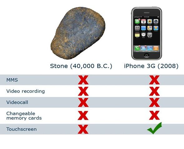
It's the same reason why cell phones used to have nice slide-out keyboards, but now you must do all your typing by swyping on a touch screen and deal with autocorrect guessing what you might have wanted to say instead of letting you type out what you actually wanted to say. Gmail is now trying to close the loop by making people on desktops with actual keyboards go through the same.
It's also the same reason why you can't easily replace the battery in cell phones anymore, and the same reason why security updates on your phone stop around the 2-year [end-of-contract] mark, so you must spend another $600-1000 if you don't want your phone to be mining buttcoins the first time you stumble upon a dodgy website thereafter.
These are all easily solved problems. Yet, somehow, they persist. Does somebody out there like it this way or what?
Around the time I was but a 12-year-old child, someone decided that documents with links to other documents would be the ideal application platform.
We are still suffering the consequences.
-
@cvi said in Do people actually like poor quality user interfaces?:
Modal dialogs likewise. There's more than one thing going on and your page/app/whatever isn't the most important thing ever.
Okay, your app has a Delete Record link. Your users are either elderly, or otherwise visually or motor-skills impaired. so this link ends up getting clicked accidentally way too many times and the tech support staff are sick of cleaning up the ensuing messes.
You are asked to implement user confirmation before deletion to reduce these incidents. What do you do?
-
@Zenith said in Do people actually like poor quality user interfaces?:
@AlexMedia I think it's retarded that I get three notifications every time I get upvoted or quoted.
And that NodeBB can't seem to keep the post/cancel buttons from going under the mobile browser's toolbar. I can only post because it also manages to put my clicks ~25 pixels above my pointer. Makes selecting text or moving the caret a real pain in the ass though.
Oh shit! I just realized you're on the same Earth as @pie_flavor !!!


-
@Groaner said in Do people actually like poor quality user interfaces?:
You are asked to implement user confirmation before deletion to reduce these incidents. What do you do?
Delete the delete record button, clearly.
-
@Zenith said in Do people actually like poor quality user interfaces?:
- Why is "oops something happened, try again later" an acceptable error message?
It's not. The fact that there's no user-digestible information in the message is just fine - the user can't do anything differently to fix it or stop it happening(1), so there's no point in providing more detail than that. (Perhaps some hint of how much later would be a good idea...)
What's not acceptable is the tone of the message. On Twitter or Facebook, OK, maybe. On a webstore or government department page, no, never.
(1) Maybe. If the same message is used for errors that can be prevented by the user doing something differently (e.g. by pushing button B after button A rather than before it), then the user should be told, or better yet, button B should be disabled or hidden or something until button A has been pressed.
-
@Groaner said in Do people actually like poor quality user interfaces?:
@cvi said in Do people actually like poor quality user interfaces?:
Modal dialogs likewise. There's more than one thing going on and your page/app/whatever isn't the most important thing ever.
Okay, your app has a Delete Record link. Your users are either elderly, or otherwise visually or motor-skills impaired. so this link ends up getting clicked accidentally way too many times and the tech support staff are sick of cleaning up the ensuing messes.
You are asked to implement user confirmation before deletion to reduce these incidents. What do you do?
If they say "prevent", you take up goat herding in Patagonia. No amount of user confirmation popups will totally prevent it from happening, ever. "Reduce" can be met with "reduce by how much?", followed by the purchase of a one-way plane ticket to northern Argentina and, once there, you buy some capra aegagrus hircus.
-
@Tsaukpaetra said in Do people actually like poor quality user interfaces?:
@Groaner said in Do people actually like poor quality user interfaces?:
You are asked to implement user confirmation before deletion to reduce these incidents. What do you do?
Delete the delete record button, clearly.
Now, the tech support staff is complaining about an excess of tickets asking for the deletion of certain records created accidentally.
-
@Steve_The_Cynic said in Do people actually like poor quality user interfaces?:
If they say "prevent", you take up goat herding in Patagonia. No amount of user confirmation popups will totally prevent it from happening, ever. "Reduce" can be met with "reduce by how much?", followed by the purchase of a one-way plane ticket to northern Argentina and, once there, you buy some capra aegagrus hircus.
Let P(d) be the probability of accidentally clicking the Delete button. 0 < P(d) < 1.
Let P(c) be the probability of accidentally clicking the Yes button in the Confirm Delete popup. 0 < P(c) <1.
Adding a confirmation popup reduces the probability of accidental deletion to P(d) * P(c), and P(d) * P(c) < P(d) by definition. So already, you see an improvement.
One of the apps my company produces (but I do not personally maintain) actually asks three times before deletion (e.g. "Are you TRIPLE SURE you want to delete this widget?"). It's kind of amusing and excessive, but our end users really are that, um... "technically challenged." I've seen them at work and it's scary.
Sure, you can't reduce the total probability to zero, but you can get pretty darn close. World of Warcraft, a game that I hate but which is an excellent study in usability and human-computer interaction on so many levels, would not only have you confirm deletion of a character, but also make you type "DELETE" into a textbox. It's pretty hard to say you accidentally deleted something if you have to go to those lengths.
-
@Zenith said in Do people actually like poor quality user interfaces?:
I really don't understand this.
- Why is "oops something happened, try again later" an acceptable error message?
How else would you phrase a server side problem to the user? There is literally nothing they can do about it in general.
- Why is a page whose elements keep jumping around as parts load so you can't click anything for a full minute acceptable?
It isn't. Not unless you're showing ads, and then it seems to be de rigueur.

- Why is server side, and only server side validation, considered efficient?
Since that is the validation you have to have (or you have a catastrophic problem waiting to happen when someone figures out what message to send) it is "efficient" to only write that part. In terms of dev time only.
Doing it right also includes soft validation client side. I say soft validation because it isn't necessarily a problem for the page to have invalid fields while the data entry is going on; client side dynamic validation should remind people gently that there is a problem, not attempt to force every issue to be dealt with as soon as it is detected. The user's one-page workflow is not necessarily always the one that you, the page developer, thought of.
[skipping, but my next response is a useful one...]
- Why do some sites render checkmarks and radiomarks the same way?
Because they're shit.
- Why did non-IE browsers fight against a modal/blocking dialog window?
Trivial abuse vector. Modality is a great way to annoy the shit out of users when abused.
These are all easily solved problems. Yet, somehow, they persist. Does somebody out there like it this way or what?
It's what you get when you hire development effort from the lowest-price bidder.
-
@Groaner said in Do people actually like poor quality user interfaces?:
@Tsaukpaetra said in Do people actually like poor quality user interfaces?:
@Groaner said in Do people actually like poor quality user interfaces?:
You are asked to implement user confirmation before deletion to reduce these incidents. What do you do?
Delete the delete record button, clearly.
Now, the tech support staff is complaining about an excess of tickets asking for the deletion of certain records created accidentally.
Records are cheap. Just ignore them.

Edit: Exhibit A:
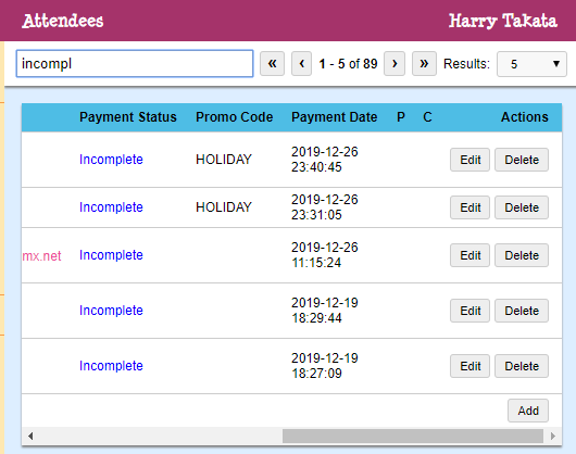
We're not even into the selling season yet. Nobody cares about the dupes. And those that do can shove it.
-
@Tsaukpaetra said in Do people actually like poor quality user interfaces?:
@Zenith said in Do people actually like poor quality user interfaces?:
@AlexMedia I think it's retarded that I get three notifications every time I get upvoted or quoted.
And that NodeBB can't seem to keep the post/cancel buttons from going under the mobile browser's toolbar. I can only post because it also manages to put my clicks ~25 pixels above my pointer. Makes selecting text or moving the caret a real pain in the ass though.
Oh shit! I just realized you're on the same Earth as @pie_flavor !!!
Huh, how do you figure?
I have a “posting on mobile is horribly broken” thread lying around somewhere, and I’m definitely not on the same earth as pie.
-
@Zenith said in Do people actually like poor quality user interfaces?:
- Why don't sites underline regular links anymore?
My guess is because underlining is ugly and should be avoided — or so typography guides say. That seems to be more important than the functionality provided by underlining links.
- Why can't we just have actual buttons for actions instead of styled links?
[snip] - Why do people reinvent the selectbox if they're not going to do anything that the browser's built-in selectbox can't do?
- Why do some sites render checkmarks and radiomarks the same way?
I’ve long had the feeling that people learning web development today are taught that HTML is some necessary evil that allows JavaScript to be used to actually implement things in. So they don’t look to see if there is a standard HTML tag that does what they want, but instead fall back to very basic elements and roll their own functionality from them.
My biggest complaint in this department is constructions such as:—
<a onclick="openLink('http://example.org')">Click me!</a>or even better, something like:—
<a data-myURL="http://example.org">Click me!</a>None of these break standard link functionality at all, of course …

- Why didn't anybody involved with HTML standards ever make table headers/footers fixed so the rest of the rows could scroll?
When I first heard about the
TBODYetc. tags (having been using tables in HTML from long before these tags were introduced), I thought that was exactly the functionality they would provide, or at least allow to be easily implemented. I was disappointed soon after.- Why did non-IE browsers fight against a modal/blocking dialog window?
Blocking the whole program? No, thanks.
-
@topspin said in Do people actually like poor quality user interfaces?:
@Tsaukpaetra said in Do people actually like poor quality user interfaces?:
@Zenith said in Do people actually like poor quality user interfaces?:
@AlexMedia I think it's retarded that I get three notifications every time I get upvoted or quoted.
And that NodeBB can't seem to keep the post/cancel buttons from going under the mobile browser's toolbar. I can only post because it also manages to put my clicks ~25 pixels above my pointer. Makes selecting text or moving the caret a real pain in the ass though.
Oh shit! I just realized you're on the same Earth as @pie_flavor !!!
Huh, how do you figure?
I have a “posting on mobile is horribly broken” thread lying around somewhere, and I’m definitely not on the same earth as pie.Well, he's not on my Earth at least. I have to work hard to experience the mis-click and overlapping-shit UI described.
Like, literally forcing the viewport to resize rapidly a bit to get it to happen. And even then...
-
@Gurth said in Do people actually like poor quality user interfaces?:
- Why didn't anybody involved with HTML standards ever make table headers/footers fixed so the rest of the rows could scroll?
When I first heard about the
TBODYetc. tags (having been using tables in HTML from long before these tags were introduced), I thought that was exactly the functionality they would provide, or at least allow to be easily implemented. I was disappointed soon after.RIGHT?!?!? There are, of course, a few JavaScript things that actually let that happen, but alas...
-
@Groaner said in Do people actually like poor quality user interfaces?:
You are asked to implement user confirmation before deletion to reduce these incidents. What do you do?
(a) Point whoever's asking in the direction of the UI people. Clearly they are talking to the wrong person at that point.
(b) Refer to the existing undo-redo system that also functions when said elderly people accidentally ${different action} a record.
Snark aside, the second part of my post, talking about more than one thing going on, is the key. If you want to block other actions in your app/page/whatever with a modal thing, fair. Sometimes that might end up being the best option given various constraints. However, maybe even then, one can make it as localized as possible, i.e., only modal w.r.t. to one document or similar. I have more issues when something tries to grab the global attention (e.g., single tab in a browser being able to modal the whole browser, or worse a single app being able to have a system wide modal). Fortunately those things are becoming rarer.
-
@Steve_The_Cynic said in Do people actually like poor quality user interfaces?:
take up goat herding in Patagonia
Patagonia sounds nice. Do you need any special previous work experience to apply there? My current job occasionally feels a lot like herding cats ... maybe I could claim that as relevant previous professional experience?