UI Bites
-
-
@levicki Early Android actually looked pretty good. IIRC "flat" design first showed up (or at least first
became populargot forced upon large numbers of people) with Windows 8.
-
@Mason_Wheeler said in UI Bites:
@levicki Early Android actually looked pretty good. IIRC "flat" design first showed up (or at least first
became populargot forced upon large numbers of people) with Windows 8.ISTR Apple tried it first.... but then they got a rush of sanity to the head and abandoned it......
or is that just my headcanon leaking into my factual memory store again?
-
@Mason_Wheeler said in UI Bites:
Apple .... sanityor is that just my headcanon leaking into my factual memory store again?
Doesn't sound particularly factual.

-
@levicki Android was first, but Android tablets were shit back then. Microsoft was chasing iPad as a trend.
 Former Microsoft exec Steven Sinofsky takes to Twitter to reflect on the iPad's impact on Microsoft - OnMSFT.com
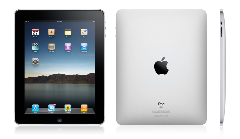
At Microsoft, Steven Sinofsky ran Office, Windows and Windows Live product development and then became President, Windows before abruptly leaving the company in 2012 in what Wikipedia generously refers to as a “power struggle or friction between himself… and CEO Steve Ballmer.” Sinofsky took over...
Actually I'm not entirely against that sort of design. It can still look ok if:
- control borders are clearly visible
- elements don't jump around or change size (Goddamit scrollbars!)
- large blocks of bright colors are avoided
- consistency is maintained (How many types of context menus there are now? Last I heard was five.)
- new controls, dialogs and stuff has equal or better feature parity
You might have noticed that 8 goddamn years have passed, they've kept revamping it any number of times and it still fails the checklist.
-
-
@Applied-Mediocrity said in UI Bites:
@levicki Android was first, but Android tablets were shit back then. Microsoft was chasing iPad as a trend.
Former Microsoft exec Steven Sinofsky takes to Twitter to reflect on the iPad's impact on Microsoft - OnMSFT.com
At Microsoft, Steven Sinofsky ran Office, Windows and Windows Live product development and then became President, Windows before abruptly leaving the company in 2012 in what Wikipedia generously refers to as a “power struggle or friction between himself… and CEO Steve Ballmer.” Sinofsky took over...
Actually I'm not entirely against that sort of design. It can still look ok if:
- control borders are clearly visible
- elements don't jump around or change size (Goddamit scrollbars!)
- large blocks of bright colors are avoided
- consistency is maintained (How many types of context menus there are now? Last I heard was five.)
- new controls, dialogs and stuff has equal or better feature parity
You might have noticed that 8 goddamn years have passed, they've kept revamping it any number of times and it still fails the checklist.
zero for five..... Eight years..... and STILL zero for five.
-
@Gurth Yeah, Apple always had “creative” translators…
That is not the problem here, and IMHO the translators aren’t any more or less creative (with or without scare quotes) than the Windows (or other software) ones. The problem appears to stem mainly from one of the two either not looking at the other’s efforts, or consciously deciding to ignore them.
-
@anonymous234 said in UI Bites:
@Gurth And then there's the big amount of words that are synonyms in English but not in other languages, like play (a movie) vs play (a game). Or "scan" as in "look for" vs digitizing a paper document.
Aside from the small mistake @Bulb already pointed out, this is also an issue, but IME mostly for translations by people who don’t really know what they’re doing. Which, unfortunately, is quite often in open-source efforts or other fan-style translations. But I think this tends to result from re-using strings in the original program, because the maker didn’t stop to think that even though two controls have the same words on them, the action they perform isn’t.
In any case, this leads to another annoyance of mine: people who don’t know what they’re doing are often inconsistent in their translations, and mix Windows and macOS styles even in a single control. For example:—
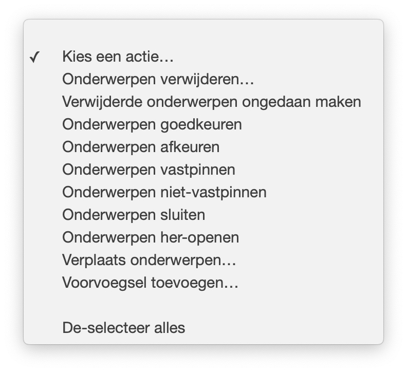
This is a
<select>control from forum software (TBH, I’ve noticed this kind of inconsistency much more in web-based software than actual apps). Almost everything here is a Windows-style translation, ending in the infinitive of a verb, except Verplaats onderwerpen (“Move topics”) and De-selecteer alles (“Deselect all”), which begin with the imperative of a verb and are therefore macOS-style.FWIW, I prefer the latter, because IMHO it’s clearer: almost everything here begins with Onderwerpen, so you have to really start reading most of the entries part of the way through to figure out which of the options you need to click on. OTOH, if they were to all begin with a description of the actual action (as they tend to in the original English) you need only look at the start and can scan much faster.
-
-
There was nothing wrong with it.
Well, nothing that isn't wrong with Windows in general.
-
IME mostly for translations by people who don’t really know what they’re doing. Which, unfortunately, is quite often in open-source efforts or other fan-style translations
It is even more often problem in commercial efforts by smaller companies. Because in open-source translations the people translating are at least generally users of the application and have some idea when and where the strings appear. But if a smaller company just hires a translation agency and throws a table of strings at them, they'll just throw a table of translations back and it won't make any sense at all.
But I think this tends to result from re-using strings in the original program, because the maker didn’t stop to think that even though two controls have the same words on them, the action they perform isn’t.
Well, if they don't know much of any foreign languages, the idea it might need to differ may not even cross their mind.You need to actually try translating to at least two or three different (and not closely related) languages to find this kind of issues, but smaller teams may simply not have people who collectively know three different languages on them. And there are the problems with plurals (Arabic has 6 forms by number), genders, inflection (in Slavic languages verb may need to reflect the gender of the subject), writing direction (Arabic and Hebrew are right-to-left) etc. that you won't realize until you know a language that has that feature.
-
by smaller companies
… and sometimes even not so small companies. In my earlier Nokia (back when they were still major vendor) phone had a restaurant subcategory “Italština” (in Nokia Maps), which means specifically Italian language, instead of “Italská” (singular) or “Italské” (plural) as appropriate for Italian as adverb for feminine noun (since “Restaurace”, meaning restaurant, is feminine in Czech). Because the software apparently reused translation for “Italian” without context…
-
It is even more often problem in commercial efforts by smaller companies. Because in open-source translations the people translating are at least generally users of the application and have some idea when and where the strings appear. But if a smaller company just hires a translation agency and throws a table of strings at them, they'll just throw a table of translations back and it won't make any sense at all.
True, they might as well use Google Translate in that case (and you come across websites especially that obviously do).
But I think this tends to result from re-using strings in the original program, because the maker didn’t stop to think that even though two controls have the same words on them, the action they perform isn’t.
Well, if they don't know much of any foreign languages, the idea it might need to differ may not even cross their mind.
Probably not, no. It’s very much a mindset you have to accustom yourself to, like naming things after what they’re for rather than what they are (
COLOR_IMAGE_BACKGROUNDrather thanCOLOR_BACKGROUND_BLUEfor example) but most people probably need this pointing out to them before they realise it.You need to actually try translating to at least two or three different (and not closely related) languages to find this kind of issues, but smaller teams may simply not have people who collectively know three different languages on them. And there are the problems with plurals (Arabic has 6 forms by number), genders, inflection (in Slavic languages verb may need to reflect the gender of the subject), writing direction (Arabic and Hebrew are right-to-left) etc. that you won't realize until you know a language that has that feature.
All of which comes back to what I was saying: you need translators who know what they’re doing.
-
use Google Translate
… or Bing Translate like MSDN. I've posted a particularly fucked example a couple of years back, but the search sucks around here.
you need translators who know what they’re doing
You also need developers who know what they're doing. Because translators will default to
 if the software is not properly prepared with sensible contexts for all the strings and such.
-
You also need developers who know what they're doing.
You do realise what forum you pointed this out at, right?
-
@Douglasac said in UI Bites:
Certainly it has a way to go but it's steadily becoming more useful.
Yeah, if they keep seriously working on it, in about 5 years it will be as useful as the Windows 7 one

-
Status: This dialog box is one of the most useless things in Visual Studio.
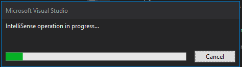
Why have a cancel button if it doesn't do anything? Why is it apparently impossible to determine the progress?
I've been waiting for this stupid thing to go away for ten minutes now and about to lose my window layout and three lines of code because of this...
-
@Tsaukpaetra said in UI Bites:
Why have a cancel button if it doesn't do anything?
https://www.nytimes.com/2016/10/28/us/placebo-buttons-elevators-crosswalks.html
-
@Zerosquare said in UI Bites:
@Tsaukpaetra said in UI Bites:
Why have a cancel button if it doesn't do anything?
https://www.nytimes.com/2016/10/28/us/placebo-buttons-elevators-crosswalks.html
The crosswalk button doesn't make the light turn sooner, but it does make the one in the direction you walk a minimum.
-
@Tsaukpaetra said in UI Bites:
The crosswalk button doesn't make the light turn sooner, but it does make the one in the direction you walk a minimum.
See, here that wouldn't work. You do need to press the button if you want to cross, because if you don't the lights will just cycle through their road-traffic-only loop. If you want a pedestrian interrupt you have to ask for one, and it will be slotted in at the appropriate phase.
On the other hand, you still see people who will come up to the signal and press it five or six times as if they think it's counting and will cycle faster if there are lots of people crossing; or who while waiting will press, and press again, and press again, and again, ... I suppose it gives them something to do.
-
You do need to press the button if you want to cross
Ah, for some of the more intelligent ones, like the ones that have sensor loops to detect cars.
I suppose it gives them something to do while they're waiting.
What's funny is, some of the more verbose buttons that talk to you will say "Wait!!!" every time you press.
I find it amusing anyways.
-
You also need developers who know what they're doing.
You do realise what forum you pointed this out at, right?
… the one where everybody should understand it's equivalent to saying you need unicorns?
… ok, maybe even unicorns wouldn't help.
-
@Zerosquare said in UI Bites:
@Tsaukpaetra said in UI Bites:
Why have a cancel button if it doesn't do anything?
https://www.nytimes.com/2016/10/28/us/placebo-buttons-elevators-crosswalks.html
Windows use a different, but related placebo. When an application crashes, there is a dialog showing progressbar and something like “searching for solutions”. When it completes, it gives you the option to restart the application. If you press cancel during the progress, it just gives you the same option immediately. I've never seen it come up with any other solution, so I doubt it is really doing anything. What I don't understand is how it can make Windows look better though.
-
The other part is a different choice in reading the English terms: English “Open” could be construed to be in the imperative (“computer, open a file for me”) but also in the infinitive (making it short for “I want to open a file”). macOS translators assumed the former, Windows translators the latter, so on macOS the Open menu entry is Open in Dutch (imperative) while on Windows, it’s Openen (infinitive).
Neither is more or less correct than the otherWut? How is infinitive verb NOT the biggest mistake ever made in the history of UI translation?
(BTW, all action verbs in Polish translation of Windows and other MS apps - and by extension, every other app too - are always in imperative form. Seems like we really lucked out with translators, to have better translations than western languages.)
-
-
Try looking around forest ponds when it's calm. They like looking at their own reflection.
-
forest ponds
WTF is that? I've never heard of it!
Makes sense, that's where all the unicorns are...

-
A simpler solution is to buy this for one of your bitches:
-
Wut? How is infinitive verb NOT the biggest mistake ever made in the history of UI translation?
May be a language thing, but I don't see it.
Some menu entries are nouns and there's no imperative form of those. Makes sense to refer to actions in infinitive, as you are mentioning them as the subject of a sentence rather than the verb.
"When I click here, this is the action it does".
-
-
Wut? How is infinitive verb NOT the biggest mistake ever made in the history of UI translation?
May be a language thing, but I don't see it.
Might it be because your native language is one of those that make zero effort to differentiate between infinitive and imperative in any way whatsoever so it's impossible to tell whether it's one or the other - such as English?
Yes, many menu items are nouns. Always in nominative case because anything else sounds like machine translation done with the most advanced technology available in 1954, supervised by someone who doesn't even know which language they're translating to, much less ever heard of it. The rest are always verbs, always in imperative, for the same reason.
-
@Tsaukpaetra said in UI Bites:
@Zerosquare said in UI Bites:
buy this for one of your bitches:
They don't like clothes....
In a place with no forests, no ponds, and no shade... who's to blame them
-
On the other hand, you still see people who will come up to the signal and press it five or six times as if they think it's counting and will cycle faster if there are lots of people crossing
My friends and me all used to believe that as children, I strongly suspect many adults (both my old friends and others) still do.
The pushbuttons for many bicycle traffic lights in my area have a ring of lights around them. Press the button and the lights go on to indicate the system is aware you’ve pressed it, and after a while the lights will begin going off in sequence to count down to when your traffic light goes green.
-
Press the button and the lights go on to indicate the system is aware you’ve pressed it, and after a while the lights will begin going off in sequence to count down to when your traffic light goes green.
Oooh! Fancy!
-
The other part is a different choice in reading the English terms: English “Open” could be construed to be in the imperative (“computer, open a file for me”) but also in the infinitive (making it short for “I want to open a file”). macOS translators assumed the former, Windows translators the latter, so on macOS the Open menu entry is Open in Dutch (imperative) while on Windows, it’s Openen (infinitive).
Neither is more or less correct than the otherWut? How is infinitive verb NOT the biggest mistake ever made in the history of UI translation?
I meant “neither is better than the other to express what the action does” though I find the imperative to be clearer myself.
(BTW, all action verbs in Polish translation of Windows and other MS apps - and by extension, every other app too - are always in imperative form. Seems like we really lucked out with translators, to have better translations than western languages.)
Could be that, since Polish translations probably came after those for Western European languages, your translators picked up a trick or two those missed?
-
@Zerosquare said in UI Bites:
Windows use a different, but related placebo. When an application crashes, there is a dialog showing progressbar and something like “searching for solutions”. When it completes, it gives you the option to restart the application. If you press cancel during the progress, it just gives you the same option immediately. I've never seen it come up with any other solution, so I doubt it is really doing anything. What I don't understand is how it can make Windows look better though.
I have. It's actually looking into their WER database. Some (very rare in my experience) times, the error can be flagged as having a known solution (i.e. a patch) or flagged as requiring more information (in which case Windows asks for a bigger error report).
-
On the other hand, you still see people who will come up to the signal and press it five or six times as if they think it's counting and will cycle faster if there are lots of people crossing; or who while waiting will press, and press again, and press again, and again, ... I suppose it gives them something to do.
In some places we have crosswalk buttons that light up a "call registered" light when pressed. It does a good job of dissuading people from abusing the button... when it works (I remember an intersection near my old home where after a few months it never lit up).
Edit: By the way, in French we use infinitive translations too. The only place where I remember seeing imperative translations was Sid Meier's Civilization II (possibly IV too? I don't remember)
Edit2: And imperative translations sound weird as £µ(< to me.
-
Might it be because your native language is one of those that make zero effort to differentiate between infinitive and imperative in any way whatsoever so it's impossible to tell whether it's one or the other - such as English?
Haha. No.
Like other Romance languages we have a ton of different inflections.
{
indicative present ("I do") |
indicative imperfect past ("I was doing") |
indicative perfect past ("I did") |
indicative pluperfect past ("I had done") |
indicative future ("I will do") |
conjunctive present ("Someone wants me to do") |
conjunctive imperfect past ("If I had been doing") |
conjunctive future("If I will do") |
conditional ("I would do it if") |
imperative ("you do it") |
infinitive ("to do") |
gerund ("doing")
}
x
{ 1st person† | 2nd person | 3rd person† }
x
{ singular | plural }†Do not exist in imperative.
This is how I learned (to the best of my memory anyway). It doesn't quite match what's in Wikipedia because I'm pretty sure the rules have changed since I've learned them, even though the words remain the same and only the interpretation changed.
Yes, many menu items are nouns. Always in nominative case
Now that I don't think we have. Our nouns are just nouns, they have no case.
So bottom line, languages are hard. Let's go shopping.
-
That said, I remember some UI in imperative, but that wasn't a translation: Back before Google became our Lord and Savior™, we had that search engine themed after a dog, so the "find" button was named "Go fetch!" in imperative form.
-
Might it be because your native language is one of those that make zero effort to differentiate between infinitive and imperative in any way whatsoever so it's impossible to tell whether it's one or the other - such as English?
Haha. No.
From a quick glance, while imperative is indeed different from indicative, the difference is quite small, especially compared to Slavic languages (compare "cortar"/"corta" with "wyciąć"/"wytnij"). So I guess it really is language-dependent. And I have the bad luck of being born in the cultural group where conjugation changes words entirely.
-
-
The other part is a different choice in reading the English terms: English “Open” could be construed to be in the imperative (“computer, open a file for me”) but also in the infinitive (making it short for “I want to open a file”). macOS translators assumed the former, Windows translators the latter, so on macOS the Open menu entry is Open in Dutch (imperative) while on Windows, it’s Openen (infinitive).
Neither is more or less correct than the otherWut? How is infinitive verb NOT the biggest mistake ever made in the history of UI translation?
(BTW, all action verbs in Polish translation of Windows and other MS apps - and by extension, every other app too - are always in imperative form. Seems like we really lucked out with translators, to have better translations than western languages.)
Without thinking about it, I superficially agreed to that the moment I read it. Since then I've checked myself1 and the German translation uses infinitive forms for everything.
It always says "Schließen" or "Fenster öffnen" instead of "Schließe" or "Öffne Fenster" (different word order). I'm not sure if this is just the result of many years of getting used to it, but the
infinitiveimperative would feel very awkward.E: fixed post to make sense.
1 I realized I didn't actually have access to a machine set to German unless I spin up a VM. And as a side WTF, the morons in IT set up some retarded password rules so I have to change the password for a throwaway machine to include the usual bullshittery, even though I obviously have admin rights on that VM, and access to the VM is restricted to my account anyway. So when I tried to reuse the one I still had lying around, I couldn't remember the password and had to throw it away. In the process of creating a new one just to test this I received 7 emails. Fucking VMware.
-
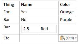
Say you have a table in OneNote. You want to move a few cells, so you select them...
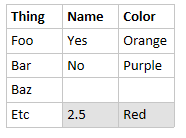
Now the old ctrl+x, ctrl+v...

-
That said, I remember some UI in imperative, but that wasn't a translation: Back before Google became our Lord and Savior™, we had that search engine themed after a dog, so the "find" button was named "Go fetch!" in imperative form.
-
@anonymous234 Word will do that too. Table manipulation is FUN!
-
@levicki I did, and it does the exact same thing.
As a matter of fact I can't find any reasonable way to insert those values there, even after looking through all the related menus and testing every idea I could think of.
-
Without thinking about it, I superficially agreed to that the moment I read it. Since then I've checked myself1 and the German translation uses infinitive forms for everything.
Interestingly, unlike Dutch localisations, it also does on macOS:
1 I realized I didn't actually have access to a machine set to German
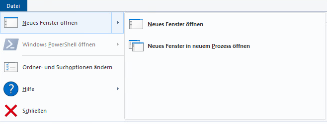
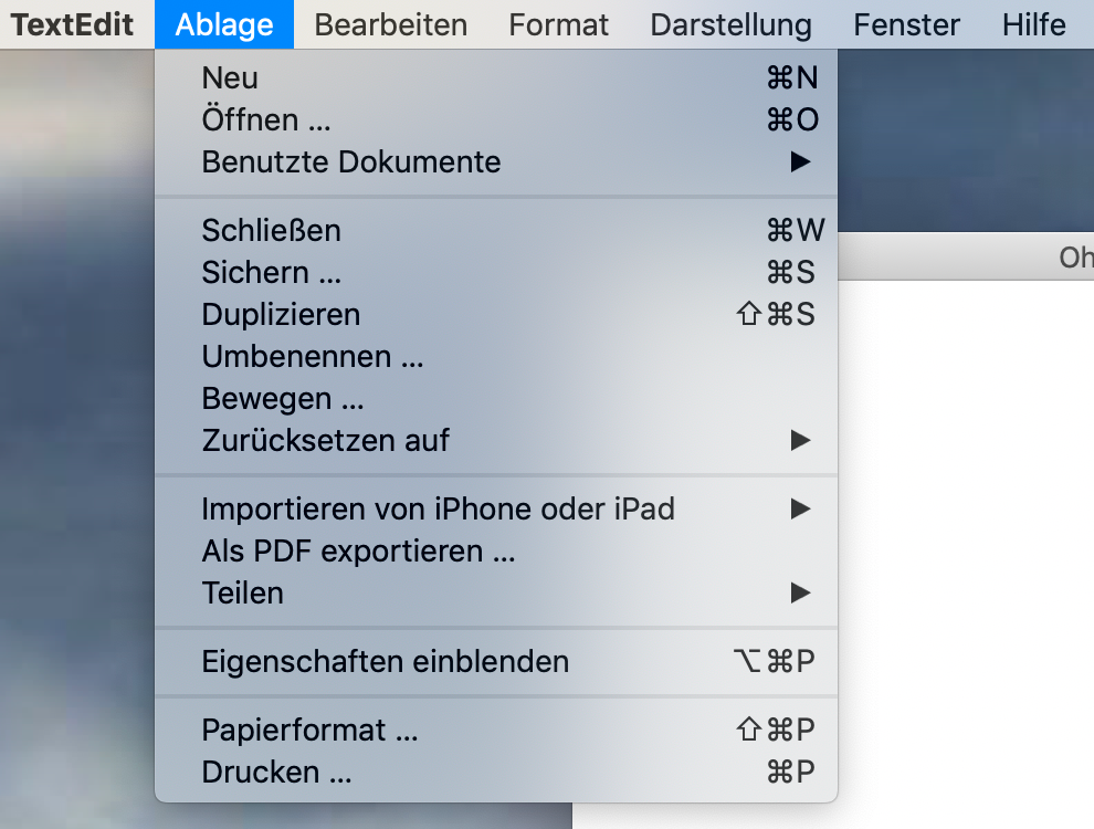
Since this is a thread called UI Bites: why does Windows still not just ship with all languages Microsoft has available for it, and the ability to switch between them pretty much at will? All I needed to do to get the above screenshot was quit TextEdit, change system language to German and restart TextEdit.
-
@Gurth licensing. Changing language is an Enterprise feature IIRC? Also, each language pack takes like 100-200MB of disk space, compressed.
-
@Gurth licensing
For completeness: you mean “Making users pay for a higher Windows licence” rather than “Microsoft having to pay licensing fees to a third party”, right?
Changing language is an Enterprise feature IIRC? Also, each language pack takes like 100-200MB of disk space, compressed.
Wow, a few hundred megabytes … let me check how big the hard drive with my OS on it is, again. Oh, yeah, 2 TB.


 =
=