Sans-Forgetica
-
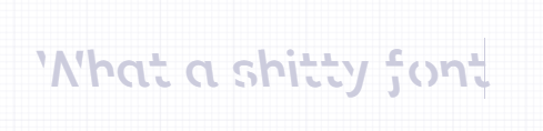
Sans Forgetica is more difficult to read than most typefaces – and that’s by design. The 'desirable difficulty' you experience when reading information formatted in Sans Forgetica prompts your brain to engage in deeper processing
Bit early for April fool so I guess this is serious?
Filed Under: FUCKING HELL WHY DOES IT SAY THERE ARE 2 POSTS WHEN I'VE ONLY SUBMITTED ONE
Filed Under Addendum: FUCKING HELL WHY DOES IT (NOW CORRECTLY) SAY THERE IS ONLY 1 POST AFTER EDITING IT TO ADD THE PREVIOUS FOOTNOTE?
-
I'll solve that issue by making the second post
Also
 why did they choose grey as the color to showcase their font?
-
@Luhmann said in Sans-Forgetica:
Also
why did they choose grey as the color to showcase their font?Must be the colour which provides the desired difficulty.
-
I take it the big idea (tm) is comparable to blasting röck müsic while you're learning, so that brain doesn't enter a proverbial C1E state due to reading a text being a trivial task, so that an otherwise capable brain will then also avail more resources to concentration and the learning task. Except it's more subtle.
Anyway. There are one or two points I'd like to make:
-
Given time a capable enough brain will adapt itself read "through it". It's from the same class of problems as learning, for example, doctor's handwriting. It's a solvable task, more so because the typeface will likely not change.
-
For non-trivial tasks where full thinking power (which is not limitless) is required it will remove a small portion of that thinking power.
-
For brains that just aren't capable of learning or have other legitimate reasons (such as the topic being some stupid bullshit), it will fuck up things even more.
And I suspect people who are otherwise capable, but are having trouble reading or interpreting language (dyslexics, whathaveyou-ill-people, second, third, n+1 language) will now have some degree of additional trouble.
An Ig Nobel candidate? No, those are at least funny.
-
-
I don't get how it's hard to read. I just lean back a bit and the gaps disappear.
-
Filed under: politics... or is it?
-
@Applied-Mediocrity said in Sans-Forgetica:
- Given time a capable enough brain will adapt itself read "through it". It's from the same class of problems as learning, for example, doctor's handwriting. It's a solvable task, more so because the typeface will likely not change.
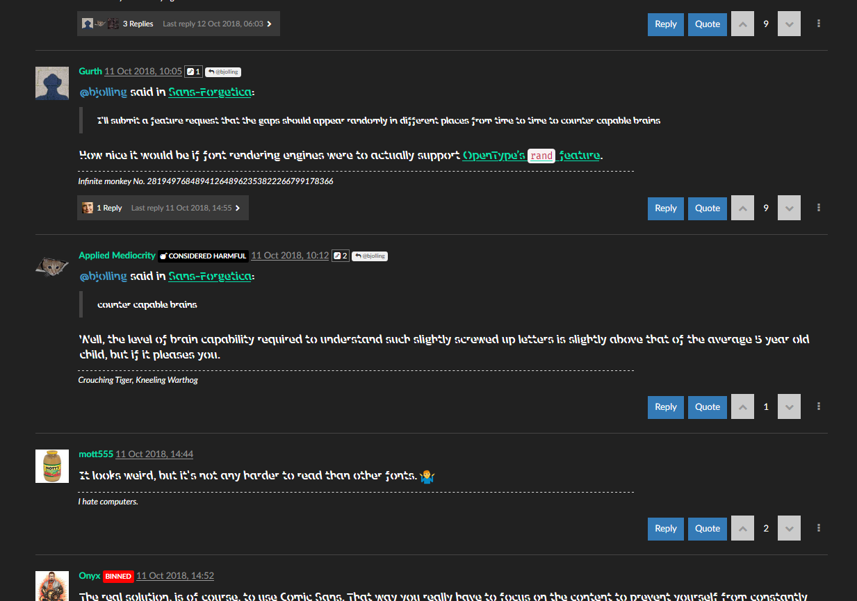
I'll submit a feature request that the gaps should appear randomly in different places from time to time to counter capable brains
-
@bjolling said in Sans-Forgetica:
I'll submit a feature request that the gaps should appear randomly in different places from time to time to counter capable brains
How nice it would be if font rendering engines were to actually support OpenType’s
randfeature.
-
@bjolling said in Sans-Forgetica:
counter capable brains
Well, the level of brain capability required to understand such slightly screwed up letters is slightly above that of the average 5 year old child, but if it pleases you.
-
It looks weird, but it's not any harder to read than other fonts.

-
The real solution, is of course, to use Comic Sans. That way you really have to focus on the content to prevent yourself from constantly bitching and moaning about the font selection both in person and on any and all social media.
-
@Gurth said in Sans-Forgetica:
@bjolling said in Sans-Forgetica:
I'll submit a feature request that the gaps should appear randomly in different places from time to time to counter capable brains
How nice it would be if font rendering engines were to actually support OpenType’s
randfeature.So you could make a character that randomly appeared as "a" or "e"... that's one feature that could be exploited for mayhem.
-
@anonymous234 said in Sans-Forgetica:
So you could make a character that randomly appeared as "a" or "e"... that's one feature that could be exploited for mayhem.
On one hand, that would entertain me. On the other hand, people's inability to differentiate
thanandthengrates me enough as it is, without randomness interfering as well.I'm embivelant.
-
@anonymous234 You could take it a step further and create a font called "scribble" where you can literally just hold down a key and it would create a random seemingly freeform line.
I don't know how crazy you can get with the rand function, but it would be even better if you could randomize the text direction each time, too.
-
I feel like they could have done a more sinister job with these:

-
@anonymous234 said in Sans-Forgetica:
So you could make a character that randomly appeared as "a" or "e"... that's one feature that could be exploited for mayhem.
You can mess with that already anyway, and even though it’ll be context-based, you can easily make it appear random to the average user. Say, something like:
@somechars = [a f L k P i h];
@someotherchars = [g j s f n k a];
@somemorechars = [o w K F Q];

feature calt {
    sub @somechars e' by a;
    sub @someotherchars a' @somechars by e;
    sub @somemorechars @somechars e' by a
    /* etc. */
} calt
-
@The_Quiet_One said in Sans-Forgetica:
I don't know how crazy you can get with the rand function, but it would be even better if you could randomize the text direction each time, too.
The idea, apparently, is that it provides a number of characters and the application chooses one, or goes through the characters provided and takes the next one in line each time the
randfeature is invoked. So I suppose the following could indeed provide a completely random string of output text:@allcharacters = [/* list of all glyph names in the font */]; feature rand { sub @allcharacters by @allcharacters; } rand
-
@Gurth Could you include non-printable characters like the ltr/rtl modifiers and such?
-
@Gurth Yeah, I know fonts are pretty complex. I'm surprised Google hasn't just made (and forced onto everyone) some format where each glyph is an arbitrary javascript program.
-
@anonymous234 said in Sans-Forgetica:
@Gurth Yeah, I know fonts are pretty complex. I'm surprised Google hasn't just made (and forced onto everyone) some format where each glyph is an arbitrary
javascriptgo program.
-
@anonymous234 said in Sans-Forgetica:
each glyph is an arbitrary javascript program.
Intel's working on mainstreaming 18-core CPUs or whatever. Someone's gotta step up and find ways to waste all of that.
Hmm, how about a font that mines bitcoin for my wallet?

-
@The_Quiet_One said in Sans-Forgetica:
Could you include non-printable characters like the ltr/rtl modifiers and such?
Non-printable characters don't have glyphs at all. Ever.
-
@Gurth said in Sans-Forgetica:
The idea, apparently, is that it provides a number of characters and the application chooses one, or goes through the characters provided and takes the next one in line each time the rand feature is invoked.
Sounds perfect for the ransom font.
-
@bjolling said in Sans-Forgetica:
@Applied-Mediocrity said in Sans-Forgetica:
- Given time a capable enough brain will adapt itself read "through it". It's from the same class of problems as learning, for example, doctor's handwriting. It's a solvable task, more so because the typeface will likely not change.
I'll submit a feature request that the gaps should appear randomly in different places from time to time to counter capable brains
Ligature-based?
-
@Tsaukpaetra said in Sans-Forgetica:
the gays should appear randomly in different places from time to time
I think I've been to the off-by-one thread one too many times.
-
@The_Quiet_One said in Sans-Forgetica:
@Gurth Could you include non-printable characters like the ltr/rtl modifiers and such?
You probably can for anything that has a Unicode code point, though I’ve never tried including them in a font file due to not having a need for them. But it sounds like something worth trying …
-
@anonymous234 said in Sans-Forgetica:
@Gurth Yeah, I know fonts are pretty complex. I'm surprised Google hasn't just made (and forced onto everyone) some format where each glyph is an arbitrary javascript program.
I was doing some reading a few weeks ago while trying to understand some OpenType feature, and came across an article that explained why OpenType doesn’t have loops, even though those would be very useful for the more complex things a font designer might want fonts to do. The main reason seems to be the mentality you displayed earlier :)
So yeah, using Javascript to create glyphs is an idea roughly on par with mailers executing scripts in messages. Come to think of it, it’s kind of amazing Microsoft didn’t push this through when they and Adobe were working out OpenType.
-
@mott555 said in Sans-Forgetica:
@anonymous234 said in Sans-Forgetica:
each glyph is an arbitrary javascript program.
Intel's working on mainstreaming 18-core CPUs or whatever. Someone's gotta step up and find ways to waste all of that.
Hmm, how about a font that mines bitcoin for my wallet?
A font where every character is Etherium?
-
@dkf said in Sans-Forgetica:
@The_Quiet_One said in Sans-Forgetica:
Could you include non-printable characters like the ltr/rtl modifiers and such?
Non-printable characters don't have glyphs at all. Ever.
To elaborate on that: non-printable characters can help the rendering program decide which glyphs to use (e.g. ZWJ and ZWNJ), and how to arrange them (RTL and LTR overrides/embedding), but the method by which this is done is arcane and involves dragons. Once the text has been translated into glyphs, however, there are no longer any non-printable characters, or even characters per se.
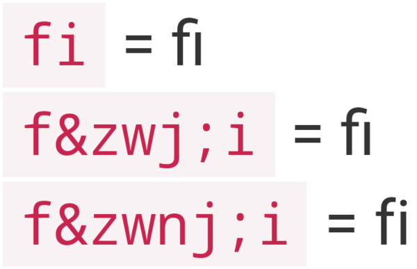
For example, "fi" is two characters, but if the font has a "fi" ligature, it's translated to one glyph. However, the ZWJ or ZWNJ can be used to explicitly indicate that the characters should be joined into a single glyph or not:
fi= fi (font engine can use a ligature or not, as it deems appropriate)
f‍i= fi (explicitly indicates that a ligature should be used if one exists)
f‌i= fi (explicitly indicates that a ligature should not be used, rendering it as two individual glyphs instead)In case your browser isn't rendering the ligature there, it should look something like this:
-
-
-
@anotherusername said in Sans-Forgetica:
Once the text has been translated into glyphs, however, there are no longer any non-printable characters, or even characters per se.
I just had to test this to make sure :) I whipped up a quick font with nothing in it but these glyphs:
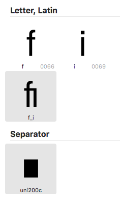
That’s f and i (both copied from TeX Gyre Heros), f_i ligature (quickly made from those letters), and a zero width non-joiner whose glyph is a simple rectangle. Here’s what InDesign makes of the sequence
fispacefZERO WIDTH NON JOINERi(with Show Hidden Characters enabled):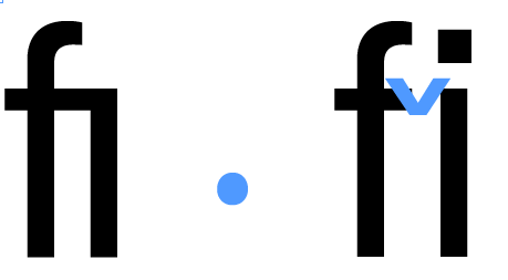
-
@Gurth And your point is? Indesign is now rendering extra glyphs because you explicitly told it so.
-
@Gąska I notice it a lot. It bothers me. I think fi looks better.
-
@anonymous234 said in Sans-Forgetica:
I notice it a lot. It bothers me. I think fi looks better.
Change what font you use to one that doesn't have that ligature.
 That's supposed to be :unhelpful: but…
-
@JBert said in Sans-Forgetica:
@Gurth And your point is? Indesign is now rendering extra glyphs because you explicitly told it so.
His point is that the ZWNJ was still an invisible character even though he put a visible glyph in the font for that code point.
-
@JBert said in Sans-Forgetica:
@Gurth And your point is? Indesign is now rendering extra glyphs because you explicitly told it so.
My point is: non-printing characters are indeed non-printing even if you do define a glyph for them. It basically satisfied my curiosity caused by a question by @The_Quiet_One earlier in this thread.
-
@bjolling Page moved here: https://sansforgetica.rmit.edu.au/
Previously claimed memory boosting font 'Sans Forgetica' does not actually boost memory

It was previously claimed that the font Sans Forgetica could enhance people's memory for information, however researchers have found after carrying out numerous experiments that the font does not enhance memory.
-
@bjolling said in Sans-Forgetica:
@bjolling Page moved here: https://sansforgetica.rmit.edu.au/
It was previously claimed that the font Sans Forgetica could enhance people's memory for information, however researchers have found after carrying out numerous experiments that the font does not enhance memory.
The burn it with fire thread is

-
@bjolling said in Sans-Forgetica:
Previously claimed memory boosting font 'Sans Forgetica' does not actually boost memory

-
You know when you regret a joke?
-
@Zecc Unforgettable.
