MUFFIN
-
-
@TimeBandit said in MUFFIN:
I don't find the ribbon an improvement
I do, but only by maybe 5-10%. It's certainly not the revelation some claim it is.
-
@RaceProUK said in MUFFIN:
I do, but only by maybe 5-10%. It's certainly not the revelation some claim it is.
I find it both annoying and useful in about equal amounts. Do note that I use office-like tools rarely, and even then I use like 5 options, 3 of which I know shortcuts for.
-
@RaceProUK said in MUFFIN:
I do, but only by maybe 5-10%.
It made some things a bit easier to find (such as the styles), but made others more obscure. Unless you have a really wide screen indeed…
-
@masonwheeler said in MUFFIN:
@TimeBandit said in MUFFIN:
What's not discoverable about a text menu ?
Off the top of my head:
- It's hard to scan visually, because it's only text
You were saying?
- You actually have to look inside the menu and scroll past all greyed out (disabled) entries to find out which actions you can perform on your current selection
How is the ribbon any different?
But what's worse about the ribbon, other than lost vertical space? At worst, you have to click to get the list of options you want, just like the regular menu. At best, you get the key things you care about visually disclosed based on what you're doing in the application. I really don't get the hate; it's nothing like the hamburger menus that go the other direction. Now, if you want to complain about it as an inadequate replacement for the old-style menus and toolbars (some of which would hide/show based on context as well), I'll hear you out, but I don't see anyone here doing that.
-
@pydsigner said in MUFFIN:
But what's worse about the ribbon, other than lost vertical space?
First, lost vertical space is a problem in and of itself.
Second, that bizarre clustering thing that ribbons do. A menu is a well-ordered list, which makes it easy to scan because the options are laid out in a predictable pattern: every option is on its own line beneath the option above it, and if an option contains a submenu, this is clearly indicated by the triangle on the right, which opens a new menu in which every option is on its own line.
In a ribbon, things go above, below, beside, and just jam-packed in wherever the developer found some extra empty space, which means it's a huge amount of extra cognitive load to sort through all the chaos and find your relevant options. Anyone who sees that as an improvement doesn't belong anywhere near UI design!
-
@TimeBandit said in MUFFIN:
Not harder than looking inside tabs.
It's harder if the menu is closed while you're interacting with the document and you don't get to see commands becoming enabled or disabled.
It's harder if all the menu items are the same size instead of having the most-frequently used commands in larger size.
My €0.02.
Edit: having said that, menus allow for more descriptive command names, so there's that.
-
I thought the ribbon was a Microsoft patent they have publicly stated not to wanting enforce except for software that directly competes with their own?
WPS Office is still alive and kicking...
Ok. Had never heard of it.
-
Ok. Had never heard of it.
Basically, same folk who made Kingsoft Office for Android.
It actually handles MS formats rather well and is now my preferred office suite.
-
I thought the ribbon was a Microsoft patent they have publicly stated not to wanting enforce except for software that directly competes with their own?
Generally, you can't patent ideas. You can only patent the specific implementation. In the case of software, this means you can only patent the code. So when somebody wants to copy someone else's software, they have "virgins" (people who have never seen the code of the software they're imitating) do the coding.
-
@TimeBandit said in MUFFIN:
TIL: Reading is hard
Pure text is hard to parse visually. That is a fact. (The icons help a bit, but due to their size it doesn't make much difference.)
-
@TimeBandit said in MUFFIN:
TIL: Reading is hard
Pure text is hard to parse visually. That is a fact. (The icons help a bit, but due to their size it doesn't make much difference.)
Icons also don't need translating

-
@RaceProUK said in MUFFIN:
@TimeBandit said in MUFFIN:
TIL: Reading is hard
Pure text is hard to parse visually. That is a fact. (The icons help a bit, but due to their size it doesn't make much difference.)
Icons also don't need translating
But they don't help when you have no clue what they are.
-
@masonwheeler said in MUFFIN:
So what's the difference between a muffin and a cupcake?

There's much online about differences in crumb coarseness, crustiness, density, ingredient proportions, etc.; but basically, if the top is higher than the paper wrapper and it doesn't have frosting, it's a muffin. If the top is about even with the top of the paper wrapper and it does have frosting, it's a cupcake.
-
@masonwheeler said in MUFFIN:
So what's the difference between a muffin and a cupcake?
There's much online about differences in crumb coarseness, crustiness, density, ingredient proportions, etc.; but basically, if the top is higher than the paper wrapper and doesn't have frosting, it's a muffin. If the top is about even with the top of the paper wrapper and it does have frosting, it's a cupcake.
Thus, see posted meme...
-
@djls45 But what if the cake is in an actual cup?
-
@masonwheeler said in MUFFIN:
How is the ribbon any different?
You want me to continue?
- Larger icons, which means: Easier to recognize, easier to hit (which is very important), easier to learn to hit frequently used options (try to rely on your muscle memory with menus, I dare you)
- The developer can easily highlight important options
- You slightly missed the point I was making when talking about contextual options. The additional ribbon bar when an image is selected in Microsoft Office is super-easy to discover.
- Visual grouping works way better
Do you still want me to continue?
Look, I get that you don't like them. Fine. But stop claiming they're worse.
-
But they don't help when you have no clue what they are.
Did you know people used to have plastic save icons they put in their machines instead of just clicking the button?
-
@RaceProUK said in MUFFIN:
@djls45 But what if the cake is in an actual cup?
It's either a smaller chance of eating the paper, or a higher chance of breaking a tooth while eating the cup.
-
Did you know people used to have plastic save icons they put in their machines instead of just clicking the button?
I still have some. I think.
-
-
@masonwheeler said in MUFFIN:
The Ribbon is horrible!
Also, have I talked about convertible devices and tablets yet? Because menus are completely useless if you don't have a mouse ready. With ribbons, you can easily make quick changes to your PowerPoint slides on your Surface without needing a table and a mouse.
-
Also, I would like to thank @djls45
<Onyx47> There's much online about differences in crumb coarseness, crustiness, density, ingredient proportions, etc.; but basically, if the top is higher than the paper wrapper and doesn't have frosting, it's a muffin. If the top is about even with the top of the paper wrapper and it does have frosting, it's a cupcake.
<Onyx47> so, basically, we make cupcakes :P
<Onyx' sister> gud
<Onyx' sister> I just need to put frosting on it and decorate the f out of it
As a result of this, I can expect more frosting in the future. This is a Good Thing™
-
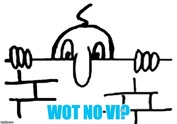
@Onyx What about this sort of muffin?
-
@loopback0 I have no problems with those, either.
-
-
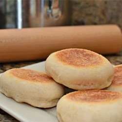
@loopback0 said in MUFFIN:
What about this sort of muffin?
That depends on whether you've got a spare fried egg to go with it.
-
@antiquarian said in MUFFIN:
@masonwheeler said in MUFFIN:
The Ribbon is horrible! Why is it that people feel the need to copy a dominant player's mistakes as well as the things they got right? (See also: Android phones with no keyboard.)
There's a faction in the OSS community that believes making software usable means making it look like Microsoft products.
Figures, since M$ is the best!
Filed under: was the $ going overboard?
-
@TimeBandit said in MUFFIN:
@antiquarian said in MUFFIN:
There's a faction in the OSS community that believes making software usable means making it look like Microsoft products.
aka the Gnome team ?
Actually, gnome is pretty awesome. Only if they stopped breaking their APIs with each new release…
-
Actually, gnome
iswas pretty awesome then version 3 came outFTFY

Edit: fuck mobile posting
-
@TimeBandit said in MUFFIN:
Actually, gnome
iswas pretty awesome then version 3 came outFTFY
Edit: fuck mobile posting
"Hey, 2009? 2017 called, it wants your Gnome back."
-
@loopback0 They're perfect conveyors of butter.
-
@asdf My Surface tablet came with a tablet-sized keyboard-and-trackpad dock, included standard in the box. Most likely because the manufacturers are not iDiots and realize that serious work on a computer requires real human interface devices.
-
@masonwheeler Most people don't do serious work on tablets.
-
-
@masonwheeler So because you don't want to do "serious work" using the touch interface and/or pen, nobody else should be able to? Got it.
-
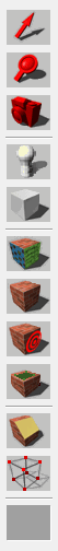


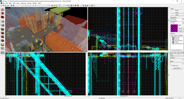
People who don't know Hammer, how many of these buttons can you identify?
I use Hammer on a daily basis and I only know what one of the first three icons in this post is.
Yes, that last big icon is a real icon and not just an empty slot.
-
@masonwheeler said in MUFFIN:
How is the ribbon any different?
It's contextual. Funny enough your screenshot even show that. You have selected a folder thus the folder part of the ribbon shows.
In Office apps this is more prevailing. Select an image in a table in Word and the ribbon options for tables and images show. Indicating that there are more options with your current selection.
Now select and image in a table in Excel that's populated from a Query and you get the table, image and query options. Prior to the ribbon you had to enable the specific toolbars to have access to these options or you had to hunt through menus without indication that certain very specific options like Pivot Table options where available for your current selection.
-
@ben_lubar said in MUFFIN:
how many of these buttons can you identify?
I can recognize cut, copy, paste, and, um, uh, that's about it. I can maybe guess at a couple of others. I don't even know what Hammer is, but some of them look like buttons one might find in a 3d graphics program. There's one that I would guess displays a wireframe view of an object, one that slices an object, and three or so (mobile, so can't see the post while in the composer) that might have something to do with different textures.
-
@ben_lubar said in MUFFIN:
People who don't know Hammer, how many of these buttons can you identify?
None, because they're really bad icons. For example, with all those cubes which look pretty much the same, it takes a whole second until you figure out which part of the cube is supposed to be highlighted. And even then, I cannot figure out their purpose, since I don't know what the program is supposed to do.
-
@HardwareGeek said in MUFFIN:
There's one that I would guess displays a wireframe view of an object
Ok, there's a wireframe toggle in this screenshot:
I'll make it easier, here's a smaller cropped version:
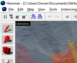
Did you guess "the text that says camera"? Because that's the correct answer!
@HardwareGeek said in MUFFIN:
I can recognize cut, copy, paste, and, um, uh, that's about it.
You can probably find Ctrl+Z and Ctrl+Y now that I've told you they're there.
It takes a whole second until you figure out which part of the cube is supposed to be highlighted.
Ok, so you click the icon that @blakeyrat says looks like a light bulb to add a light source. What button do you click to add a forklift?
The same button. Which button do you use to add an alien?
The same button. Which button do you click to add a camera?
The exact same button. No, not the one that looks like a camera. I have no idea what that one does.
@HardwareGeek said in MUFFIN:
might have something to do with different textures
The "manipulate terrain" button is inside the menu opened by the "apply texture" button.
-
@TimeBandit said in MUFFIN:
Actually, gnome
iswas pretty awesome then version 3 came outFTFY
Edit: fuck mobile posting
I wasn't that big a fan of gnome 2, but sure, it was kinda nice. Gnome 3 is bold and it took courage!
In all seriousness, headerbars are awesome, what they did to gedit deserves accolades, shell itself is kinda nice too.
Or at least it was, haven't used gnome since 3.14 or 3.20, or something like that.
-
@masonwheeler said in MUFFIN:
@asdf My Surface tablet came with a tablet-sized keyboard-and-trackpad dock, included standard in the box. Most likely because the manufacturers are not iDiots and realize that serious work on a computer requires real human interface devices.
Are you sure about that? Really really sure?
-
@loopback0 said in MUFFIN:
@masonwheeler Most people don't do serious work on tablets.
It's different with surface books. I mean, its Windows 10 for crying out loud, of course you would want to be able to use it to its fullest. It is a mouse-and-keyboard interface after all. Being able to use it as a tablet is a perk, but that's all.
-
@ben_lubar said in MUFFIN:
People who don't know Hammer, how many of these buttons can you identify?
I use Hammer on a daily basis and I only know what one of the first three icons in this post is.
Yes, that last big icon is a real icon and not just an empty slot.
You should treat Hammer with a hammer.

-
@boomzilla It's amazing how every interface OSS people make ends up looking horrible. Even if they are just copying an existing thing.
-
You want me to continue?
Larger icons, which means: Easier to recognize, easier to hit (which is very important), easier to learn to hit frequently used options (try to rely on your muscle memory with menus, I dare you)
The developer can easily highlight important options
You slightly missed the point I was making when talking about contextual options. The additional ribbon bar when an image is selected in Microsoft Office is super-easy to discover.
Visual grouping works way betterDo you still want me to continue?
Look, I get that you don't like them. Fine. But stop claiming they're worse.In reality both the ribbon and toolbar are annoying.
The interface I want is a "search everything" box from sublime (and Visual Studio TBH). Attach Cortana or similar AI to it, and now we are talking.
-
@boomzilla said in MUFFIN:
@RaceProUK said in MUFFIN:
Icons also don't need translating

They're equally incomprehensible in any language.
-
@cartman82 said in MUFFIN:
The interface I want is a "search everything" box from sublime (and Visual Studio TBH).
Ctrl+Shit+A in IntelliJ. It even lets you change boolean settings right there.
Typo left for lulz
-