MUFFIN
-
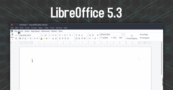
LibreOffice is finally copying the ribbon in 5.3:
 LibreOffice 'Ribbon Interface' Called MUFFIN, Gets Detailed - OMG! Ubuntu
"Microsoft Ribbon UI Coming to LibreOffice" shouted we last week, as we told you about the (experimental) 'Notebook Bar; interface in testing in the
Maybe not copying copying.
-
Seriously?!?
The Ribbon is horrible! Why is it that people feel the need to copy a dominant player's mistakes as well as the things they got right? (See also: Android phones with no keyboard.)
-
@masonwheeler said in MUFFIN:
Seriously?!?
The Ribbon is horrible! Why is it that people feel the need to copy a dominant player's mistakes as well as the things they got right? (See also: Android phones with no keyboard.)
-
@masonwheeler said in MUFFIN:
The Ribbon is horrible! Why is it that people feel the need to copy a dominant player's mistakes as well as the things they got right?
At least, it looks like you have to option to have the ribbon or not.
So they didn't totally copy the mistake part
-
“The MUFFIN concept is … going to be available starting from LibreOffice 5.3 either as a standard or experimental feature: the Default UI (with toolbars), a Single Toolbar UI, the Sidebar with a Single Toolbar, and the new Notebook Bar (experimental).”
Why so many? The Document Foundation say it’s to cater to different clusters of user groups. The one-size fits all approach is broken; they want to build user interfaces that bridge the generational gaps (and user interface expectations) within its user base.
Well, at least they understand not everyone will like it... whether they will fuck it up later by removing some of the options is left to be seen I guess.
-
All 4 of the new layouts are part of the tasty acronym MUFFIN. MUFFIN stands for “My User Friendly & Flexible INterface” — and if you hate tautologies you’re gonna want to avoid most blog posts discussing it as I’ve already seen people refer to it as “the MUFFIN interfaces” ;).
So what they're saying is that it should really be called the MUFF interface?


-
@hungrier would that mean you have to install
libbeaveras a dependency though?
-
*sigh* Welcome to WTDWTF, the only community of programmers on the Internet for which LCD stands for Lowest Common Denominator...
-
@masonwheeler where the fuck else am I meant to go to make immature jokes?
I mean, what else is there to say? People who hate the ribbon won't have to use it, those who do have the option, and we don't know how well it works because it's still not released (I think?).
The fact that it copies MS' ideas... eh, ideas get "stolen" in this industry all the time. If lawsuits happen I'll grab the popcorn, until then, meh.
-
-
I'm fine with the idea. Sounds like it'll be customizable, and there are a lot of people who are now more comfortable with the ribbon.
But that logo?
 :do_not_want:

-
So what's the difference between a muffin and a cupcake?

-
@RaceProUK my awesome cannot be contained within measly 140 characters! The extent of my genius needs breathing space, I can't fit the punc
-
Twitter: by Twits, for Twits.
-
my awesome cannot be contained within measly 140 characters!
If it's good enough His Imperial Trumpesty, it's more than good enough for you!
-
If it's good enough His Imperial Trumpesty, it's more than good enough for you!
That amateur? Psshh, get him on WTDWTF, he won't survive a week. Sure, his trolling looks impressive to common folk, but we have higher standards than that over here!
-
-
@masonwheeler said in MUFFIN:
The Ribbon is horrible! Why is it that people feel the need to copy a dominant player's mistakes as well as the things they got right? (See also: Android phones with no keyboard.)
There's a faction in the OSS community that believes making software usable means making it look like Microsoft products.
-
we have higher standards than that over here
Do you remember @TopCod3r? Now there was an awesome troll!
-
Do you remember @TopCod3r? Now there was an awesome troll!
I'm going to assume CS before my lurking days, since it sadly does not ring a bell.
-
@antiquarian said in MUFFIN:
There's a faction in the OSS community that believes making software usable means making it look like Microsoft products.
aka the Gnome team ?
-
I'm going to assume CS before my lurking days, since it sadly does not ring a bell.
He was a front page troll. I don't think he ever got into the forums (and his post count agrees).
-
@TimeBandit said in MUFFIN:
aka the Gnome team ?
Hey, this modified Gnome thing, what's it called, Unity or something? Looks like a semi-decent idea, let's copy it, badly!
 Hey, this modified Gnome thing, what's it called, Unity or something? Looks like a semi-decent idea, let's copy Windows 8, badly!
Filed under: Don't even care that this is probably completely false
-
@TimeBandit said in MUFFIN:
aka the Gnome team ?
Y
Also, part of the Emacs team (the old guard is not happy about that).
@boomzilla said in MUFFIN:
He was a front page troll.
Was he the same troll who used to post on the c2.com wiki?
-
@antiquarian said in MUFFIN:
Was he the same troll who used to post on the c2.com wiki?
I don't know but he really was hilarious. Though I think FP mods (Alex?) deleted a lot of his best work.
-
@masonwheeler said in MUFFIN:
Seriously?!?
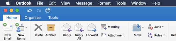
The Ribbon is horrible!I disagree. The only problem I have with the ribbons is that they're not implemented as sidebars, which means they waste vertical space. But the contextual ribbon is so much easier to use than a menu with contextually enabled options.
-
@asdf Would it be better to have them waste horizontal space?
-
@masonwheeler said in MUFFIN:
@asdf Would it be better to have them waste horizontal space?
In Word, probably, since documents tend to be portrait. In Excel though, the top-bar ribbon's probably better.
-
@masonwheeler said in MUFFIN:
Would it be better to have them waste horizontal space?
Yes, because you have a lot of that. Which is obvious, because most documents are narrow and long.
-
@RaceProUK @asdf You know what's even better? Not wasting a big, thick strip of space at all, in any orientation!
-
/me gets off @masonwheeler's lawn
-
@masonwheeler said in MUFFIN:
You know what's even better? Not wasting a big, thick strip of space at all, in any orientation!
So you don't give a flying fuck about discoverability and usability, then? In that case, why are you using Microsoft Word at all when you could write TeX documents in Emacs?
-
@masonwheeler Or, God forbids, give the user the option to have the ribbon at the top or the side, or not at all.
-
@masonwheeler said in MUFFIN:
@RaceProUK @asdf You know what's even better? Not wasting a big, thick strip of space at all, in any orientation!
@TimeBandit said in MUFFIN:
@masonwheeler Or, God forbids, give the user the option to have the ribbon at the top or the side, or not at all.
You can hide the ribbon.
-
-
So you don't give a flying fuck about discoverability and usability
What's not discoverable about a text menu ?
-
-
@antiquarian said in MUFFIN:
There's a faction in the OSS community that believes making software usable means making it look like Microsoft products.
Which is probably better than the usual
-
@TimeBandit said in MUFFIN:
@loopback0 said in MUFFIN:
You can hide the ribbon.
Does it bring back the menu ?
No.
-
I thought the ribbon was a Microsoft patent they have publicly stated not to wanting enforce except for software that directly competes with their own?
CBA to go finding information about this though.
-
-
So you don't give a flying fuck about discoverability and usability, then?
/me points @asdf to some remedial history about UI design and why we use menu bars in the first place.
-
@TimeBandit said in MUFFIN:
What's not discoverable about a text menu ?
Off the top of my head:
- It's hard to scan visually, because it's only text
- You actually have to look inside the menu and scroll past all greyed out (disabled) entries to find out which actions you can perform on your current selection
-
-
-
@TimeBandit Nobody in their right minds would give me commit privileges to the code for Gnome, not given the opinions I've expressed on it in the past. FFS, I think it makes Java, Python and Ruby all look well-designed and sensible…
-
@TimeBandit said in MUFFIN:
What's not discoverable about a text menu ?
Off the top of my head:
- It's hard to scan visually, because it's only text
You were saying?
- You actually have to look inside the menu and scroll past all greyed out (disabled) entries to find out which actions you can perform on your current selection
How is the ribbon any different?
-
Should just use the OS where you get the ribbon and the menu

-
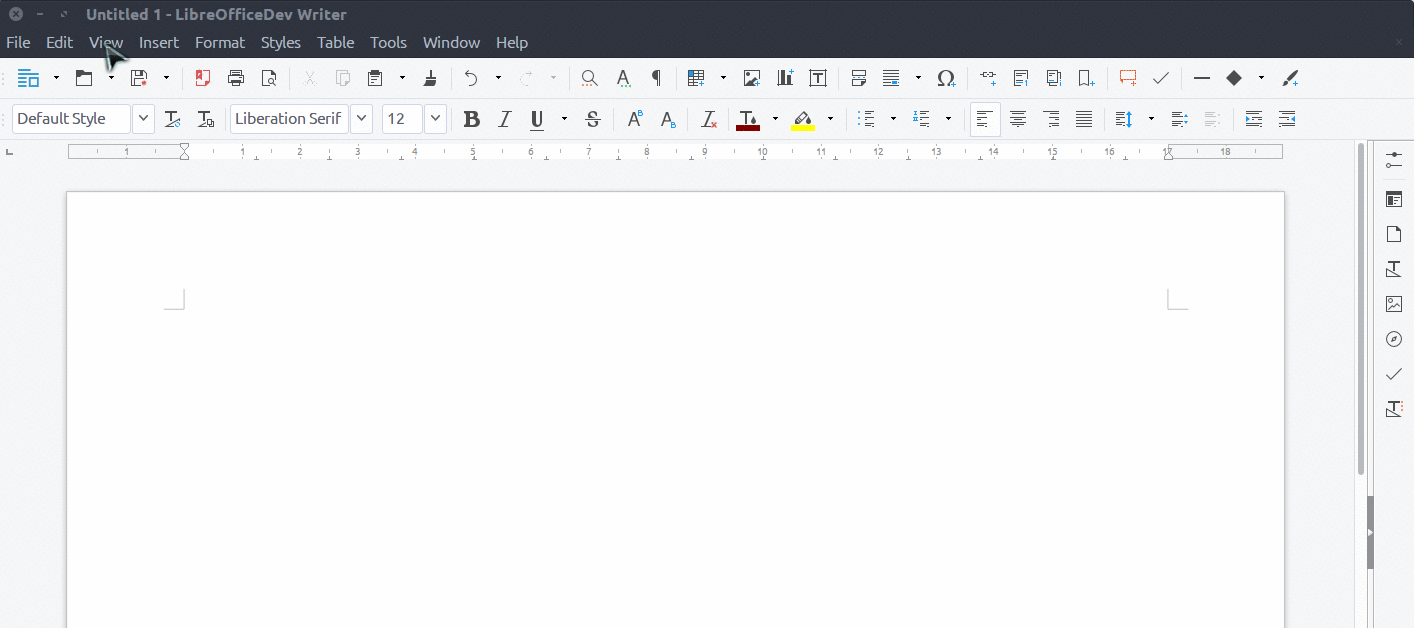
Off the top of my head:
- It's hard to scan visually, because it's only text
TIL: Reading is hard
- You actually have to look inside the menu and scroll past all greyed out (disabled) entries to find out which actions you can perform on your current selection
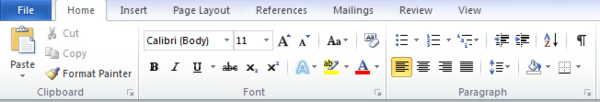
Not harder than looking inside tabs.
Also notice the greyed out "Cut" and "Copy" since I have no text selected.And what about that itsy-tiny menu that you need to open by clicking on that tiny down-arrow ?
I don't find the ribbon an improvement
-
I thought the ribbon was a Microsoft patent they have publicly stated not to wanting enforce except for software that directly competes with their own?
WPS Office is still alive and kicking...