How not to plot
-
Imagine you had a set of data that changes over time, and you wanted to visualise the trends. Consider how you’d go about this.
“I know,” you hopefully would never say, “I shall graph the first derivative of the data as a function of the second derivative of the exact same data.” (that is, show how it changes in relation to how much the change is changing)
That was apparently the thought process of the certified expert behind this holy grail of intuitive charting:
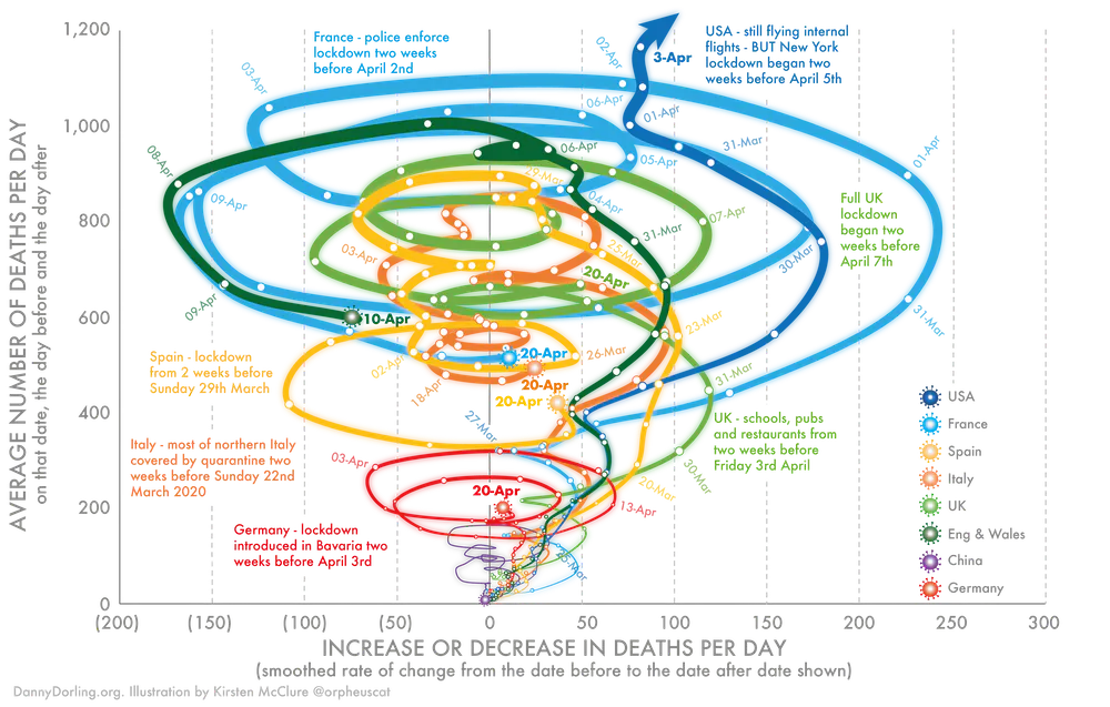
The method of showing change used in the graph above was developed for my book, Slowdown, which I worked on with illustrator Kirsten McClure who turned my crude Excel graphs into the clearer visual shown above.
(emphasis mine)
It’s a useful way to look at data
*scoffs*
when you are trying to demonstrate change over time. When a line curves to the right, deaths per day are increasing. When it curves to the left, they are decreasing.
Erm, akshuarlly, being on the side of “(100)” rather than “100” means
we’re accounting financesit’s going down, not the actual movement towards the left. But clearly some things were lost in translation when communicating to peons like ourselves.If anybody wants to try plotting other data like this, I implore you to share. It’s bound to be
insightfulhilarious.Addendum on why this style of chart is so useless:
The horizontal axis adds literally nothing, serving only to obfuscate the real information. Movement upwards is intrinsically bound to being on the right-hand side (and vice versa), and any downwards trend must correlate with being on the left (and vice versa).
-
Coronavirus "death spiral"!

-
This does give fresh meaning to "spiraling out of control" and "spinning in circles".
And reading useful values is indeed an exercise for the reader.
-
@JBert said in How not to plot:
And reading useful values is indeed an exercise for the reader.
Isn't it always?
-


-
This does seem less useful from a pure data reading perspective than the normal ways of plotting frequency data (cumulative total, or delta, versus date).
There is value in this kind of pretty curvy graph though - it can get people who wouldn't look at a boring old sensible graph to engage with the content.
Any mathmos able to tell us if the area enclosed by a path on this chart has any meaningful value?
-
@error_bot xkcd coronavirus charts
-
-
-
The upshot is (arguably) that with these sort of plots bus seat cover designers will be able to find employment in these difficult times.
-
I like the idea. Stuff like this can sometimes bring out interesting patterns that are difficult to see in "normal" charts (think: attractor). I'm not convinced that this one does, though.
-
I award this at most 2 out of 5 visuhipsters. Doesn't even mention stochastic high-dimensional parallel coordinate embeddings. One point is for the gratuitous extrapolation between data points (e.g., the extra curve between March 31 and April 1 on the right hand side). Technically gets +.5 for using (x) instead of -x, but those .5 points are immediately deducted again for writing "increase or decrease" instead of simply "change".
All in all, relatively legible, despite attempts by the authors.
Does the data makes sense? Visuhipster-scores do not consider such details, but rather focus on the way the (potentially meaningless) data is presented.
-
@boomzilla said in How not to plot:
I like the idea. Stuff like this can sometimes bring out interesting patterns that are difficult to see in "normal" charts (think: attractor).
Agreed in general.
I don't understand this one at all, but that's mostly a failure on my part because I didn't really put any thought into it. Of course it's not going to be "intuitive" if you have to read an instruction manual first before understanding the data, but once you have it still might reveal interesting things.
I can't really say if this one does, probably not as you all suggested.
-
@topspin it might also need more data before something emerges. We're still in the early stages of the pandemic.
-
@boomzilla said in How not to plot:
We're still in the early stages of the pandemic.
Are you saying we need to extend the lockdown?

-
To read a trendline, just pay attention to its vertical motion only. It’s the same as it would be on a normal blah-versus-time graph.
The weirdness is that, rather than advancing with time towards the right, each trendline has been “curled up” based on whether it’s increasing or decreasing. But the vertical axis remains unchanged.
I couldn’t find a generic data set to plot that would work well, so I generated two sets of values that can be compared side-by-side, so hopefully you can see how the spirals correlate to a normal graph.
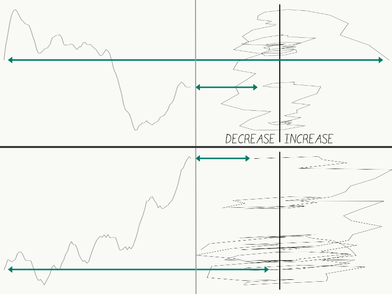
(apologies for the nasty aliasing, )
)Note that the vertical axis has a direct correlation. Each pair starts and ends at the same height, and likewise for all the peaks and troughs and every point in-between. But when it’s going down, it stays on the left, and stays on the right as it goes up.
So beyond being confusing, all the loops really do is emphasise when it’s rapidly changing direction.
I hope this explains
- what’s going on
- the complete extent of secret patterns to be unlocked
It’s a dataset and its first derivative, plotted on the same chart as a single series. That’s all there is to it.
-
@kazitor said in How not to plot:
It’s a dataset and its first derivative, plotted on the same chart as a single series. That’s all there is to it.
And it turns out to reveal very little interesting. Just a whole load of spin and confusion. In part that's because the underlying dataset is noisy, so most of what they're plotting is just the effects of noise. Pretty much by definition, there's not much to be learned from noise. Once you can remove the main sources of noise (which requires understanding the data) then you can have a go at looking for something meaningful, but when a large part of what you're plotting is because, say, Martha at the testing lab only works three days a week because she has to share childcare with her ex-partner, you're not not gleaning a great deal of insight.
-
@dkf yeah. One of the things drummed into me in my numerical methods classes was that taking descrete derivatives amplifies noise. And 2nd derivatives? Garbage for any non smooth function.
-
@dkf said in How not to plot:
Just a whole load of spin and confusion.
That much was clear from the graph
-
@kazitor said in How not to plot:
so hopefully you can see how the spirals correlate to a normal graph.
Only if I close my eyes. After drinking 1/2 bottle of whiskey.
-
The part that I dislike most about the chart is that it effectively makes it impossible to compare two lines based on time. But I have to admit that turning what really just amounts to noise into spirals is kind of interesting.
-
@brie said in How not to plot:
The part that I dislike most about the chart is that it effectively makes it impossible to compare two lines based on time. But I have to admit that turning what really just amounts to noise into spirals is kind of interesting.
Given past troubles in lining up different countries' graphs to one time axis for comparison, that might not be as much of a problem as it seems at first glance.
-
I might find this more interesting (in the
 sense, not the usefulness sense) if time was also represented, either along the z-axis or the t-axis (i.e., animation).
-
-
@error said in How not to plot:
I might find this more interesting (in the
sense, not the usefulness sense) if time was also represented, either along the z-axis or the t-axis (i.e., animation).Time is actually represented by the white dots (each apparently represents a day's data point)... however I don't find them particularly helpful.
-
@bobjanova Welcome to the forums, Bob. It looks like it took you 14 years to move from front page comments to here.
-
@jinpa That account doesn't seem to exist any more, I had to create one. I used to have it on my browse list back at a previous job, indeed. Did you do some advanced detective work to turn that up, or has the site managed to link them together even though it told me there was no such account?
-
@bobjanova said in How not to plot:
@jinpa That account doesn't seem to exist any more, I had to create one. I used to have it on my browse list back at a previous job, indeed. Did you do some advanced detective work to turn that up, or has the site managed to link them together even though it told me there was no such account?
As you might imagine, I had to use a cryptography program leaked from the NSA to figure out where to put the space in bobjanova. Then from there, I did a search on the goog. A main page comment from 2006 turned up on the first page of hits.
-
@jinpa said in How not to plot:
@bobjanova said in How not to plot:
@jinpa That account doesn't seem to exist any more, I had to create one. I used to have it on my browse list back at a previous job, indeed. Did you do some advanced detective work to turn that up, or has the site managed to link them together even though it told me there was no such account?
As you might imagine, I had to use a cryptography program leaked from the NSA to figure out where to put the space in bobjanova.
So, that is where the compute time on the Quantum 5D-Hypercluster went!

 2294: Coronavirus Charts - explain xkcd
 Attractor - Wikipedia