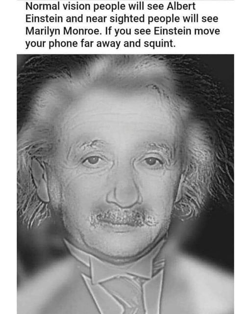
Is it a duck or a rabbit?
-
-
@Zerosquare I'm pretty sure that's a duck. I mean, it even says so in the video's title.
-
@boomzilla said in Is it a duck or a rabbit?:
As a nearsighted person I just needed to remove my glasses and the man turned into a woman before my very eyes.
-
@Atazhaia said in Is it a duck or a rabbit?:
the man turned into a woman before my very eyes.
There's a
 thread for that.
-
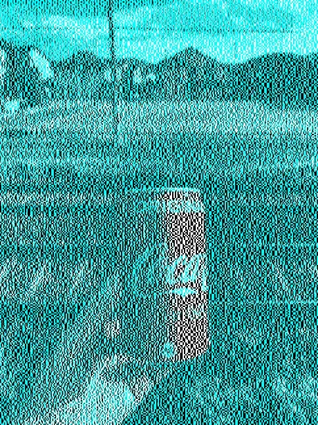
There's no red in the picture.
-
@error said in Is it a duck or a rabbit?:
There's no red
Thanks for explaining, I was wondering if there was a statement about dithering or something.
Have one based on a related (not not the same) phenomena.

-
@Tsaukpaetra the difference is the “dithering” in the first picture appears to produce something that looks red despite there being no red in the picture.
The other…

-
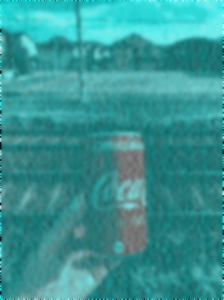
@Arantor I'm wondering if it's the same for someone who has never seen a Coca Cola can before. If it was just a matter of optical perception, I would expect the rest of the picture to have some (false) colour in it, but I only see the can as red
-
@hungrier I don't think it's based entirely on recognition and pattern matching to a Coke can; it is reliant on the contrast between the pale colour and the cyan to encourage the eye to see red.
The rest of the image has too much noise (and not enough white to do anything with), and if I relax my vision ever so slightly I can see it for the not-red it actually is.
-
@hungrier It would. The effect that turns the can red is essentially the eye's internal automatic white balance adjustment.
-
@ixvedeusi said in Is it a duck or a rabbit?:
@hungrier It would. The effect that turns the can red is essentially the eye's internal automatic white balance adjustment.
I know that's part of it, but if it was just that I would expect e.g. the hand to have a similar effect of having some red. To me the rest of the image looks like a uniform black-and-white image with a cyan cast. Maybe there's something particular about the noise pattern in the can that's different from the rest of it
-
@hungrier Maybe the original image before the noisification was filtered to black and white with only the can red to produce exactly this effect
-
@hungrier said in Is it a duck or a rabbit?:
I would expect e.g. the hand to have a similar effect of having some red
Why? It's tinted cyan just like the rest of the image.
I think the main effect of the noise is that it makes you focus more on the image (to be able to make it out) so the brain ignores what's around it, thus triggering the white balance adjustment.
-
@hungrier I don't think so, if you look closely at the rest, you can see there's other parts which where the cyan tint somewhat fades into white. It's just that the color contrast of the can is so much stronger than anything else in there.
-
I tried playing around with it in Irfanview:
Just blurring a bunch
Colour adjust -> white balanced by clicking on the end of the "C" swoosh
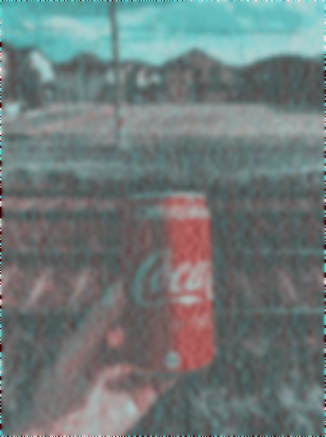
I don't know if that tells us anything about the original image. The hand looks more coloured in the white balanced version, but so does the crosswalk
-
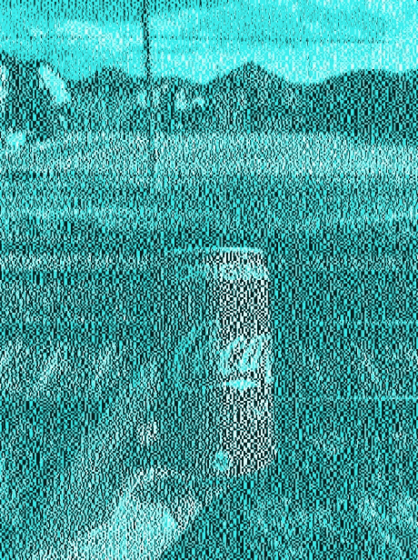
I also tried gradually decreasing the colour depth - from the original image to 16 bit, then 8 bit, then 4 bit (16 colours)

-
@hungrier not sure whether that really helps deciding anything, but I've noticed that if I scroll so that the top part of the picture, including the Coca-Cola logo, is hidden above the fold, then I still get the same red effect, although a bit weakened.
The weakening of the effect could just be that I'm now only seeing a small area of black & white and thus the triggered effect is not as strong. Or it could be that the effect is weak anyway, even with the full picture the intensity of the red very much depends of how I look at it. And the fact I still see some red could mean the logo isn't the key here (of course I consciously know that it's there, but maybe that doesn't really matter for the automatic colour-interpretation done on the fly by the brain?).
Then again, the weakening could also be that I'm no longer influenced by the logo.
Still, my hunch here is that the logo isn't really critical to the effect.
You could say it's a
redblack and white herring.
-
@remi I'm more fascinated by it after my experimentation. To my eyes, the reduced colour version has a weaker effect than the original, despite theoretically still having plenty of colour space for what's in the picture. The blurred version on the other hand has a stronger effect to me, but examining the reddest-looking pixels of that reveals that they are completely gray - RGB values equal. The only deviation anywhere in the can is in the other direction - lower R, from the cyan and black.
-
@ixvedeusi said in Is it a duck or a rabbit?:
The effect that turns the can red is essentially the eye's internal automatic white balance adjustment.
There are also some sub-pixel level effects from your display; the image is less perceptibly red on a HighDPI screen.
-
@dkf said in Is it a duck or a rabbit?:
@ixvedeusi said in Is it a duck or a rabbit?:
The effect that turns the can red is essentially the eye's internal automatic white balance adjustment.
There are also some sub-pixel level effects from your display; the image is less perceptibly red on a HighDPI screen.
Wow, yes. It definitely looks red on my phone, but I just looked at it for the first time on my 4k monitor, and I don't see any red, at all; the can is black&white.
-
@dkf I find that somewhat doubtful because the effect is strongest for me in @hungrier 's blurred version; I can't see how sub-pixel effects could survive such a treatment. But I don't have a HiDPI screen at hand to test.
-
@ixvedeusi Once you introduce a blur, you can get other things going on. The interesting bit was that dragging the browser window from one display to another changed how strong the effect was.
-
@dkf I've got a high-ish DPI laptop screen and I see the same effect as on my usual 1080p 23'' monitor, with the same intensity differences between the normal/blurred/colour-reduced versions across all screens
-
For me, I see the effect in my peripheral vision, but when I focus directly on it it goes away.
-
@HardwareGeek said in Is it a duck or a rabbit?:
@dkf said in Is it a duck or a rabbit?:
@ixvedeusi said in Is it a duck or a rabbit?:
The effect that turns the can red is essentially the eye's internal automatic white balance adjustment.
There are also some sub-pixel level effects from your display; the image is less perceptibly red on a HighDPI screen.
Wow, yes. It definitely looks red on my phone, but I just looked at it for the first time on my 4k monitor, and I don't see any red, at all; the can is black&white.
Huh, now I do see the red, even on the 4k monitor, but I also notice direct vs. peripheral vision phenomenon @error mentioned. Maybe it's also related to eyes being tired in the late afternoon compared to mid-morning.

-
@error said in Is it a duck or a rabbit?:
For me, I see the effect in my peripheral vision, but when I focus directly on it it goes away.
For me the effect is visible while the image is moving across my field of view, probably some persistence-of vision effect of the resulting cyan/white/black flickering.
-
@Watson said in Is it a duck or a rabbit?:
@error said in Is it a duck or a rabbit?:
For me, I see the effect in my peripheral vision, but when I focus directly on it it goes away.
For me the effect is visible while the image is moving across my field of view, probably some persistence-of vision effect of the resulting cyan/white/black flickering.
I only see it when I'm pushing my office chair away from the monitor at about 0.3c.
-
@LaoC your office is how big?
-
@dkf said in Is it a duck or a rabbit?:
The interesting bit was that dragging the browser window from one display to another changed how strong the effect was.
That could also just be differences in color rendering of the two screens, e. g. different color profiles, more / less color contrast. I did notice a difference when dragging the window between different screens, but it didn't seem to be related to the screen resolution.
-
@hungrier said in Is it a duck or a rabbit?:
If it was just a matter of optical perception, I would expect the rest of the picture to have some (false) colour in it, but I only see the can as red
I can see other parts in the background as red, mostly the tracks and the buildings, just like in your white-balanced picture. Well, brown anyway. Same thing, really, but might explain why it's stronger for the can. If you look at your picture, there's other reddish things but the can is clearly the strongest.
So no, I doubt it's got much to do with pattern recognition.
-
@topspin said in Is it a duck or a rabbit?:
So no, I doubt it's got much to do with pattern recognition.
The mental conditioning from the can being expected to be red doubtless has a part in strengthening the illusion.
-
@dkf I guess it would be relatively easy to check that if you could edit the image to replace the Coca-Cola logo by that of another drink (I'm thinking Orangina or Seven Up or Mountain Dew which are mostly blue or green).
But I have no idea how difficult it was to generate the original image, and thus how difficult it might be to generate another similar one.
-
@hungrier said in Is it a duck or a rabbit?:
@ixvedeusi said in Is it a duck or a rabbit?:
@hungrier It would. The effect that turns the can red is essentially the eye's internal automatic white balance adjustment.
I know that's part of it, but if it was just that I would expect e.g. the hand to have a similar effect of having some red. To me the rest of the image looks like a uniform black-and-white image with a cyan cast. Maybe there's something particular about the noise pattern in the can that's different from the rest of it
I see that effect a bit in the hand. But there's more cyan there, so it's less dramatic.
-
@remi said in Is it a duck or a rabbit?:
@dkf I guess it would be relatively easy to check that if you could edit the image to replace the Coca-Cola logo by that of another drink (I'm thinking Orangina or Seven Up or Mountain Dew which are mostly blue or green).
But I have no idea how difficult it was to generate the original image, and thus how difficult it might be to generate another similar one.
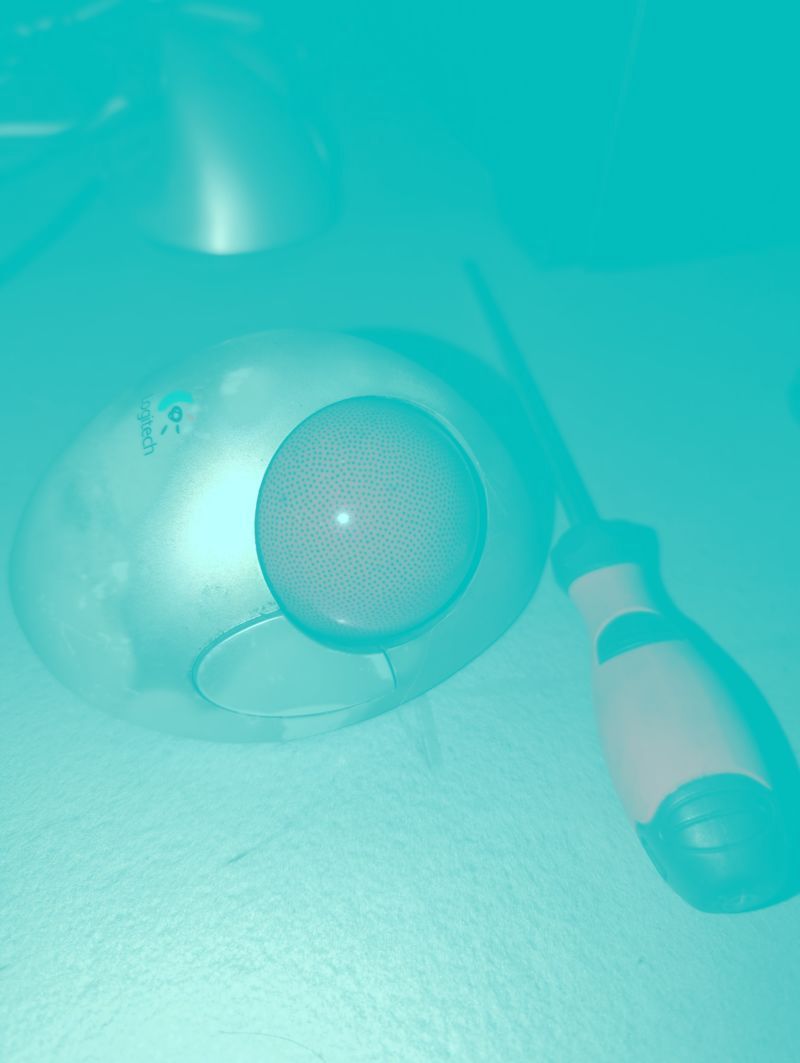
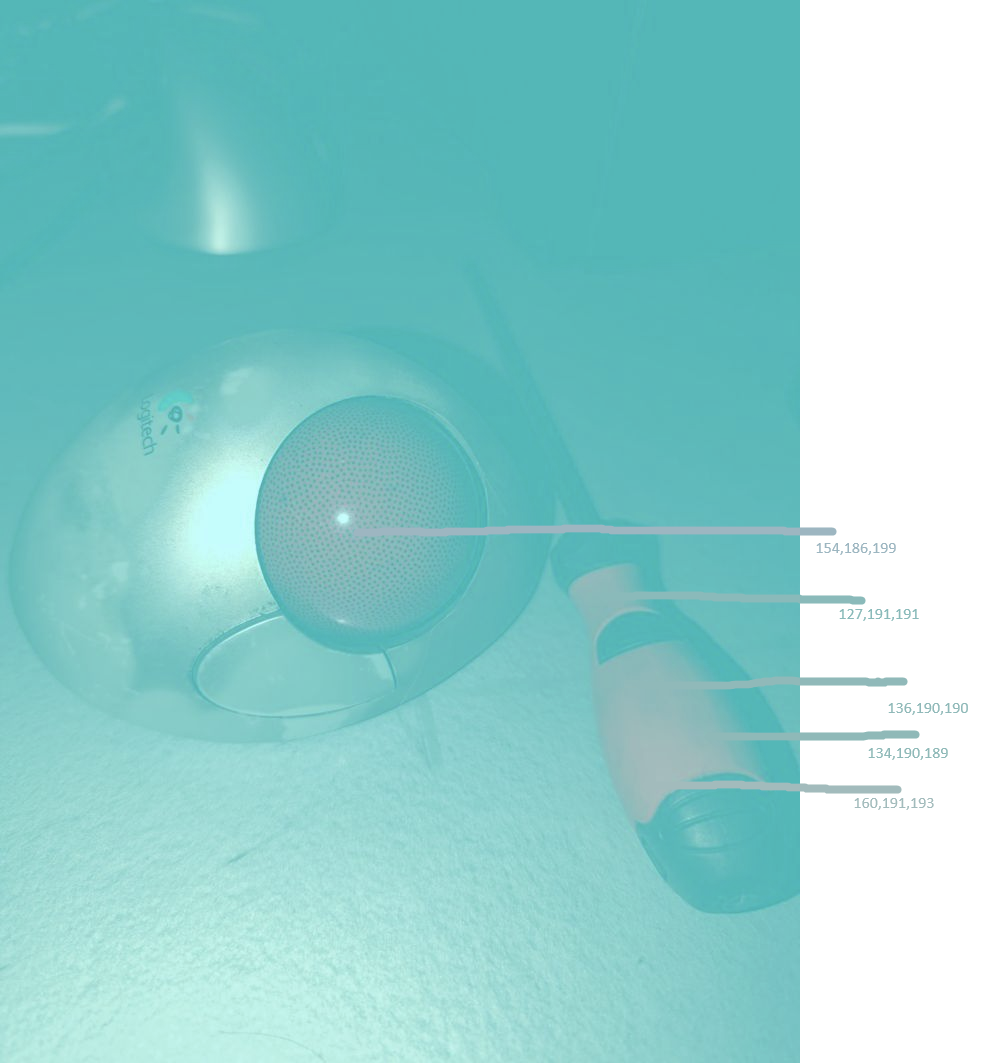
Simple. All I did was bucket-fill over this photo of red shit on my desk with 100% cyan at 50% opacity.
-
-
@hungrier Yeah it's not as nicely balanced out to neutral grey but OTOH it's even further from red while still looking red.
-
@LaoC I don't know how much the blue background skews the perception (see the (in)famous dress or other similar confusing images). So I'm not convinced this is a fair reproduction of the original (black & white) effect.
-
@remi said in Is it a duck or a rabbit?:
original (black & white)
 The original isn't black-and-white, it contains rather a lot of cyan. it's based exactly on this fact that the blue background skews perception: everything that's supposed to be white is cyan, so anything that's actually white must (to the brain) be even less cyan (i. e. red) than the "white" things.
-
Yes, of course. I'm not gonna go honk and delete my post, so you can all
 at my stupidity. But ignore I said anything.
So yeah, this is pretty much the whole effect and it clearly works even when the brain has no idea that the object (screwdriver or trackball) is supposed to be red.
-
@remi said in Is it a duck or a rabbit?:
Yes, of course. I'm not gonna go honk and delete my post, so you can all
at my stupidity. But ignore I said anything.So yeah, this is pretty much the whole effect and it clearly works even when the brain has no idea that the object (screwdriver or trackball) is supposed to be red.
The fact that we know Coke is supposed to be red may play a role, too—I played around with changing the cyan to some other hue and the can seemed to change color a bit but the effect was never as strong as in the original. But yeah, most of it is just contrast.
-
@LaoC out of curiosity, is it possible to get other fake colours?
I don't know much about human perception so I have no idea which other pairs of colours might work, maybe red/cyan instead of cyan/red (but it's not even obvious that simply reversing colours would work!)?
-
@remi Any pair of opposite colors will work. Brain simply automatically white-balances the image whatever color it is skewed towards. We encounter light that is not exactly white all the time—even the daylight under cloudy sky has different color than daylight in direct sunlight—so automatically adjusting color perception to the estimated color of the light makes recognizing things a lot easier.
-
@remi said in Is it a duck or a rabbit?:
@LaoC out of curiosity, is it possible to get other fake colours?
I don't know much about human perception so I have no idea which other pairs of colours might work, maybe red/cyan instead of cyan/red (but it's not even obvious that simply reversing colours would work!)?
With a purple background you can make it look a bit greenish but the effect is quite weak, probably because it contradicts experience. I think it should work with any color as long as the background has enough things that you know roughly how they should look so the brain can use them to calibrate its color correction.
-
@Bulb said in Is it a duck or a rabbit?:
Brain simply automatically white-balances the image whatever color it is skewed towards
Many years ago, I took a workshop on (photographic) color printing. One of the tricky things about color printing is adjusting the color of the print so that it matches the original color of the negative or slide (or doesn't, if the original color is off due to, say, florescent lighting, or using daylight film indoors, or vice versa). The instructor was using a slide projector to illustrate his lecture, and at one point he left a slide on the screen for a while as he was talking. And as he was talking, he slowly changed the color balance. (I don't remember which colors he shifted between — maybe red-cyan or magenta-green, or something, not necessarily even opposite pairs, but probably at least near-opposite, since something like red-magenta would have been much more difficult to notice.) Perhaps about half the people in the workshop noticed. Whether or not you noticed was a potentially useful predictor of how difficult it would be for you to be successful at making good color prints. I'm not sure if I would have noticed that either color was off, viewed in isolation, but I did notice the shift.
-
@Bulb said in Is it a duck or a rabbit?:
We encounter light that is not exactly white all the time—even the daylight under cloudy sky has different color than daylight in direct sunlight
What does "white" even mean? There are several different colorimetric definitions of white. And the "white" light we encounter in daily life is, at best, an approximation to any particular one of those. Or the standards are an approximation of natural light. Take your pick.
-
@HardwareGeek For a material, white means it has uniform reflectivity over the visible spectrum. For a light … as I already mentioned, daylight under clear sky is different from daylight under overcast sky—direct sunlight has more red as the blue gets scattered more, while through clouds you are mainly getting the scattered blue.
But you generally don't care about colour of the light. you care about the colour of the illuminated things. Which is why the colour perception is adjusted for the estimated colour of the light. So you see the white thing as white in direct sunlight, when its overcast and even when illuminated by even more reddish light of a lightbulb. Which with photos and images on screen leads to the above effect.
-
@Bulb said in Is it a duck or a rabbit?:
But you generally don't care about colour of the light. you care about the colour of the illuminated things. Which is why the colour perception is adjusted for the estimated colour of the light. So you see the white thing as white in direct sunlight, when its overcast and even when illuminated by even more reddish light of a lightbulb. Which with photos and images on screen leads to the above effect.
Which now makes me wonder if the room's ambient lighting where the image is being viewed can play a role in how striking the effect is.