0.3 pixels
-
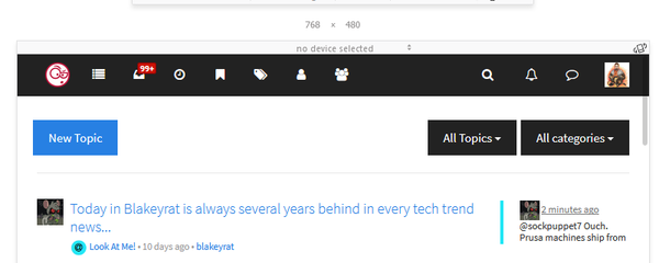
Half-window layout: NodeBB can't get any less usable than this.
https://i.imgur.com/G8RCnpt.png
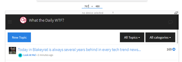
Quarter-window layout: Hold my beer.
https://i.imgur.com/xHz4q9b.png
-
-
@tsaukpaetra what's your monitor resolution? Mine's 1920x1080.
-
@pie_flavor said in 0.3 pixels:
@tsaukpaetra what's your monitor resolution? Mine's 1920x1080.
The image is of the window as sized when snapping it to a corner (quartered as you say).
-
@tsaukpaetra Right, and NodeBB bases its layout on pixel width.
-
@pie_flavor said in 0.3 pixels:
@tsaukpaetra Right, and NodeBB bases its layout on pixel width.
Is this news to you for some reason? Why do you seem surprised that a Bootstrap-based site does this?
-
@tsaukpaetra I'm saying that monitor resolution therefore matters, and I was then asking you what yours was, and you didn't really answer.
-
Blakeyalt detected.
-
@polygeekery Nah, blakey would have insulted himself by now.
-
Works here on 1080p screen:
-
@bb36e Your window may be a quarter of the screen, but the browser viewport is not the full width of that window.
-
E_NO_REPRODUCE
It looks like your stylesheet is broked, because that menu shouldn't be vertical at any screen size...
-
@pie_flavor I think CSS/JS just shit itself when you loaded or something:
-
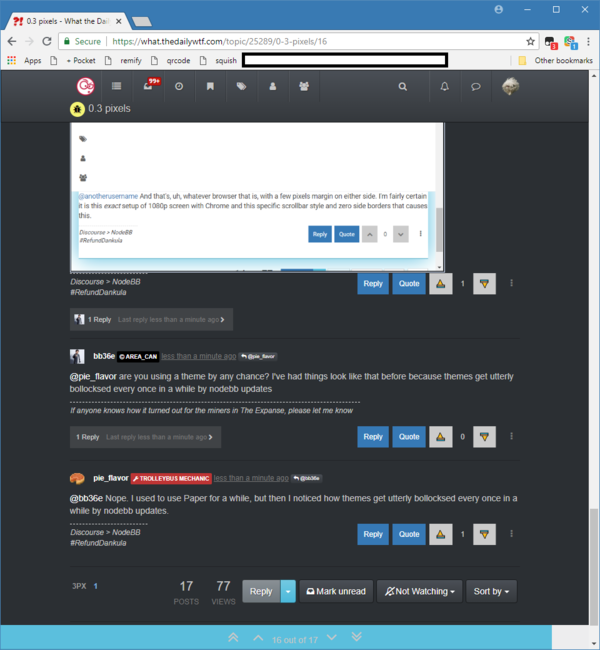
@anotherusername And that's, uh, whatever browser that is, with a few pixels margin on either side. I'm fairly certain it is this exact setup of 1080p screen with Chrome and this specific scrollbar style and zero side borders that causes this.
-
@bb36e After Ctrl Shift R:
https://i.imgur.com/twUSDf1.png
-
@pie_flavor are you using a theme by any chance? I've had things look like that before because themes get utterly bollocksed every once in a while by nodebb updates
-
@bb36e Nope. I used to use Paper for a while, but then I noticed how themes get utterly bollocksed every once in a while by nodebb updates.
-
Chrome on Windows 10, with Slate theme (no bollocking):
-
I just tried to repro using devtools, the "full" triggers at 768px. Lowering it to 767 doesn't repro

-
@pie_flavor said in 0.3 pixels:
@anotherusername And that's, uh, whatever browser that is, with a few pixels margin on either side. I'm fairly certain it is this exact setup of 1080p screen with Chrome and this specific scrollbar style and zero side borders that causes this.
Well, it really shouldn't matter, because I should be able to reach the same pixel size by adjusting my window. Can you log
window.innerWidthandwindow.innerHeight(in a separate console -- so it won't change the size of the window dedicated to the page)? That'll give you the pixel size of the page (including the scroll bar, but since the document isn't wider than the window, you could getdocument.body.offsetWidthinstead, and that wouldn't include the scroll bar).Also it looks like you've increased the scale. Try hitting Ctrl+0, and see if it fixes it. That said, it shouldn't break like that, no matter the window size or scale...
-
@onyx said in 0.3 pixels:
I just tried to repro using devtools, the "full" triggers at 768px. Lowering it to 767 doesn't repro
Did you try it at 765?
-
Here it is in action.
Interestingly, it seems like it often doesn't happen when going from larger to smaller, except for the initial half-window calibration or when it hasn't been 'dropped' yet and the original was a half-window calibration.
-
@anotherusername 767 width, 754 height at half screen.
-
@hungrier said in 0.3 pixels:
@onyx said in 0.3 pixels:
I just tried to repro using devtools, the "full" triggers at 768px. Lowering it to 767 doesn't repro
Did you try it at 765?
There's no threshold there, and in this specific case it shouldn't be a rounding error. But, just for you, I tried. Looks the same as 767, just 2px narro....
Oh.
I see what you did there.
Bastard.
-
@pie_flavor said in 0.3 pixels:
@tsaukpaetra I'm saying that monitor resolution therefore matters, and I was then asking you what yours was, and you didn't really answer.
1080p.
-
I'm able to reproduce this in Chrome at a zoom level of 125% and a window innerWidth/Height of 767x754...
-
@anotherusername yup, it's the zoom, "works" in FF as well...
Fucking CSS pixels, how do they work?
Or, rather, I think Bootstrap 3 is highly addicted to using
emeverywhere, it might be a fuckup in that part of the equation..
-
Ok, this is definitely a rounding issue. There are two CSS styles, this:
@media (max-width: 767px) {
    .hidden-xs {
        display: none!important;
    }
}
and:
@media (min-width: 768px)
    .navbar-nav>li {
        float: left;
    }
}
Neither style is being applied at that precise width, meaning that even though the page's reported width is 767, its CSS width is actually some fraction between 767px and 768px.
-
@anotherusername And there might be a workaround:
@media (max-width: 767.9px) {
    .hidden-xs {
        display: none!important;
    }
}
After applying that media change locally, I wasn't able to replicate the issue in Chrome, Firefox, and Edge even up to 400% zoom.
I don't know if there will be any issues of older browsers supporting the media queries with decimal pixel values, though.
-
@chaostheeternal That's really pretty awful. I was hoping for something more like
@media (max-width: 768px) and not (width: 768px) {
    .hidden-xs {
        display: none!important;
    }
}
...but you can't do that, apparently. You also can't do this:
@media (max-width: 768px) {
    .hidden-xs {
        display: none!important;
    }
}
@media (width: 768px) {
    .hidden-xs {
        display: unset!important;
    }
}
...because that'll unset the
displayattribute if you've set it in another style, too.
-
You can, at least in Chrome (and I think maybe Firefox), do this:
@media all and (max-width: 768px) { @media not all and (width: 768px) { .hidden-xs { display: none!important; } } }notrequires a media type, and it negates the whole query string, so it inverts the meaning of@media all and (width: 768px).However, I'm not sure whether other browsers will allow nested
@mediaqueries.
-
@anotherusername hey, the thread title was unwittingly accurate!
-
Related:
 Media queries running weird because of non-integer width

Can't say is it a real problem or I'm just being paranoid but this behavior of media queries is really driving me crazy for last couple of hours. Let's consider this really simple CSS. body {
http://damienclarke.me/code/posts/those-1px-gaps-between-media-queries-can-be-a-problem
Unfortunately, the consensus seems to be one of "it hurts when I do that... well then don't do that".
-
@anotherusername said in 0.3 pixels:
http://damienclarke.me/code/posts/those-1px-gaps-between-media-queries-can-be-a-problem
Webkit browsers (Safari and Chrome) appear to internally round the viewport width before applying rules in media queries
Thanks to forking WebKit, they apparently reintroduced the bug to Chrome/Chromium.
I will note, Safari does not appear to have this issue, so the quote isn't entirely wrong. But given the nature of the bug, browser makers and designers using CSS with media queries can play hot potato and not take ownership.
-
@chaostheeternal realistically, the solution here should be that the ranges should overlap at the endpoints instead of having a 1px gap. But that would be more work...

 2018-06-14_09-21-42.mp4