Specifications for a panic button
-
Specifications for a panic button with an eye to modern web app design...
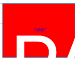
- The panic button should measure 4 x 3 centimeters on screen. Or bigger. Big buttons are better.
- Bright red background with 120pt bold bleached "PANIC" watermark lettering centered vertically and horizontally to identify the button. Color is great and watermarked color is even better.
- Hovering anywhere over the button should pop up a helpful hint box stating, "Click to panic." Note that the hint popup should block attempts to click the panic button.
- The button should show a visible depress on mouse click or touch.
- There should be a centered link text on the button: "PANIC" in 6pt font. Tinier if possible.
- Clicking on the link text should trigger the Panic app. Triggering should occur not less than 8 seconds after the click and clicking twice (or more) during the 8 second delay is to be treated as an error.
- Only clicking on the link text should trigger the app. Clicking anywhere else on the button should only show the depress action. No indication should be given that such a click does nothing else.
Why would anyone want an app that way?
There's an old joke about the guy who goes into a diner and orders, "cold, runny fried eggs; burned toast; limp; under-cooked bacon; and lukewarm coffee." The waitress says, "We can't make an order like that." The guy replies, "You had no trouble making that order yesterday."
Why would anyone want an app that way? I don't know. But apparently lots of people do.
-
@CoyneTheDup said in Specifications for a panic button:
hint popup should block attempts to click the panic button.
Wat.
-
-
@Tsaukpaetra said in Specifications for a panic button:
@CoyneTheDup said in Specifications for a panic button:
But apparently lots of people do.
....?
...based on the fact there are so very many apps
designedimplemented that way.
-
@CoyneTheDup said in Specifications for a panic button:
@Tsaukpaetra said in Specifications for a panic button:
@CoyneTheDup said in Specifications for a panic button:
But apparently lots of people do.
....?
...based on the fact there are so very many apps
designedimplemented that way.Huh. I don't have a lot of apps, but none are. Maybe I'm not hipster enough?
Can you provide an example?
-
@CoyneTheDup said in Specifications for a panic button:
120pt
4.23 centimeters tall in a 4×3 centimeter window? How can you tell it says PANIC and not JAPANIMATION or ANIMORPHS?
-
@ben_lubar said in Specifications for a panic button:
ANIMORPHS
As bad as that series was. The side stories were actually good.
-
@xaade said in Specifications for a panic button:
@ben_lubar said in Specifications for a panic button:
ANIMORPHS
As bad as that series was. The side stories were actually good.
Oye! Be nice to my childhood! :P
-
@Tsaukpaetra said in Specifications for a panic button:
@CoyneTheDup said in Specifications for a panic button:
@Tsaukpaetra said in Specifications for a panic button:
@CoyneTheDup said in Specifications for a panic button:
But apparently lots of people do.
....?
...based on the fact there are so very many apps
designedimplemented that way.Huh. I don't have a lot of apps, but none are. Maybe I'm not hipster enough?
Can you provide an example?
Office 365 web. They are fixing them, but an earlier version had big buttons everywhere that only worked if you clicked the link text. The Office programs are always/forever posting a context menu where I want to see or select text. (Visio is the pits with its connector arrows that are always in the way.) ServiceNow used to pop up solid hint boxes that block selection.
My specs are satire of course. What I'm complaining about is a mix of "helpful design" and sloppy implementation.
Microsoft in particular drives me crazy with their endless "help the user" that so often turns out to be anti-helpful to me.
-
@CoyneTheDup said in Specifications for a panic button:
The panic button should measure 4 x 3 centimeters on screen
@CoyneTheDup said in Specifications for a panic button:
120pt bold bleached "PANIC" watermark lettering centered vertically and horizontally to identify the button

Truly a PANIC button worthy of TDWTF.
And yes, I've set the text to be centred, but Chrome has its own ideas.
-
@CoyneTheDup said in Specifications for a panic button:
Big buttons are better.
-
-
The fact you can see the switch mounting actually moving with each toggle, I find annoying and sloppy. Poorly executed.
-
-
@RaceProUK said in Specifications for a panic button:
And yes, I've set the text to be centred, but Chrome has its own ideas.
We've seen this problem before! This is why you need a button CDN.
-
@CoyneTheDup said in Specifications for a panic button:
Specifications for a panic button with an eye to modern web app design...
If you need to turn off the web app (toghether with your computer) quickly:
Mobile edition: throw the mobile device as far as you can.
-
@Mikael_Svahnberg said in Specifications for a panic button:
Looks like someone stuck poor @accalia (or maybe @Perverted_Vixen) in one of those:
-
@ben_lubar said in Specifications for a panic button:
How can you tell it says PANIC and not JAPANIMATION or ANIMORPHS?
Because it's a red big button. All big red buttons are for panic, throwing missiles or getting coffee
-
@wharrgarbl said in Specifications for a panic button:
@ben_lubar said in Specifications for a panic button:
How can you tell it says PANIC and not JAPANIMATION or ANIMORPHS?
Because it's a red big button. All big red buttons are for panic, throwing missiles or getting coffee
So they're all Japanimation buttons?
-
@Dreikin there is a scene in aliens vs monsters that the red button the president use to launch the nuclear missiles is identical and near the coffee button
-
@wharrgarbl said in Specifications for a panic button:
@ben_lubar said in Specifications for a panic button:
How can you tell it says PANIC and not JAPANIMATION or ANIMORPHS?
Because it's a red big button. All big red buttons are for panic, throwing missiles or getting coffee
Besides, it has the 6pt (or smaller) link text that says PANIC.
@RaceProUK said in Specifications for a panic button:
@CoyneTheDup said in Specifications for a panic button:
The panic button should measure 4 x 3 centimeters on screen
@CoyneTheDup said in Specifications for a panic button:
120pt bold bleached "PANIC" watermark lettering centered vertically and horizontally to identify the button
Truly a PANIC button worthy of TDWTF.
And yes, I've set the text to be centred, but Chrome has its own ideas.
Oh, BTW, @RaceProUK , you forgot the link text.
 Good effort though.
Borrows and amends...
-
@RaceProUK @CoyneTheDup Does nobody know what "vertically and horizontally centered" means for white text? I think @CoyneTheDup got it for blue underlined text, at least.
-
@ben_lubar I applied the CSS rules to centre the text, and Chrome ignored them
-
@RaceProUK said in Specifications for a panic button:
@ben_lubar I applied the CSS rules to centre the text, and Chrome ignored them
Because the rules on centering - especially vertically - are fucking insane.
-
@Arantor the rules for vertical center is just use a table and fuck this CSS nonsense
-
@wharrgarbl except when even that won't work...
-
@Arantor said in Specifications for a panic button:
Because the rules
are fucking insane.
FTFY. Fucking floats, man. Fucking floats.