Genuinely Useless Bug Reports
-
it doesn't work
-
-
-
Yes, I've had that sort of thing, too. Or users being cute by inventing their own terminology for things.
-
This post is deleted!
-
Bug Can't connect
Description it doesn't workAnd absolutely no other context. (Email report)
-
Every user, ever.
-
Every user, ever.
Except my bug reports even for things I am not a developer for/contributor to, I refuse to give such shitty bug reports.
-
Hypothetical but typical interaction with a customer "bug":
User: [Application] doesn't work, I got an error!
Me: Well, what's the error?
User: I don't know, I didn't read it.
Me: Run it again and read me the error message.
User: It says "This file may take some time to generate. Continue? Yes or no"
Me: That's not an error, click yes you retard!
User: Yep, that works! Thanks!
-
Hypothetical but typical interaction with a customer "bug":
User: [Application] doesn't work, I got an error!
Me: Well, what's the error?
User: I don't know, I didn't read it.
Me: Run it again and read me the error message.
User: It says "This file may take some time to generate. Continue? Yes or no"
Me: That's not an error, click yes you retard!
User: Yep, that works! Thanks!That's just bad UI design. You don't make them interact with a warning.
-
Someone posted this screenshot:
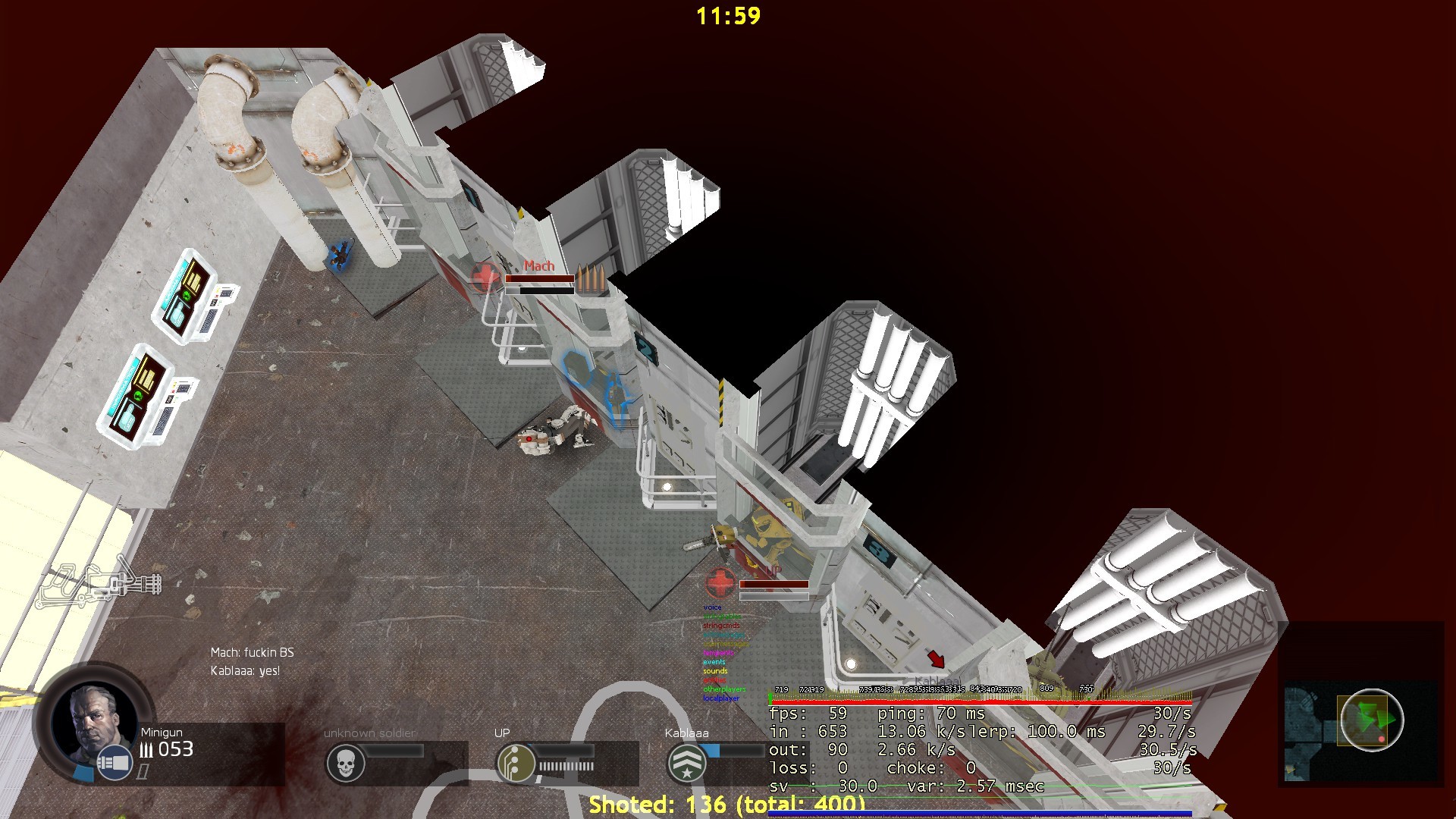
I asked them why they were playing with
mat_fullbright 1. They responded:Are you referring to the cvar mat_hdr_level? Which mine is normally 1, and on occasion 0. I believe the default is 2 which makes it 'dark' (and also slows down framerate).
mat_hdr_level 0is LDR, AKA HL1 mode, which this map doesn't have, so it defaults to "no lighting information" mode.mat_hdr_level 1is LDR with bloom, AKA HL2 mode.mat_hdr_level 2is HDR, AKA every Source engine game after the original HL2 mode. In fact, they went back and added HDR to HL2 because LDR looks like shit.Here's what it's supposed to look like:
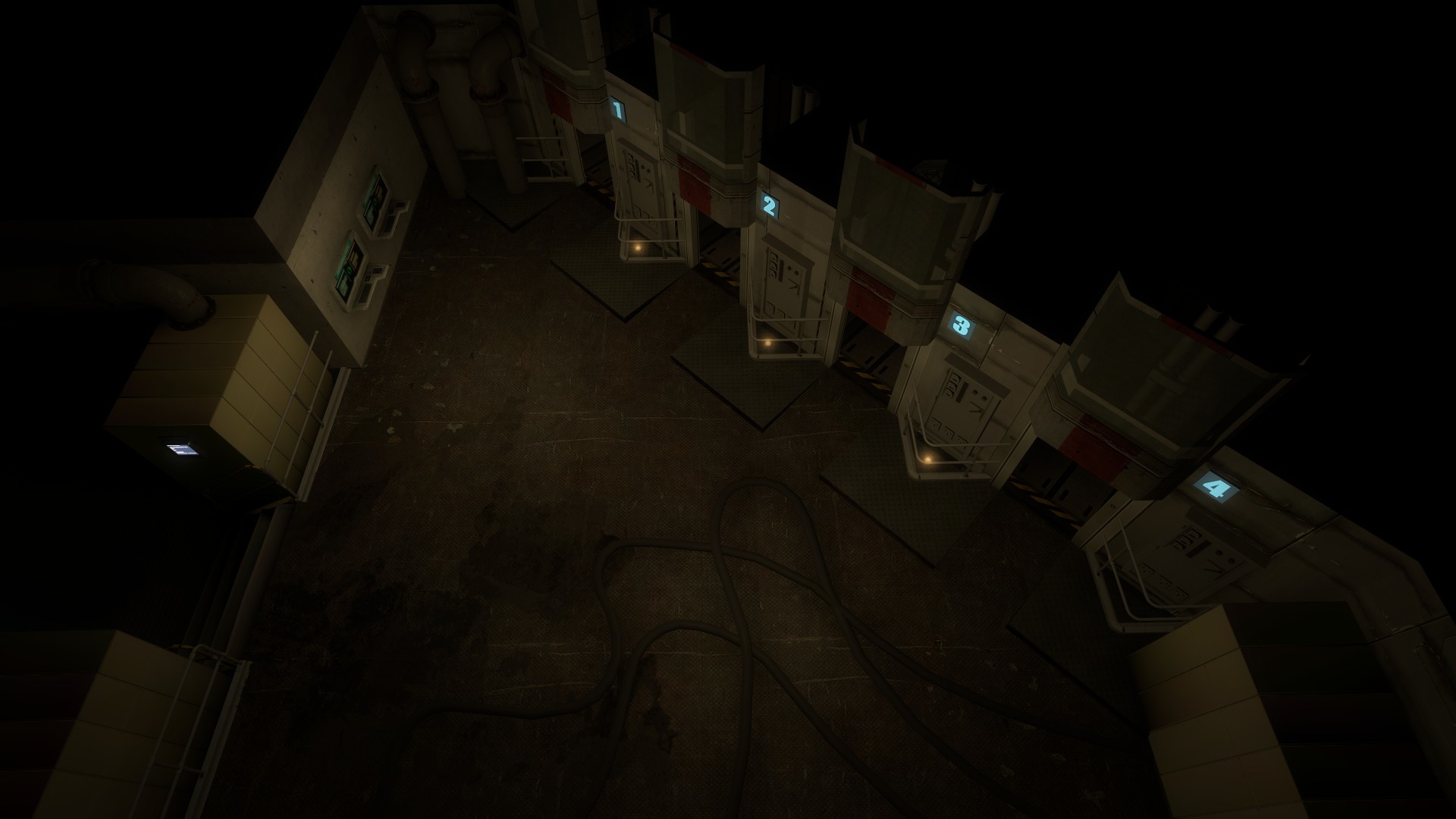
If static lighting is that much of a burden on your system, it might be time to upgrade.
-
That's just bad UI design. You don't make them interact with a warning.
It's a common pattern back in the Silverlight world because there are very unusual restrictions meaning certain things can only be done as a result of "user interaction" which is unfortunately too-narrowly-defined. This leads to dialog boxes asking if the user really meant to do that, just so that you can have them click the button which meets the proper "user interaction" criteria, allowing your task to execute.
-
My 'favourites' are the ones where the user tries to perform an action and is presented with a message of some kind telling them they've missed a prerequisite action, and exactly what they need to do before they proceed, then they report they can't progress because of the 'error'.
Unfortunately a fair portion of our users do jobs which they'll basically employ anyone to do, so you can't expect common sense.
-
Client: "When I log in, I can see all accounts, not just mine."
Me: "That's how it works for internal users. Same as it has for the past 10 years."WORKING_AS_DESIGNED_CLOSED
-
This topic is now closed. New replies are no longer allowed.
WORKS ON MY MACHINE
-
This topic is now opened. New replies are allowed.

-
You spoiled the irony of the perfect bug report
-
I disagree; reopening a bug report is a great example of indecisive bug management/fixing/reproduction.
-
But they don't reopen bugs over on Meta - you simply have to create a new topic (or three)...
-
I do not wish to overstep the ruling of a moderator but I need to make this part very clear.
We.
Are.
Not.
Meta.d.
-
-
I do not wish to overstep the ruling of a moderator but I need to make this part very clear.
Given past performance, I trust @dhromed and @PJH as moderators. I think this was a meta joke on meta, as @dhromed kinda confirmed with his follow ups. Possibly even coordinated via PM. </conspiracy>
-
-
That makes it funnier, at least. Even if we're retconning.
-
Well, apparently many newbie Developers act like it.
"Code doesnt work, it does error".We need a default routine how to deal with such....
-
I just happened to notice a padlock in Latest - in Bugs no less - wondered WTF was going on and what @system was up to this time, came here and saw the lock post, and the rest - as they say - is history.
-
I do not wish to overstep the ruling of a moderator but I need to make this part very clear.
We.
Are.
Not.
Meta.d.Sounds like something for Apache.
-
Nah, Apache would have modmetadiscourse.
-
No, it would have mod_metadiscourse, get it right.
-
I like the bright one better. It's easier to see the bad guys.
-
Really? Even the ones that glow in the dark and jump on your head and kill you?
-
That sounds too scary. I only play nice games like Roller Coaster Tycoon 3.
-
That sounds too scary. I only play nice games like Roller Coaster Tycoon 3.
If you consider that a nice game, then you play it differently than most people.
-
I don't usually make roller coasters fly off the track, if that's what you mean.
I do like to make waterslides that don't have a "safe" exit (even though the peeps land in the pool) I hate it when I make a neat 3 level pool and it bitches at me.
-
I don't usually make roller coasters fly off the track, if that's what you mean.
But that is how you are supposed to score your game! How far did the coaster go X number of people that got on it.
-
Did you ever see that story about the guy that made his coasters crash into the neighboring park?
-
No. I don't think I've ever seen a map with more than one park on it.
-
Let's see if this works:
Roller Coaster Tycoon
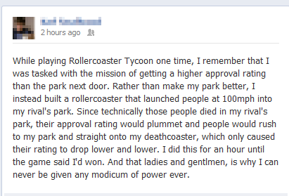
Roller Coaster Tycoon. . 2 hours ago It While playing Rollercoaster Tycoon one time, Remember that f was tasked with the mission of getting a higher approval ra
-
Have you heard of Mr. Bones' Wild Ride?
-
That's a useless oneboxing.
-
If you click the little gear in the corner, you can get rid of the oneboxing by opening the images in a new tab.
-
Yeah, that's great for usability.
Anyways, reminds me of that long rollercoaster that was pretty much all underground.
-
It doesn't change that it's still sucky for usability.
Also, awesome.
-
It's sucky, but at least it's not as sucky as it could be.
-
It's sucky, but at least it's not as sucky as it could be.
That depends on your definition of usability, I suppose.
-
That depends on your definition of usability, I suppose.
Unfortunately, @codinghorror's dictionary appears to have been written by somebody who was drunk while working on words beginning with "U."
-
Unfortunately, @codinghorror's dictionary appears to have been written by somebody who was drunk while working on words beginning with "U."
Uglificated Interface (UI) - noun - Design principle stating that the uglier an interface is, the more likely that users will become zealously attached to it and defend it irrationally against all criticism.
-
Uglificated Interface (UI) - noun - Design principle stating that the uglier an interface is, the more likely that
usersdevelopers will become zealously attached to it and defend it irrationally against all criticism.I have not yet met a user that likes Discourse's UI. The irony of this has not gone unnoticed as per the comment earlier about Jeff blogging about developer UI which is what DC really is.
-
I vote for the infiniscroll to be ditched and put back the REAL scrollbar working like it should. Then put the page #s in that green blob like my pagination JS does to allow going to next page without having to scroll to top/bottom. That is the one part I do like, when I turn on my pagination JS, the page links are always there instead of needing to scroll.
It'd be nice if the posts had a bit more noticeable break between them,.
I'd like the main topic list to show a preview of the OP when you hover the post, so you don't have to go into the topic to see what they're talking about. This I think I could actually fix myself in JS like I did with pagination I guess.
I also wish the preview window had an overlay or something saying preview, because I swear, I click on it with my mouse sometimes when I'm trying to go back to edit a previous paragraph in my post... at which point I start typing and accidentally navigate off the page because the text input no longer had focus.
I should go into stylish and change the css things myself I guess. I HAVE THE POWER!
CLOSED JEFFWONTFIX