Desktop Mode should have configurable max width
-
Re: NodeBB Updates
Ask for bug reports and ye shall receive.
Desktop mode's nice, but should have a user configurable slider to set a max width. this should default to "Viewport Width".
that way we can use desktop mode and still reserve some whitespace for tossing chat windows into.
-
OK, so what setting / style would that need to affect? How would one do the UI for that?
-
@boomzilla If I have my Bootstrap right, you're looking for the max-width on
.containeror.container-fluid, whichever you use
-
@boomzilla said in Desktop Mode should have configurable max width:
K, so what setting / style would that need to affect?
it should put a max-width on
.containerif set to anything not 'viewport width'@boomzilla said in Desktop Mode should have configurable max width:
How would one do the UI for that?
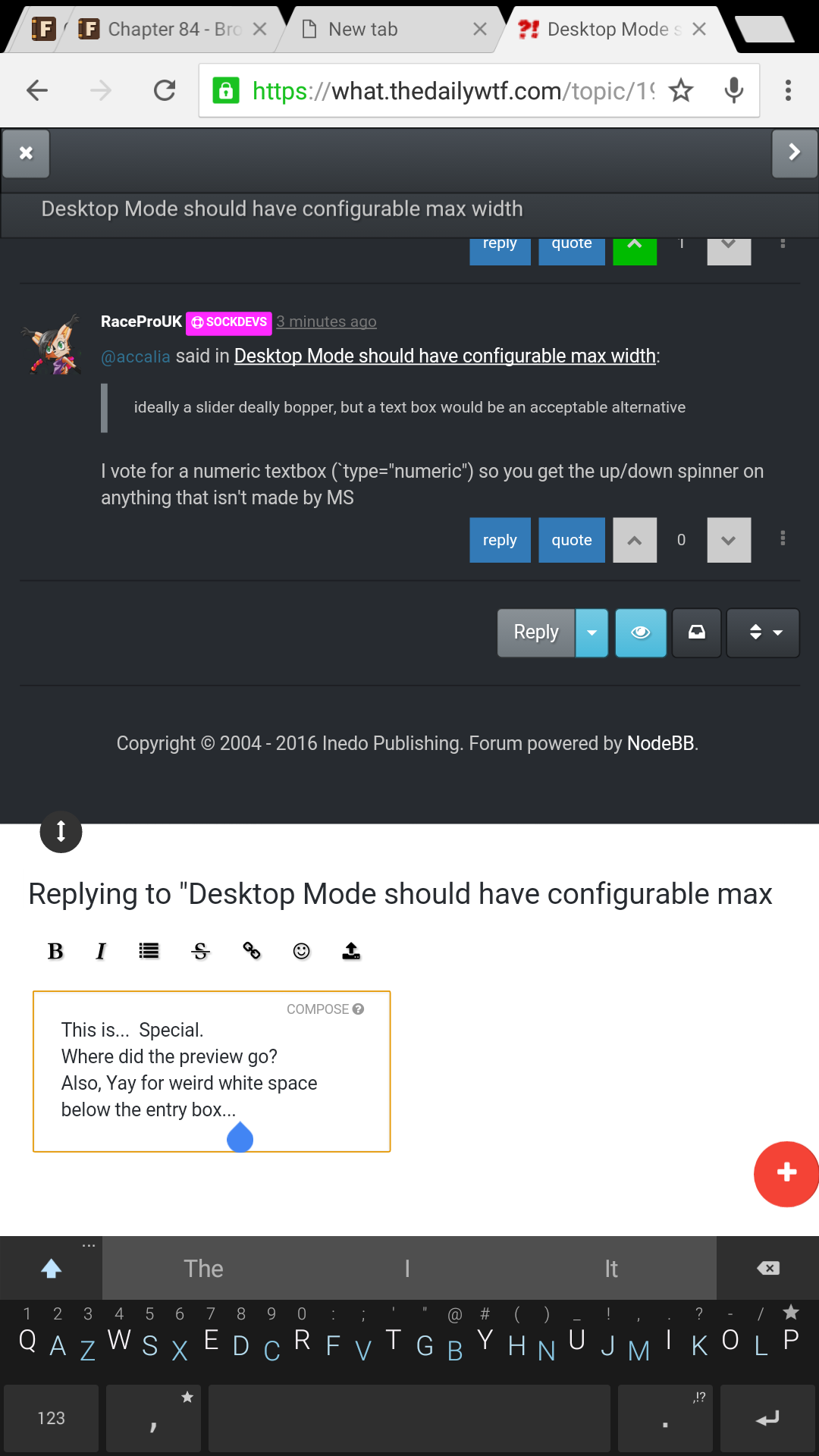
ideally a slider deally bopper, but a text box would be an acceptable alternative
but that's just my opinion.
-
-
@accalia said in Desktop Mode should have configurable max width:
ideally a slider deally bopper, but a text box would be an acceptable alternative
I vote for a numeric textbox (
type="numeric") so you get the up/down spinner on anything that isn't made by MS
-
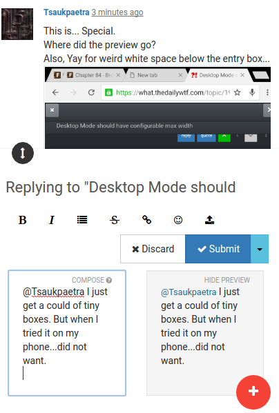
This is... Special.
Where did the preview go?
Also, Yay for weird white space below the entry box...
-
@RaceProUK said in Desktop Mode should have configurable max width:
I vote for a numeric textbox (`type="numeric") so you get the up/down spinner on anything that isn't made by MS
/shrug that works too i guess.
/me is not a front end developer, thank the goddess.
-
@accalia said in Desktop Mode should have configurable max width:
but that's just my opinion
Well, I was mainly thinking about how to make it happen in NodeBB.
-
@Tsaukpaetra I just get a could of tiny boxes. But when I tried it on my phone...did not want.
-
@boomzilla said in Desktop Mode should have configurable max width:
Well, I was mainly thinking about how to make it happen in NodeBB.
ooooh.....
no idea, but when you figure it out do let me know for my own shenanigan related rasins
-
@accalia Yeah, the first question is...is it all done via front end stuff or do I need to make some templates and some back end code to render it or what?
I'm totally not a front end dev in this style, so this is all pretty new to me.
-
@boomzilla said in Desktop Mode should have configurable max width:
Yeah, the first question is...is it all done via front end stuff or do I need to make some templates and some back end code to render it or what?
well, how did you get the select buttons in the user menu? that's a good place to start.
-
@accalia said in Desktop Mode should have configurable max width:
/me is not a front end developer, thank the goddess.
I work the full stack (pre-emptive
 )
)@accalia said in Desktop Mode should have configurable max width:
well, how did you get the select buttons in the user menu? that's a good place to start.
IIRC, that was faked with smart use of FontAwesome icons
-
@accalia said in Desktop Mode should have configurable max width:
well, how did you get the select buttons in the user menu?
Someone clued me in on how to use font awesome glyphs ( @RaceProUK )
-
@boomzilla said in Desktop Mode should have configurable max width:
Someone clued me in on how to use font awesome glyphs
oh...... well there goes that idea for that......
don't suppose you could do markup instead of text for the menu item name?
-
@accalia Yeah, probably. I mean...there's some markup in there created with js:
function createMenuItem(text, selected){
	var li = document.createElement('li');
	var a = document.createElement('a');
	li.appendChild(a);
	a.href = '#';
	var i = document.createElement('i');
	a.appendChild(i);
	i.className = 'fa fa-fw';
	if( selected ){
		i.classList.add('fa-dot-circle-o');
	}
	else{
		i.classList.add('fa-circle-o');
	}
	var span = document.createElement('span');
	$(span).text(text);
	a.appendChild( span );
	return li;
}
-
Christ... it taking the whole window was a bit of a surprise, but I like it. It's like the Discourse Widescreen one we had previously, which I used until the menu was broken.
-
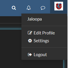
There's no option to change it back. It seems I'm stuck in desktop mode on this computer.
Also, the lack of preview at half page width means it's still pretty useless if not taking up most of your screen
-
@Jaloopa said in Desktop Mode should have configurable max width:
There's no option to change it back.
You don't have the "Responsive Mode" item?
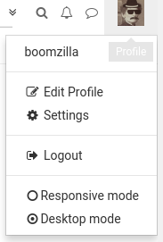
If all else fails put this into the js console:
window.localStorage['responsive'] = 'responsive';@Jaloopa said in Desktop Mode should have configurable max width:
Also, the lack of preview at half page width means it's still pretty useless if not taking up most of your screen
You're in desktop mode and the preview goes away? What browser?
-
@boomzilla Firefox 46.0.1. Darkly theme
Both options were there when I was in Responsive mode, now my menu looks like this
The preview disappears at somewhere around 980px
-
@Jaloopa That looks like a skin. Which one are you using? Maybe it and the plugin are racing to restyle the page.
-
I can reproduce the preview going away, but not the menu thing using Darkly.
 Doesn't work with skins · Issue #2 · boomzillawtf/nodebb-plugin-unresponsive
When users have custom skins, the composer preview may disappear and the menu items may not show up. I reproduced the missing preview using the Darkly skin.
-
Desktop makes the avatar and infinispinner occupy the same space...
-
@boomzilla But Boomzilla, it's not a bug because Stylish exists! @ben_lubar said so!
-
@loopback0 said in Desktop Mode should have configurable max width:
Desktop makes the avatar and infinispinner occupy the same space...
Yeah, I had noticed that it moves over to the edge (though not WRT the spinner). Obviously more differences between
.containerand.container-fluid.
-
@boomzilla
.container-fluidwill always expand to the full viewport width no matter how wide you make it, whereas.containeronly does that below (IIRC) 768px; above that,.containeris a fixed width
-
@boomzilla said in Desktop Mode should have configurable max width:
I can reproduce the preview going away, but not the menu thing using Darkly.
Doesn't sound like something that browser/OS choice would affect. I am behind a proxy but if it got through in Responsive I don't see why Desktop would kill it.
Can't think of anything else nonstandard about this setup.
Edit: just checked the developer tools, the options aren't in the DOM at all
-
@boomzilla AFAIK it's all hard-coded in the CSS. Maybe you can change those CSS values in real-time via. DOM? I don't know for sure.
-
BTW some CSS to prevent paragraphs from sailing all the way across a 1920 pixel wide screen and becoming unreadable would be nice, except now if I can turn off that retarded "mobile mode" misfeature I don't need that as much. Would still be kind of handy on my laptop where paragraphs are REALLY long and I usually keep the browser maximized.
-
@blakeyrat said in Desktop Mode should have configurable max width:
some CSS to prevent paragraphs from sailing all the way across a 1920 pixel wide screen and becoming unreadable would be nic
Yeah, I hate that widescreen stuff and have a stylish rule for that, personally. But I know there are some forum members (in particular @PJH) who really like the wisescreen thing, so it needs a more tailored approach than a site-wide CSS fix.
I suppose I could add something like that to the Unresponsive plugin. Though it seems like the requested configuration options are outgrowing the menu approach for UI.
-
@boomzilla I'd rather just have it universally applied, since it's a provable fact that wide paragraphs are more difficult to read. But whatever. It's small beans compared to getting rid of that moron mobile mode.
-
@boomzilla said in Desktop Mode should have configurable max width:
it seems like the requested configuration options are outgrowing the menu approach for UI.
Put it in the profile settings page. It's not likely to be needed to change on a given page vs sitewide for a given user.
-
@Yamikuronue said in Desktop Mode should have configurable max width:
Put it in the profile settings page.
Yeah....Guess I'll have to figure out how to hook into that stuff.
-
@boomzilla I recall you were going to make it configurable per user per browser via local storage? So a user can use 'desktop' mode on a PC, yet still get 'mobile' mode on a phone.
-
@RaceProUK said in Desktop Mode should have configurable max width:
I recall you were going to make it configurable per user per browser via local storage?
Yes. That's how it works right now and I don't see a reason to change that. I'd just be moving the UI to change it to the settings page.
-
I am going to not uncompliment you: I turned on desktop mode on the desktop where I need it and it works.
-
@Yamikuronue said in Desktop Mode should have configurable max width:
@boomzilla But Boomzilla, it's not a bug because Stylish exists! @ben_lubar said so!
It's actually an issue with cross origin scripting. Since the CSS comes from the bootstrap CDN, my code can't access the actual rules to do anything about them.
So I think I'll need to disable it all if there's a skin enabled. The alternative (says the interwebs) is CORS, which is way out of my league.
-
@loopback0 said in Desktop Mode should have configurable max width:
Desktop makes the avatar and infinispinner occupy the same space...
I found that I could make that happen at certain widths in responsive mode, too. There's no hard margin there. It seems that the way the responsive limits are set there just happens to be enough space there most of the time.
If someone has a good idea on how to change this, I'm open to suggestions.
-
@boomzilla said in Desktop Mode should have configurable max width:
Since the CSS comes from the bootstrap CDN, my code can't access the actual rules to do anything about them.
No, but you can inject CSS into the elements itself, like I did here: https://github.com/SockDrawer/SockSite/blob/master/static/plugins/DiscoRound/round.js
-
@Yamikuronue said in Desktop Mode should have configurable max width:
No, but you can inject CSS into the elements itself, like I did here:
Sure, but that doesn't seem like a viable solution here. To clarify, what @Lorne-Kates' script does is goes through the style sheets and updates the media queries so that any styles relying on them to be responsive don't actually change based on the size of the viewport.
If it's the exact same classes as the default, it's maybe possible to figure out all of the elements that need to be updated. But then what do you add to those elements to override the media based application of the classes? Maybe we could just remove all the classes that have the size suffixes? I guess that could work if those don't really control any of the actual skinning.
-
@boomzilla
!importantall the things.
-
Out of curiousity why was the functionality disabled for "custom" skins? It seemed to be working fine for the dark skin (with a few exceptions), and the reason listed says "due to cross origin policies".
Are the available skins being hosted elsewhere or something?
-
@Arantor said in Desktop Mode should have configurable max width:
@boomzilla
!importantall the things.LOL. Yeah, but that just kills the skin, which will not be happy making.
@Tsaukpaetra said in Desktop Mode should have configurable max width:
Are the available skins being hosted elsewhere or something?
Yes, they're at the bootstrap cdn. Check your sources and you'll see. Basically, I think all that was happening was the swapping out of
.container-fluidfor.container.
-
@boomzilla could you catch the cross-origin access denied error in your script, and use it to decide whether to make the extra options visible or not?
And/or, experiment with just skipping the external stylesheet(s) and see if changing the ones you can change doesn't have more or less the same result.
the serenity to accept the stylesheets you cannot change...
-
@anotherusername said in Desktop Mode should have configurable max width:
@boomzilla could you catch the cross-origin access denied error in your script, and use it to decide whether to make the extra options visible or not?
What I see is that in the CSS sheet, instead of there being an array of CSS rules, it's just null.
@anotherusername said in Desktop Mode should have configurable max width:
And/or, experiment with just skipping the external stylesheet(s) and see if changing the ones you can change doesn't have more or less the same result.
This was actually what was happening.
-
@boomzilla said in Desktop Mode should have configurable max width:
the bootstrap cdn
Is this the reason why toasters with no color happen with a theme, but not on the default?
That would explain so much...
-
@Tsaukpaetra Yes, I assume the toasters just need skin compatible styling.
-
So, I figured out how to make a settings dialog:
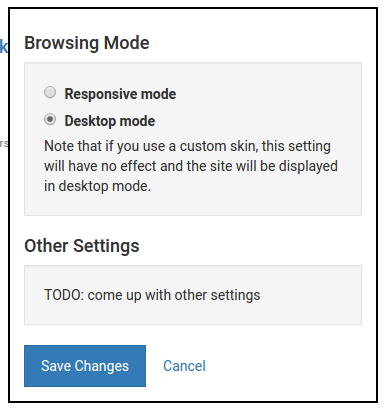
I have a couple of ideas about what to do next. I haven't tried, but the main idea for this topic appears to be adding
max-widthto.container-fluid, I think.I guess the next step might be to add other stylish-type things.
-
@boomzilla said in Desktop Mode should have configurable max width:
I have a couple of ideas about what to do next.
So there really is no way to get around the XSS thing with custom themes? That's kinda disappointing...
