Dear blakeyrat. I fixed the css. Signed The Desktop View
-
@fbmac said in Dear @blakeyrat. I fixed the css. Signed The Desktop View:
would using "em" instead of "px" in the media queries fix it?
No; because it would still be tied to window size. Just in a slightly less direct way. You stupid moron, etc.
-
This post is deleted!
-
@fbmac said in Dear @blakeyrat. I fixed the css. Signed The Desktop View:
would using "em" instead of "px" in the media queries fix it?
Only in the case of using browser zoom, as em-relative measurements are unaffected by browser zoom
-
@RaceProUK I did some testing now and it seems that pixel units are already adjusted for zoom (so calling them pixels is a lie, but that doesn't matter).
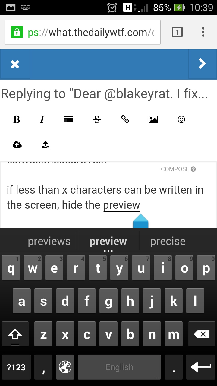
the choice of showing the preview window could be tied to the ratio of character size and window size. using something like canvas.measureText
if less than x characters can be written in the screen, hide the preview
maybe they could do something similar with height and get rid of those useless buttons eating my vertical space
-
@fbmac said in Dear @blakeyrat. I fixed the css. Signed The Desktop View:
it seems that pixel units are already adjusted for zoom
Incorrectly, according to my research:
http://blog.55minutes.com/2012/04/media-queries-and-browser-zoom/(It should be noted that, since that article was published, Firefox and IE have since replicated the WebKit behaviour)
-
@RaceProUK said in Dear @blakeyrat. I fixed the css. Signed The Desktop View:
Incorrectly, according to my research:
Oh good. RaceProUck is here demonstrating her complete inability to absorb new information again. It's already been clearly proven that her assertion here is FUCKING WRONG, but she'll bring it up again and again until the end of time. Because her brain is entirely fossilized, apparently. No new information can be inserted.
-
Oh look, it's that guy who makes absolutely no attempt whatsoever to understand why things are the way they are, and absolutely refuses to admit he might actually be wrong about something occasionally
-
@The_Quiet_One said in Dear @blakeyrat. I fixed the css. Signed The Desktop View:
That's what gets me about this. We're talking about all these workarounds like userscripts and installing third-party addons when the obvious and easiest workaround is to JUST RESIZE YOUR FUCKING WINDOW.
Uh-- that's a stupid work around.
BUG: "My windows are THIS size to fit my workspace. The site displays wrong"
People: "Resize your windows".Guys, seriously. The problem has been pretty clearly stated on this one. As with any problem, there's variables you can change, and variables you can't. The window size is a variable you can't change. @blakeyrat has said the windows are a particular size, and some people have (most likely correctly) guessed that it's because that's the way the OS sizes them in some sort of tile layout.
The only adjustable variable is the css. Fix it, or ignore it. The devs are working on fixing it (at least that's what I remember reading earlier-- can't be arsed to double check right now. Maybe after coffee). So the only immediate workaround is to ignore the css. Which is what this script does.
It. Is. A. Temporary. Patch.
-
960px IS NOT A NARROW VIEWPORT.
-
@PleegWat something mumble everything mumble phone something retina mumble
-
@flabdablet should measure characters, and not pixels then.
-
@fbmac Which is what Bootstrap 4 will do; until then, we're stuck on Bootstrap 3 and pixels
-
@Polygeekery said in Dear @blakeyrat. I fixed the css. Signed The Desktop View:
It is not a bug. It is fully expected and desired behavior by the devs.
Remember, crankyrat's custom definition of "bug" is "behavior I don't like".
-
@Polygeekery said in Dear @blakeyrat. I fixed the css. Signed The Desktop View:
But then he wouldn't have anything to bitch about.
Oh, you poor naif. Of course he'll find something else to bitch about. If he has to, he'll provoke RaceProUK or someone else into a flamefest.
-
@flabdablet said in Dear @blakeyrat. I fixed the css. Signed The Desktop View:
Oooh ooh ooh that's a request for information!
No it's not, this isn't a topic created by him in the help categories.
-
@RaceProUK I will now translate your post into common english: "Blakey, come yell at me for blaming the underlying library again despite knowing that makes you angry!"
-
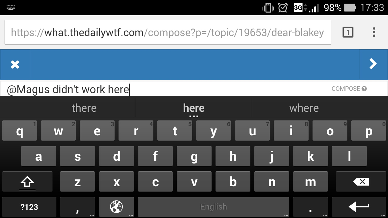
@Magus If he wants to do that, then he's welcome to make himself look like an idiot ;)
-
@blakeyrat said in Dear @blakeyrat. I fixed the css. Signed The Desktop View:
Look, the bug is simple: I am on a desktop computer. It has desktop computer capabilities. It is not a low resolution device. It does not have a touchscreen, or an on-screen keyboard. I don't want to see a version of the site optimized for a low resolution device and a touchscreen, as that does not apply to me.
You cockhole, you reduce the viewport size to the point that it kicks in to a mode adapted to that, and you just bitch and refuse to make your window the tiniest bit larger so you can keep lying about "mobile view".
-
@blakeyrat said in Dear @blakeyrat. I fixed the css. Signed The Desktop View:
I'm not maximizing a browser window regardless.
Just make it 3 pixels larger in width. Problem solved.
-
@Polygeekery if he gets to this size using a windows shortcut he is right about being annoyed, and your point goes moot. its annoying to manually resize it all the time
-
@fbmac said in Dear @blakeyrat. I fixed the css. Signed The Desktop View:
your point goes moot.
The proper term is "moo". As in, "Your point is moo".
-
@Polygeekery It's like a cows opinion. It doesn't matter.
-
@loopback0 said in Dear @blakeyrat. I fixed the css. Signed The Desktop View:
It's like a cows opinion. It doesn't matter.
Not unless it is about the best way to properly prepare veal.
-
@Polygeekery said in Dear @blakeyrat. I fixed the css. Signed The Desktop View:
Just make it 3 pixels larger in width. Problem solved.
Not necessarily. That works if he's always 3 pixels away from the point it changes.
Snapping the browser to half the window also retardedly causes mobile view - and the only way to make that wider is to unsnap it.I get that people enjoy arguing with blakey - but he's right here - this is stupid behaviour. Even Discourse got it right.
-
This post is deleted!
-
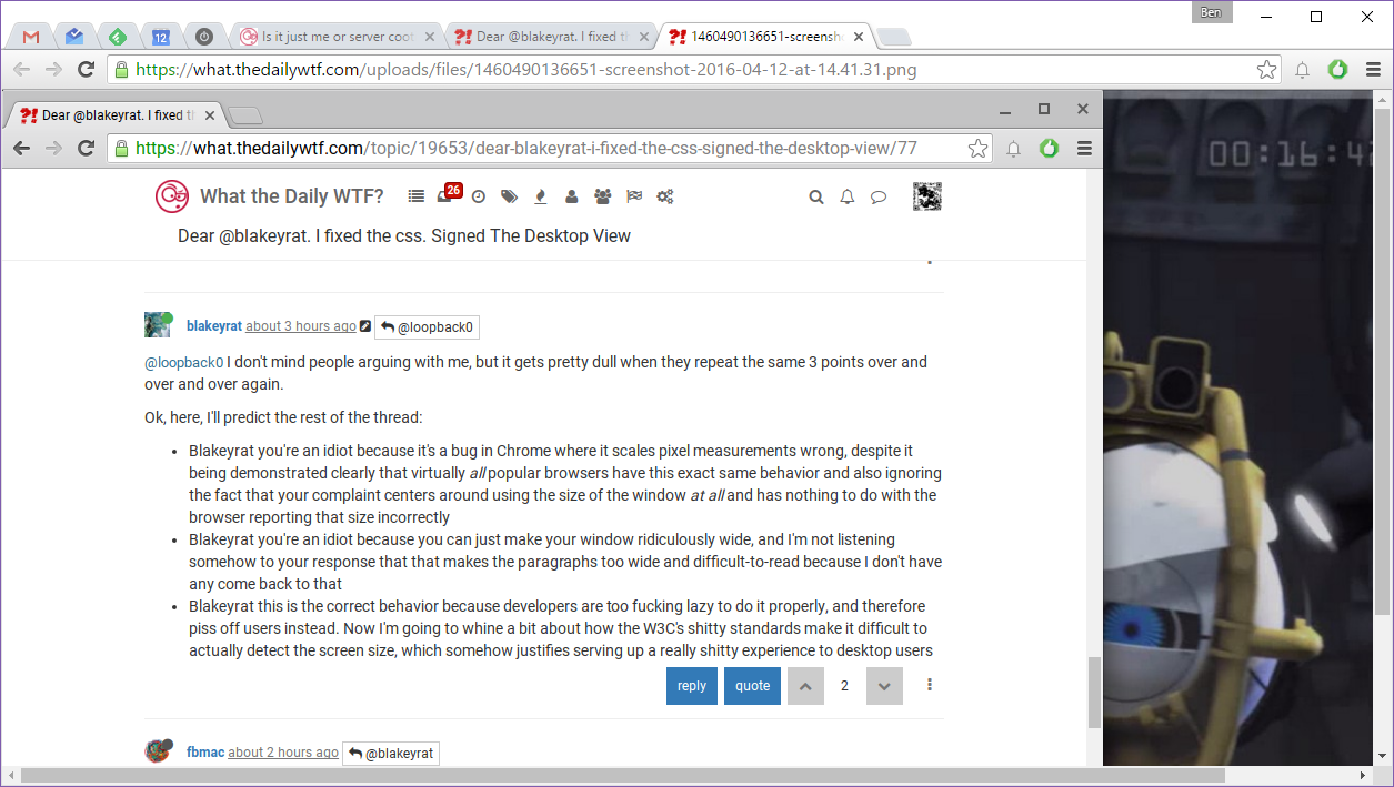
@loopback0 I don't mind people arguing with me, but it gets pretty dull when they repeat the same 3 points over and over and over again.
Ok, here, I'll predict the rest of the thread:
- Blakeyrat you're an idiot because it's a bug in Chrome where it scales pixel measurements wrong, despite it being demonstrated clearly that virtually all popular browsers have this exact same behavior and also ignoring the fact that your complaint centers around using the size of the window at all and has nothing to do with the browser reporting that size incorrectly
- Blakeyrat you're an idiot because you can just make your window ridiculously wide, and I'm not listening somehow to your response that that makes the paragraphs too wide and difficult-to-read because I don't have any come back to that
- Blakeyrat this is the correct behavior because developers are too fucking lazy to do it properly, and therefore piss off users instead. Now I'm going to whine a bit about how the W3C's shitty standards make it difficult to actually detect the screen size, which somehow justifies serving up a really shitty experience to desktop users
-
@blakeyrat said in Dear @blakeyrat. I fixed the css. Signed The Desktop View:
also ignoring the fact that your complaint centers around using the size of the window at all
IMO there is a window horizontal size too small for showing the preview at any device, and the number of characters that can be displayed in a line is the best thing I could think of (with a way to force it maybe)
-
@blakeyrat you're not an idiot, so I don't understand why you refuse to work around this broken behavior until it gets unbroken, by choosing 50% page zoom along with 250% text zoom.
-
@blakeyrat said in Dear @blakeyrat. I fixed the css. Signed The Desktop View:
@The_Quiet_One said in Dear @blakeyrat. I fixed the css. Signed The Desktop View:
That's what gets me about this. We're talking about all these workarounds like userscripts and installing third-party addons when the obvious and easiest workaround is to JUST RESIZE YOUR FUCKING WINDOW.
Tell me how to resize my window without creating ridiculously-wide paragraphs.
The answer is you can't until your issue is fixed. I get it. You want NodeBB to use a desktop layout on your screen regardless of your window size. I want Skittles to bring back the lime flavor. Life sucks. Bitching at everyone who can't magically fix your problem perfectly is pointless.
So, that means you're left with a few admittedly non-ideal options. Either you do what Lorne Kates suggests or you simply change your window size so that it uses the desktop layout. That's it. We're not genies. We can't grant your every wish perfectly. These workarounds have drawbacks. Lorne Kates' workaround is a hack that involves installing browser addons which override the CSS delivered by the server. My workaround is a hack that involves resizing your window. That's all we've got.
@Lorne-Kates said in Dear @blakeyrat. I fixed the css. Signed The Desktop View:
The window size is a variable you can't change. @blakeyrat has said the windows are a particular size, and some people have (most likely correctly) guessed that it's because that's the way the OS sizes them in some sort of tile layout.
A tile layout he's opting-in for. If this is Windows we're talking about, browser windows are ALWAYS able to be resized (assuming there's no modal dialog in the way). I'm not saying my workaround is "good" but it's no better or worse than your solution. Your solution is good if he under no circumstances wants to resize his window. (Yes, I said "wants", not "is able to" because unless he has some stupid window utility that prevents him from resizing his windows, it's all under his will-power to resize his window). My solution is good if he under no circumstances wants to go through the trouble of setting up addon software to override the CSS on the forum.
Either opinions are valid. But he clearly wants a solution that requires him to do nothing, which is about as useless and counterproductive as honking at all the traffic in front of your car to make the traffic jam magically disappear. All it does is annoy the shit out of everyone who's in the same exact situation.
-
@The_Quiet_One said in Dear @blakeyrat. I fixed the css. Signed The Desktop View:
But he clearly wants a solution that requires him to do nothing
Yes. Also known as fixing it.
-
Here's the browser width that @blakeyrat is using:
Here's the minimum browser width to not have the mobile view:

-
@ben_lubar I feel like more sites should progressively remove features. Like, if I have a widescreen view in Discourse, it'd be lovely if the whole menu thing became a sidebar, because the gutters are just too big. At half the screen maybe tighter gutters; at a quarter, maybe I want the preview above the composer instead of beside it. At tiny resolutions, I probably want a full-on phone UI. After all, wasn't that the whole point of responsive design?
But Bootstrap encourages you to just put in "xs" and "normal" :/
-
@The_Quiet_One said in Dear @blakeyrat. I fixed the css. Signed The Desktop View:
So, that means you're left with a few admittedly non-ideal options. Either you do what Lorne Kates suggests or you simply change your window size so that it uses the desktop layout. That's it. We're not genies. We can't grant your every wish perfectly.
That's fine; but that's not what's happening on this forum.
What's happening on this forum are people are going way out of their way to tell me how wrong I am at every possible occasion. Even when I am not wrong.
I'm not expecting NodeBB to magically fix itself; I filed the bug, it's going through whatever process filed bugs go through. I get that. But even as I was filing the bug, the person on this forum most responsible for fixing bugs (BenL) was adding comments telling me how wrong and stupid I was.
I'm more encouraged by Lorne's statement that the NodeBB devs are actually fixing the CSS to enable us to add a toggle, but I have no idea where he got that information, I have no corroborating information, and I suspect he pulled it out of his ass.
@The_Quiet_One said in Dear @blakeyrat. I fixed the css. Signed The Desktop View:
Either opinions are valid. But he clearly wants a solution that requires him to do nothing,
The bug is on the server. As I stated previously in this thread, there is nothing I can do on my personal computer that can fix the server.
-
@ben_lubar Hey Ben L, remember a bit ago when you told us that paragraphs were shorter in "desktop" mode because the avatar icons shifted to the left?
That statement would have had a lot more weight if you hadn't just posted two screenshots demonstrating that it was COMPLETELY WRONG. The right-padding disappears in desktop view and the paragraphs are, at best, the exact same width (a.k.a. too fucking wide.)
-
@Yamikuronue said in Dear @blakeyrat. I fixed the css. Signed The Desktop View:
But Bootstrap encourages you to just put in "xs" and "normal"
Bootstrap actually defines four sizes of device/screen (
xs,sm,md, andlg); it's just lazy devs only use two.Disclaimer: I'm currently building a website that recognises five different sizes (the Bootstrap four and
xl), simply because even Bootstrap's widest layout isn't wide enough for some purposes
-
@ben_lubar Yeah, proof that this is stupid. 60% of a screen is mobile view?
 this is the worst design I've ever seen.
-
@Magus I took that screenshot on a netbook. Here's what it looks like on my desktop's browser window size:
-
@ben_lubar So? If I can't use windows on my PC that has a built in side docking system without it magically becoming a featureless blob of awful, it's badly designed.
I get that you all know that windows can be made fullscreen, and that some people even do that. But making your site only work that way is completely broken and wrong.
Do you not understand the problem? Do you really not think this is a bug?
-
@Yamikuronue it'd also make sense if it did some things based on viewport height, not just the width. For instance... making the editor the entire height of the viewport should be based on how high the viewport is, not how wide it is.
Currently, you can take a perfectly good desktop-sized window and decrease its width (not changing its height, though) and instead of just hiding the preview pane at some point to make more horizontal space for the post, the composer jumps and takes over the whole viewport. That's dumb.
Then you also have the problem that the low-res mode looks so drastically different from the full-res mode. That's another issue.
-
@Magus I think you're missing the main point here, which is that 99% of the things still work exactly the same way. The remaining 1% is that the composer uses a different layout. Because the side-by-side layout won't fit on low-width windows.
-
@ben_lubar said in Dear @blakeyrat. I fixed the css. Signed The Desktop View:
@Magus I think you're missing the main point here,
No. The only one missing the point is you. On a desktop PC, no one ever wants mobile. No one. If you think it is ever acceptable to force this, you are beyond stupid. That is the only point that matters.
-
@ben_lubar only flaw in your argument is your definition of low width.
also last time I cared to check, it's impossible to change settings while on a phone.
-
@Magus what, is NodeBB telling you to download the app or something?
The mobile view is just a slightly slimmed-down layout. It's exactly the same content.
-
@ben_lubar said in Dear @blakeyrat. I fixed the css. Signed The Desktop View:
the side-by-side layout won't fit on low-width windows.
It's switching to "mobile" long before it reaches low width windows.
-
I need to go see if I can put my phone sideways and use desktop mode on my phone, because this stupid logic you all profess says 'yes'.
-
-
OH LOOK, putting my HD PHONE sideways does not put me in desktop mode, despite having the same resolution. Which is sane behavior.
JUST MAKE THE DESKTOP ONE WORK LIKE THAT.
-
@Magus it's not "mobile" or "desktop" mode. It's entirely dependent on the viewport width.
It actually makes sense, and the overall design except for the post editor seems to handle it pretty well here. Unfortunately, the editor is a big part of the forum and having it work well should be kind of non-negotiable.
-
@anotherusername said in Dear @blakeyrat. I fixed the css. Signed The Desktop View:
@Magus it's not "mobile" or "desktop" mode. It's entirely dependent on the viewport width.
False.
-
@ben_lubar said in Dear @blakeyrat. I fixed the css. Signed The Desktop View:
Because the side-by-side layout won't fit on low-width windows.
It'll fit in a window that's 992px wide, which is the switching point, and not an unreasonable width for a desktop window.
@Magus said in Dear @blakeyrat. I fixed the css. Signed The Desktop View:
OH LOOK, putting my HD PHONE sideways does not put me in desktop mode, despite having the same resolution.
The screen may be high resolution, but the viewport (which is what CSS uses) will be narrower. I can't say how narrow exactly, as it's device-dependent, but a viewport pixel will be (somewhere in the region of) two device pixels.