Some proposed Discourse improvements for TDWTF
-
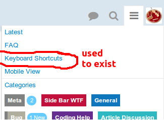
Bug: Help menu should be available in both edit and non-edit scenarios
Expected: Pressing the universal help key while editing a post should provide context-sensitive help on keyboard shortcuts
Actual: An odd glyph is entered into the edit window, some form of curved line with a dot under it. I think it might be one of those high-byte Unicode things.
-
An odd glyph is entered into the edit window, some form of curved line with a dot under it.
Testing:
?
Confirmed on Chrome 34 on Linux.
-
I think there is an important false assumption that @codinghorror is making: that pages have to be short.
Community Server, like most forums, shows 50 posts per page. But 4chan, for example, has threads that have over 700 posts with 100-200 images, all on a single (static) page, and they work perfectly fine in every computer I've tried. It's like reading a thread with infinite scrolling, except you have a working scrollbar and jumping to any point of the page is completely instantaneous.
So even if you really wanted with infinite scrolling, I don't see why you would ever keep less than 500 posts loaded at any time.
...and now I tried disconnecting my computer from the internet and scrolling through a thread to see how many posts Discourse kept, for reference, and noticed the posts still "load" fine after showing the loading spinner. Just where exactly are you loading them from?! What's wrong with keeping them in the page as standard HTML elements?
TL;DR make scrolling one order of magnitude faster and people will probably complain less.
-
Compare the Infinite Scrolling here to something like Never Ending Reddit (part of the RES addon).
I appreciate it's not a perfect comparison because it's a list of unrelated items rather than a continuous thread but it works very well.
It loads the first 25 posts, you scroll to the bottom, it loads the next 25 while leaving what it's loaded previously in the browser. It doesn't fill the History with the URL for each post, the scrollbar continues to function exactly as you expect it to, it handles 1000+ posts without issue, and Ctrl+F still works perfectly for search. It's also completely optional.
If you're dealing with loading/unloading X number of posts each time someone scrolls down/up then it doesn't seem like a huge leap to load a user configurable number like 25/50/100 each time. Once you're there, it's a much to implement the option for more traditional pagination for users who want it.
-
My concern is for the discoverability of functionality which is only exposed via keyboard shortcuts
That will not be the case for this feature, though, so this line of discussion is kind of irrelevant. See my previous post in this topic for the mockups. (Or filter to my posts -- click my avatar, click, filter posts)
-
Location field is now present in your profile:

We need to surface it on the user card properly, but it is there as requested.
-
That will not be the case for this feature, though, so this line of discussion is kind of irrelevant.
I'm not sure if you're just intentionally missing the point to be difficult, or whether you actually can't figure out that the feature isn't the issue here. In the interests of addressing the actual problem (which is to say hiding functionality behind keyboard shortcuts that mobile users can't even use,) let's substitute this feature:
Sounds like an interesting idea for a keyboard shortcut possibly,
-
There will (eventually) be a mouse click way to do it as well, per the post I linked you to. So what is the concern, again?
-
The concern is the keyboard-centric approach that seems to pervade development across multiple features. The quote in my post you just replied to has nothing to do with the feature covered by the post you linked to. It's an entirely different feature request, which perfectly illustrates the real point - there are, relatively speaking, a lot of features where the approach seems to be "make it a keyboard shortcut."
The fact that the enhancement to thread navigation is going to be clickable is nice (just figured I'd explicitly acknowledge that in case you think I'm still oblivious to the fact); it's the attitude of "make a hotkey" across multiple features which concerns me, especially in an era when so many devices don't have keyboards.
-
Trip report:
- Opened browser.
- Typed 'github.com' into the address bar
- Page loaded.
- Pressed ?
- Result:

No help!
-
Maybe you have the wrong universal help key on your keyboard? I can't press F17 properly ever since I got rid of my VT200 terminal.
-
Have you tried pressing F12and 5 at the same time?
-
-
Firefox 29.0.1 on Windows 7. The URL doesn't change while scrolling here, either.
-
The URL doesn't change while scrolling here, either.
I've seen this when cached JS from a prior deploy is still in effect. In fact I'm getting it right now (again).Sigh, this is a bug. Has to do with entering a topic at
/lastvia suggested topics. Repeatable here, on meta, on try, etc. Sorry, We will fix. cc: @ben_lubar
-
Question mark is a really standard convention for this. Humor me. Try pressing ? on Twitter, GitHub, Gmail, etc..
Wow. Talk about the problem with discoverability. I use GMail since its early beta days and never saw that page. In other words this is the method by which I should discover functionality? I'd say it's a good thing that most of Gmail works fine without those shortcuts.
-
By the way @codinghorror....


Everybody, please revise your "Discoverability" arguments.
I'd enjoy the link back.
-
I have absolutely never used those menus in twitter and gmail. I've gone into twitter settings, maybe 3 times; for Gmail, maybe once.
I am tweaking my discoverability argument, but definitely not revising it.
-
Only way to allow for this feature would be to provide another super intuitive way to mark a topic read.
Yes, please.
- A "mark topic read" button in the to-be-done progress bar popup
- A "mark read until here" button for each post
- (Should this button appear for "read" posts as well so you can "unread" or "rewind" a topic?)
- An indication of the "reading position" (Is the current post in the "read" or "unread" part of a topic?)
-
a keyboard shortcut to jump to arbitrary post numbers (or "pages", whatever we define that to mean) in a topic
Here's the current spec for this change. TL;DR expansion on click or tap
-
Here's the current spec for this change.
Wow, that spec is more complete than Markdown's!
-
expansion on click or tap
Don't roll up everything behind yet another click.It'a fashionable to do that these days for that "clean UI look", but STOP IT.
-
There's always home and end keys.
And to move to top, you can click or tap the title of the topic, too.
-
Don't roll up everything behind yet another click.
It'a fashionable to do that these days for that "clean UI look", but STOP IT.
I agree. Especially since that kind of thing tends to take a split second longer on mobile devices, during which time you're left wondering if you tapped in right spot.
-
OK, the final part of this is now deployed -- move to arbitrary post number.
-
This post is deleted!
-
But 4chan, for example, has threads that have over 700 posts with 100-200 images, all on a single (static) page, and they work perfectly fine in every computer I've tried. It's like reading a thread with infinite scrolling, except you have a working scrollbar and jumping to any point of the page is completely instantaneous.
No wonder this all reminded me of 4chan... infinite scrolling, people trolling with nothing but images in their posts....
Filed under: Whhhhhhhhhhhhhhhyyyyyyyyyyyyyyyyyyy
-
Good, but needs more contrast.
-
I am not sure the green bar response count needs to be there if you are going through with this widget thingy.
I was always confused my the green bar thing. I would expect it to take me to the next block of messages below what I am currently reading. Maybe you have some preference controls for the green thing but I haven't looked and it hasn't jumped out at me.
I like discourse the way it is. Endless scroll is ok (there I said it).
I made a mock-up for you (below). It may or may not be interesting to you. I would say if you are considering this as an option then make one or the other show. big widget minus green thing, or green thing minus big widget.
One last thing... I can see this being useful for handicapped people or visually impaired (accessibility is always a nice thing for our handicapped forum friends).

(Note: I thought I was on meta discourse when I posted this...I am going to scurry back to safety now).
-
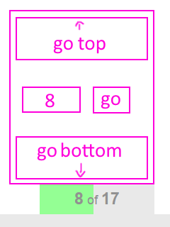
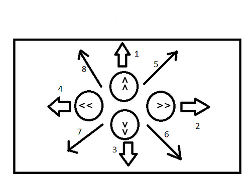
Where would the < and << (and > and >>) buttons go, out of interest?
-
Holy. fucking. shit.
I don't care about scrolling at all. But how did we get allllll the way to here:
from here?

How?
Filed under: I have a great idea for a bicycle with no handlebars
-
Ha...I'm not sure. I just looked at his widget and it sparked the standard pagination stuff. All you want is this scroll bar? I can see that being a problem in some discourse situations. On topic+topic comments it might work.
So here was my thinking:
Home and End is specific to the current page you are on.
if there are more than 25 comments in the convo, then > pagination kicks in and >> takes you to the end of convo
then the reverse arrows << and < are obvious.
and the 2 and go button will take you to group 2 which start and comment 50 (if grouped by 25).
Filed under: Maybe I run with widgets before I fully understand what I am doing.
-
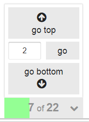
Ok then. How about something like this?
-
You're a funny man, Frank.
-
I just looked at his widget and it sparked the standard pagination stuff. All you want is this scroll bar?
To be fair, I know exactly how we got here (since it's the sum total of about 80% of the posts on the forum to this point). So my question was somewhat rhetorical, and was much less about your specific edits than about the result as a whole.
I just figured the insanity would have tapered off by now. But since it hasn't, and it might even be getting somewhat worse, it seemed like it might be a good time to have (another) reminder: occasionally, the right thing to do is to take a step back, set fire to whatever contraption you're building, and go grab a beer while it slowly burns to the ground.
-
Well, why don't we skip the widgets and go straight to something everyone can get behind.

-
-
@subscript_error ..I have coded myself into corners before (its embarrassing). I can't think of anything more painful than doing that other then spawning multiples of that same application to throw you into unending maintenance hell (I have done that too)... Luckily I respond 'vigorously' to pain and make better applications as a result (sometimes).
-
Filed under: I have a great idea for a bicycle with no handlebars
The Complicator's Gloves

Good software is constantly under attack on several fronts. First, there are The Amateurs who somehow manage to land that hefty contract despite having only finished "Programming for Dummies" the night before. Then there are The Career Amateurs who, having found success after that first contract...
Filed under: Really, no OneBox™?, Damn, he beat me to it.
-
Did I understand this correctly... they're offering pagination to us at last?
-
I just figured the insanity would have tapered off by now
For a big community change, it's 60 - 90 days -- it certainly was on bbs.boingboing.net.Change is hard in communities. Square of the number of active users, times the number of years they've been using their current software.
-
..multiplied by the number of systems that use the same functionality you're trying to get us all to unlearn. Some of us have been haunting forums for a number of years - and that's a lot of learned behaviour to put aside.
Still, as much as I'm not a fan, this isn't nearly the WTF of implementation one site I know uses.
-
Square of the number of active users, times the number of years they've been using their current software.
And you get the amount of days?2020~5 = 2,000 days and that's lowballing it!
Ok, so we'll never hear the end of it, if Jeff's Topic Persistence Theorem holds up.
-
-
Who said the resulting unit was days, though?
I was thinking it's more like a number that represents "force of resistance to change".
We'd have to calculate..
-
I was thinking it's more like a number that represents "force of resistance to change".
Sounds like alternative mathematics to me.
Filed under: Homeomathy
-
Sounds like alternative mathematics to me.
Filed under: Homeomathy
-
Well, why don't we skip the widgets and go straight to something everyone can get behind.
It's all fun and games until someone tries to play an FPS with it.
-
It's all fun and games until someone tries to play an FPS with it.
Same goes for all gamepads. Seriously, how do people manage to play FPSs with those thumby-thingies?
-
BTW, That controller you see is your standard Atari Jaguar controller. Some say it is the worst design of all contollers. It had 17 buttons the pro pad had an additional 5 buttons (I should have posted that one).
I never played the Jaguar system so I have no first hand knowledge. I actually never saw one in real life.
I did read that the Jaguar was the last Atari console produced before the company, reverse merged and then spun off to Hasbro.
