Goddamit, Gmail
-
@blakeyrat said:
And change for the sake of change is not a bad thing, as long as it doesn't become worse.
FWIW I'm with blakeyrat on this one.@boomzilla said:
If change makes something better, then it's not change for change's sake.
What if what you've changed neither makes things better nor worse for whatever measures of quality you have? Or do you lump "variety" and "aesthetics" with "better"?
-
@boomzilla said:
If change makes something better, then it's not change for change's sake. Possibly, it doesn't make things worse (maybe rounded vs sharp corners), but it seems like this must be something extremely trivial. Therefore you're an idiot or a troll.
At the risk of replying to Boomzilla, who is the WORST, here goes:
When you say "better" or "worse" in the field of usability, you mean "as applied to the largest number of users." If you make Git, which is great for an extremely tiny subset of users but awful for everybody else, you've made a program with shitty usability. Similarly, if you re-arrange the controls in a way that frustrates RobFreundlich but makes the form easier to fill-out for 80% of users, then you've made a net gain in usability.
I'd also say that while there's nothing wrong with muscle-memory, there's also a danger of stagnation. The longer your program goes without changes, the more painful the changes will be when they finally occur. In the extreme cases (say, the Linux CLI) it becomes impossible to change the program because it's impossible to get enough buy-in, even if the change would be a hugely positive one for all users. And you're stuck with the shitty experience until the end of time.
-
@mott555 said:
@Ragnax said:
(Shifting into 5th is pretty much reserved for roads outside the city. You'd be nowhere near the optimal speed to switch to 5th when driving within city limits unless you were seriously breaking traffic regulations...)
My last pickup truck had a manual transmission, and the slowest practical speed in 5th gear was around 30 mph. The annoying blinking shift indicator came on at 35 mph if it was in 4th.
I've got a 4-cylinder and the automatic transmission will shift into overdrive around the same speed, just so long as I'm not accelerating.
-
@blakeyrat said:
At the risk of replying to Boomzilla, who is the WORST, here goes:
I'd be very sad if your opinion of me ever changed. Confirmation of the righteousness of my path always makes my day a little bit better.
@blakeyrat said:
I'd also say that while there's nothing wrong with muscle-memory, there's also a danger of stagnation. The longer your program goes without changes, the more painful the changes will be when they finally occur. In the extreme cases (say, the Linux CLI) it becomes impossible to change the program because it's impossible to get enough buy-in, even if the change would be a hugely positive one for all users. And you're stuck with the shitty experience until the end of time.
I can see this as a psychological tool. And of course, dicking your users around softens them up for future dicking. I will also concede that there's probably a sweet spot between Steve Jobs and unix like systems.
-
Blakeyrat is now able to admit that some people have differents needs and loke differents interface.
Next time, maybe even he will admit he have no fucking idea whether people prefer CLI or graphic interface, for the simple reason that almost every user just never got in touch with the non mainstream options.
Now, I believe that the "stagnation" is a big bullshit. People aren't that slow to change their interface when you propose them something that is easier to use. For example, it's not like a lot of people don't use tab in browser because they are not accustomated to them. Most people tried tab navigation, a good portion of thoses loved it, and it have stuck.
-
remember that any change breaks someone's workflow
-
@blakeyrat said:
If you make Git, which is great for an extremely tiny subset of users but awful for everybody else, you've made a program with shitty usability.
Considering there's only a tiny subset of world+dog for whom git is aimed, rather than anyone who uses a computer as you imply, this makes your observation a non sequitur.
Just because you don't know how to use a command line doesn't automatically make you part of the majority to whom git is aimed.
-
@TheLazyHase said:
Blakeyrat is now able to admit that some people have differents needs and loke differents interface.
Huh?
@TheLazyHase said:
Next time, maybe even he will admit he have no fucking idea whether people prefer CLI or graphic interface, for the simple reason that almost every user just never got in touch with the non mainstream options.
Wha? I have never been so lost and confused while reading a post...
@TheLazyHase said:
Now, I believe that the "stagnation" is a big bullshit. People aren't that slow to change their interface when you propose them something that is easier to use. For example, it's not like a lot of people don't use tab in browser because they are not accustomated to them. Most people tried tab navigation, a good portion of thoses loved it, and it have stuck.
But tabbed browsing would never have come about in a stagnant project, by the definition of "stagnant" I'm using here. So your example doesn't make the case.
Also the tabs should be in the window manager, like on BeOS which got this so, so, so right-- not each individual application doing it on its own. But sigh. I guess that ship has sailed by this point.
-
@PJH said:
Considering there's only a tiny subset of world+dog for whom git is aimed, rather than anyone who uses a computer as you imply, this makes your observation a non sequitur.
@PJH said:
Just because you don't know how to use a command line doesn't automatically make you part of the majority to whom git is aimed.
The majority never use a CLI, ever. I think it's safe to say the majority don't even know it exists.
Git is aimed at a tiny minority, at best. Or as I said in that linked post:
@myself said:
Their target base is actually, "software developers who use the CLI and think exactly like Linux Torvalds who need to track revisions of documents".
-
@blakeyrat said:
The majority never use a CLI, ever.
The majority don't use a desktop or laptop either. Not that that means all that much.Restricting to the set of people who do software development (given what the target audience for any SCM is) gets a saner comparison baseline.
-
@blakeyrat said:
@RobFreundlich said:
If the controls change order, or buttons change behavior, or whatever, I have to struggle until my unconscious learns the new patterns. I'd call that a bad change, unless there's a compelling reason to make it.
You seem to be forgetting the "as long as it doesn't become worse" part of my sentence there. You even quoted it.
Good point. But you still haven't identified here (or in any subsequent posts so far, as far as I can tell), when change for change's sake alone isn't bad. Later on, you identify preventing stagnation (so not for change's sake alone), and improvement for the majority of users (which, again, isn't change for its own sake).
In fact, the reason I chose this example, in spite of your "as long as it doesn't become worse" qualification, is precisely because any change for its own sake WILL make things worse BECAUSE users expect a solid, unchanging UI. You must have a good reason beyond "change's sake" to overcome that, or else your change is bad.
-
The majority don't use a CLI because they never have a CLI on hand, and don't feel the need to try it out. When they do, there is quite an high % of conversion. By the way, the "innovation" of gmail we talk of are about as novel as a CLI. Would you accept if windows suddenly switched to CLI interface because it's new ? Cause that's about what's happening. Something work, and it's replaced by something which is different, not exactly innovating, not exactly easier to use, but different. I don't want to use that, like you don't want to use CLI.
It's like the majority of american and european don't have an opinion on automatic vs manual transmission because they never have used the other one. They aren't interested in switching either, because it work and the switch don't seem to have much additional functionality (in both sense : I believe automatic don't consume more fuel than manual and don't break more often, so switching to manual seem useless, and manual is not hard at all to use once you know how, so switching to automatic seem useless)
-
@Zecc said:
@blakeyrat said:
And change for the sake of change is not a bad thing, as long as it doesn't become worse.
FWIW I'm with blakeyrat on this one.@boomzilla said:
If change makes something better, then it's not change for change's sake.
What if what you've changed neither makes things better nor worse for whatever measures of quality you have? Or do you lump "variety" and "aesthetics" with "better"?Change for aesthetics is not change for change's sake - it's change for the sake of aesthetics. As for whether it's better or worse, show me the visuals before and after the changes, and let me use the app in depth before and after the changes, and I'll answer you then. All other things being equal, I put usability above aesthetics, but if the usability hasn't changed, and I like the look better after the changes, then I'll call it a good change. Unfortunately, aesthetics are highly subjective, so my "better" may be your "worse". They're also subject to fads, which makes it hard for an app to keep up, whereas if it sticks with a look that is decent and doesn't follow the fads, it probably can't go wrong. At least for me. But then again, I've been wearing jeans and solid-colored T-shirts to work for the last 20 years, regardless of fashion trends, so YMMV.
As for variety, well, that's just another way of saying "change for change's sake", so I don't see it as relevant.
-
@blakeyrat said:
When you say "better" or "worse" in the field of usability, you mean "as applied to the largest number of users." If you make Git, which is great for an extremely tiny subset of users but awful for everybody else, you've made a program with shitty usability. Similarly, if you re-arrange the controls in a way that frustrates RobFreundlich but makes the form easier to fill-out for 80% of users, then you've made a net gain in usability.
This is why I'm a big advocate of user options. I know all of the arguments against them, and I know that providing them at the granularity necessary to let me have my controls stay in the old order while new users get them in the new order would be ridiculously complex, but following guidelines like "when you remove functionality, make an option to retain it", and "slowly phase in or out changes instead of doing them wholesale", and "if a reasonable number of users might want feature X to do A, and a reasonable number might want it to do B, make it an option", you can make your UI a lot more usable to a lot more people. That increases the overall "better" factor.
Another principal/guideline to follow is to really understand your user base before making changes, and to use your own app a lot before making changes. I don't personally use GMail, so I don't have the experience to agree/disagree with Lorne (although at a glance, the UI looks like I wouldn't like it).
However, the latest Google Maps for Mobile rollout has a lot of usability problems, some of which are clearly change for change's sake (or coolness factor, or something), and were clearly not field tested in any reasonable way. And in a lot of cases, the changes they made and the things they pulled out could easily have been made into options, but they chose not to do so.
@blakeyrat said:
I'd also say that while there's nothing wrong with muscle-memory, there's also a danger of stagnation. The longer your program goes without changes, the more painful the changes will be when they finally occur. In the extreme cases (say, the Linux CLI) it becomes impossible to change the program because it's impossible to get enough buy-in, even if the change would be a hugely positive one for all users. And you're stuck with the shitty experience until the end of time.
Interesting idea. Not exactly change for change's sake, but more like change in preparation for future unknown-now-but-likely-necessary changes. I don't think stagnation is a problem per se (see earlier comments about jeans and T-shirts. I also like rectangular Win95/XP buttons and battleship gray dialogs), but if your UI is bad and you know you'll need to change it to fix things, I can see making some preliminary changes that don't necessarily have much impact but set up for the later ones.
-
@blakeyrat said:
@Zecc said:
I interpreted your "Welcome to 1994" as an indication that you thought the paperclip icon was outdated. But I have since seen I may have misinterpreted.Situation: you have on your clipboard the path to the file you want to attach. Maybe it came from a log file, maybe it was written in an email from one of your co-workers, whatever.
Then you use the Attach button, which still exists. Duh.
-
@RobFreundlich said:
Alrigth, I'm going to cut my losses and concede that you're right. It's hard to think of an example of a perfectly neutral change, as at the very least people's habits are messed with and that lands it back smack into the "worse" field.Change for aesthetics is not change for change's sake - it's change for the sake of aesthetics. As for whether it's better or worse, show me the visuals before and after the changes, and let me use the app in depth before and after the changes, and I'll answer you then. All other things being equal, I put usability above aesthetics, but if the usability hasn't changed, and I like the look better after the changes, then I'll call it a good change. Unfortunately, aesthetics are highly subjective, so my "better" may be your "worse". They're also subject to fads, which makes it hard for an app to keep up, whereas if it sticks with a look that is decent and doesn't follow the fads, it probably can't go wrong. At least for me. But then again, I've been wearing jeans and solid-colored T-shirts to work for the last 20 years, regardless of fashion trends, so YMMV.
As for variety, well, that's just another way of saying "change for change's sake", so I don't see it as relevant.
I don't know why I have this stupid habit of trying to play the devil's advocate.
-
@Zecc said:
@blakeyrat said:
@Zecc said:
I interpreted your "Welcome to 1994" as an indication that you thought the paperclip icon was outdated. But I have since seen I may have misinterpreted.Situation: you have on your clipboard the path to the file you want to attach. Maybe it came from a log file, maybe it was written in an email from one of your co-workers, whatever.
Then you use the Attach button, which still exists. Duh.
You assumed? Quit making shit up! All he said was welcome to 1994, so the only thing we know with certainty is that Blakeyrat does not know the current year.
-
@TheLazyHase said:
The majority don't use a CLI because they never have a CLI on hand, and don't feel the need to try it out. When they do, there is quite an high % of conversion.
[Citation needed]
-
@joe.edwards said:
All he said was welcome to 1994, so the only thing we know with certainty is that Blakeyrat does not know the current year.
Not even that. Are we sure which calendar he's using? How long is a lizard person's year, anyway?
-
I know I'm late to this topic, but my new job uses Gmail for company email accounts and holy crap this is bad stuff. Need to forward an email? No button! I ended up hovering over all the buttons to read the tooltips, wasting a good minute of time, then finally finding it buried in a submenu. So the forward comes up, and the subject was missing. I had to go digging to find the "Edit Subject" button. And then the email shows in some kind of box on the bottom right, like it's a chat menu? WTF? I'm not chatting, I'm sending a business email! And as pointed out in the OP, the form is confusing, lacks traditional labels, and looks awful.
I'm used to Yahoo! Mail. And though it always suffers AJAX timeouts and slow loading, I find it very easy to use and very easy to find stuff. On Gmail it seems they hide every single thing I actually need and I end up searching and digging.
At least, though hidden, the functionality still exists. They could have gone the Apple route and taken it completely out. "The removal of the subject line is a great new feature! Seriously, if you were to get an Android device they'd still be giving you subject lines, and why would you want that? All hail the great Jobs!"
-
@mott555 said:
On Gmail it seems they hide every single thing I actually need and I end up searching and digging.
I hardly ever use gmail and every time I have to reply (twice a year, maybe), I can't find the reply button because it's not on the toolbar. It's the light-grey-on-white button in the top-right corner of the email's body. The reply-like button that is on the toolbar takes you back to the inbox. So does clicking on "inbox". Which is nearly next to it.
So I clicked the Reply button, and it said BEEEPP WRONG DUMBASS LOL and with a massive black overlay pointed out with confusing widgets that I was supposed to click a textbox that seemed to be purposely hidden from me, being white and a light grey border.
Google doesn't know what UX or usability is. That entire body of knowledge and insights is hidden from them. My cat has a greater chance of discovering the minds and intentions of other human beings than the people working on Gmail.
-
@dhromed said:
Google doesn't know what UX or usability is. That entire body of knowledge and insights is hidden from them. My cat has a greater chance of discovering the minds and intentions of other human beings than the people working on Gmail.
This is undeniably true.
-
@mott555 said:
I know I'm late to this topic, but my new job uses Gmail for company email accounts and holy crap this is bad stuff... as pointed out in the OP, the form is confusing, lacks traditional labels, and looks awful.
The really sad part about all that is that Gmail used to be the best webmail service available, hands down, bar none, no contest, paid services included. Then they let some Metro-wannabe designer give it a gratuitous makeover, and now it's just hideous and irritating.
I have been avoiding needing to put up with the new bleeding-into-the-dirty-gym-sock color scheme and general fucked-upness of the interface as a whole by using this user style, but the "new compose experience" is just beyond repair.
I really, really don't want to have to fuck around with maintaining an email server just so I can have tolerable webmail. Outlook.com is even uglier, if that's even possible, so that's out. Yahoo is a flaky heap of shit. GMX is overrun by spammers and spends more time blacklisted than not. Which, near as I can tell, leaves only the paid services. Should I try fastmail or hushmail first? Or does anybody do it better than one of those two?
-
@flabdablet said:
Outlook.com is even uglier
You can make Hotmail slightly tolerable with a certain someone's [url="http://userstyles.org/styles/75248/trying-to-fix-hotmail-metro-style-outlook-com"]userstyle[/url]. Slightly, but not much.
@flabdablet said:
Or does anybody do it better than one of those two?
........ Swampy Sendmai *takes unfunny bullet to the head*
-
@Lorne Kates said:
@flabdablet said:
Outlook.com is even uglier
You can make Hotmail slightly tolerable with a certain someone's userstyle. Slightly, but not much.
@flabdablet said:
Or does anybody do it better than one of those two?
........ Swampy Sendmai takes unfunny bullet to the head
Not this shit agai-- takes an unfunny piano to the skull
-
@mott555 said:
I know I'm late to this topic, but my new job uses Gmail for company email accounts and holy crap this is bad stuff.
OK, I can understand a company saying "we don't want to run mail servers so we'll just use Gmail". But why would you use the shitty web interface? Why wouldn't you use a real email client (even Thunderbird has a better UX than Gmail) and just point it at Google's mail servers? I've doing that for years and don't have to suffer through the pointless changes to a shitty UX.
-
@El_Heffe said:
OK, I can understand a company saying "we don't want to run mail servers so we'll just use Gmail". But why would you use the shitty web interface? Why wouldn't you use a real email client (even Thunderbird has a better UX than Gmail) and just point it at Google's mail servers? I've doing that for years and don't have to suffer through the pointless changes to a shitty UX.
I tried Outlook Express (or whatever they're calling it these days) and couldn't get it to communicate, even though it claims right there on the setup page that it works with Gmail. I haven't tried anything else yet since I'm used to Outlook when it comes to desktop mail clients.
-
@mott555 said:
I tried Outlook Express (or whatever they're calling it these days) and couldn't get it to communicate, even though it claims right there on the setup page that it works with Gmail. I haven't tried anything else yet since I'm used to Outlook when it comes to desktop mail clients.
Outlook Express hasn't existed for like 8 years.
Windows Live Mail is a new product written from scratch, if that's what you mean. It also sucks ass, like all products under the "Windows Live" brand. But it's not related to Outlook Express or Outlook.
-
@blakeyrat said:
Outlook Express hasn't existed for like 8 years.
Outlook Express may have been offiically end-of-lifed back then, but it was usable on XP and Vista, as long as you could find a download for it (I think I kept the installer on disk somewhere on my home network). It was a nice, simple, fast client. It was only when I moved onto Win7 a couple of years ago that I had to find an alternative.
-
@blakeyrat said:
But it's not related to Outlook Express or Outlook.
Are you sure about that, because in the log files it spews all over %TEMP% it calls itself Outlook Express 7.
-
That's what Microsoft claimed when it came out.
-
@blakeyrat said:
That's what Microsoft claimed when it came out.
And you believed Microsoft. Bwahahahahahahahaha....
-
@ender said:
@blakeyrat said:
But it's not related to Outlook Express or Outlook.
Are you sure about that, because in the log files it spews all over %TEMP% it calls itself Outlook Express 7.
-

-
-
Hey, look! GMail is looking to complicate email even further.
Some asshole doesn't know how to type in their own goddamn email address, so I get their email about once a week. It's usually innane bullshit. Now I'm getting their airline tickets. I was just going to delete it like normal, when I noticed-- hey, look! GMail is doing stupid bullshit to overcompliate the inbox again:
(click to maxulate)

I can *almost* see putting context-sensitive helper buttons in the menu bar inside the mail itself, but overlaying shit in the Inbox itself is just begging for problems.
Of course, they can't put context-senstive helper buttons in the menu bar inside the mail itself because the fucking removed all the menu bars blah blah blah whatever
-
@Lorne Kates said:
Hey, look! GMail is looking to complicate email even further.
Some asshole doesn't know how to type in their own goddamn email address, so I get their email about once a week. It's usually innane bullshit. Now I'm getting their airline tickets. I was just going to delete it like normal, when I noticed-- hey, look! GMail is doing stupid bullshit to overcompliate the inbox again:
(click to maxulate)
I can almost see putting context-sensitive helper buttons in the menu bar inside the mail itself, but overlaying shit in the Inbox itself is just begging for problems.
Of course, they can't put context-senstive helper buttons in the menu bar inside the mail itself because the fucking removed all the menu bars blah blah blah whatever
How come you get free airplane tickets from the Gmail typo lottery and all I get is photos of ugly kids?
I've been getting those for months now and I still don't know their names because there is no text in the email, just photos. I'm worried a little about the one I call "Little Timmy" because lately he looks pale.
-
@Ronald said:
I've been getting those for months now
Have they grown visibly? Does it feel like a creepy slice of their life you're watching?
-
@Ronald said:
How come you get free airplane tickets from the Gmail typo lottery and all I get is photos of ugly kids?
I've been putting up with vacation photos and New Age spiritual healing Chakra-alignment classes bullshit from this person. I've earned me a jet ride.
-
Ok so have either of you tried, like, responding?
-
Looks like they just messed up Google Maps too. The "Photos" button no longer displays aerial photography but opens some sidebar where you can search for user-submitted photographs...
-
@dhromed said:
@Ronald said:
I've been getting those for months now
Have they grown visibly? Does it feel like a creepy slice of their life you're watching?
Little Timmy looks pretty pale lately. But Plumpy Pammy seems to do well (or at least eat well), I think she gained maybe 3 or 4 pounds this summer. Probably those JITB shakes she is slurping in on a few photos. I hope her parents are not getting her those 1000+ calories bacon shakes but it's hard to tell.
-
@dhromed said:
Ok so have either of you tried, like, responding?
Yes, to the first few. "Hi, this isn't so and so. She probably typed in her email wrong. Please try again, and next time you talk to her let her know to be more careful. Thanks."
But they kept coming. The last straw was when someone sent photos. I replied back with the cordial message. They replied back with "oops, sorry". Then immediately resent them to the exact same address.
Since then I read them out of curiosity, then delete them. If this person can't be arsed to type in her own email address correctly-- or even notice that she isn't getting emails that she's expecting-- then too bad.
I've seen her actual email address, and the typo she's making is leaving out one character-- and it isn't one of those "easy" ones to leave out by mistake. This shouldn't be a common occurance for her. You'd think she could have figured this out years ago. "Hey everyone, I sent around the class study notes yesterday for our fairly small study group. Did everyone get it. No, is this your email address? No it isn't? Okay, I'll fix it. Done."
The one and only time I replied in the years since was when I get her volunteer information package from Ronald McDonald house. They do good work. They shouldn't be screwed out of a volunteer.
-
@Ronald said:
How come you get free airplane tickets from the Gmail typo lottery and all I get is photos of ugly kids?
So glad I have my own domain in my primary email address. Weeds out all but the spam. No, seriously, nobody seems to be able to type it correctly the first time.
EDIT:
Just came to my mind. You don't suppose that some of these "private" emails are spam list validity checks?
Also, how (and where) did you see the "real" address?
-
There's an IM screenname I've had for around 15 years now (wow I feel old), that consists of two fairly common words. A few years ago a band started up with the same name and I started getting random messages from their fans.
-
My guess is that she has the typo stored as a contact in whichever email client she uses, and just selects that other person from the list without thinking about it (or she doesn't know how to modify or delete contacts).
Thankfully these problems will be solved in the future when google introduces their Google+ID™ project, forcing every person in the world to have a Google profile with their real name and proper biometric identification, linked to their physical Google ID Card™. Google then declares all other forms of personal identification (online or offline) obsolete, including email addresses.
-
@anonymous235 said:
Thankfully these problems will be solved in the future when google introduces their
Google+BEAST ID™ project, forcing every person in the world to have a Google profile with their real name and proper biometric identification, linked to their physicalGoogleBEAST ID Card™. Google then declares all other forms of personal identification (online or offline) obsolete, including email addresses.
666TFY
-
@joe.edwards said:
There's an IM screenname I've had for around 15 years now (wow I feel old), that consists of two fairly common words. A few years ago a band started up with the same name and I started getting random messages from their fans.
Pussy Riot? Cannibal Corpse? Metal Lica? Bee Thoven?
-
@Lorne-Kates Right WTF,,, why did they change everything and switch it up?? Now can'i delete old messages or see what you sent or remove that stupid ass chat box thing which is all bots anyway// it is retarded only way to describe it... its millinials with a job and nothing else to do but fk everything up and call it an upgrade and you cant go on dating sites anymore because its all those stupid tiny icon symbols and it sends people weird messages I know I didnt write
-
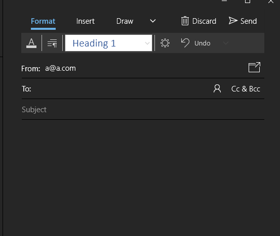
@Lorne-Kates said in Goddamit, Gmail:
In the above example
You seem to have fucked up and not used The One True Browser. It looks like this in Supported Application:
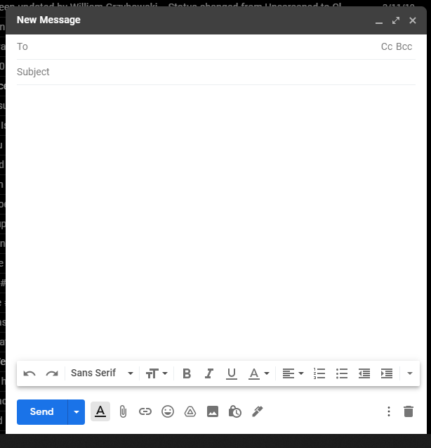
@Lorne-Kates said in Goddamit, Gmail:
- In the above example, you see an email address. Assuming for a second that "stupid@example.com" is a valid Gmail address, is this email FROM, TO, CC, or BCC to stupid@example.com
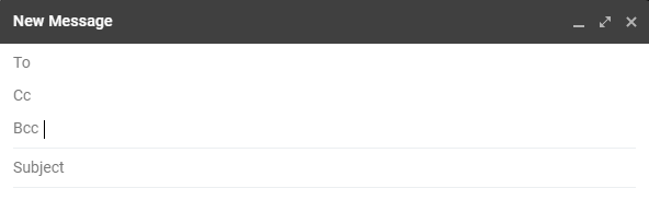
From, of course. Unless you click the CC BCC links-that-act-like-buttons. At which point looks like this:
@Lorne-Kates said in Goddamit, Gmail:
- Where would you enter the subject line of this email?
In a supported browser, it's clearly labeled "Subject".
@Lorne-Kates said in Goddamit, Gmail:
- Is the massive blank space in the middle the text entry box, or a rendering error?
Don't know. Is the massive white area in any other "write a message" window a text entry box, or a rendering error?
@Lorne-Kates said in Goddamit, Gmail:
3a) BONUS: As you write your reply, please look left, right, up and down from the position of the cursor. Do you see borders around the text area?
@Lorne-Kates said in Goddamit, Gmail:
- Using only the UX cues on the screen, how do you CC or BCC someone on this email?
Answered in 1.
@Lorne-Kates said in Goddamit, Gmail:
- Using only the UX cues on the screen, what is the difference between the paperclip and the plus sign?
Plus means more? Though why it's not an ellipsis button is the better question.
@Lorne-Kates said in Goddamit, Gmail:
- Please survey a subset of everyone you know personally, come across in your daily life, or are in fact a perfect stranger. Show them this screen shot side-by-side with their familiar email compose screen. Ask them which one they prefer. If anyone answers "the new Gmail Compose Experince", assume they work for the Gmail team and murder them. (This isn't a question. This is a command. I'm sorry I numbered it. I know that's confusing)
Where have you been these last few years? It's been this way for... quite some time now.
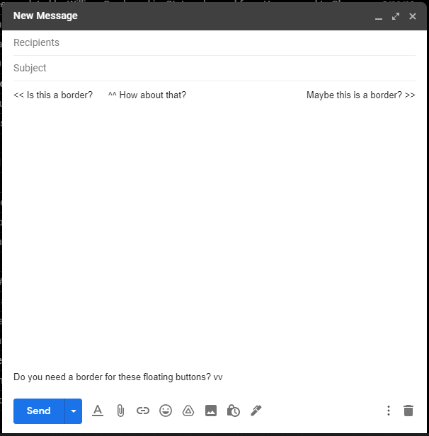
Here, how about someone else's idea of a compose window?
Betcha won't be able to guess what it's from!
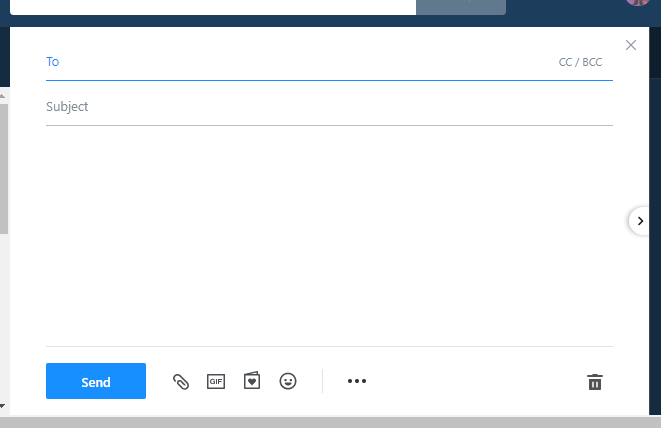
Oh! Oh! How about this one?
Golly, where's my textbox borders?!? What's this sun icon? How do I find the paperclip?!????