UI Bites
-
@pie_flavor
Thank you, pie:)
-
I'm sad, the fact that the last four (*known to me) welcomings have not been by me indicates my forum attentiveness has severely fallen...
I'm not sure if this is a bad thing.......
-
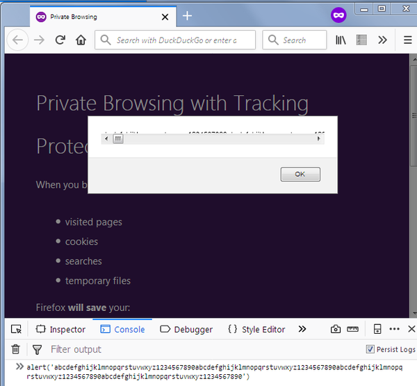
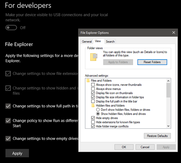
So I'm poking through Windows settings...
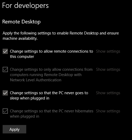
Checkbox before "Change X"? Really? I mean, I assume that the checkbox means I changed something in there... or no, wait, absolutely every one of them has a checkbox that's checked... but some of them are styled as disabled, and are actually disabled... but hitting "Show settings" works on all of them regardless of styling?


-
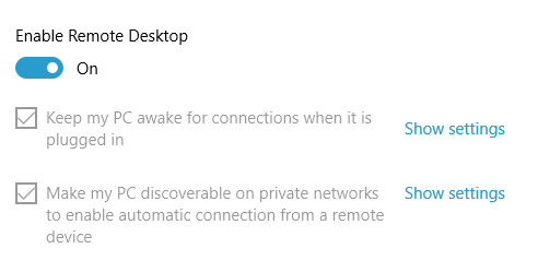
@onyx Old build? Mine looks like:
Or it's that dark theme - its link color sucks?
-
Or it's that dark theme - its link color sucks?
Probably. It would be even less visible than if Night Mode were enabled and Dark Mode were enabled.
-
Or it's that dark theme - its link color sucks?
Disabled styling, bad colors on dark theme, take your pick, it's confusing just the same.
-
@tsaukpaetra Yeah, old build. I'm on 1803 (17134.81)
-
Or it's that dark theme - its link color sucks?
Disabled styling, bad colors on dark theme, take your pick, it's confusing just the same.
The disabled stuff is correct - you can't toggle the setting. But there's no reason for them to disable to link...
-
Or it's that dark theme - its link color sucks?
Disabled styling, bad colors on dark theme, take your pick, it's confusing just the same.
The disabled stuff is correct - you can't toggle the setting. But there's no reason for them to disable to link...
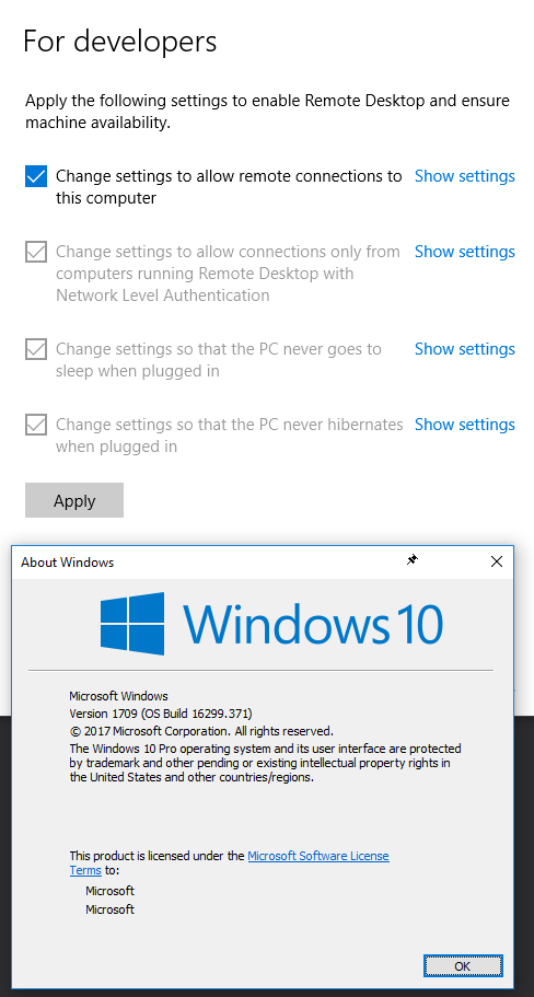
In that UI you mean? Because I changed it in the folder settings, which is where the link takes me:
If they just didn't make it work in the new UI yet, why the hell is it in the non-beta / fast track / whatever it's called build anyway?
Also, 1803, build 17134.48, with some updates waiting for a reboot.
-
@onyx brought to you by the people who made the original
chrome://flags, the greyed-out ones are the ones that have already been applied, and the enabled ones are ones that you can apply by pressing the Apply button. They're only enabled so you can untick the ones you don't want to apply.
-
Or it's that dark theme - its link color sucks?
Disabled styling, bad colors on dark theme, take your pick, it's confusing just the same.
It uses your accent color, so you have some control over it. (I don't like this kind of button/link either, though.)
-
Checkbox before "Change X"? Really? [...] but some of them are styled as disabled [...]
It's not that hard. There's a call to action ("Apply the following settings") and a checklist of the actions to satisfy that call. The ones that are checked and disabled are the ones that were already done when you got to the checklist. The ones that are checked (by default) but not disabled are the ones Windows is volunteering to change when you hit Apply. You can always uncheck the ones you don't want Windows to change.
 : What @LB_ said.
-
@twelvebaud said in UI Bites:
Checkbox before "Change X"? Really? [...] but some of them are styled as disabled [...]
It's not that hard. There's a call to action ("Apply the following settings") and a checklist of the actions to satisfy that call. The ones that are checked and disabled are the ones that were already done when you got to the checklist. The ones that are checked (by default) but not disabled are the ones Windows is volunteering to change when you hit Apply. You can always uncheck the ones you don't want Windows to change.
: What @LB_ said.To which I had no complaints if it were worded more clearly. Maybe it's my ESL showing, but I'd expect:
Change settings to show hidden files and folders
To mean "if I check this and hit OK / Next / Apply this will open some sort of an additional dialog, since I'm telling the system I want to change something". Which is bad UI in itself, but that's not even what happens. What's wrong with:
Show hidden files and folders
which is completely clear to anyone?
-
@onyx More to the point - if those items are disabled, what do you do if you want to change them back? (Yes, I know, you change it in the folder options. But a simple list of checkboxes like you describe could handle any desired transition and would be less coding to boot.)
-
@Onyx Your way is clearer and easier to localize; I don't know why Microsoft did it the way that they did. But I didn't have a problem. Maybe it was because I read the call to action above the list... *shrug*
@scarlet_manuka If those checkboxes become re-enabled, then you lose the distinction between current state and desired state. And some of those settings have more than one other option; what does unchecked (back) mean in that case? And before you say "default", then that implies that a cleared checkbox is default configuration: what should the checkbox look like in a non-default non-desired configuration, and what if the desired state (in the checklist) is the default state?
-
@twelvebaud I don't see why you need to maintain a distinction between current and desired state. Let the user set what they want and apply it if they press OK, like every other settings dialog.
If some of those options have more than one state - I don't know which ones or which states you're referring to here - then why are MS using a checkbox for them in the first place? This has nothing to do with my point, which is that disabling the checkboxes for options that were previously set is stupid.
-
Show hidden files and folders
which is completely clear to anyone?
@twelvebaud said in UI Bites:
@Onyx Your way is clearer
I beg to differ; I find the original much more honest and obvious in what it does. In particular, it highlights a specificity which you both seemingly ignore: This is not really a configuration panel, at least not like the "file explorer options" is. It's more akin to a "wizard" which automates changing a whole bunch of configuration settings. It's not a window showing you some system state, it's a window which offers some actions (which in turn involve changing system state).
Basically what's going on here is Windows saying "your computer would be more developer friendly if you change a bunch of settings. I can do that for you if you just click 'Apply'. Now, what clicking 'Apply' means is that I'll change this and this setting, and also this one (see list things with checkboxes). Usually, I'd also change that other setting, but it has already been changed so I won't have to actually touch it (thing with disabled check box). In case you don't agree that all of this is useful, I'll allow you to skip some of these changes (by unchecking it). However that other setting is already applied, so it makes no sense to skip the configuration change (hence disabled checkbox)".
Your way does not convey that meaning, it makes the dialog look like a representation of system state, when it is in fact a representation of the "script" executed when you click apply.
-
@scarlet_manuka said in UI Bites:
If some of those options have more than one state - I don't know which ones or which states you're referring to here - then why are MS using a checkbox for them in the first place?
Because currently you're not selecting between the setting's different possible values, you're making a yes-or-no choice: Should this setting be changed to the developer-friendly value?
Here's a setting with more than one possible value: "Put the computer to sleep in [X minutes]" where the developer-friendly value is "never". If unchecking the box changed the setting away from "never", what should it be changed to? How many minutes?
Here's another setting with more than one possible value: "PowerShell Execution Policy" where the default value is "Restricted" (no scripts run) and the developer-friendly value is "RemoteSigned" (trusted remote scripts and all local scripts run), but there are three other options. What happens in your world when it's currently set to "AllSigned"? How would a user indicate that they don't want it to change? And if the answer to that is "the UI starts with that, don't change it", then how would they know what value is considered developer-friendly?
-
@twelvebaud There's standard UI for all these sorts of cases. You're acting as if this is some sort of insoluble problem.
[ X ] Put the computer to sleep after |n| minutes
when checked, the edit box for n becomes editable(Spaces added because without them,
[X]followed by text gets you this:)
[X] what just happened?Powershell Execution policy: (drop-down list)
When it's currently set to AllSigned then that's what initially shows in the dropdown. You indicate that you don't want it to change by not changing it. It's not a difficult concept. You add hints to the values to indicate recommendations:
Restricted (default)
AllSigned
RemoteSigned (recommended for developers)
Unrestricted (least safe)Or you do it like the UAC or IE security level sliders. (Or like they used to be, I don't know what the UI is for that these days.)
I don't think developers are a uniform enough breed that there's a single set of settings that is best for all or even a majority of them. In addition, they're probably more likely than most users to be able to navigate the settings without this sort of handholding. Not that I'm opposed to making the UI easier for developers; I just don't agree that this has done so.
-
There was a firmware update for my router. They couldn't forget about GDPR, could they?

Those agree/disagree buttons look disabled, but you can click them and they do work.
-
There was a firmware update for my router. They couldn't forget about GDPR, could they?
Those agree/disagree buttons look disabled, but you can click them and they do work.I'd also like to rant on the stupid wording of this whole page. You agree... to what? There is no privacy policy or terms of service referenced in the sentence above that you're agreeing to.
-
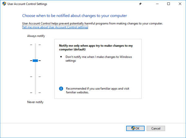
@scarlet_manuka said in UI Bites:
(Or like they used to be, I don't know what the UI is for that these days.)
It's no longer embedded in the "classic" Control Panel:
-
@tsaukpaetra Basically the same UI as before, though. This is a good UI for security settings: the slider gives you a visual indication of "most secure" to "least secure", and the box at the right lets you know which are the default settings and provides guidance on when other settings might be appropriate.
-
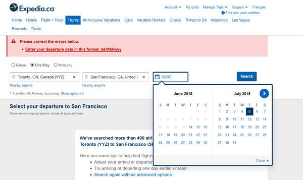
Why can't I just type dd/mm? Your date picker automatically highlighted the right day!
-
@the_quiet_one said in UI Bites:
I'd also like to rant on the stupid wording of this whole page.
Enable router to automatically update to future firmware.
[x]I Completely Agree
[ ]I Mostly Agree
[ ]I Slightly Agree
[ ]I Slightly Disagree
[ ]I Mostly Disagree
[ ]I Completely Disagree
-
@ixvedeusi From the Social Sciences department?
-
In fairness, this appeared after an "incident" occurred and I tried to navigate to a different area. But still.

-
Why doesn't Ctrl+Backspace work in so many Windows applications?
-
@bb36e Because no one made it work. The brain worms the IE team had way back in the way back haven't quite made its way to the Common Controls team.
-
Ctrl+Backspace work
What is expected to happen?
... *Googles* .... Well that's... kinda useful. But obviously not standard. I wonder if it works anywhere else?
-
@Tsaukpaetra Other than in most of Windows and in most of Linux, I don't think it works anywhere else.
You didn't know about Ctrl+Backspace? Well, use it!
That, Ctrl+Del and Ctrl+Arrows. They make editing a lot faster.
Combine with Shift for selection too.
-
-
@Tsaukpaetra it works better when you remap CapsLk to Backspace. 😃
-
@Tsaukpaetra it works better when you remap CapsLk to Backspace. 😃
Why would you do that?
-
This one's been bugging me for a while... in one reporting product I use, this is the icon for CSV format:

Let's zoom in on that a bit, shall we?

Yes, it's a piece of paper with the letters "CVS" on it.

It's been like this for several versions.
-
@Scarlet_Manuka said in UI Bites:
This one's been bugging me for a while... in one reporting product I use, this is the icon for CSV format:
Let's zoom in on that a bit, shall we?
Yes, it's a piece of paper with the letters "CVS" on it.
It's been like this for several versions.
Before looking at the zoomed version I thought it was a broken-page iron.
-
@Tsaukpaetra said in UI Bites:
a broken-page iron
Time to retrain your keyboard with the word "icon".
-
@Zecc
icon icon icon icon icon iron icon icon icon
-
@Tsaukpaetra said in UI Bites:
a broken-page iron
Time to retrain your keyboard with the word "icon".
**Status:**attend chubby!!!!!!!I
-
@Tsaukpaetra said in UI Bites:
@Scarlet_Manuka said in UI Bites:
This one's been bugging me for a while... in one reporting product I use, this is the icon for CSV format:
Let's zoom in on that a bit, shall we?
Yes, it's a piece of paper with the letters "CVS" on it.
It's been like this for several versions.
Before looking at the zoomed version I thought it was a broken-page
ironicon.It's CSV, so yes, it probably is broken with respect to most of the applications that might attempt to read it.
-
@hardwaregeek Fortunately it's CSV that I control, so there's no funny stuff allowed.
-
@Scarlet_Manuka said in UI Bites:
@hardwaregeek Fortunately it's CSV that I control, so there's no funny stuff allowed.

Oh, that's not what you meant... Nevermind....
-
@scarlet_manuka Time to file a P1 bug!
-
Say you've got Chrome maximised with a few tabs open:

Now you want to drag it to a different monitor. With a normal application, you just grab the titlebar somewhere where there's free space and drag it onto the other monitor. Windows de-maximises the window and lets you drag it. Then you double-click the title bar to maximise it on the new window.
So we need to hunt for free space. Here's a version of the screenshot with the approximate locations you can click highlighted:

Everywhere else you either get the standard window menu, a tab, the new tab button, or one of the four buttons on the right of the window.
It's almost like fucking with the conventional UI paradigm for the platform you're on has downsides...
-
@jmp On my computer at least there's a lot more title bar real estate when the window isn't maximized. So instead of letting windoze un-maximize it for you as you move, try doing it yourself.
-
@coderpatsy said in UI Bites:
@jmp On my computer at least there's a lot more title bar real estate when the window isn't maximized. So instead of letting windoze un-maximize it for you as you move, try doing it yourself.
Good idea! I'll just double-click somewhere on the title bar to restore the window.
(Yes you can click the 'restore' button on the top-right or left-click on the top-left and select the 'restore' option in the window that appears; this is more me griping about how Chrome breaks the behaviours that work fine for other programs. Well, unless they're Electron apps.)
-
Now you want to drag it to a different monitor.
Why? + a few times too hard for you?

-
@Tsaukpaetra said in UI Bites:
Now you want to drag it to a different monitor.
Why? + a few times too hard for you?
Because it's how I habitually do it. + , + , + , + does it too, but it's not what I normally do and maybe my hand is already on my mouse or something.
-
@jmp Even though Firefox does the same it at least leaves an area between the New Tab button and the window controls that can be used for grabbing the window. Also, hitting Alt to bring up the normal menu bar works to get even more grabbable area. Has Chrome disabled the normal menu bar completely?
-
@jmp not that it's an excuse for removing the option to have a native titlebar on windows, but damn does the "hold a modifier key and click anywhere on the window to move" feature on pretty much every Linux DE help here. I don't know why to this day that isn't an option on Windows.
And no, none of the third-party addons that do that work for me. They are either buggy as hell, or they stop working after reboot and you need to restart them manually. Grumble.