Blakeyrat complains about Android, because it's shit
-
Every time I turn on the development Android phone I get like a dozen notifications. Mostly apps being updated. Facebook is ALWAYS updating and I suppose they make updates just to trigger the notification and continuously remind the user about it, not because they actually need to update stuff.
Then, random stuff like "You've plugged in the power cable so now the phone is charging!". No shit Sherlock.
Then, the obligatory "have you tried this thing you don't give a damn about?".
Then, the security notification about you logging in on a different PC 1 month ago, which you didn't notice among the other many notifications, and now that something hax expired on the server it just shows an error if you tap on it and will re-appear every bloody time you use the phone.These notifications (except the last one) are just annoying, period. They're pointless.
Edit: oh, I forgot. As it's a development phone, I wanted to get rid of Facebook and other apps. Well, I don't know if it's Samsung or Google, but the phone decided it knew better and automatically reinstalled them. The very least it could do is respect the user choices.
-
@hardwaregeek said in Blakeyrat complains about Android, because it's shit:
@timebandit Action Center is worse than useless. Notifications about email I read a week ago hang around forever (until dismissed), but notifications that the computer is going to reboot for updates and there's not a thing you can do to stop it vanish without a trace in 10 seconds.
You can’t choose the style per app that sends notifications?
-
@benjamin-hall said in Blakeyrat complains about Android, because it's shit:
@bb36e , @topspin Desktop, but Mac OS has these annoying "upgrade to <newest version>" bubbles that only have two options: upgrade now and more information. You can't dismiss them without opening the store
Yes, you can. IIRC, you couldn’t in 10.10 or below, but in the last few versions there’s an “Ask me tomorrow” option. Yes, that pops up the same question tomorrow, but at least you don’t have to open the app store to get rid of the notice.
I can't upgrade because the MacBook is old and janky and it belongs to the school.
In the system prefs, you could turn off that it automatically searches for updates.
-
@blakeyrat said in Blakeyrat complains about Android, because it's shit:
Special super bonus hypocrite points: official App page on Play Store does not include "contains ads" warning. Because Google doesn't have to follow their own rules! Fuck you, consumers!
I had to use the system settings to disable notifications from Tango, because even if you disable all notifications from the application settings, it still sends you notifications for the Tango account messaging you, which end up being ads, of course.
-
@zmaster said in Blakeyrat complains about Android, because it's shit:
As it's a development phone, I wanted to get rid of Facebook and other apps. Well, I don't know if it's Samsung or Google, but the phone decided it knew better and automatically reinstalled them.
That would be Samsung. I don't have and never have had Facebook on my Pixel.
-
@deadfast said in Blakeyrat complains about Android, because it's shit:
That would be Samsung. I don't have and never have had Facebook on my Pixel.
Samsung are well known round here for their… enlightened approach to applications on devices.
-
@rhywden said in Blakeyrat complains about Android, because it's shit:
That was the wrong takeaway. That would be:
!a & !b == !(a | b)
-
@gurth said in Blakeyrat complains about Android, because it's shit:
Yes, you can. IIRC, you couldn’t in 10.10 or below, but in the last few versions there’s an “Ask me tomorrow” option. Yes, that pops up the same question tomorrow, but at least you don’t have to open the app store to get rid of the notice.
I have 10.12 and I get the notice with only "Install" and "Details" buttons. Can't swipe it to the side, and clicking on the notification itself opens the app store. Once that's open I can close it, but it's still annoying.
-
@hardwaregeek said in Blakeyrat complains about Android, because it's shit:
@rhywden said in Blakeyrat complains about Android, because it's shit:
That was the wrong takeaway. That would be:
!a & !b == !(a | b)
Yeah, that's the reason why people tend to laugh at geeks.
-
@hardwaregeek said in Blakeyrat complains about Android, because it's shit:
@rhywden said in Blakeyrat complains about Android, because it's shit:
That was the wrong takeaway. That would be:
!a & !b == !(a | b)
Not when you're combining logical and bitwise operators in one expression like that.
EDIT: I'm not thinking right. This way round, it actually doesn't matter. Only the accompanying expression with & and | swapped doesn't work when using logical instead of bitwise negation.
-
@hardwaregeek said in Blakeyrat complains about Android, because it's shit:
!a & !b ==
!(a | b)"['']"FTFPHP
-
@hungrier said in Blakeyrat complains about Android, because it's shit:
I have 10.12 and I get the notice with only "Install" and "Details" buttons. Can't swipe it to the side, and clicking on the notification itself opens the app store. Once that's open I can close it, but it's still annoying.
As I recall, I get those notifications with a drop-down menu for the Install button, that allows me to pick “Ask me tomorrow” (or whatever it says in English, exactly). But, of course, the one time when you actually want to see a notification like that so you can check what you’re saying, the OS doesn’t oblige :)
-
@gurth Because I have both of them up on my screen right now… I can say that the OSX notification for system updates can be dismissed until later (e.g., tomorrow) and the notification for upgrading to the next version of the OS can't; that just gives the options of “install now” or
“show advertising about it”“show more details” . The last time I installed a new version of the OS on this computer, the system was weirdly unstable for months afterwards.I think that's a bit backwards. The upgrade-the-OS notification shouldn't have a single click option to authorise it, but should have a “go away for a while” option, and the reboot-for-security-update notification should be more difficult to hide away.
-
Come to think of it, I haven't rebooted my Macbook for any OS updates in a long time, and it never bothers me.
I did get the Google Photos notification on that yesterday, but I swiped it away before I thought to check what "notification category" it was in. I have Oreo on the Pixel 2, which has very fine-grained system-level settings on notifications. It hasn't bothered me enough to blanket disable all Photos notifications, but that's always there. I think I've done that to a couple of other apps.
-
I still haven't gotten that notification. I have though gotten the "OMG you didn't backup 1 photos in Downloads do it nao!" notification a few times.
-
@benjamin-hall said in Blakeyrat complains about Android, because it's shit:
@bb36e , @topspin Desktop, but Mac OS has these annoying "upgrade to <newest version>" bubbles that only have two options: upgrade now and more information. You can't dismiss them without opening the store and they reappear every day.
The ones in iOS are less aggressive. Upgrade now | Upgrade Later | More Info. If you pick Upgrade Later, you get to select a time OR tap "Remind me later".
-
@dkf said in Blakeyrat complains about Android, because it's shit:
@gurth Because I have both of them up on my screen right now… I can say that the OSX notification for system updates can be dismissed until later (e.g., tomorrow) and the notification for upgrading to the next version of the OS can’t
Ah, OK. I was beginning to wonder myself, because for some reason I think it hasn’t nagged me about updating to 10.13 at all, even though the app store app does show that as an update. (I just can’t be bothered to reboot yet.)
-
@hardwaregeek said in Blakeyrat complains about Android, because it's shit:
I know that's not a response to me, because that's not even remotely similar to what I said
Forget it Jake, its @blakeyrat
-
@pie_flavor said in Blakeyrat complains about Android, because it's shit:
Advertising yourself is
perfectly normaladvertisingFTFY
I don't give a damn who's going to get the money. If ever I discover I want to print my photos, I'll go look for a printing service. Until then, STFU.
-
@dreikin said in Blakeyrat complains about Android, because it's shit:
oes actually do stuff you'd want to know about, like backing up photos, making automatic panoramas and gifs, and suggesting rotations. So it does have a good use for notifications
... why would it need to use notifications for doing any of these things? It could just provide in-app user interface elements for them.
-
@ixvedeusi said in Blakeyrat complains about Android, because it's shit:
@dreikin said in Blakeyrat complains about Android, because it's shit:
oes actually do stuff you'd want to know about, like backing up photos, making automatic panoramas and gifs, and suggesting rotations. So it does have a good use for notifications
... why would it need to use notifications for doing any of these things? It could just provide in-app user interface elements for them.
Because many of those operations are asynchronous--backing up happens automatically in the background, the automatic stuff takes enough time (and is low priority enough) that you're probably 3 pictures later, and rotations require computations (and are low priority to save battery life and help the system remain snappy).
And you don't normally have the photos app (gallery functions) open when you're shooting pictures anyway. You have the camera app open.
-
@hungrier Yet another reason why I will never get an Android phone.
-
@lb_ said in Blakeyrat complains about Android, because it's shit:
@blakeyrat yeah I've been pretty annoyed with that as well, I use Google Photos all the time and that ad has appeared to me as a notification, as a card inside the mobile app, as a card inside the desktop/web app, and maybe even another place. I don't want physical copies of my photos!
I would have just preferred an email. Just email me about the offer and leave it at that.
Sounds like our app. Oh, you're a free user? Then we're going to bug the shit out of you to upgrade! Oh, and we're going to annoy you just to make sure you know about all these really neeto-keeno-coolo features too!
-
@dcon said in Blakeyrat complains about Android, because it's shit:
Oh, you're a free user? Then we're going to bug the shit out of you to upgrade!
The only reaction you'll get from me is not an upgrade, but an uninstall

-
@timebandit said in Blakeyrat complains about Android, because it's shit:
@dcon said in Blakeyrat complains about Android, because it's shit:
Oh, you're a free user? Then we're going to bug the shit out of you to upgrade!
The only reaction you'll get from me is not an upgrade, but an uninstall
I read our forums. That's a common reaction.
-
@steve_the_cynic said in Blakeyrat complains about Android, because it's shit:
The ones in iOS are less aggressive. Upgrade now | Upgrade Later | More Info. If you pick Upgrade Later, you get to select a time OR tap "Remind me later".
That's still extremely aggressive. Any "choice" that does not allow me to say "no, just go away and leave me alone" is no choice at all.
-
@ixvedeusi said in Blakeyrat complains about Android, because it's shit:
And if discoverable interfaces were still a thing known to humanity, I would simply check out that 'create photo book' button I'd find when I browse through the app.
Therein lies the problem: users are idiots. You say 'discoverable interface' like it has meaning, but nobody discovers their interfaces anymore. They just use the advertised features at default settings. If something stops working, they don't try to see why, they go ask someone else. Yes they have a photo book printing interface, but so few people would actually find it that it's much better to advertise it.
-
@hungrier said in Blakeyrat complains about Android, because it's shit:
I have 10.12 and I get the notice with only "Install" and "Details" buttons.
I also get that on my work machine, which is blocked from upgrading to 10.13.
-
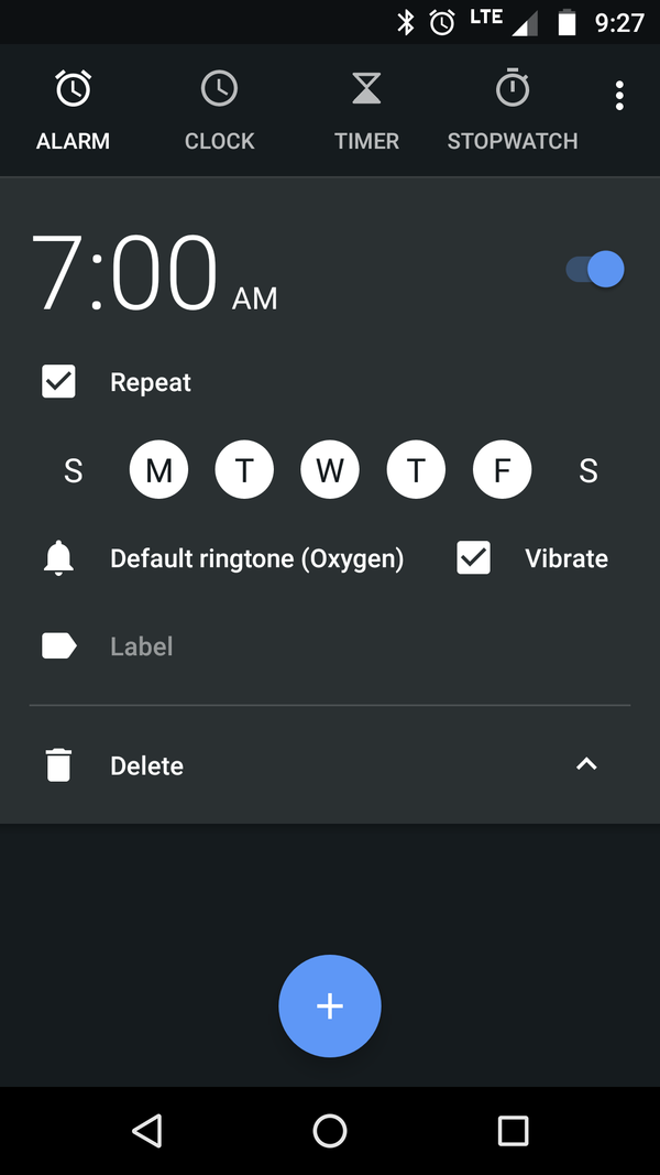
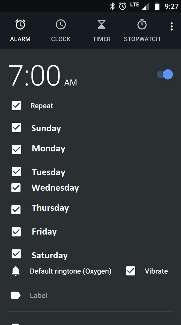
Are days circled in white the days the alarm will go off? Or are days surrounded in black the days the alarm will go off? How could I possibly tell, short of waiting until 7 AM tomorrow and seeing if the alarm goes off? Could this UX be more obtuse?
-
@blakeyrat If you select or unselect a day, it will put a message on the screen telling you how long until the next trigger. You can use this to work out the convention, which is fortunate because I can never remember it either.
Maybe you only get the message if the change you make affects the next trigger time, I don't recall precisely.
Also, in the summary view it will list the days the alarm is set for.
I agree, it's a pretty dismal UI (as I said, I can never remember the convention - which in itself says "this is a bad UI"). I'm not trying to defend it, just answering the question you asked, namely "How could I possibly tell?"
(checked on my phone: looks like surrounded in white = on)
-
@masonwheeler said in Blakeyrat complains about Android, because it's shit:
Any "choice" that does not allow me to say "no, just go away and leave me alone" is no choice at all.
For updates or upgrades?
-
@greybeard said in Blakeyrat complains about Android, because it's shit:
blocked from upgrading to 10.13
I think it is worth waiting a while on that one. Unless you like having
 .
. for a security solution.
-
@dkf Funny you mentioned that: I kicked off the upgrade on my home machine a couple of hours ago. It’s still “in progress.”
-
@blakeyrat said in Blakeyrat complains about Android, because it's shit:
Are days circled in white the days the alarm will go off? Or are days surrounded in black the days the alarm will go off? How could I possibly tell, short of waiting until 7 AM tomorrow and seeing if the alarm goes off? Could this UX be more obtuse?
I'm starting to think you just have no idea how UI works, and figure the more you yell at it the better you'll feel.
If the space surrounding them is the same color as the background, i.e. there is no visual indicator whatsoever, it's a good assumption that they are deselected. If there is a nice, contrasting, easily visible indicator around the letter, and the letter itself is a different color from the text on the screen, it's a safe bet that it's selected. No different than if the background was white and the selection color was green.
Next on the Blakeyrat channel: How can you tell if a checkbox is selected or not? And what's with that confusing checkmark symbol in the middle of these things?
-
@pie_flavor No, this isn't an intuitive UI. It's a victim of the modern obsession with removing visual indicators, depth and contrast for a "clean" look, resulting in the bare minimum of indicators of a state.
-
...aaand rebooted it. Boot loop. Boot into recovery mode, select reinstall OS, “About 9 hours and 22 minutes remaining.”
-
@jaloopa said in Blakeyrat complains about Android, because it's shit:
@pie_flavor No, this isn't an intuitive UI. It's a victim of the modern obsession with removing visual indicators, depth and contrast for a "clean" look, resulting in the bare minimum of indicators of a state.
And bare minimum they remain, and I like it that way. Not, for example, below the bare minimum, such that you can't actually tell what state is indicated anymore. But they don't do much in the way of opera-singing firework displays these days, and I'm sure my phone's Enlightened
 CPU prefers it that way too.
-
@pie_flavor said in Blakeyrat complains about Android, because it's shit:
Next on the Blakeyrat channel: How can you tell if a checkbox is selected or not? And what's with that confusing checkmark symbol in the middle of these things?
This checkbox ☒ is marked with an "X".
X means no, or wrong, so I'm going to assume that means "not selected".
-
@dkf said in Blakeyrat complains about Android, because it's shit:
For updates or upgrades?
Yes, even then. Not all upgrades are good ones. Some of them suck, some of them remove useful features, some of them even introduce new bugs or new security holes.
-
@jaloopa said in Blakeyrat complains about Android, because it's shit:
@pie_flavor No, this isn't an intuitive UI. It's a victim of the modern obsession with removing visual indicators, depth and contrast for a "clean" look, resulting in the bare minimum of indicators of a state.
I agree that the "modern" ultra-minimalist design trend is mostly a pile of shit, but IMO "highlighted = turned on" isn't rocket surgery. In this case it's alright.
-
@scarlet_manuka said in Blakeyrat complains about Android, because it's shit:
I agree, it's a pretty dismal UI (as I said, I can never remember the convention - which in itself says "this is a bad UI"). I'm not trying to defend it, just answering the question you asked, namely "How could I possibly tell?"
Ooooo...and he actually typed a question! Even if he just meant it rhetorically.
Check and mate.
-
@pie_flavor said in Blakeyrat complains about Android, because it's shit:
I'm starting to think you just have no idea how UI works, and figure the more you yell at it the better you'll feel.
I have no idea how that UI works, which is why I posted it here.
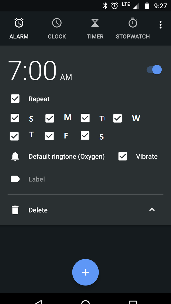
Strangely, Android does have perfectly acceptable checkboxes-- two of them on that very screen. Why wouldn't they also use those for the days?
@pie_flavor said in Blakeyrat complains about Android, because it's shit:
If the space surrounding them is the same color as the background, i.e. there is no visual indicator whatsoever, it's a good assumption that they are deselected. If there is a nice, contrasting, easily visible indicator around the letter, and the letter itself is a different color from the text on the screen, it's a safe bet that it's selected. No different than if the background was white and the selection color was green.
Except when you turn on repeat, the days appear with all of them having white circles. I'd assume turning on repeat would put me in a state with no days selected, so therefore the white circle would logically mean deselected. But that's not the case-- instead turning on repeat defaults to "repeat every day" (and the circles mean selected) which is surprising behavior to me.
@pie_flavor said in Blakeyrat complains about Android, because it's shit:
Next on the Blakeyrat channel: How can you tell if a checkbox is selected or not? And what's with that confusing checkmark symbol in the middle of these things?
I'm ok with Android's checkboxes, but why weren't they used for the days? What's the point of having that widget if you don't use it everywhere? And even if you are super mental magic man and instantly understand that white circle == selected, shouldn't you still get annoyed at the inconsistency? This one screen has two different ways to select things. Why?
-
@hungrier said in Blakeyrat complains about Android, because it's shit:
but IMO "highlighted = turned on" isn't rocket surgery.
But there's actual checkboxes less than 50 pixels away. What's the criteria for using checkboxes as opposed to white circles? How do white circles differ from checkboxes?
They fucking don't. They're just "checkboxes, but more confusing".
And since they had to write a new widget to create those white circles, that means they've gone out of their way to make their UX worse. They wrote extra code to make their product worse.
What is wrong with you people defending this.
-
@blakeyrat said in Blakeyrat complains about Android, because it's shit:
But there's actual checkboxes less than 50 pixels away. What's the criteria for using checkboxes as opposed to white circles? How do white circles differ from checkboxes?
How about "it would be stupid as fuck to do it with checkboxes"?
Variant 1:
Variant 2:
-
@hungrier Stupid... why?
Although I would recommend drawing a box around the days to distinguish them visually. I doubt Android has anything similar to the Windows "GroupBox" concept, though, because that would be useful to have.
-
@hungrier Why not put the checkbox above/below the day? Removes ambiguity.
-
@blakeyrat said in Blakeyrat complains about Android, because it's shit:
I doubt Android has anything similar to the Windows "GroupBox" concept, though, because that would be useful to have.
You could just use another nested LinearLayout and give it a border.
-
@blakeyrat said in Blakeyrat complains about Android, because it's shit:
@hungrier Stupid... why?
Variant 1: There's no visual difference between the days and the "Repeat" option, and it also takes up way more space.
Variant 2: The relationship between checkbox and day is ambiguous (yes, "checkbox to the left" is easy and you get the hint from the other checkbox options, but it's one more mental step than thing = thing), and it breaks up the natural grouping of weekdays in a way that looks goofy. Alternatively, you could squeeze them all together, making it both visually cluttered and hard to use with your finger.
@jazzyjosh said in Blakeyrat complains about Android, because it's shit:
@hungrier Why not put the checkbox above/below the day? Removes ambiguity.
That would basically just be an uglier version of what they already have.
-
@hungrier said in Blakeyrat complains about Android, because it's shit:
Variant 1: There's no visual difference between the days and the "Repeat" option, and it also takes up way more space.
Right; that's why you'd add a GroupBox-esque border. Also the vertical space here is infinite, that screen scrolls.
@hungrier said in Blakeyrat complains about Android, because it's shit:
Variant 2: The relationship between checkbox and day is ambiguous (yes, "checkbox to the left" is easy and you get the hint from the other checkbox options, but it's one more mental step than thing = thing), and it breaks up the natural grouping of weekdays in a way that looks goofy. Alternatively, you could squeeze them all together, making it both visually cluttered and hard to use with your finger.
There's no "natural grouping of weekdays", what does that even mean?
I agree that the positioning of the checkboxes is problematic, but I liked the vertical version frankly, which both solves that and lets you actually spell-out which T is Tuesday and which T is Thursday.
@hungrier said in Blakeyrat complains about Android, because it's shit:
That would basically just be an uglier version of what they already have.
Oh; so now it's all about attractiveness and not usability?
I want stuff that works and is well-designed. I don't give a shit how "ugly" it is, until given the choice between two things that work equally-well.
This screen in Android is badly-designed. I want good design. Where do I get good design? Where do I go to point out bad designs without tons of rabid Android fans telling me I'm a wrong idiot?
-
@blakeyrat said in Blakeyrat complains about Android, because it's shit:
There's no "natural grouping of weekdays", what does that even mean?
There aren't 7 of them, in a particular order, in a week? News to me.
@blakeyrat said in Blakeyrat complains about Android, because it's shit:
lets you actually spell-out which T is Tuesday and which T is Thursday.
Has there ever been a case in the history of the world where a list of weekdays had Tuesday and Thursday swapped?
@blakeyrat said in Blakeyrat complains about Android, because it's shit:
Oh; so now it's all about attractiveness and not usability?
It's about usability, which includes both visual distinction and aesthetic quality.
@blakeyrat said in Blakeyrat complains about Android, because it's shit:
This screen in Android is badly-designed.
It isn't, no matter how many times you say so.
@blakeyrat said in Blakeyrat complains about Android, because it's shit:
Where do I go to point out bad designs without tons of rabid Android fans telling me I'm a wrong idiot?
You can shout at your mirror where no matter how wrong you are, nobody will disagree.