-
My big Google annoyance is how Gmail doesn't have a link to news. I read news when I'm done with email. Give me a link to news.
I've never used Google Calendar in my life. Ever. Why is that link there? Go away Calendar, give me News!
I guess you can click Web and then News. Because News shows up in the toolbar for Web, but not in the toolbar for Gmail. Figure that one out.
-
There's a little fadey, and some "lost" links to facitlities that one should have bookmarked with a quick-access keyword anyway.
:care
Instead of whining about irrelevant unproblems, I'm going to the pub now and have me a Guinness, because it tastes better.
-
You guys, it doesn't really make much of a fucking difference either way. Aren't there more fun things to complain about?
-
@dhromed said:
There's a little fadey, and some "lost" links to facitlities that one should have bookmarked with a quick-access keyword anyway.
"We don't need your way, we've got an even better way that we'll force on you despite the fact that you're used to the old way! And then we'll insult you when you complain and say it doesn't matter because your way is inferior!"
Were you on the Windows 7 team by any chance?
-
@morbiuswilters said:
@monkeypants said:
By God's Wound's, Jeeves, you must have been a Rhodes scholar to perform that brilliant analysis!
Usually it's "his wounds" or "Christ's wounds". Unless you're a Unitarian, but those people are all assholes.
http://dictionary.reference.com/browse/zounds?db=luna
http://www.urbandictionary.com/define.php?term=%27Swounds
http://www.answers.com/topic/swounds
http://www.definition-of.com/swounds
http://www.askoxford.com/results/?view=dev_dict&field-12668446=zounds&branch=13842570&textsearchtype=exact&sortorder=score%2Cname
@morbiuswilters said:
@monkeypants said:
How odd that you didn't surmise that mhole is a combination, a portmanteau if you will, of MHolt and asshole.
I figured it was either this or that your fat fingers slipped on your Cheeto-slick keyboard and fumbled. Regardless, it's not funny and your intent was hardly clear.
I originally intended it as a criticism of MHolt, by combining his moniker with "asshole". It's now grown into mhole=(MHolt + asshole)=(MHolt + morbiuswilters). I leave it to the reader to apply the addition property of equality. MHolt, I sincerely apologize for aspersing your fine WTF handle. Also, I prefer Pringles.
@morbiuswilters said:
...leads me to doubt your sincerity.
You doubt my sincerity? I'm hurt...
-
@tdb said:
@tster said:
@tster said:Fading is not about "fancy" or "pretty." It is about eye focus. The new Google home page, when you view it, only has one thing to look at. So no matter ifyou go there every day, or have never been there, your eyes only have 1 place they can possibly be drawn to. Then the reason the other links don't just appear is that if that were to happen they would immediately draw attention and your eyes would be drawn to them instead of what you are looking at. By fading in, your eyes remain focused where they were,while you gradually become aware of everything else.
3. Like I said, fading causes their attention to not move to things because they do not suddenly appear.
You're overlooking one critical thing. Motion or change draws attention even better than static difference (the links and search bar are different from the plain white background). The fade-in effect is fast enough to register as a change, at least to my eyes. The existence of the links on the top has barely registered to me when I haven't needed them, but last week when I saw the fade-in effect for the first time, I immediately went "Hey, what's here? Oh, just the old link bar." If you wanted the links to appear sneakily without the user noticing, the effect would have to last tens of seconds at least, in which case it would be far too slow to be usable.
good god, you do realize that you just made their argument for implementing the fading.
1. It makes you notice they have links up there. How many people do you think there are that didn't realize that google had more than just search? How many of those people are now using other Google services?
2. I didn't say that by fading in it didn't register in your brain, or you wouldn't notice it. I said it doesn't draw the eyes like a sudden "appear." Something suddenly appearing draws the eyes instinctly. Something is changing rapidly and survival instinct makes your eyes focus on it even if you knew what was coming. However, with fading your brain is fast enough to realize that it can safely ignore whatever is fading in.
-
@monkeypants said:
I originally intended it as a criticism of MHolt, by combining his moniker with "asshole". It's now grown into mhole=(MHolt + asshole)=(MHolt + morbiuswilters). I leave it to the reader to apply the addition property of equality. MHolt, I sincerely apologize for aspersing your fine WTF handle.
morbiuswilters = mhole - MHolt?
-
@scgtrp said:
"We don't need your way, we've got an even better way that we'll force on you despite the fact that you're used to the old way! And then we'll insult you when you complain and say it doesn't matter because your way is inferior!"
Were you on the Windows 7 team by any chance?
Windows 7 actually seems to be quite an improvement and thus the Google fadey thing has no relation to whathever it was that you were saying.
-
@dhromed said:
Windows 7 actually seems to be quite an improvement and thus the Google fadey thing has no relation to whathever it was that you were saying.
Mostly, I agree. However I'm still bitter about the classic menu's disappearance because there are now "better" ways. Putting search facilities in everything was a solution to the wrong problem. If you need to search a menu you have a serious organization problem. That said, if you want to include searchability go right ahead, but don't cripple the menu for the rest of us.
-
@scgtrp said:
@dhromed said:
Windows 7 actually seems to be quite an improvement and thus the Google fadey thing has no relation to whathever it was that you were saying.
Mostly, I agree. However I'm still bitter about the classic menu's disappearance because there are now "better" ways. Putting search facilities in everything was a solution to the wrong problem. If you need to search a menu you have a serious organization problem. That said, if you want to include searchability go right ahead, but don't cripple the menu for the rest of us.
"Cripple" is a little strong for such a minor layout change.
I mentally translate posts like this to, "waaah! Change is scary!"
-
Compressing a menu into a small space and requiring extra clicking to use it is definitely crippling.
-
@scgtrp said:
Compressing a menu into a small space and requiring extra clicking to use it is definitely crippling.
?
The button is bigger.
The menu itself is bigger.Please demonstrate the diminished surface as well as the extra clicks. Or are you not referring to the start menu?
But,
I do loathe that you cannot add extra level-0 menus to the new* start menu. Under XP, I have three extra menus at the top of the classic start menu, for "semi-frequent-but-not-quickstart-frequent" applications, games, and quick access to work tools when I'm working from home.
That's a closed alley now, I think. :\
*) that began life in ol' XP, so not that new, really.
-
Anyone else noticed that the bar at the top of the Google search-homepage has now changed? They are now emphasizing Mail to be a Google product, even though its on the Google search page! So now instead of the clean "Mail", it now says "Google Mail", just in case it wasn't obvious to you before.
I wonder how many idiots thought "Mail" took them to Hotmail or whatever there webmail provider was. There could be a fun log of support calls to ISPs. "The mail button at the top of my browser page takes me to Google mail, but I'm with Yahoo. Please fix it."
Things like this really do scare me. More so than Windows7.
-
@Mole said:
Anyone else noticed that the bar at the top of the Google search-homepage has now changed?
ObXThread (or it may be this one): Yes. It's disappeared. I have to move my mouse to make it reappear.
-
@dhromed said:
Please demonstrate the diminished surface as well as the extra clicks. Or are you not referring to the start menu?
I now have the "benefit" of my rather short start menu still scrolling if I open any of the folders in it, and mine is reasonably organized (Vista on my girlfriend's laptop is pure misery). Extra clicks: is there a way to open subfolders without clicking them?
I wonder how many idiots thought "Mail" took them to Hotmail or whatever there webmail provider was.
You underestimate the power of human stupidity. I am regularly expected to fix 404'ing/NXDOMAIN sites, and watched someone blame Yahoo's new interface on a virus (despite the large "hey, look at the new design!" banner across the top).
-
@scgtrp said:
If you need to search a menu you have a serious organization problem
My menu is just as organized as anyone else's. I just now have another way to get to my program. I can type it and then click, or I can click three or four times and find it. Personally, rather than go Programs -> Accessories -> Paint, I'd rather type paint, wait the <.5 seconds it takes, and click on paint.If I do it enough, Paint ends up in my commonly used programs, or I can put it there myself.
I don't see the problem.
-
@Mole said:
I wonder how many idiots thought "Mail" took them to Hotmail or whatever there webmail provider was. There could be a fun log of support calls to ISPs
And loads of real passwords for other sites in gmail's apache logs.
-
@belgariontheking said:
@Mole said:
I wonder how many idiots thought "Mail" took them to Hotmail or whatever there webmail provider was. There could be a fun log of support calls to ISPs
And loads of real passwords for other sites in gmail's apache logs.Gmail doesn't use apache, apache doesn't log password attempts and I would hope Google is smart enough to never log plaintext passwords.
-
@morbiuswilters said:
@belgariontheking said:
@Mole said:
I wonder how many idiots thought "Mail" took them to Hotmail or whatever there webmail provider was. There could be a fun log of support calls to ISPs
And loads of real passwords for other sites in gmail's apache logs.Gmail doesn't use apache, apache doesn't log password attempts and I would hope Google is smart enough to never log plaintext passwords.
Wait, you mean google isn't a little LAMP shop?
-
-
@scgtrp said:
Extra clicks: is there a way to open subfolders without clicking them?
Um, yes. Hover over the folder, or if you're impatient, use the cursor keys.
-
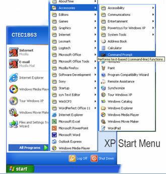
@scgtrp said:
@dhromed said:
Please demonstrate the diminished surface as well as the extra clicks. Or are you not referring to the start menu?
[XP start menu image]
I now have the "benefit" of my rather short start menu still scrolling if I open any of the folders in it, and mine is reasonably organized (Vista on my girlfriend's laptop is pure misery). Extra clicks
You complained about the Windows 7 start menu and its search feature, and proceed to post an XP screenshot?
Extra points: the total menu depth in this case is exactly the same as classic start menu. Count 'em:
classic:
Start > Programs > MyProgram > RunMyProgramnew:
Start > All Programs > MyProgram > RunMyProgram@scgtrp said:
is there a way to open subfolders without clicking them?
De hover-open delay is 0.5 seconds. It has been this way since Windows 95. I'm surprised you never noticed that submenus open automatically.
(PS: I often click 'em open as well, because 0.5 seconds is a little slow)
-
@dhromed said:
(PS: I often click 'em open as well, because 0.5 seconds is a little slow)
IIRC this is configurable via HKCU\Control Panel\Desktop\MenuShowDelay (reg_sz, 0 - 999 or 4000 ms depending on who you believe). I don't know if this applies to Vista or Windows 7 though.
-
@fatdog said:
Now someone go to google blog and find out why they did that. I don't really care, but it would be mildly interesting to read why they did it
Now you see it, now you don't

Insights from Googlers into our products, technology, and the Google culture
@Google said:
For the vast majority of people who come to the Google homepage, they are coming in order to search, and this clean, minimalist approach gives them just what they are looking for first and foremost. For those users who are interested in using a different application like Gmail, Google Image Search or our advertising programs, the additional links on the homepage only reveal themselves when the user moves the mouse. Since most users who are interested in clicking over to a different application generally do move the mouse when they arrive, the "fade in" is an elegant solution that provides options to those who want them, but removes distractions for the user intent on searching. [...]
All in all, we ran approximately 10 variants of the fade-in. Some of the experiments hindered the user experience: for example, the variants of the homepage that hid the search buttons until after the fade performed the worst in terms of user happiness metrics. [...] However, in the end, the variant of the homepage we are launching today was positive or neutral on all key metrics [...]
-
@Tyler said:
@fatdog said:
Now someone go to google blog and find out why they did that. I don't
really care, but it would be mildly interesting to read why they did it
Insights from Googlers into our products, technology, and the Google culture
Cool, Thanks.
Just what I thought. Google employees have way too much free time.
Now go get me a coffee. Double Espresso with 2 sugars and a bottle of Norweigan glaciar water, please.
This time try not to take 3 days, and make sure the coffe is very hot.
-
@upsidedowncreature said:
I don't know if this applies to Vista or Windows 7 though.
It does.
And thanks :).
-
@fatdog said:
Cool, Thanks.
Just what I thought. Google employees have way too much free time.
Now go get me a coffee. Double Espresso with 2 sugars and a bottle of Norweigan glaciar water, please.
This time try not to take 3 days, and make sure the coffe is very hot.
I'll try but I'm not sure if I can get to Norway and back in under 3 days, given that it's the holiday season and I'm short on frequent flier miles. Also the hike up the glacier might delay me a bit.
-
Although I don't use several of Google's products, I also don't like the fading, either.
-
@zzo38 said:
Although I don't use several of Google's products, I also don't like the fading, either.
I'm going to go out on a limb and guess that you dislike the fading because it requires using the mouse.
-
I remember seeing the concept of this a few weeks ago, but since I practically never use the google homepage, I wouldn't have noticed it at all if it wasn't mentioned here.
-
@dhromed said:
You complained about the Windows 7 start menu and its search feature, and proceed to post an XP screenshot?
You asked for the difference between the 7 and XP menus. Since we're arguing about 7 I assumed you know what it looked like, so I threw in a reminder that the XP start menu expands to fill the space it needs rather than forcing itself into a tiny box within the original menu panel.
@dhromed said:
De hover-open delay is 0.5 seconds. It has been this way since Windows 95. I'm surprised you never noticed that submenus open automatically.
I'm sure I tried this before, but I just left my cursor over Accessories for a full 20 seconds and it didn't open. All Progams itself does open after about 2 seconds of hovering though. I blame Microsoft.
-
@bstorer said:
@zzo38 said:
Although I don't use several of Google's products, I also don't like the fading, either.
I'm going to go out on a limb and guess that you dislike the fading because it requires using the mouse.And it's not implemented in some obscure language completely unsuited for the task, like Forth.
-
@bstorer said:
@zzo38 said:
Wrong. It's because it's too user friendly. Lern2simplify.Although I don't use several of Google's products, I also don't like the fading, either.
I'm going to go out on a limb and guess that you dislike the fading because it requires using the mouse.
-
In the end, I'm going to trust to decisions and research of one of the worlds best companies to a couple dozen retards on an internet forum.
-
@tster said:
In the end, I'm going to trust to decisions and research of one of the worlds best companies to a couple dozen retards on an internet forum.
And this is why so many large projects completely fail at user friendliness.
The key to usability is not doing research and studies. It's to LISTEN TO YOUR USERS. All of them, not just the ones that agree with your research team. There's a well known mailing list argument about this. TL;DR: Force people into your way of thinking just because some "experts" say so, and people will get angry. The real experts are the people who use it - they know better than your magical mind-reading researchers how their own minds think.
These "couple dozen retards on an internet forum" are, in the end, the people you work for. Listen to them.
-
@scgtrp said:
The key to usability is not doing research and studies. It's to LISTEN TO YOUR USERS. All of them, not just the ones that agree with your research team. There's a well known mailing list argument about this. TL;DR: Force people into your way of thinking just because some "experts" say so, and people will get angry. The real experts are the people who use it - they know better than your magical mind-reading researchers how their own minds think.
These "couple dozen retards on an internet forum" are, in the end, the people you work for. Listen to them.
But on the other hand, remember to listen to *all* your users, not just the ones that bitch on forums and mailing lists.
The vocal minority frequently thinks they're right, but they're not. If Slashdot had its way (for example), no software UI would ever change, ever-- they hate everything.
-
@scgtrp said:
These "couple dozen retards on an internet forum" are, in the end, the people you work for. Listen to them.
On the other hand, the "couple dozen retards" in THIS particular internet forum are not exactly your average user... and doing things the way it makes sense to US may not help that average user very much.
I mean, honestly: don't you wish you had PCRE support in Google's search box?
No normal person wants that! You're not the average user! STFU!
-
@CDarklock said:
I mean, honestly: don't you wish you had PCRE support in Google's search box?
No normal person wants that! You're not the average user! STFU!
Actually that would be a rather cool feature, and I can't imagine it affecting anyone else as "average" users would never think of typing a regex in the Google search box.
-
One of my pet peeves with Google (along with all the others) is you type something into the search box and get nothing like what you asked for because google assumed you mistyped your search parameters, guessed what you meant, and searched for that instead. Then you have to go back put quotes round everything to tell it search for what you actually typed. Then half the time it still searches for what it thinks is best.
-
@scgtrp said:
You asked for the difference between the 7 and XP menus. Since we're arguing about 7 I assumed you know what it looked like, so I threw in a reminder that the XP start menu expands to fill the space it needs rather than forcing itself into a tiny box within the original menu panel.
We had a subtle misunderstanding.
I heartily accept your demonstration.
@scgtrp said:
I'm sure I tried this before, but I just left my cursor over Accessories for a full 20 seconds and it didn't open.
Looks like the Vista/7 start menu is thoroughly fucked in that respect.
-
@dhromed said:
@scgtrp said:
Compressing a menu into a small space and requiring extra clicking to use it is definitely crippling.
?
The button is bigger.
The menu itself is bigger.Please demonstrate the diminished surface as well as the extra clicks. Or are you not referring to the start menu?
But,
I do loathe that you cannot add extra level-0 menus to the new* start menu. Under XP, I have three extra menus at the top of the classic start menu, for "semi-frequent-but-not-quickstart-frequent" applications, games, and quick access to work tools when I'm working from home.
That's a closed alley now, I think. :<br>
*) that began life in ol' XP, so not that new, really.
Can't you just use Pin to Start Menu? Still works in Windows 7 and will place the program where the Internet/Email links used to be.
-
@Mole said:
One of my pet peeves with Google (along with all the others) is you type something into the search box and get nothing like what you asked for because google assumed you mistyped your search parameters, guessed what you meant, and searched for that instead. Then you have to go back put quotes round everything to tell it search for what you actually typed. Then half the time it still searches for what it thinks is best.
So basically your pet peeve here is that you do not know how to use google?
-
Negative. I know how to use Google, I just find it annoying that you have to learn how to get Google to search for what you type, rather than what it thinks you want.
-
@Mole said:
Negative. I know how to use Google, I just find it annoying that you have to learn how to get Google to search for what you type, rather than what it thinks you want.
Eh? For me, Google always puts the "did you mean" as the first couple of results, but everything after that is based on your actual search.
-
@random.next said:
Personally, I think the static page was less confusing than having things suddenly pop up.
Here I thought only infants were confused by things that suddenly pop up out of nowhere.
-
@bob171123 said:
@random.next said:
Personally, I think the static page was less confusing than having things suddenly pop up.
Here I thought only infants were confused by things that suddenly pop up out of nowhere.
Your wife was pretty confused about something suddenly popping up out of nowhere, but I talked her through it.
-
@bob171123 said:
@random.next said:
Personally, I think the static page was less confusing than having things suddenly pop up.
Here I thought only infants were confused by things that suddenly pop up out of nowhere.
Can't speak for anyone else here, but from my perspective "annoying" is a much more accurate term than "confusing".
-
@morbiuswilters said:
To be fair, her confusion was due to the fact that she originally mistook you for a woman.@bob171123 said:
@random.next said:
Personally, I think the static page was less confusing than having things suddenly pop up.
Here I thought only infants were confused by things that suddenly pop up out of nowhere.
Your wife was pretty confused about something suddenly popping up out of nowhere, but I talked her through it.
-
@scgtrp said:
It's to LISTEN TO YOUR USERS.
Are you trying to argue that MS didn't do that? or that Google didn't do that? Because I recall being a part of an extensive Beta test of Windows 7.Honestly, I lost your argument in the whole "not giving a shit what you say" weeds.
-
I can't think of any noticeable UI changes between the beta and the RTM. They certainly didn't address any of my concerns, mainly the menu, and I am not the only person who has a problem with it.
Other screwups in the name of "a large part of the users like it because we told them it was cool" include throwing a ribbon on EVERYTHING, and the fact that the Games folder in the start menu behaves absolutely nothing like any other folder (Windows tries to be clever and fails epicly in auto-adding things to it, and renaming it to "Kittens!" creates a new folder called "Kittens!" and leaves the old one in place).