How can I make this page layout less awful to look at?
-
I'm specifically working on the section the link scrolls to right now, but the whole page is awful.
-
I'm assuming you're keeping with the static content model and not allowing toggle-able hiding and the like?
-
@ben_lubar why is everything in a <pre>? this forces the font to monospace on my machine. Anyways, here's what I got:
- change the pre to a div to allow default browser font to be used
- add a translucent background colour to <ul>s to easily distinguish nesting levels (and add a left border to child lists)
- tweak margins and padding for child lists to make them more distinct
- add bold text to anchors
- add border to headers
- cap page width to 100ex and center (up to you)
beyond that, i'm not sure what else can be done because a lot of the stuff on the page appears to be text nodes and they can't be targeted with CSS.
-
@bb36e said in How can I make this page layout less awful to look at?:
why is everything in a <pre>? this forces the font to monospace on my machine.
Holdbacks from the fact that Dwarf Fortress is primarily a console-based game using fixed-width characters and glyphs.
Edit: Markdumb-escaped the select-to-quote snafu.
-
@tsaukpaetra said in How can I make this page layout less awful to look at?:
I'm assuming you're keeping with the static content model and not allowing toggle-able hiding and the like?
this is still doable with <details> (or older css trickery from the past)
-
@bb36e said in How can I make this page layout less awful to look at?:
css trickery
Yeah, that was more or less my question.
Like, how limited are we speaking? If I was bored I could totally scaffold something I would find comfortable using, but so far most of Ben's projects seem to be extravagantly minimalistic...
-
@bb36e said in How can I make this page layout less awful to look at?:
beyond that, i'm not sure what else can be done because a lot of the stuff on the page appears to be text nodes and they can't be targeted with CSS.
The whole page (and the HTTP headers, too) is being generated by a Dwarf Fortress plugin (to be precise, a plugin I wrote for a Dwarf Fortress memory hacking library that talks to another plugin I also wrote for that specific page).
I can change any part of it as long as I only use characters available in code page 437. I could add the ability to do stuff outside of CP437 but that would require adding another plugin API. Doable, but not really required for anything HTTP-related.
One thing I was thinking of doing is just splitting this into more pages. Mostly because the page gets really, really tall after a while.
@bb36e said in How can I make this page layout less awful to look at?:
why is everything in a
<pre>?I'm pretty sure the only thing it actually makes look better is the manager order list, and even then, not that much better at all.
@bb36e said in How can I make this page layout less awful to look at?:
@tsaukpaetra said in How can I make this page layout less awful to look at?:
I'm assuming you're keeping with the static content model and not allowing toggle-able hiding and the like?
this is still doable with
<details>(or older css trickery from the past)Yeah,
<details>is allowed since I'm using HTML5.@tsaukpaetra said in How can I make this page layout less awful to look at?:
but so far most of Ben's projects seem to be extravagantly minimalistic...
I mean, it's generated by using the
<<operator on astd::ostringstream, but that's basically how all HTML pages are generated at some point in the process...
-
By the way, the health section of that page is generated by this 700-ish line
forloop: https://github.com/BenLubar/df-ai/blob/642843d443e6224dd308ce9d713ff11c912e6de1/population.cpp#L763-L1419I've split it into three pages and removed the
<pre>tag, but I'm going to try the other suggested changestomorrowtoday, but not at 00:30.
-
@ben_lubar said in How can I make this page layout less awful to look at?:
I can change any part of it as long as I only use characters available in code page 437.
As long as you're not doing AMP (don't!) you ought to be able to entity-encode any non-ASCII glyphs you want to put in there. Encodings are a barrier, but only really to readability of the source and most HTML isn't the easiest thing in the world to read by hand. (Have you seen how many
<div>s the average page has?)What sort of information do you want to be easily picked out of the page? What flow of understanding do you want within the page?
-
Some information could use some graphics. For example, indicating injuries on a doll figure and/or colour-coding them for how dangerous they are and/or whether they are treated would make dwarf health more insightful. This would require external image resources.
Adding progress bars to things like stock levels and production orders can indicate which items have high/low stock. These can be generated using embedded SVG, either directly or an<img src="base64:...">tag. I believe mafiabot has code for this.
When indicating events that happened over time, embedding a calendar may be helpful.
-
- switch from monospace to proportional font
- when screen width is small, wrap lines instead of introducing a horizontal scrollbar
Stockssections could use tables, so that thex / Xcolumns are aligned- colors to differentiate types of things (name, place, number), maybe the title line of an item should be a bit bolder
- collapsible hierarchy
-
@ben_lubar So you can use javascript, right? It was invented for this exact purpose after all.
-
By the way, here's what it looks like split:
https://archive.is/yTtxn
https://archive.is/FsaFT
https://archive.is/EpvFc
https://archive.is/GuPGA
https://archive.is/m7tlo
https://archive.is/ZgJS4
-
@pleegwat said in How can I make this page layout less awful to look at?:
These can be generated using embedded SVG, either directly or an
<img src="base64:...">tag.Why not just
<progress>or<meter>?
-
@pleegwat said in How can I make this page layout less awful to look at?:
For example, indicating injuries on a doll figure
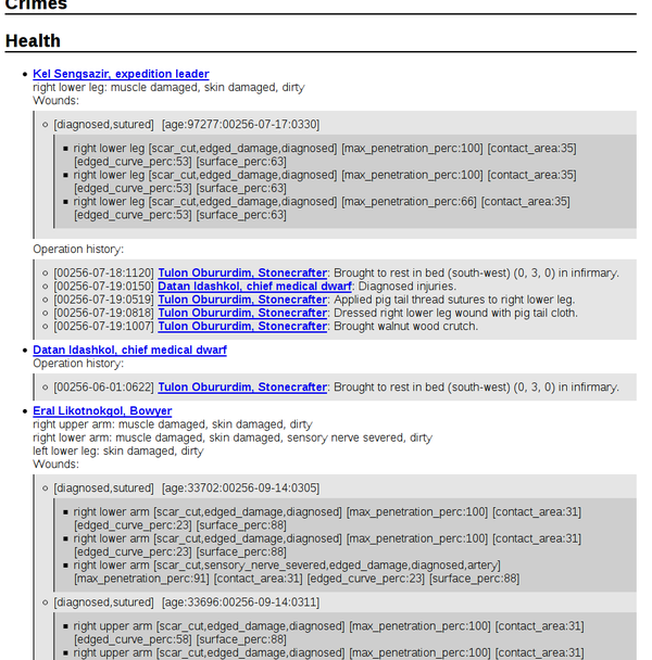
That might be difficult because the body information I'm dealing with is basically a parsed version of this kind of thing.
-
@anonymous234 said in How can I make this page layout less awful to look at?:
@ben_lubar So you can use javascript, right? It was invented for this exact purpose after all.
Yes. I would need to change the CSP, but that's done through nginx, so it's not part of the code actually being changed here.
-
@pleegwat said in How can I make this page layout less awful to look at?:
When indicating events that happened over time, embedding a calendar may be helpful.
By the way, what would be a good way to show the time part of timestamps here? Currently, it's just a number from 0 to 1199, representing the number of 72-second intervals since midnight.
There are 12 months and each has 28 days, which means there are always exactly 4 weeks in a month. The months have assigned names, but more importantly, 1-3 are spring, 4-6 are summer, 7-9 are autumn, and 10-12 are winter, assuming your fortress is in a climate that has 4 seasons.
There are also ages, but those are world-specific and very rarely change during a playthrough. Usually, the age world generation ends in is the same age your fortress will end in.
-
@ben_lubar said in How can I make this page layout less awful to look at?:
Currently, it's just a number from 0 to 1199, representing the number of 72-second intervals since midnight.
:Wtf:
-
@bb36e said in How can I make this page layout less awful to look at?:
beyond that, i'm not sure what else can be done because a lot of the stuff on the page appears to be text nodes and they can't be targeted with CSS.
Also by the way, the health section is currently just a bunch of data spewed out in a vaguely human-readable format. It's almost verbatim what the game keeps track of with the internal reverse-engineered property and bitfield names.
The only major differences are that I hide wound information for dead creatures and I hide body part information for missing parts that also have a missing parent part.
Ideally, I'd like to have it at least be as readable as what's in the game, although having more information than the game shows would be nice, since this is kind of a cheat-y omniscient view of the game's current state.
-
@bb36e said in How can I make this page layout less awful to look at?:
@ben_lubar said in How can I make this page layout less awful to look at?:
Currently, it's just a number from 0 to 1199, representing the number of 72-second intervals since midnight.
:Wtf:
It's also the number of game ticks, which happen 100 times per second by default unless you're suffering from FPS death, so you could look at it as jiffies of real time.
The number is stored in the game's memory as the number of 72-second intervals since the start of the year, so showing the month and day is already helping a lot.
-
@adynathos said in How can I make this page layout less awful to look at?:
when screen width is small, wrap lines instead of introducing a horizontal scrollbar
I believe that's an artifact of the archiving website I used. If you go to the actual page (which is generated directly from game state when it's requested, so everyone would see a different page if i had linked there) it should wrap normally.
Does anyone have a small-screen device that can check whether I need to add a viewport meta tag?
-
@ben_lubar said in How can I make this page layout less awful to look at?:
@pleegwat said in How can I make this page layout less awful to look at?:
These can be generated using embedded SVG, either directly or an
<img src="base64:...">tag.Why not just
<progress>or<meter>?Cause my HTML5 knowledge is rather limited.
-
@ben_lubar said in How can I make this page layout less awful to look at?:
@bb36e said in How can I make this page layout less awful to look at?:
@ben_lubar said in How can I make this page layout less awful to look at?:
Currently, it's just a number from 0 to 1199, representing the number of 72-second intervals since midnight.
:Wtf:
It's also the number of game ticks, which happen 100 times per second by default unless you're suffering from FPS death, so you could look at it as jiffies of real time.
The number is stored in the game's memory as the number of 72-second intervals since the start of the year, so showing the month and day is already helping a lot.
I'd recommend showing whatever people using dwarf fortress tend to show. I imagine time generally gets discarded. Hour may be interesting since it tells you whether events happened during day or night time. Do underground sleeping periods tend to follow the above-ground day/night cycle?
-
@ben_lubar said in How can I make this page layout less awful to look at?:
@pleegwat said in How can I make this page layout less awful to look at?:
For example, indicating injuries on a doll figure
That might be difficult because the body information I'm dealing with is basically a parsed version of this kind of thing.
Right, so that'd probably be way too many graphics assets to create. You wouldn't want to have a separate graphics asset for every possible combination of injured body parts even if there were only one body shape to deal with, and I have no clue if the images could be feasibly generated in the code producing the html.
-
@pleegwat said in How can I make this page layout less awful to look at?:
Do underground sleeping periods tend to follow the above-ground day/night cycle?
Not really, no. Dwarves sleep about every 45 days in fortress mode. In adventure mode, sleeping is much more closely related to the day-night cycle, but the game ticks are 1 second of in-world time, not 72 seconds.
-
Who is the audience for this? Is this only useful with df-ai, or could this be published by someone doing a dwarf fortress let's play as well? Of course that's assuming there are people making dwarf fortress let's plays, but let's be honest this is the internet.
-
@adynathos said in How can I make this page layout less awful to look at?:
Stockssections could use tables, so that thex / Xcolumns are aligned
@pleegwat said in How can I make this page layout less awful to look at?:
Adding progress bars to things like stock levels and production orders can indicate which items have high/low stock.
I've implemented these two suggestions. I should probably make the text alignment different in the table, but here's what I have so far:
https://archive.is/4WkbU/image
Unfortunately, the archive site butchers the HTML5 stuff, so you'll either need to look at the screenshot it took or the live version, assuming I haven't broken it at the time when you click the link.
-
@pleegwat said in How can I make this page layout less awful to look at?:
Who is the audience for this? Is this only useful with df-ai, or could this be published by someone doing a dwarf fortress let's play as well? Of course that's assuming there are people making dwarf fortress let's plays, but let's be honest this is the internet.
Hmm, I could definitely split most of this out of df-ai and into weblegends, which can be used without having df-ai enabled. If someone was doing a Dwarf Fortress LP with this, they could probably set their browser to auto-refresh the page or something. If they were doing a live playthrough on Twitch or whatever, they could set up port forwarding so the HTTP server would be accessible to their viewers directly.
-
@bb36e said in How can I make this page layout less awful to look at?:
add bold text to anchors
@adynathos said in How can I make this page layout less awful to look at?:
maybe the title line of an item should be a bit bolder
Yeah, that does look a lot better:
-
@ben_lubar said in How can I make this page layout less awful to look at?:
Does anyone have a small-screen device that can check whether I need to add a viewport meta tag?
I simulate a small-screen device by resizing the browser window.
I've implemented these two suggestions. I should probably make the text alignment different in the table, but here's what I have so far:
Good job with the table, nice progress bars :)
Unfortunately, the archive site butchers the HTML5 stuff
One more suggestion then: ditch the archive site and put the generated HTMLs on a site you control.
-
@adynathos said in How can I make this page layout less awful to look at?:
One more suggestion then: ditch the archive site and put the generated HTMLs on a site you control.
-
@ben_lubar said in How can I make this page layout less awful to look at?:
@tsaukpaetra said in How can I make this page layout less awful to look at?:
but so far most of Ben's projects seem to be extravagantly minimalistic...
I mean, it's generated by using the
<<operator on astd::ostringstream, but that's basically how all HTML pages are generated at some point in the process...Well in that case, do what I did and just have the endpoints spit out JSON data on an /api path, otherwise splat the content of a www subdirectory in accordance with a standard web server. Or not, I think you mentioned using nginx as a upstream proxy so might not even need to do that anyway....
-
@tsaukpaetra said in How can I make this page layout less awful to look at?:
just have the endpoints spit out JSON data on an /api path
Why? These pages already jellypotato enough on refresh with no dynamic content. I'd hate to have them be generated client-side.
-
@ben_lubar said in How can I make this page layout less awful to look at?:
@tsaukpaetra said in How can I make this page layout less awful to look at?:
just have the endpoints spit out JSON data on an /api path
Why? These pages already jellypotato enough on refresh with no dynamic content. I'd hate to have them be generated client-side.
All the benefit of not having to refresh the whole page of course!

-
@tsaukpaetra said in How can I make this page layout less awful to look at?:
@ben_lubar said in How can I make this page layout less awful to look at?:
@tsaukpaetra said in How can I make this page layout less awful to look at?:
just have the endpoints spit out JSON data on an /api path
Why? These pages already jellypotato enough on refresh with no dynamic content. I'd hate to have them be generated client-side.
All the benefit of not having to refresh the whole page of course!
I'm pretty sure the amount of data transferred for the JSON needed to update the page would be at best a few bytes smaller than the HTML it already sends. And the script that parses the JSON and generates the page would be another place bugs could be introduced.
-
@ben_lubar said in How can I make this page layout less awful to look at?:
to update the page
Why would you update the whole damn thing? Do things really change that much between ticks?
-
@tsaukpaetra go here: https://ben.lubar.me/weblegends-g/df-ai/report/population
wait approximately 0 seconds and then refresh
-
@ben_lubar said in How can I make this page layout less awful to look at?:
@tsaukpaetra go here: https://ben.lubar.me/weblegends-g/df-ai/report/population
wait approximately 0 seconds and then refresh
That's fuckin' ridculous, smalls...
-
@ben_lubar said in How can I make this page layout less awful to look at?:
@tsaukpaetra said in How can I make this page layout less awful to look at?:
@ben_lubar said in How can I make this page layout less awful to look at?:
@tsaukpaetra said in How can I make this page layout less awful to look at?:
just have the endpoints spit out JSON data on an /api path
Why? These pages already jellypotato enough on refresh with no dynamic content. I'd hate to have them be generated client-side.
All the benefit of not having to refresh the whole page of course!
I'm pretty sure the amount of data transferred for the JSON needed to update the page would be at best a few bytes smaller than the HTML it already sends. And the script that parses the JSON and generates the page would be another place bugs could be introduced.
Yeah, the only reason I'd go for JSON here is to separate the HTML formatting from the game code, if JSON is significantly easier to generate (which it sounds like it isn't). You could periodically and/or on command save the json data to disk, and have a background process pick that up and format it into HTML.
-
Ok, I spammed the
migrants-nowcommand a bunch and now there are an absurd number of useless citizens in my fortress:tasks - population - stocks
The stocks page changed the most out of any of them so far today. I need to figure out a better way to style the
Needtable.
-
@ben_lubar Good work on the UI.
Why do some animals have sophisticated names?
Tulon Tunbokbon, Duckling (age 0y9m19d)
corridor (corridor) (main staircase - fort entrance)while others do not?
Cat (age 6y1m1d)
corridor (corridor)
hunts verminAre those ducks from a noble house?
-
@pleegwat said in How can I make this page layout less awful to look at?:
This would require external image resources.
ASCII art, to stay topical! /s
@pleegwat said in How can I make this page layout less awful to look at?:
Adding progress bars to things like stock levels and production orders can indicate which items have high/low stock. These can be generated using embedded SVG, either directly or an tag.
<progress>. Remember when Discourse allowed<progress>in posts? That was fun.
-
@adynathos for pets, they usually get a name in one of two ways:
- Being adopted (which right now only happens in df-ai fortresses for cats and immigrants pets who come with their owners)
- Killing an enemy or enemies deemed significant enough by the game (this is much rarer)
-
Replace all the dwarf fortress stuff on it with porn.
(Hey, you asked.)
-
@anotherusername said in How can I make this page layout less awful to look at?:
Replace all the dwarf fortress stuff on it with porn.
(Hey, you asked.)
Oh it's there, just heavily encrypted and compressed.
-
0_1519798598492_df-ai report_ stocks.html
I may have accidentally made it more awful to look at.
But at least now it shows a description of why there aren't enough of various items yet.
-
@ben_lubar Seems fine to me.
I'd:
table { background-color: #eee; }

td {
  background-color: #fff;
  padding: 0.1em 0.5em;
}

/* Did I just assume your default color and background-color? */
It's a shame
position: stickydoesn't work onthead. A long table would really benefit from a sticky table header.Also, I'd set
text-align: righton numeric cells, but that's just me.Why are the last few
<progress>s in the page missingvalueattributes?
-
@ben_lubar It needs some way to distinguish where one table row ends and the next begins. Could be done as @Zecc suggests, or with alternating background colors, or possibly changing vertical alignment to top.
-
This post is deleted!
-
@zecc said in How can I make this page layout less awful to look at?:
Why are the last few
<progress>s in the page missingvalueattributes?Manager orders that haven't been validated by the manager yet (a gameplay mechanic that starts when you have a population of 20+ citizens if I remember correctly) are shown in indeterminate state on this page.